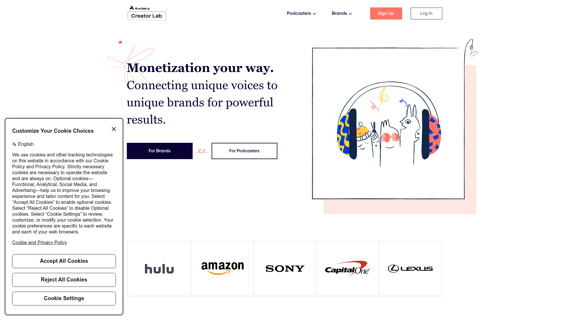
Audacy Creator Lab Marketplace Landing Page
A clean marketplace landing page featuring a dual-CTA hero section, an auto-scrolling partner logo ribbon, animated illustration containers, and three-column feature cards.
Overview
Audacy Creator Lab is a dual-sided marketplace landing page designed to bridge the gap between podcasters and brands. It serves as an excellent clone reference for complex platforms needing to speak to two distinct user personas simultaneously through a unified, high-trust visual language.
Design System
- Color Palette & Visual Hierarchy: The site uses a high-contrast palette of deep navy (
#000033) for headings and primary buttons, offset by a energetic coral (#FF7F6F) for tactical CTAs like "Sign Up." A soft peach background block behind the main illustration provides warmth without sacrificing white space. - Typography: Features a sophisticated serif for primary headers to establish authority, paired with a clean, highly legible sans-serif for body copy and navigation. Headers use a large scale with tight leading to create a impactful, modern editorial feel.
- Page Structure: The layout follows a logical trust-building flow:
- Dual-CTA Hero with split user paths.
- 'Featured In' logo marquee for social proof.
- Value proposition sections with alternating illustration/text alignment.
- Three-column benefit grid (cards).
- Segmented deep-dives for 'Brands' vs 'Podcasters'.
- Reusable Components:
- Dual CTAs: The 'For Brands' (solid navy) and 'For Podcasters' (outlined) buttons separated by a decorative hand-drawn flourish.
- Interactive Logo Ribbon: A horizontal scrolling container housed in a
.scroll-xclass for brand placement. - Feature Cards: Boxed components with centered icons and descriptive text, ideal for scaling across different content types.
- Interaction & Motion: The HTML reveals
animation-wrapperclasses suggesting that the hero and feature illustrations are dynamic or animated SVGs triggered by page load or hover states. - Implementation Clues: The code uses a standard grid-based layout (
col-sm-6,col-md-4) characteristic of Bootstrap or a similar responsive flexbox framework. Decorative elements are handled as separate absolute-positionedimgtags (decor style-1) to add visual flair without breaking the document flow.
Use Cases
- Who should clone this: Marketplace founders, B2B SaaS companies targeting two separate audiences, or agency portfolios looking for a balance of professional and creative aesthetics.
- Effective Remixes: Adapt this for a jobs board (Employers vs. Candidates), a real estate platform (Buyers vs. Sellers), or a technical tool (Developers vs. Managers).
- Remix Directions: Swap the hand-drawn squiggles for technical schematics or geometric patterns to shift from a creative vibe to a more corporate or fintech feel. Use the logo marquee section to showcase clients or technology integrations.
- Clone Scope: A quick section clone of the hero is highly effective for any landing page needing a clear entry point for two user types. A full-page clone is recommended for startups needing a complete, high-conversion marketing structure.
Related Inspirations
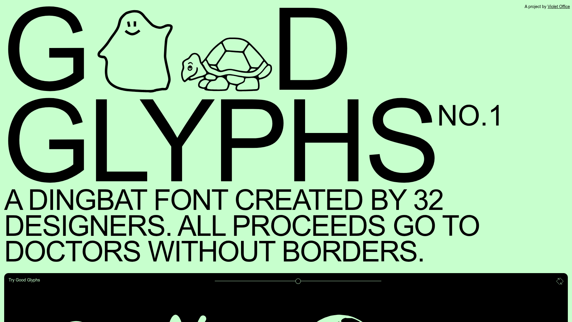
Good Glyphs Font Showcase Landing Page
A single-page layout featuring an interactive type tester, donation form with custom amount logic, and a contributor gallery using swiper-based glyph previews.
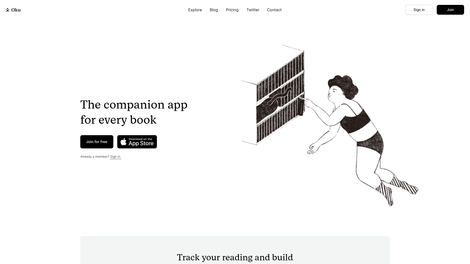
Oku Minimalist Book Tracking Landing Page
A clean, typography-focused landing page featuring a minimalist header, illustrated hero section, and clear call-to-action buttons for app downloads.

Slite SaaS Knowledge Base Landing Page
A clean SaaS hero section with a conversational headline, secondary call-to-action buttons, and a structured software interface preview featuring user testimonials.
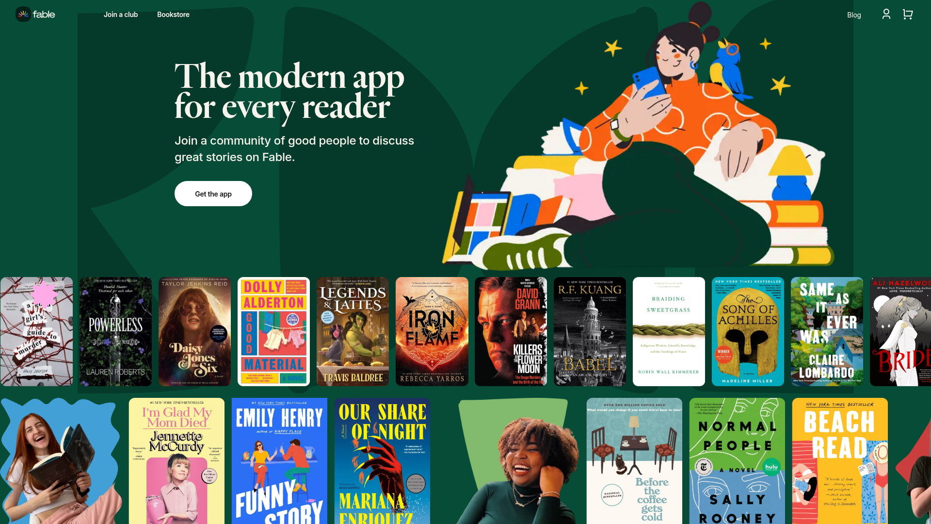
Fable Social Reading Landing Page
A vibrant community site featuring a dual-row animated book cover slider, bento-style feature cards with parallax transforms, and a horizontal gallery of popular clubs.
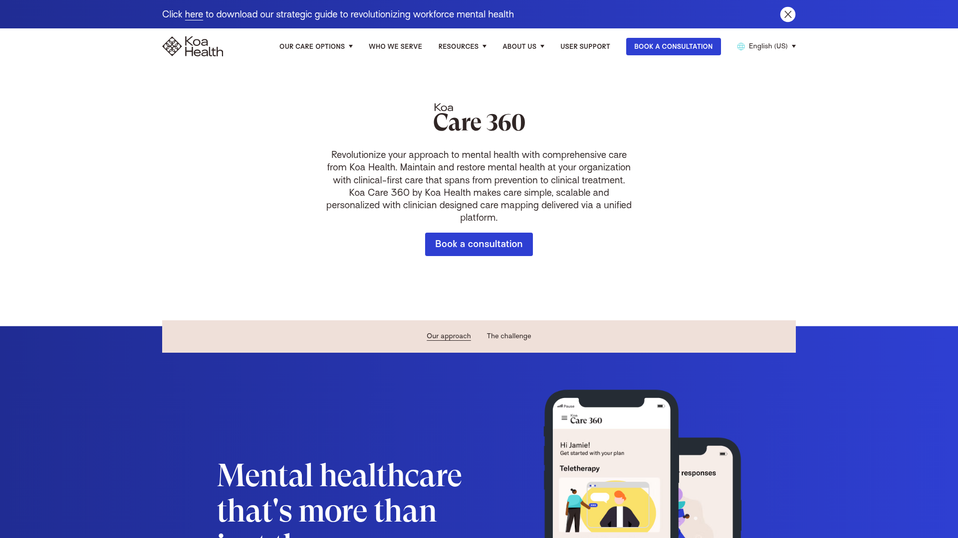
Koa Health Mental Care Landing Page
A clean healthcare landing page featuring a centered hero section, scroll-based fade-in animations, overlapping mobile mockups, and a multi-column feature grid with accent borders.
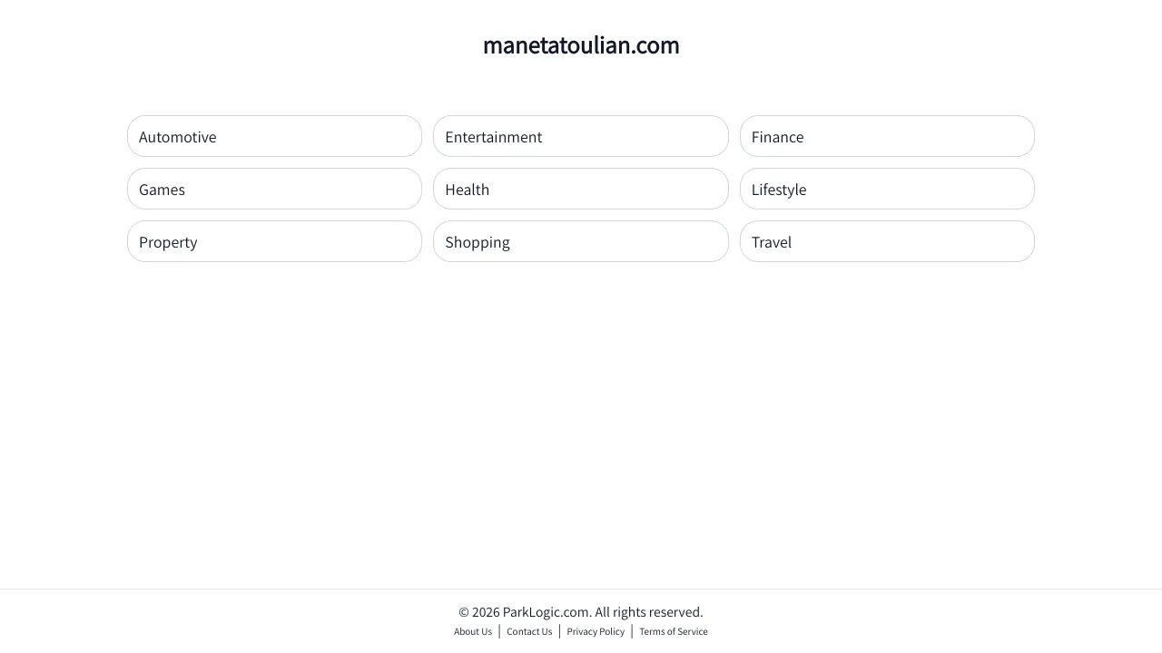
Minimalist Category Directory Landing Page
A clean, responsive link directory featuring a three-column grid of pill-shaped buttons and a simple header-footer layout ideal for landing pages.
