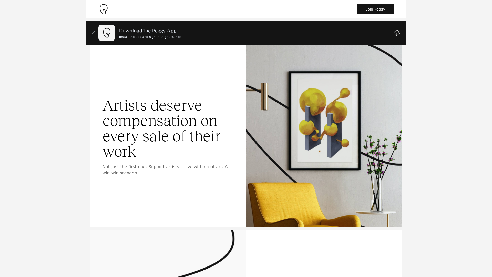
Peggy Art Royalties Pitch Page
A clean storytelling layout featuring alternating image-text sections, a three-column testimonial grid with circular avatars, and a icon-based feature grid for brand values.
Overview
This website is a clean, editorial Pitch Page for Peggy, an art marketplace focused on secondary sales and artist royalties. It effectively combines high-fashion imagery with structured storytelling to communicate a value proposition through a sequence of high-contrast, alternating layout blocks. It serves as an excellent reference for builders looking to create sophisticated, trust-based landing pages for premium service platforms or creative marketplaces.
Design System
- Color Palette & Visual Hierarchy: A minimalist monochrome base (pure whites and deep blacks) is used to establish luxury. Accent colors are derived entirely from the photography (e.g., the yellow accent chair) and high-impact CTA banners featuring subtle SVG patterns. The black top-bar and footer create a strong "frame" for the white main content area.
- Typography: A dual-system approach using high-contrast serif headings (Playfair or similar) for emotional hooks and a clean, medium-weight sans-serif for functional UI and body text. The hierarchy uses large scales (up to
text-6xl) to emphasize key statements like "Artists deserve compensation..." - Page Structure & Flow:
- Sticky Header & Promotion: A thin black banner with an app download call-to-action.
- Zig-Zag Media Sections: Alternating 50/50 image-and-text blocks that guide the eye down the page.
- Call-out Statement: A centered, large-text typography section for "The Problem."
- Tertiary Testimonial Grid: A three-column layout featuring circular headshots and italicized quotes.
- Feature Icon Grid: A 6-column (desktop) / 2-column (mobile) grid for brand trust signals.
- Reusable Components:
- The Wide-Card: A responsive flex container (
flex-row-reverse flex-wrap) that swaps ordering on mobile to ensure images always ground the text. - Icon-Based Value Grid: A simple white-box container used for standardizing platform benefits (e.g., Secure Payments).
- CTA Banner: A full-width black section with an SVG background image and dual-button secondary orientation.
- The Wide-Card: A responsive flex container (
- Implementation Clues: The HTML confirms the use of Tailwind CSS for layout utilities (
max-w-7xl,md:w-1/2,flex-row-reverse) and Alpine.js (x-data) for lightweight interactive states like the video modal logic.
Use Cases
- Who should clone this: This pattern is ideal for SaaS startups, luxury goods marketplaces, or advocacy groups that need to present a logical argument through storytelling rather than just displaying features.
- Remixing for other products: A legal tech firm could swap the art imagery for professional photography, or an eco-conscious brand could use the 6-icon grid to display sustainability certifications.
- Direction for Builders: The alternating "Wide-Card" section is the highest-value component to clone first, as it handles responsive image-text stacking perfectly. For a quick clone, focus on the typography scale and white-space ratios which provide the "premium" feel. For a full-page clone, ensure high-fidelity photography is available to balance the minimalist text.
Related Inspirations
WalletConnect Pay Crypto Hero Page
A high-impact landing page featuring a full-width blue hero section with side-by-side text and hardware mockup, bento-style feature grids, and a clean blog post masonry layout.
Vibrants Wellbeing E-commerce Landing Page
A clean Shopify-style landing page featuring a full-width hero with overlaid product cards, a horizontal product slider, and interactive cart drawer with utility progress bars.
Relate.app Domain Sales Landing Page
A high-impact domain landing page featuring a centered content overlay on a dynamic human-centric background grid with clear pricing and 'Buy Now' call-to-action components.
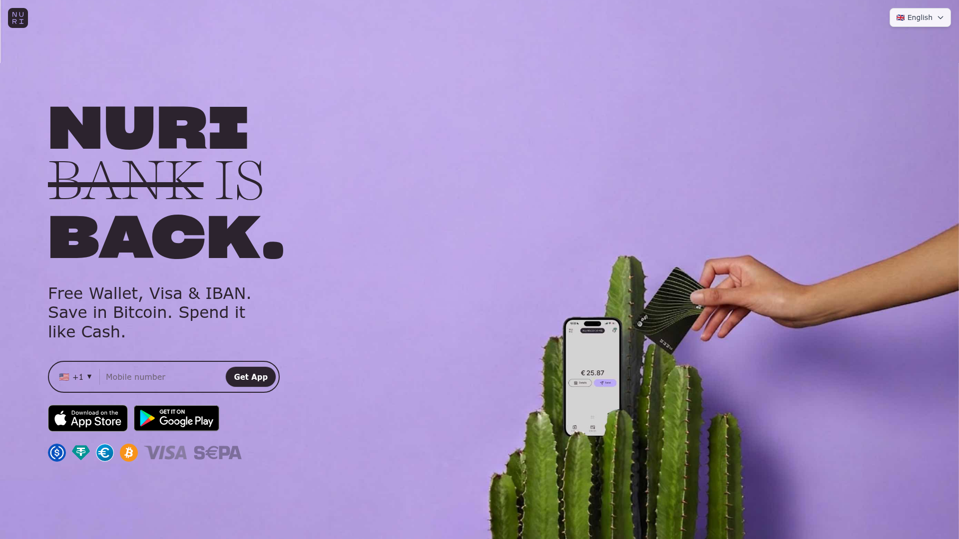
Nuri Cryto Banking Landing Page
A high-impact landing page featuring a bold typography hero, a phone-number signup component, and a sticky scroll-driven feature showcase with centered mobile mockups.
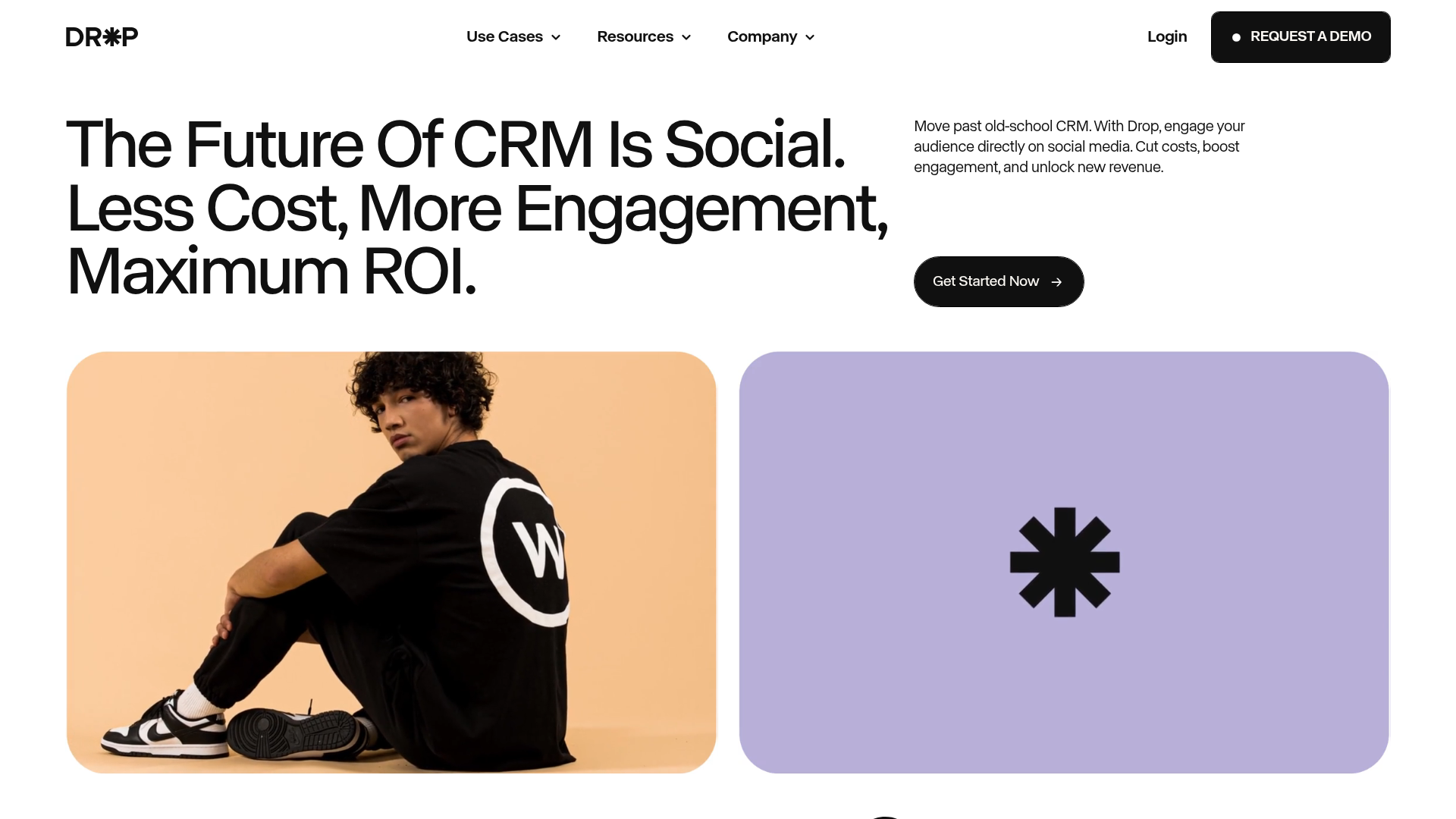
Drop Social CRM Landing Page
A modern SaaS landing page featuring a minimalist large-typography hero section, rounded bento-style image containers, and a clean navigation bar with a CTA.
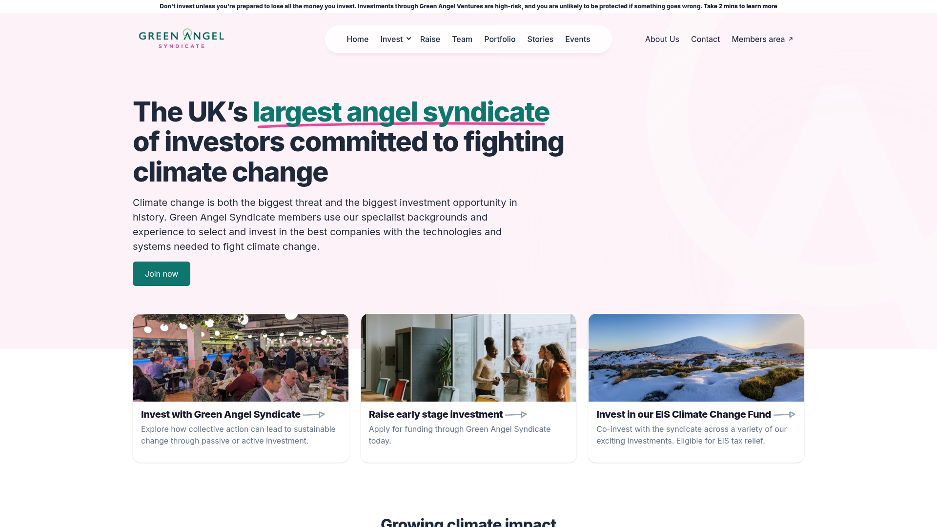
Green Angel Syndicate Investment Landing Page
A clean venture capital landing page featuring a hero section with card-based navigation, a four-column stat grid, and alternating split-layout content sections with image-text pairings.
