Elvina Prasad Portfolio Design Site
A minimalist portfolio layout featuring an animated grid hero section, custom cursor interactions, and vertical scrolling typography for case studies.

Overview
This minimalist portfolio design stands out for its sophisticated use of typography and interaction-led navigation. It features a unique grid-based hero section and a custom cursor system that changes state based on context, making it an excellent reference for high-end creative portfolios or agency websites that prioritize visual storytelling over dense text.
Design System
- Color Palette & Visual Hierarchy: The site uses a high-contrast monochromatic base (predominantly black and white) to establish a clean, editorial look. Accents are kept to a minimum, allowing project imagery to dictate the secondary color story.
- Typography: The system relies on a bold, oversized high-contrast serif/sans-serif combination for headers like "Human," "centred," and "designs." Case studies and body text use a more legible, compact sans-serif typography with generous line-height to maintain readability during vertical scrolls.
- Page Structure: The layout follows a distinctive flow: an animated grid hero with floating image assets, followed by an "About" section with staggered text blocks, and finally a vertically stacked "Selected Projects" list that uses horizontal dividing lines to create a structured, rhythmic feel.
- Reusable Components:
- Custom Cursor: A
cursor_movediv with acursor_dotchild that displays interactive text like "View Project." - Animated Navigation: A full-screen overlay menu (
menu-list) featuring 3D transforms and staggered link reveals. - Project List: A dynamic list component (
selected-project-list) with hover reveals for project thumbnails and categories.
- Custom Cursor: A
- Interaction & Motion: The site uses
will-change: transformandtranslate3dextensively for smooth parallax effects on grid images and "overflow" hidden containers for sliding text reveals during scroll. - Implementation Clues: The HTML structure uses Webflow-specific classes (
w-dyn-list,w-dyn-item,w-embed) indicating a CMS-driven approach for project listings, which simplifies scaling for builders who want to add more work.
Use Cases
- Who should clone this: Individual designers, architectural firms, and boutique creative agencies looking for a high-impact, low-copy landing page.
- Effective Remixes: This pattern works exceptionally well for luxury brand lookbooks or digital brochures where the imagery needs to breathe.
- Remix Directions:
- Brand Swap: Replace the monochrome palette with vibrant gradients while keeping the 3D staggered typography reveals.
- Information Architecture: Use the "Selected Projects" list structure as a horizontal services menu instead of a project gallery.
- Clone Scope: For a quick win, clone the custom cursor and the animated grid hero. For a complete transformation, clone the full-page structure to leverage the pre-built Webflow CMS interactions for work displays.
Related Inspirations

Jakub Reis Portfolio Case Study Gallery
A dark-themed designer portfolio featuring a typography-focused loading animation and a staggered masonry grid for project case studies.
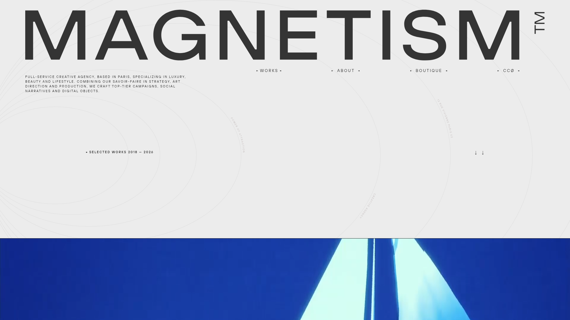
Magnetism High-End Portfolio Landing Page
A luxury-focused creative agency layout featuring a oversized typographic hero, interactive project grid with video hovers, and a sleek concentric-ring background animation.
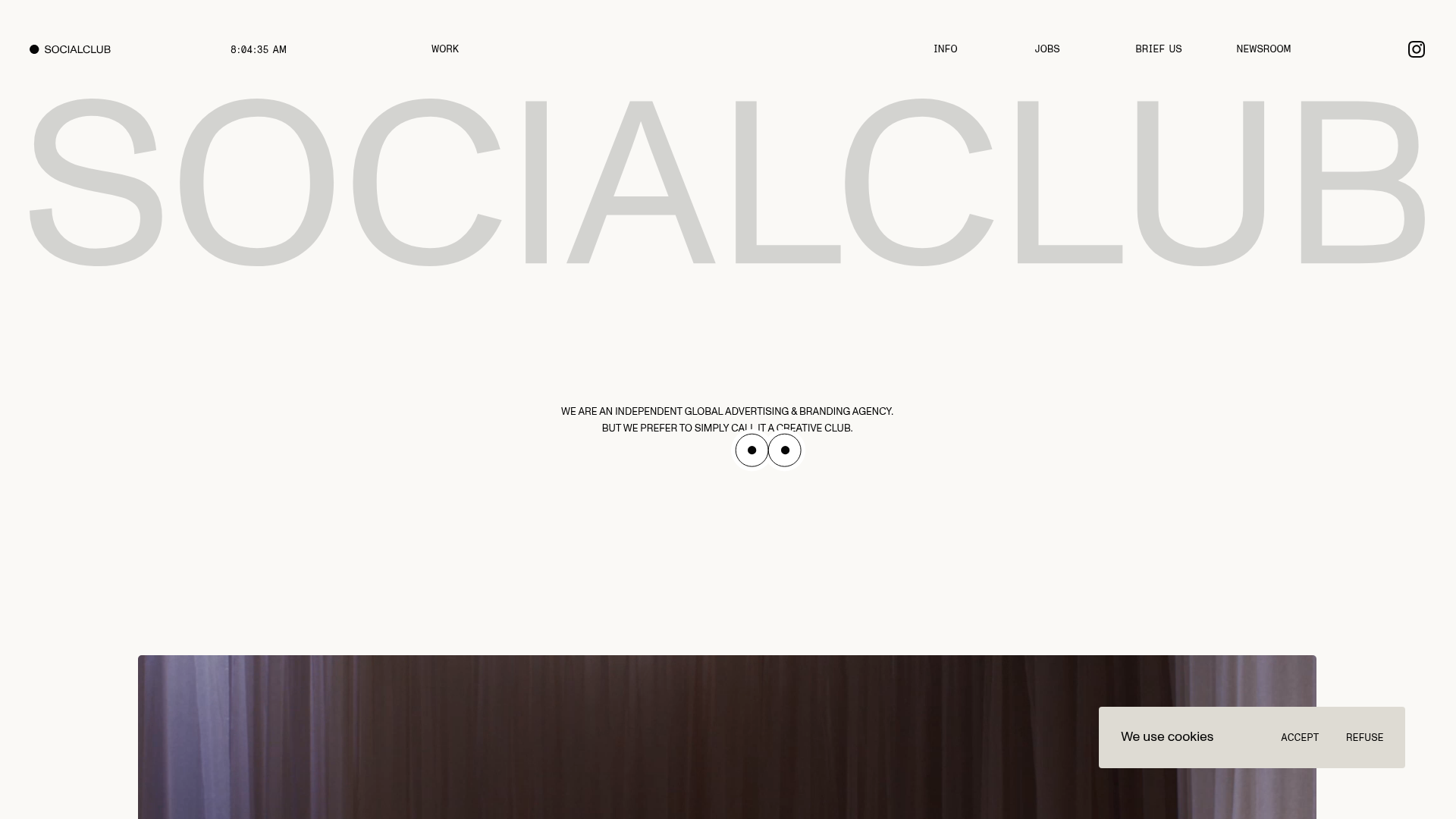
SocialClub Creative Agency Portfolio Landing
A minimalist advertising agency site featuring a large-scale typographic hero header, custom interactive cursor movements, and an asymmetrical grid of video project cards.

Dennis Snellenberg Animated Portfolio Site
High-end portfolio featuring magnetic button interactions, a multi-language preloader, smooth GSAP-based scroll animations, and dynamic project hover states for designers/developers.
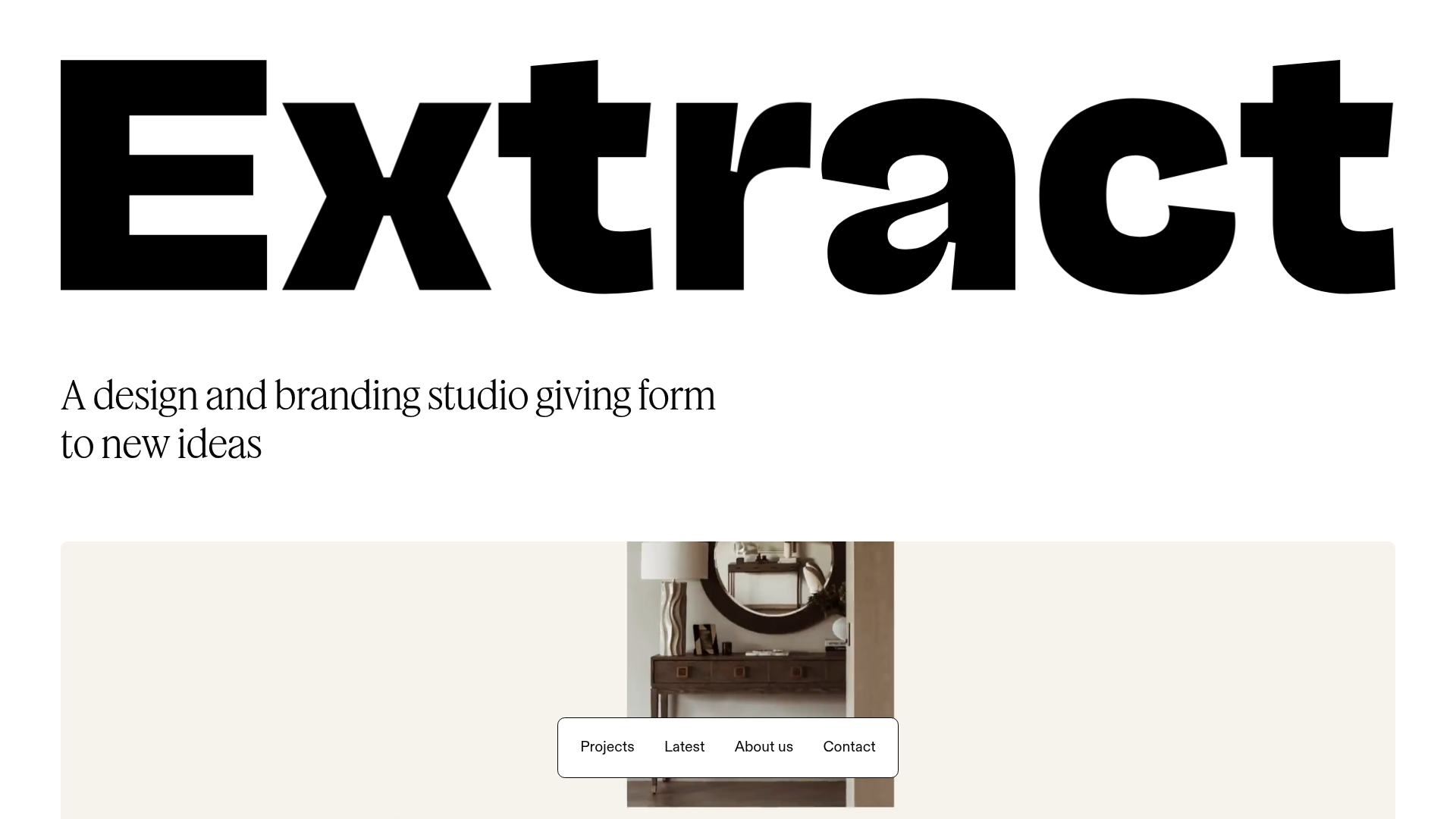
Extract Studio Design Agency Portfolio
A minimal agency landing page featuring high-impact typography, a bottom-fixed floating navigation bar, and a hover-responsive project grid with image swapping.
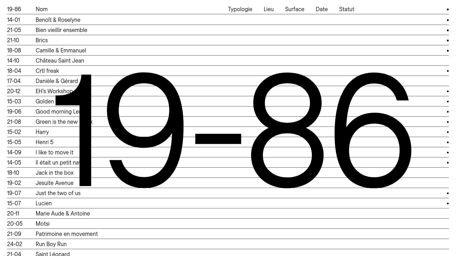
19-86 Architecture Portfolio List Layout
A minimalist, text-focused portfolio featuring vertically stacked collapsible project rows, interactive image-hover effects, and large-scale background typography.
