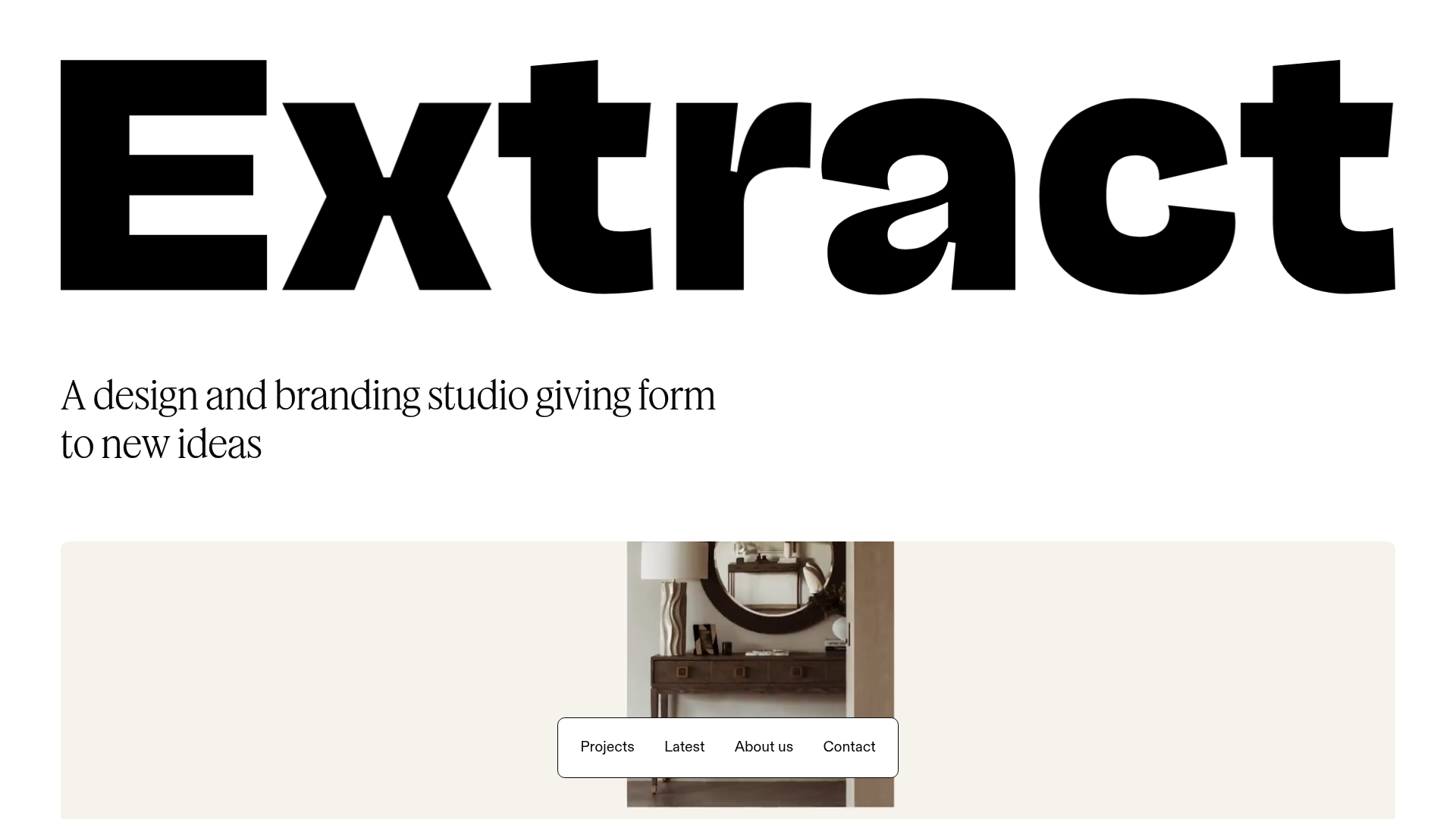
Extract Studio Design Agency Portfolio
A minimal agency landing page featuring high-impact typography, a bottom-fixed floating navigation bar, and a hover-responsive project grid with image swapping.
Overview
Extract Studio's website is a masterclass in high-contrast, minimalist branding that uses oversized typography to establish immediate authority. It is an excellent clone reference for creatives who want to showcase high-quality imagery within a clean, rigorous layout that prioritizes content over complex UI elements.
Design System
- Color Palette & Visual Hierarchy: The site uses a high-contrast monochromatic base (pure black
#000000on pure white) with functional background shifts, such as thebg-extract-greensection for secondary content. Hierarchy is defined by extreme scale differences between the massive hero wordmark and the refined body text. - Typography: The system relies on two distinct styles: a bold, wide sans-serif for the brand identity (visible in the "Extract" logo) and a sophisticated serif (likely a custom variation of ABC Caslon or similar) for headings and body copy. The HTML reveals a
fluid-text-xlutility, suggesting a responsive type scale that shrinks gracefully for mobile. - Page Structure: The layout flows from a massive branding block to a focused mission statement, followed by a dense 2-column project grid. It concludes with a three-column "Newsworthy" section and a minimal footer, maintaining a strict 11/12 width container.
- Reusable Components:
- Floating Navigation: A bottom-fixed, rounded-pill navigation bar (
Projects,Latest,About us,Contact) that stays accessible without obscuring the top-heavy typography. - Image Hover Grid: Project cards (
aspect-4/3) featuring a sophisticated stack of absolute-positioned images. On hover, these rotate visibility to create a "flipbook" preview effect. - Animated Underline Links: Links use CSS transitions (
AnimatedUnderlineLink_animatedLink) that animate a border-bottom on hover.
- Floating Navigation: A bottom-fixed, rounded-pill navigation bar (
- Interactions: The site uses a custom cursor and smooth page transitions (
page-transition-overlay). The project grid usesopacity: 0andvisibility: hiddenstates to toggle preview images during user interaction. - Implementation Clues: Built with Next.js and Tailwind CSS (visible via
xl:w-11/12,grid-cols-1, andflexclasses). Sanity.io is used as the headless CMS for dynamic image and video assets.
Use Cases
- Who should clone this: Independent design studios, architects, or high-end photographers who need a portfolio that feels "expensive" but remains functionally simple.
- Remix Directions: Swap the monochromatic scheme for a bold duo-tone palette to match a different brand identity. The project grid can be easily adapted to a single-column layout for more immersive case study previews.
- Suggested Scope: A full-page clone is ideal for those needing a complete brand overhaul. Alternatively, the bottom-fixed floating nav and the hover-flip image cards are standout components that can be integrated into existing React/Tailwind projects.
Related Inspirations
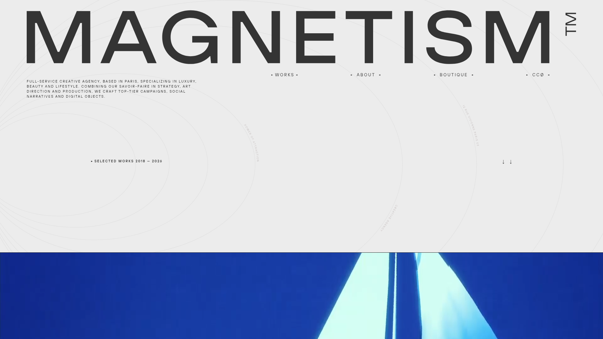
Magnetism High-End Portfolio Landing Page
A luxury-focused creative agency layout featuring a oversized typographic hero, interactive project grid with video hovers, and a sleek concentric-ring background animation.
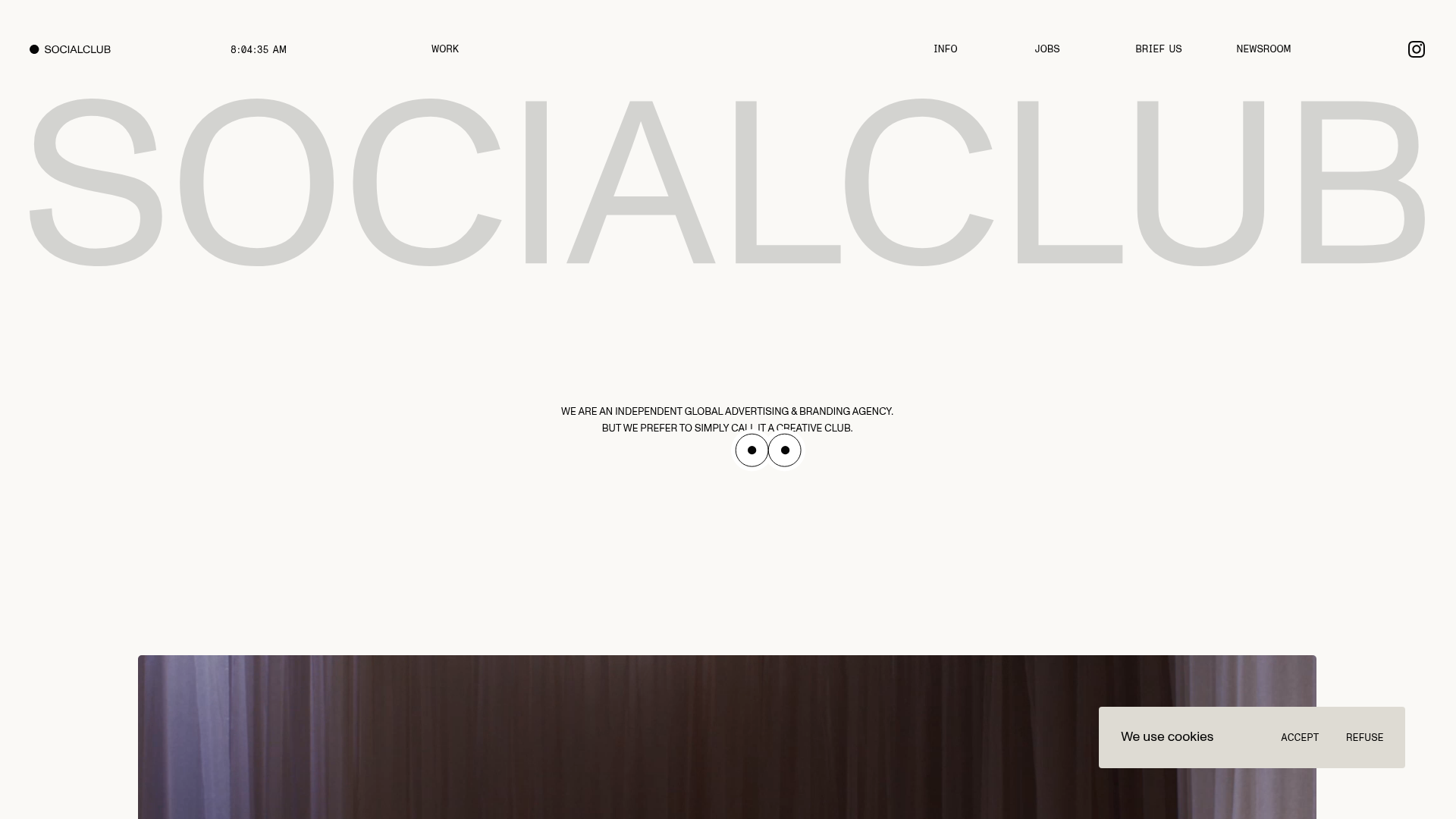
SocialClub Creative Agency Portfolio Landing
A minimalist advertising agency site featuring a large-scale typographic hero header, custom interactive cursor movements, and an asymmetrical grid of video project cards.
Studio Lathe Minimalist Portfolio List
A high-contrast, minimalist portfolio layout featuring a dense list-based project index with flexible category labeling and a full-screen yellow background.

Niklas Rosén Designer Portfolio Index
A minimalist, responsive grid-based portfolio index featuring a clean 16-column layout, typographic list components, and a custom dark mode transition.

Clase Agency Branding Portfolio
A minimalist design agency portfolio featuring a typographic hero section, full-width image articles, sticky title bars, and integrated scrolling text marquees for a clean editorial layout.
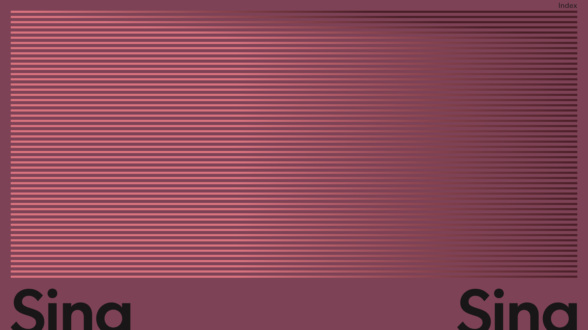
Sing-Sing Creative Portfolio Landing Page
A minimalist studio portfolio featuring high-contrast typography, a horizontal line-grid hero section, and responsive image components with custom cursor interactions.
