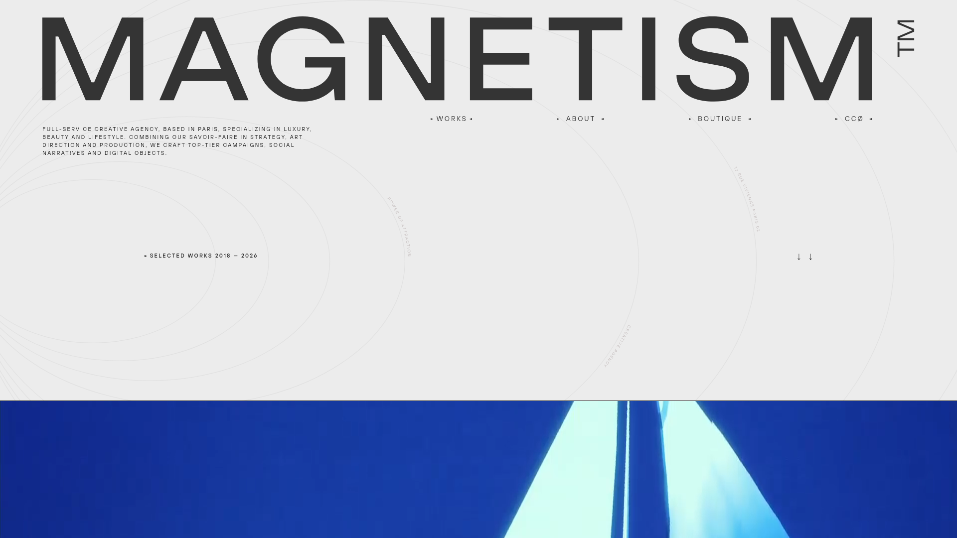
Magnetism High-End Portfolio Landing Page
A luxury-focused creative agency layout featuring a oversized typographic hero, interactive project grid with video hovers, and a sleek concentric-ring background animation.
Overview
This website represents the digital presence of Magnetism, a high-end luxury creative agency. It is an exceptional clone reference for professionals seeking to build ultra-clean, editorially focused portfolios where bold typography and immersive media take center stage. The layout demonstrates how to balance minimalist white space with high-impact visual storytelling.
Design System
- Color Palette & Visual Hierarchy: The site uses a high-contrast monochromatic base (off-white background
#F0F0F0and deep charcoal text) complemented by a single accent color from project media (vibrant cobalt blue in the hero section). The hierarchy is established through extreme scale, with massive header text and meticulous alignment. - Typography System: A bold, sans-serif grotesque is used for the header (
MAGNETISM), likely a custom or premium font. Body text is set in a smaller, monospaced or technical sans-serif, often in all-caps, to provide a "technical precision" contrast to the fluid art direction. - Page Structure & Section Flow:
- Hero Header: Massive typographic title with a minimalist utility nav (
Works,About,Boutique,CC0). - Intro Section: A left-aligned descriptive paragraph and a right-aligned "Selected Works" label with scroll cues (
↓↓). - Masonry/Grid Portfolio: A dense layout of project tiles with varying heights.
- List View: A secondary projects section using an interactive list format (
More projects).
- Hero Header: Massive typographic title with a minimalist utility nav (
- Reusable Components:
- Project Cards (
c-home-projects-item): These feature a specific hover state where static images are replaced by auto-playing silent video loops. - Interactive Project List: A clean row-based list where hovering over a project name reveals a floating preview image.
- Custom Cursor: The HTML reveals a
c-cursorcomponent with context-aware labels (e.g., "Learn more", "Discover").
- Project Cards (
- Interaction & Motion Patterns: The background features subtle concentric ring animations (
c-home-intro_shapes-wrapper). High-end page transitions are hinted at by ac-page-transitiondiv that likely slides letters across the viewport. - Responsive Behavior: The design uses a flexible grid; the HTML reflects different image sources for mobile (
md:hidden) and large screens (md-max:hidden), indicating a mobile-first approach for image aspect ratios. - Implementation Clues: Built with Nuxt.js and Prismic CMS, the structure relies heavily on BEM-style classes (
c-nav-toggler,o-link-arrows) and GSAP-like transformation styles on interactive elements.
Use Cases
- Who should clone this: Independent creative directors, boutique design studios, or high-end architectural firms wanting to signal prestige and attention to detail.
- What to remix: This pattern is ideal for "Vision-first" brands. It can be adapted for premium e-commerce (e.g., a jewelry lookbook) or specialized luxury real estate listings.
- Practical remix directions:
- Typography Swaps: Replace the grotesque sans-serif with a high-contrast Serif (like Bodoni) to move from "Modern/Minimal" to "Classic/Heritage."
- Background Layering: Keep the typographic overlay but replace the concentric rings with geometric WebGL shapes or grain texture shaders.
- IA Adaptation: Use the project grid for a blog/magazine and the interactive list for a site navigation index.
- Suggested clone scope: A full-page clone is best to maintain the specific balance of the hero and grid. However, cloning just the Interactive Project List with its progress bars and hover previews provides high value for any standard interior page.
Related Inspirations
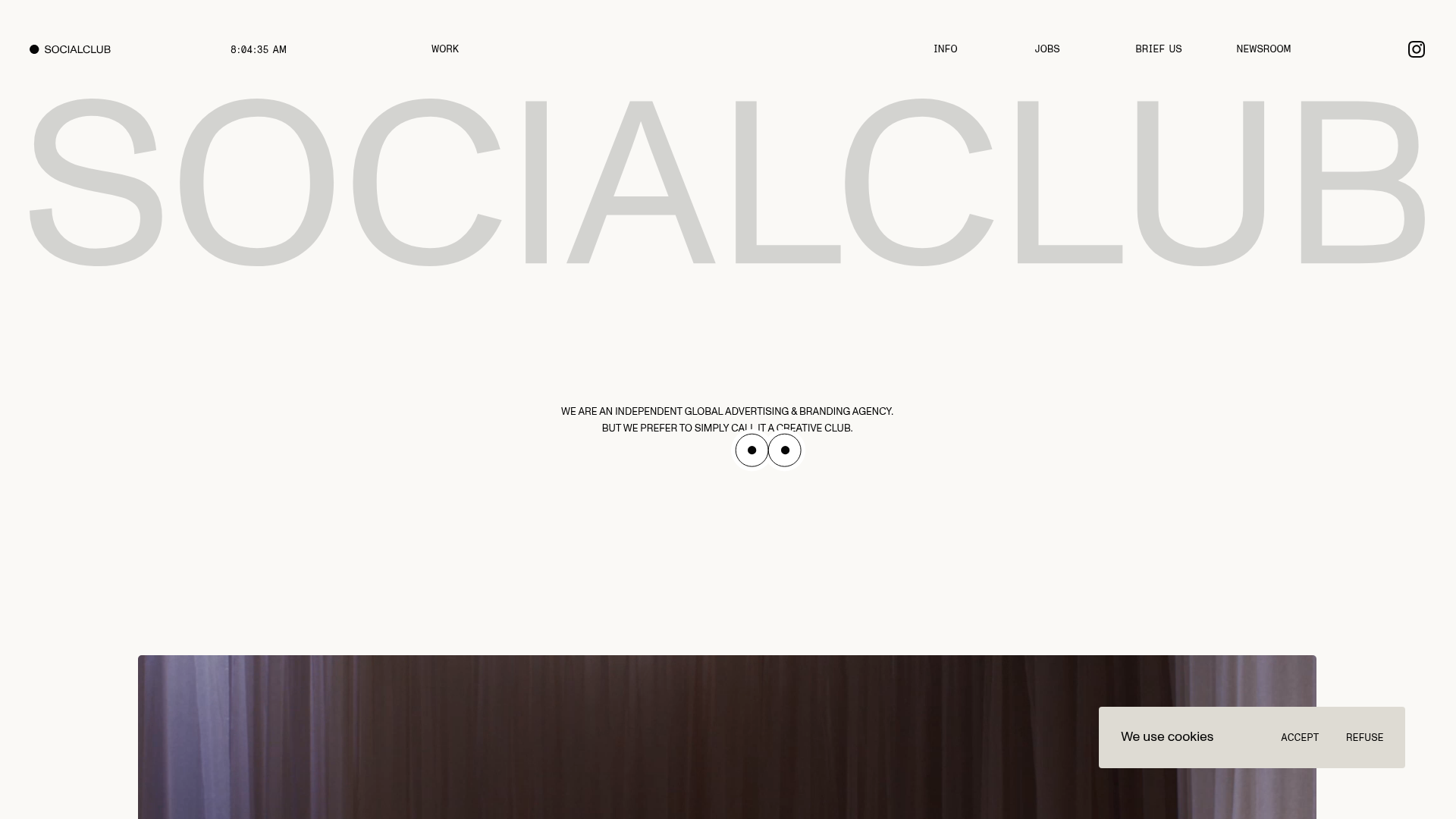
SocialClub Creative Agency Portfolio Landing
A minimalist advertising agency site featuring a large-scale typographic hero header, custom interactive cursor movements, and an asymmetrical grid of video project cards.
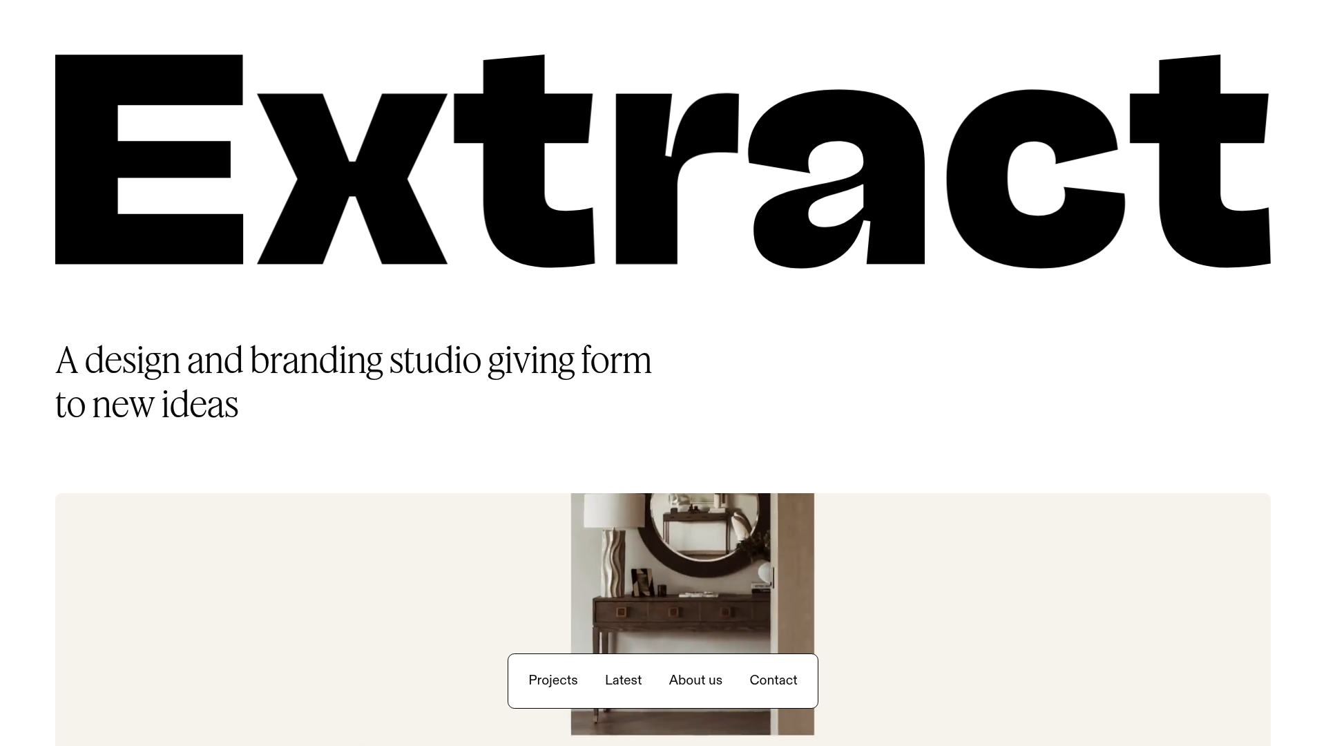
Extract Studio Design Agency Portfolio
A minimal agency landing page featuring high-impact typography, a bottom-fixed floating navigation bar, and a hover-responsive project grid with image swapping.
Studio Lathe Minimalist Portfolio List
A high-contrast, minimalist portfolio layout featuring a dense list-based project index with flexible category labeling and a full-screen yellow background.

Niklas Rosén Designer Portfolio Index
A minimalist, responsive grid-based portfolio index featuring a clean 16-column layout, typographic list components, and a custom dark mode transition.

Clase Agency Branding Portfolio
A minimalist design agency portfolio featuring a typographic hero section, full-width image articles, sticky title bars, and integrated scrolling text marquees for a clean editorial layout.
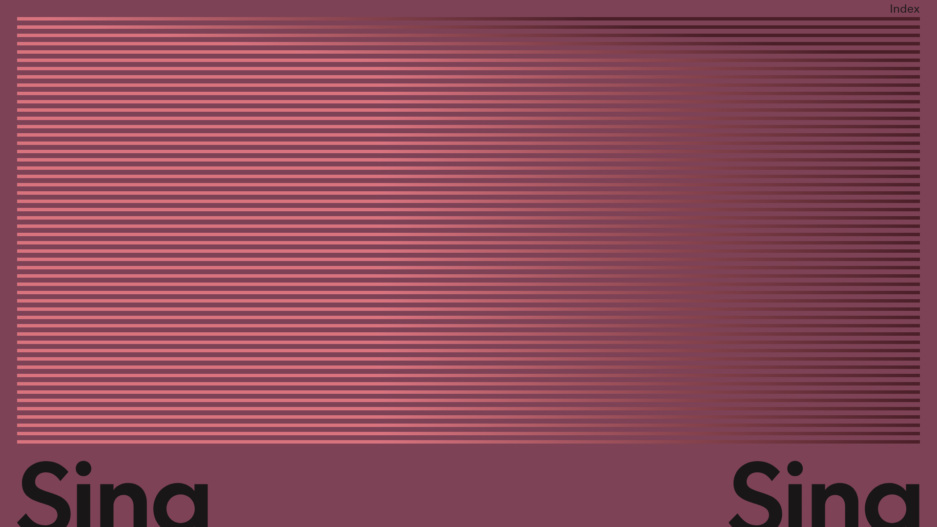
Sing-Sing Creative Portfolio Landing Page
A minimalist studio portfolio featuring high-contrast typography, a horizontal line-grid hero section, and responsive image components with custom cursor interactions.
