Jakub Reis Portfolio Case Study Gallery
A dark-themed designer portfolio featuring a typography-focused loading animation and a staggered masonry grid for project case studies.

Overview
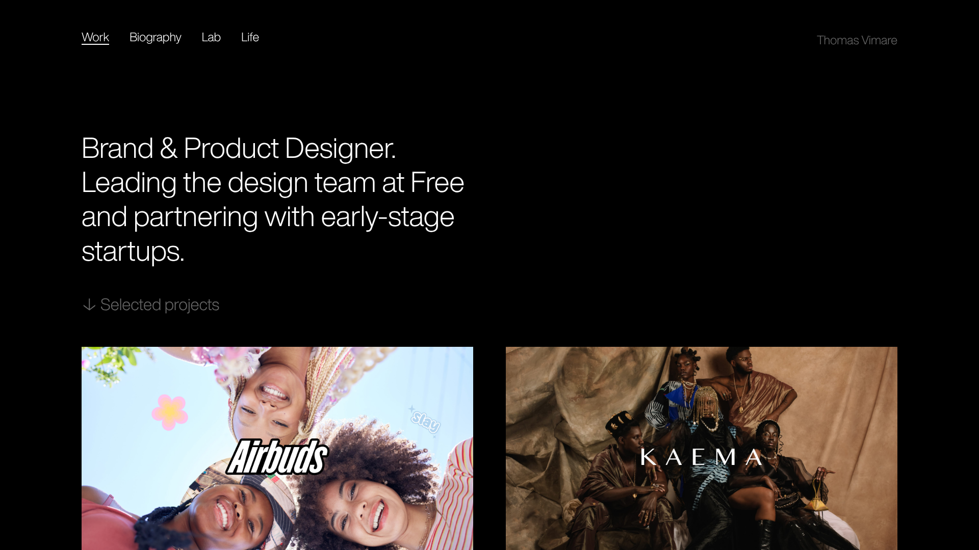
This portfolio for designer Jakub Reis is a masterclass in minimalist, high-impact typography and grid layout. It serves as an excellent reference for builders because it demonstrates how to balance a stark, dark-themed aesthetic with a dynamic staggered masonry grid for visual interest.
Design System
- Color Palette & Visual Hierarchy: The site utilizes a high-contrast 'Dark Mode' default with a pitch-black background (#000000) and off-white/grey text. Hierarchy is established through extreme font sizing differences and opacity levels (e.g., 0.85 opacity for body text).
- Typography System: A bold, modern sans-serif is used for display headings. The design relies on large-scale typography for the hero section and loading states, while smaller, more readable scales are used for metadata like project categories (e.g., "Visual Identity, User Interface Design").
- Page Structure:
- Loading Sequence: A typography-focused 'Intro' animation with individual character transforms.
- Hero Intro: A minimal text block highlighting name and a list of high-profile clients.
- Case Study Gallery: A two-column masonry grid containing image-led project cards.
- Reusable Components:
- The Masonry Grid: A balanced two-column layout that handles varying image aspect ratios and orientations without creating excessive whitespace.
- Project Cards: Deeply integrated link blocks containing a
gatsby-image-wrapperfor optimized assets, a project title, and descriptive tags. - Loading Animation Wrapper: The
loading__LoadingWrapusestranslateYtransforms on text spans to create a cinematic entry effect.
- Interaction & Motion: The HTML reveals extensive use of inline transforms and opacity transitions. Key patterns include scroll-based triggers (tracked via
data-scroll-section) and staggered entrance animations for grid items. - Implementation Clues: Built using Gatsby, indicated by the
#___gatsbywrapper andgatsby-imagecomponents. It utilizes styled-components (noted by unique class hashes likebjrqRe) and likely Locomotive Scroll or GSAP for the smooth parallax and motion effects.
Use Cases
- Who should clone this: Independent creatives (designers, photographers, architects) who want their work to be the primary focus through a "gallery-first" interface.
- Effective Remixes: Creative agencies can adapt the masonry grid to display a broader mix of media like video or client logos. The loading animation can be remixed as a transition between separate case study pages.
- Remix Directions:
- Color Swap: Replace the black background with a deep navy or forest green while keeping the white typography for a "sophisticated editorial" look.
- Grid Variation: Shift from a 2-column masonry to a 3-column grid for higher volume portfolios.
- Interactive Hero: Instead of a static intro, use the large typography area for a scrolling ticker of services.
- Suggested Scope: Start by cloning the Masonry Grid for a standalone project showcase, or the Loading/Intro sequence to add a premium feel to an existing landing page.
Related Inspirations

Niklas Rosén Designer Portfolio Index
A minimalist, responsive grid-based portfolio index featuring a clean 16-column layout, typographic list components, and a custom dark mode transition.
Minimalist Dark Designer Portfolio Grid
A clean, dark-themed portfolio featuring a bold typography hero section and a staggered two-column image grid with subtle entrance animations.

Break Maiden Agency Portfolio Hero
A high-impact dark mode hero section featuring oversized typography with inline GIF icons and a responsive grid for display-heavy case studies.

Dima Kutsenko Photography Portfolio Hero
A refined dark-mode portfolio featuring a full-screen image loader, tiered typography animations, and creative text-distortion hover effects for high-end fashion branding.
Norgram Minimalist Design Portfolio
A high-end, monochrome studio portfolio featuring a brutalist typography-led hero section, a clean asymmetrical masonry grid, and minimalist project navigation.

Marx Design Minimal Portfolio Grid
A high-end design portfolio featuring a synchronized image-hover grid layout, GSAP-powered transitions, and a hidden fullscreen menu with portrait image links.
