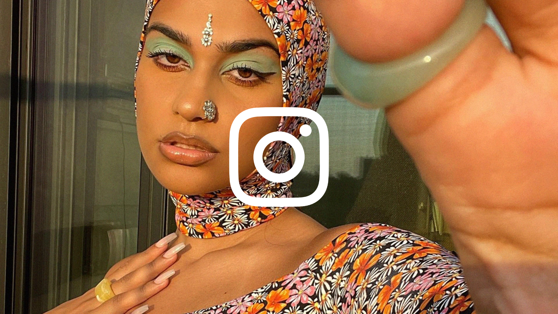
Instagram Brand Identity Showcase
A high-impact brand guide featuring an animated hero image grid, interactive video sections, and a horizontal scrollable media gallery designed for visual storytelling.
Overview
This website serves as the official brand identity showcase for Instagram, utilizing a bold, media-heavy design to communicate aesthetic principles. It is a premier reference for high-end portfolio sites or brand guidelines that need to balance large-scale typography with immersive video and image grids.
Design System
- Color Palette & Visual Hierarchy: The design relies on a high-contrast foundation of deep blacks and pure whites, accented by Instagram’s signature vibrant multi-color gradients. Visual hierarchy is established through massive display typography and a "sizzle-reel" video approach that draws immediate focus to the center of the viewport.
- Typography: The site features a custom sans-serif typeface ("Instagram Sans") used at extreme scales for headlines. The HTML shows a mix of large display sizes (
_a88f) for impact and smaller, legible body text (_a4ko) for descriptions, often with subtle entry transitions. - Page Structure: The flow follows a "scroll-to-reveal" narrative:
- Animated Hero: A dense grid of images (
_a8-c) that serves as a backdrop for the floating Instagram logo. - Concept Sections: Alternating blocks of text and media that explain brand pillars (Type, Gradient, Layout).
- Interactive Media Canvas: A central video player with a dedicated "PLAY FILM" overlay button.
- Horizontal Gallery: A swipeable media slider (
_a8yt) containing mixed assets (video and stills).
- Animated Hero: A dense grid of images (
- Reusable Components:
- Media Cards: Linked image/video containers (
_a8vz) that feature a primary static image and a secondary autoplaying video on a loop. - Brand Footer: A minimalist footer containing legal links and a clean language picker dropdown (
_a96e). - Hover States: The code indicates
_9giiclasses on links, suggesting standardized interaction patterns across components.
- Media Cards: Linked image/video containers (
- Interaction & Motion: The UI is heavily animated with scroll-triggered transitions and staggered delays (seen in
transition-delay: 300msproperties in the HTML). Video is used as a background element and as a primary interactive focal point. - Implementation Clues: The structure uses highly atomized class names (likely generated via a CSS-in-JS utility) and leverages HTML5
<video>tags withplaysinlineandmutedfor seamless mobile performance.
Use Cases
- Who should clone this: Creative agencies, fashion brands, or tech companies launching a major visual refresh who want a cinematic, narrative-driven landing page.
- Effective Remixes:
- Personal Portfolios: Adaptation of the image grid for project thumbnails and the large typography for high-impact personal branding.
- Product Showcases: Reuse the interactive video section (
_a8zz) to demonstrate hardware details or software workflows.
- Remix Directions: Swap the high-energy Instagram gradient for a more muted or monochromatic brand palette; adapt the horizontal scroll section for testimonials or case study highlights.
- Clone Scope: For a fast win, clone the image grid hero and the horizontal media slider. For a full brand experience, clone the entire single-page scroll architecture to ensure consistent thematic pacing.
Related Inspirations
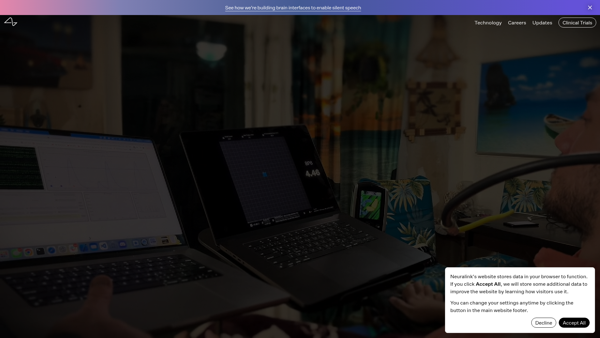
Neuralink Brain Technology Landing Page
A high-tech medical landing page featuring an immersive video hero section, typewriter animation effects, and a custom swiper carousel with integrated video testimonials.
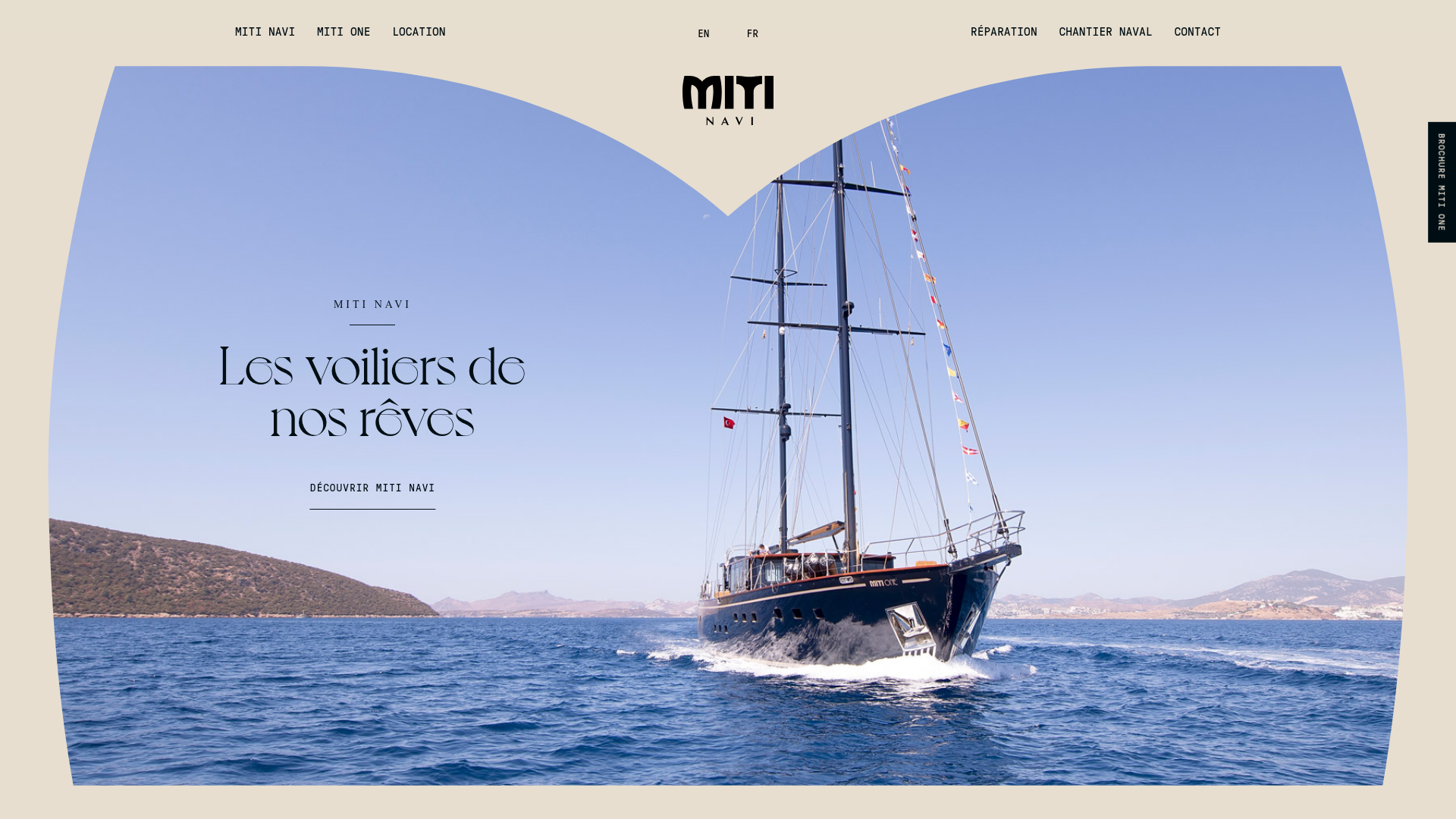
Miti Navi Luxury Nautical Portfolio
A high-end landing page featuring a curved hero mask, smooth parallax scroll effects, card-based service layouts, and sophisticated serif typography for a premium brand feel.
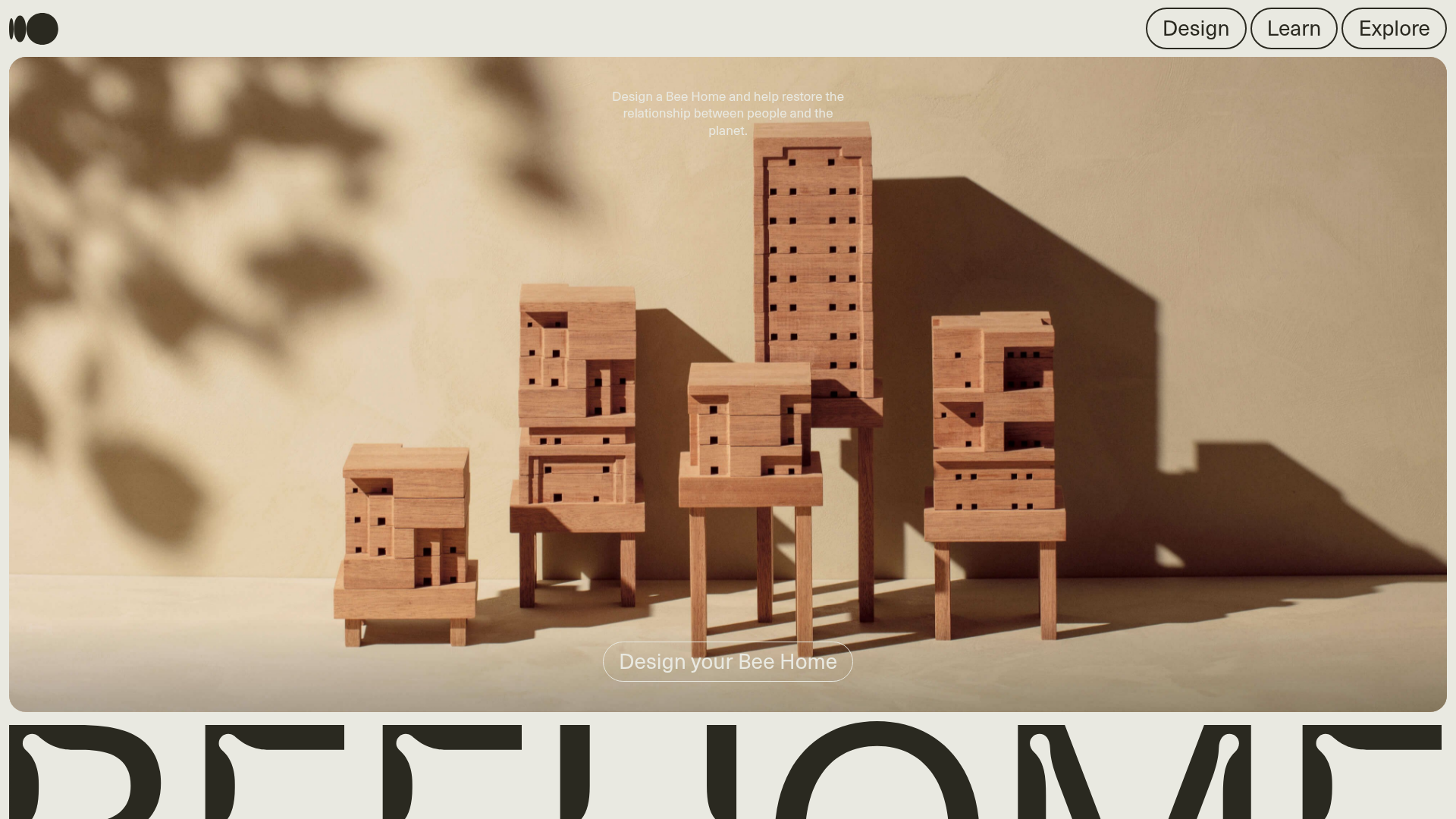
Bee Home Modular Design Landing Page
A minimalist landing page featuring an animated hero section, custom typography, and a modular component architecture built with Gatsby and Emotion CSS.
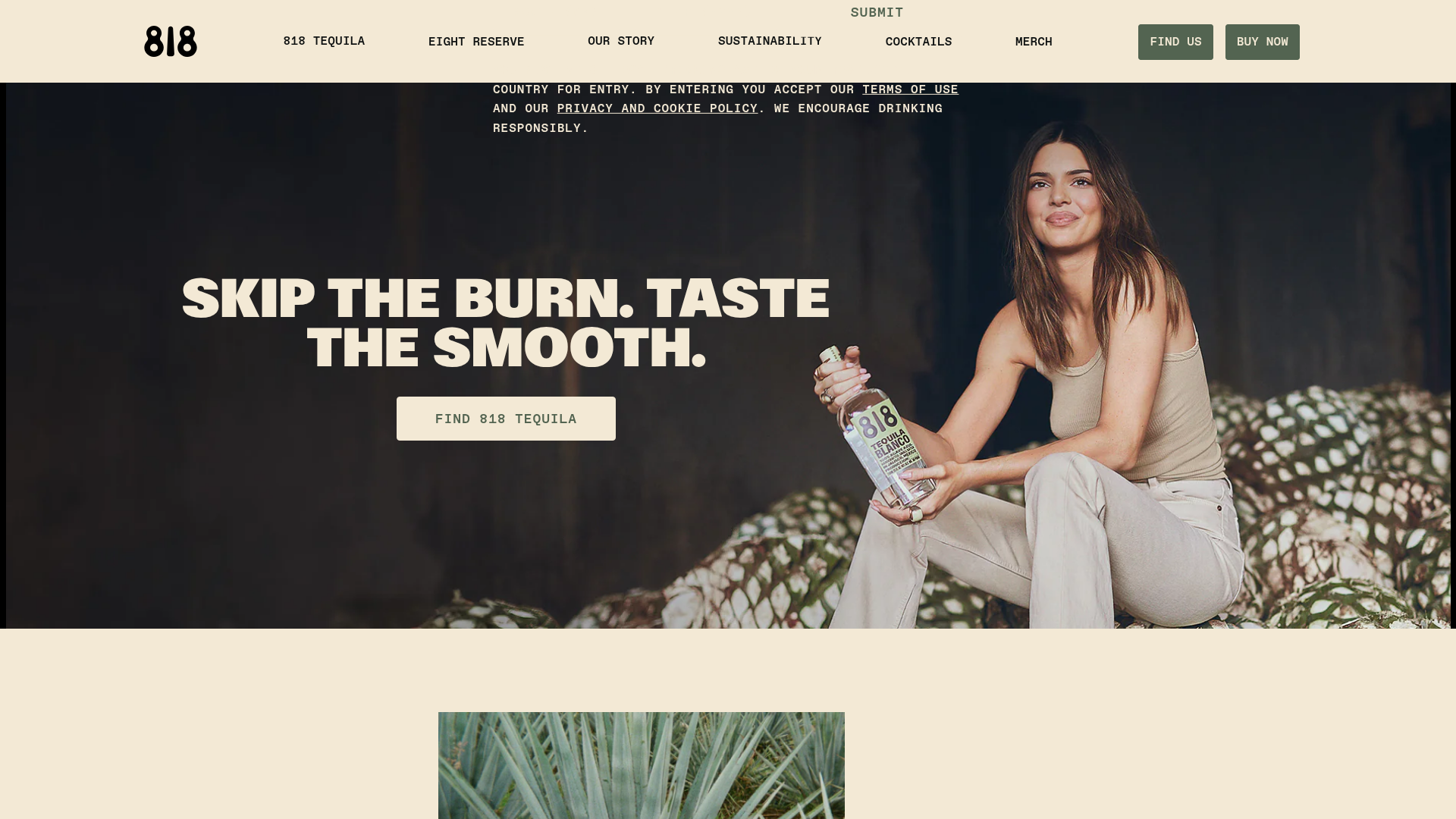
818 Tequila Beverage E-commerce Landing
A high-end brand landing page featuring video overlays, scroll-responsive text reveals, product carousels, and interactive flip-card cocktail recipe components.
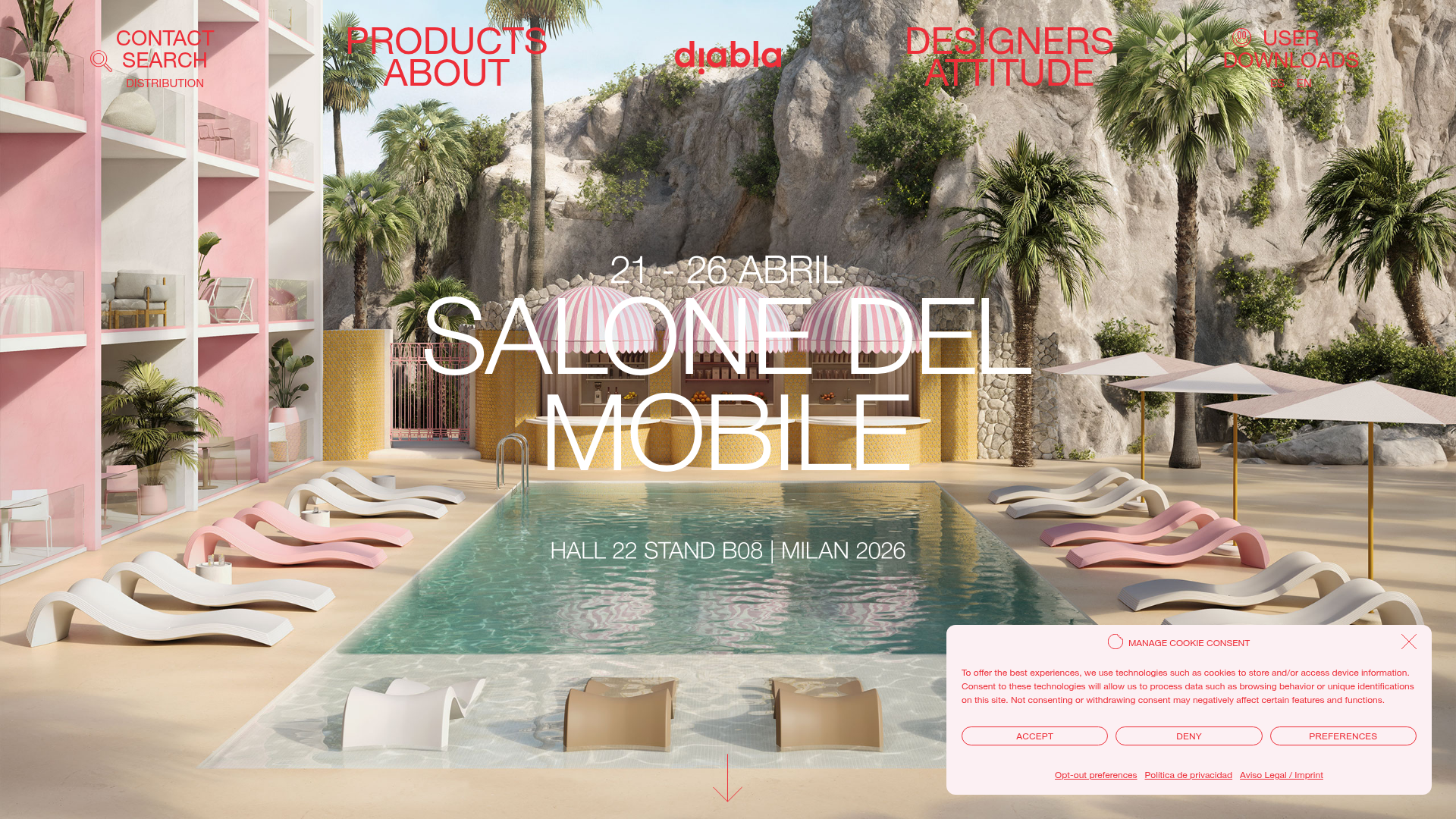
Diabla Outdoor Portfolio Showcase
A high-impact furniture showcase featuring an immersive full-screen hero slider, bold typography overlays, horizontal scroll sliders, and a minimalist luxury aesthetic for product galleries.
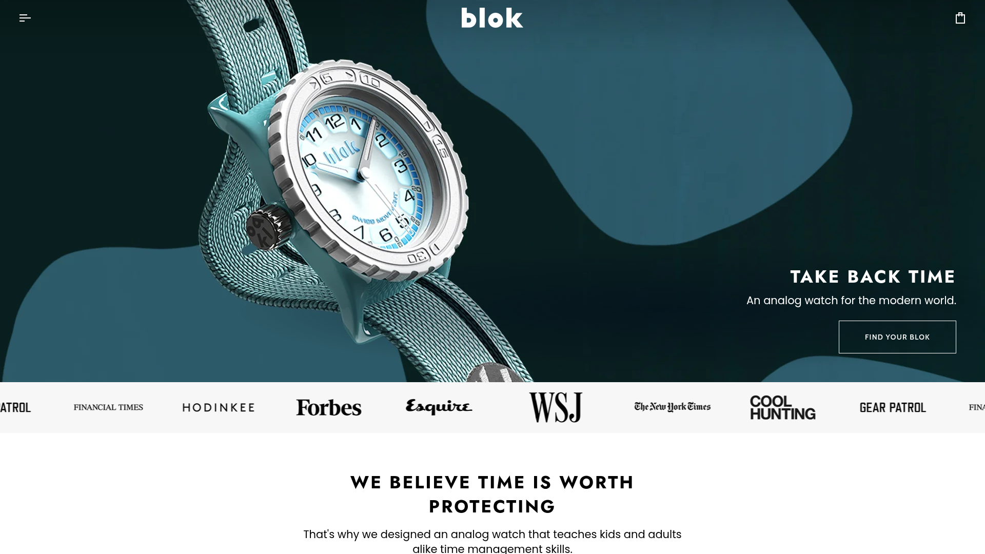
Blok Watches E-commerce Hero Landing
A clean Shopify-based storefront featuring a full-bleed parallax hero, a moving logo marquee for social proof, and tabbed product carousels with hover-to-add functionality.
