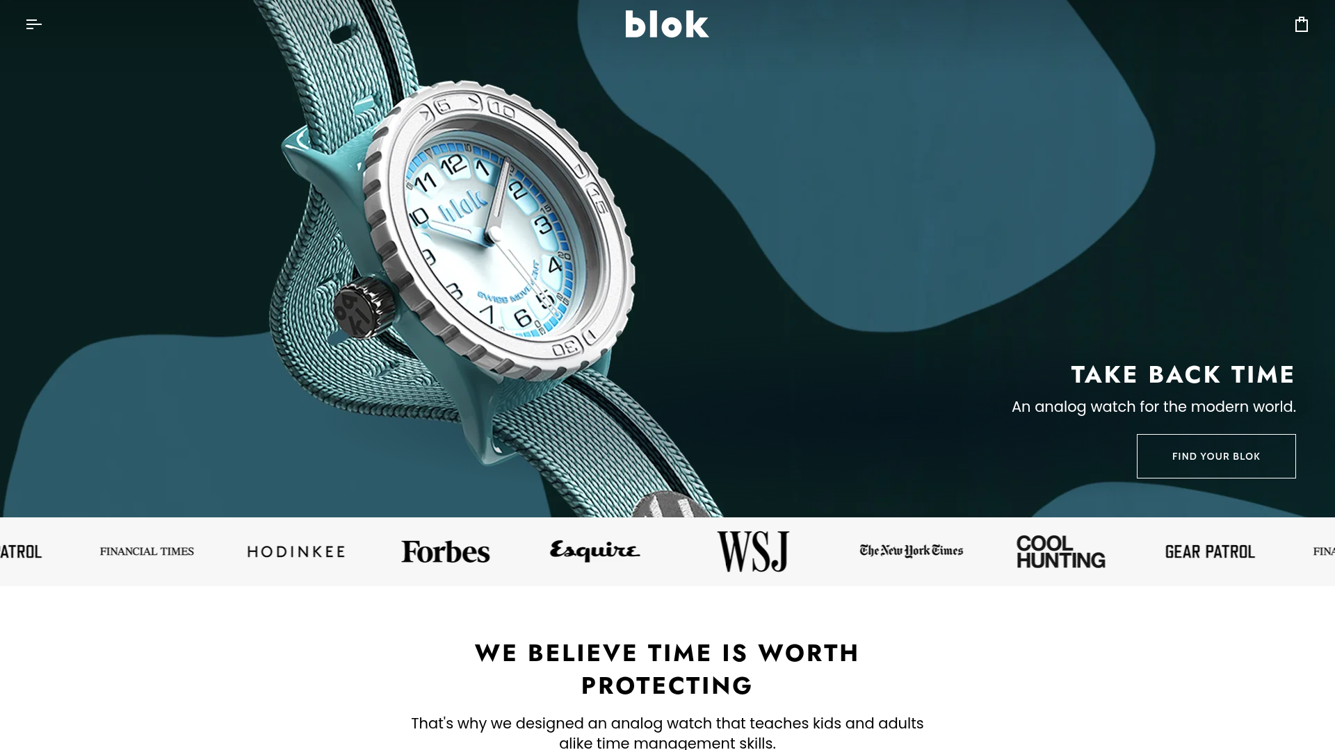
Blok Watches E-commerce Hero Landing
A clean Shopify-based storefront featuring a full-bleed parallax hero, a moving logo marquee for social proof, and tabbed product carousels with hover-to-add functionality.
Overview
Blok Watches is a premium e-commerce landing page built on Shopify that expertly balances high-end lifestyle photography with clear product utility. It serves as a strong reference for brand-first storefronts that need to convey authority through media mentions while maintaining a high-conversion product grid.
Design System
- Color Palette & Visual Hierarchy: The design uses a deep charcoal and slate navy base (
#04101d) for the hero section to create high contrast with product imagery. The rest of the page transitions into a clean, off-white (bg--neutral) and light-grey palette, using subtle teal accents to match the signature product color. - Typography: A bold, geometric sans-serif (resembling Gotham or Montserrat) is used for headings and brand messaging. It features wide tracking (letter-spacing) on CTA buttons like "FIND YOUR BLOK" and all-caps styling for secondary headings like "TAKE BACK TIME" to establish a modern, technical feel.
- Page Structure: The flow follows a classic trust-building sequence: 1) Full-bleed parallax hero, 2) Continuous marquee of high-authority media logos (Forbes, WSJ, NYT), 3) A values-based mission statement, and 4) A tabbed collection carousel for quick product discovery.
- Reusable Components: Notable components include the drawer-style navigation and cart system (visible in HTML as
drawer--right), the infinite scrolling logo bar (logo-bar--marquee), and the tabbed product navigator that allows users to switch categories (BK33, BK38, Bundles) without a page reload. - Interactions & Motion: The hero utilizes a parallax scaling effect (
transform: translate3d) on the background image. Product cards feature "hover-to-add" logic where a primary action button slide-ins on hover, and images swap to a secondary view (data-slideshow-style="second_immediately"). - Responsive Behavior: On mobile, the multi-column product grid collapses into a 1.2-item horizontal flickity slider (
--grid-small-items: 1.2), ensuring users see a partial second card to signal scrollability.
Use Cases
- Who should clone this: Direct-to-consumer (DTC) brands selling niche technical hardware, watches, or accessories where "social proof" from press is critical to justifying a premium price point.
- Effective Remixes: The tabbed carousel is perfect for brands with deep catalogs but distinct categories (e.g., an apparel brand with Men's, Women's, and Kids' lines). The logo marquee can be repurposed for client logos in a B2B SaaS context.
- Remix Directions: Builders can swap the full-bleed static image for a background video loop for a more immersive feel or replace the tabbed collection with a single high-impact "Product of the Month" feature.
- Clone Scope: A full-page clone is ideal for a seasonal launch landing page. For existing sites, the logo marquee and the responsive tabbed carousel (
flickity-grid) are the most modular and high-value sections to port over.
Related Inspirations
Neuralink Brain Technology Landing Page
A high-tech medical landing page featuring an immersive video hero section, typewriter animation effects, and a custom swiper carousel with integrated video testimonials.
Seed Health Landing Page
An elegant wellness landing page featuring a full-viewport parallax hero, vertical swiper transitions, an interactive product carousel, and a custom video gallery for customer stories.
Cowboy E-bikes Landing Page
A minimalist e-commerce showcase featuring a full-screen hero image, integrated notification banners, navigation for test rides, and a technical feature footer.
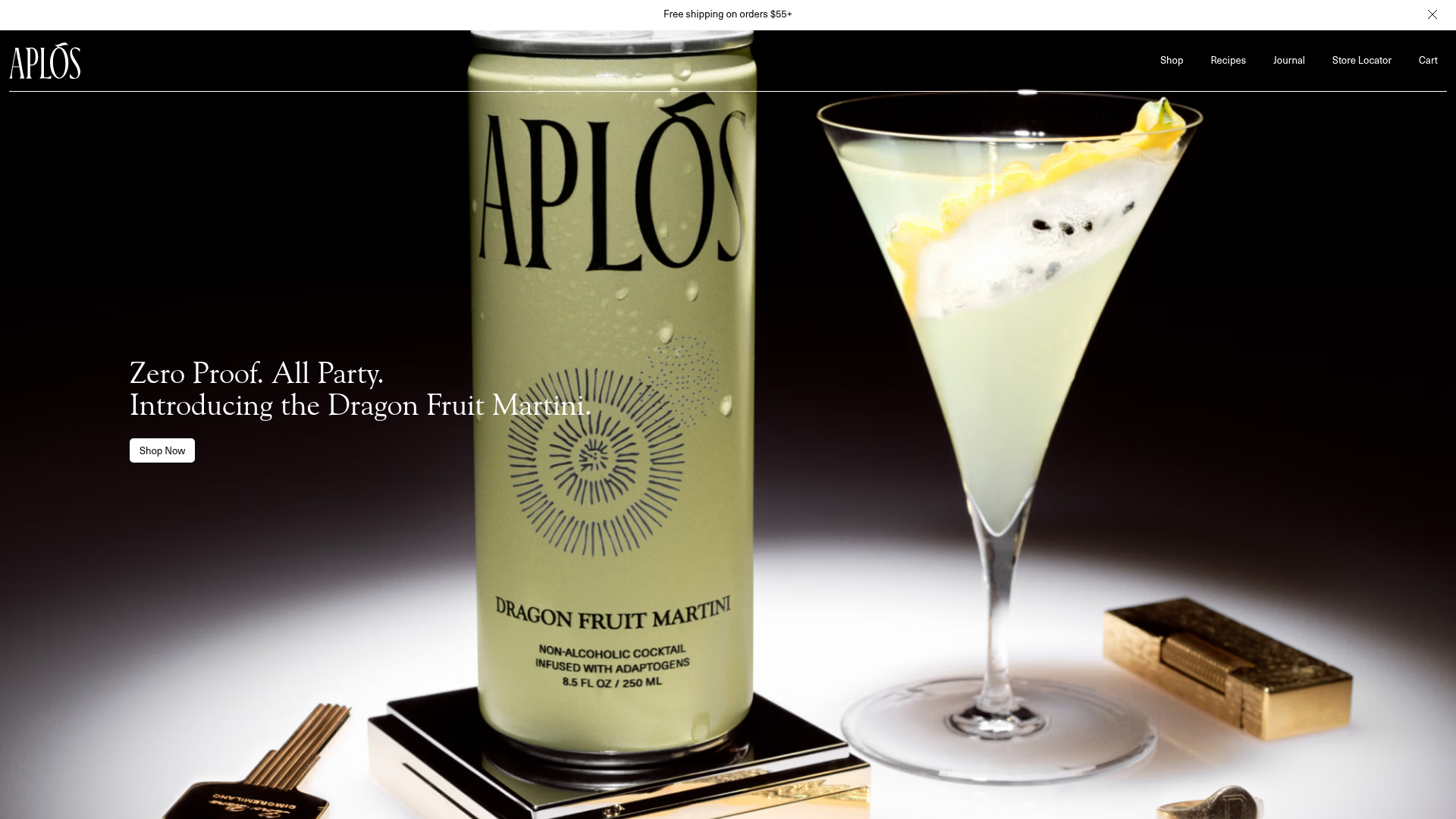
Aplós E-commerce Product Landing Page
A high-fidelity landing page featuring multiple full-height sticky hero sections, horizontal scroll sliders for reviews and lifestyle stories, and transparent product cards.
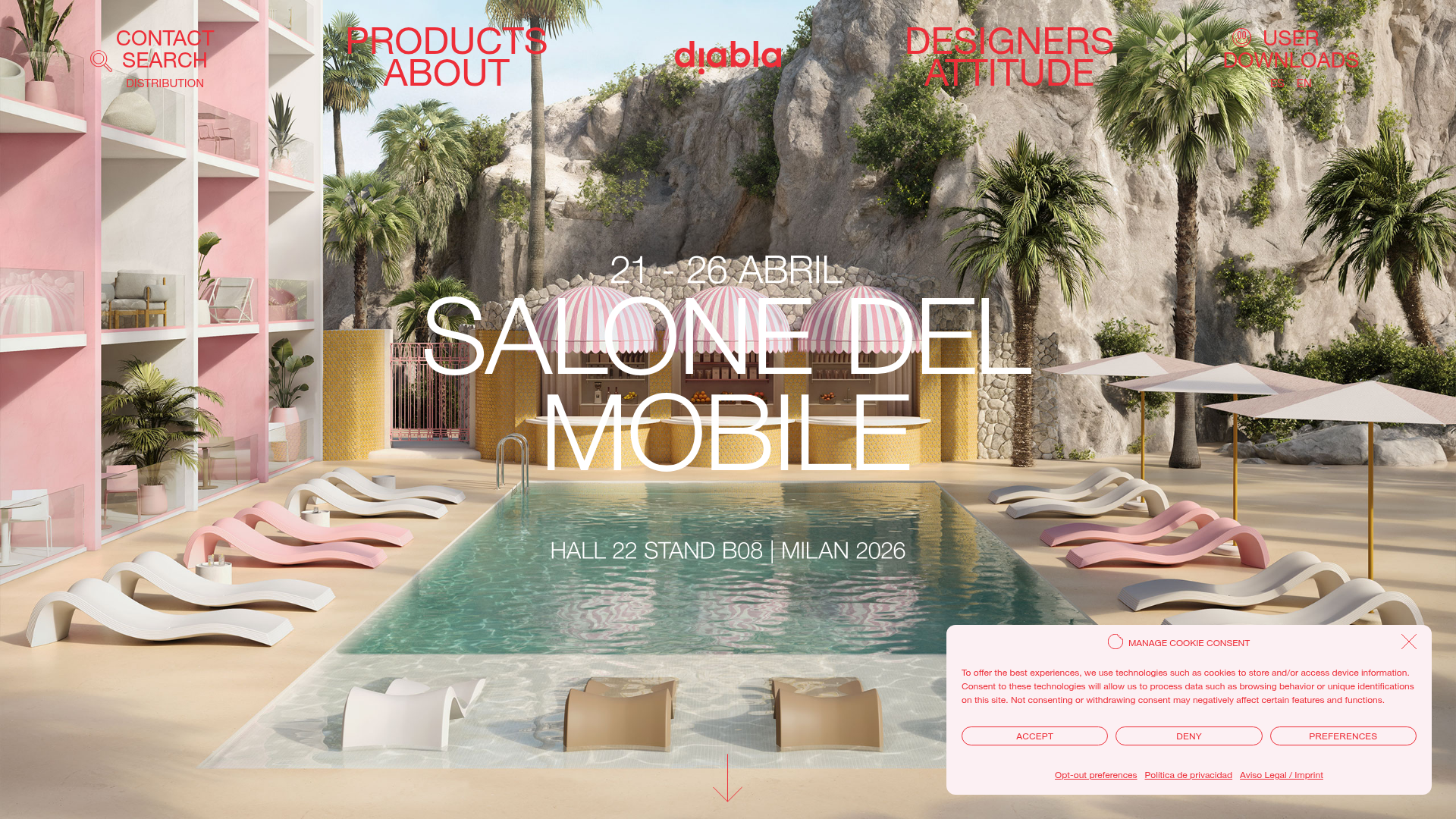
Diabla Outdoor Portfolio Showcase
A high-impact furniture showcase featuring an immersive full-screen hero slider, bold typography overlays, horizontal scroll sliders, and a minimalist luxury aesthetic for product galleries.
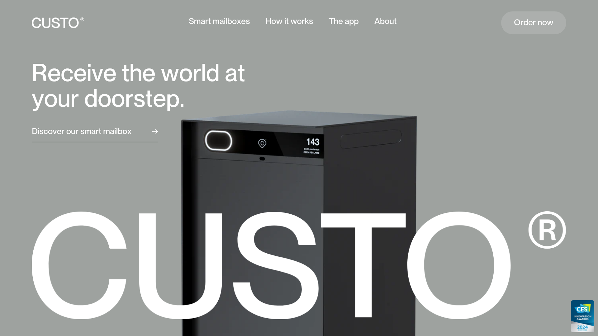
Custo Smart Mailbox Landing Page
A minimalist hardware product landing page featuring a parallax hero section, sticky step-by-step app feature descriptions, and a sophisticated grayscale aesthetic with integrated product sliders.
