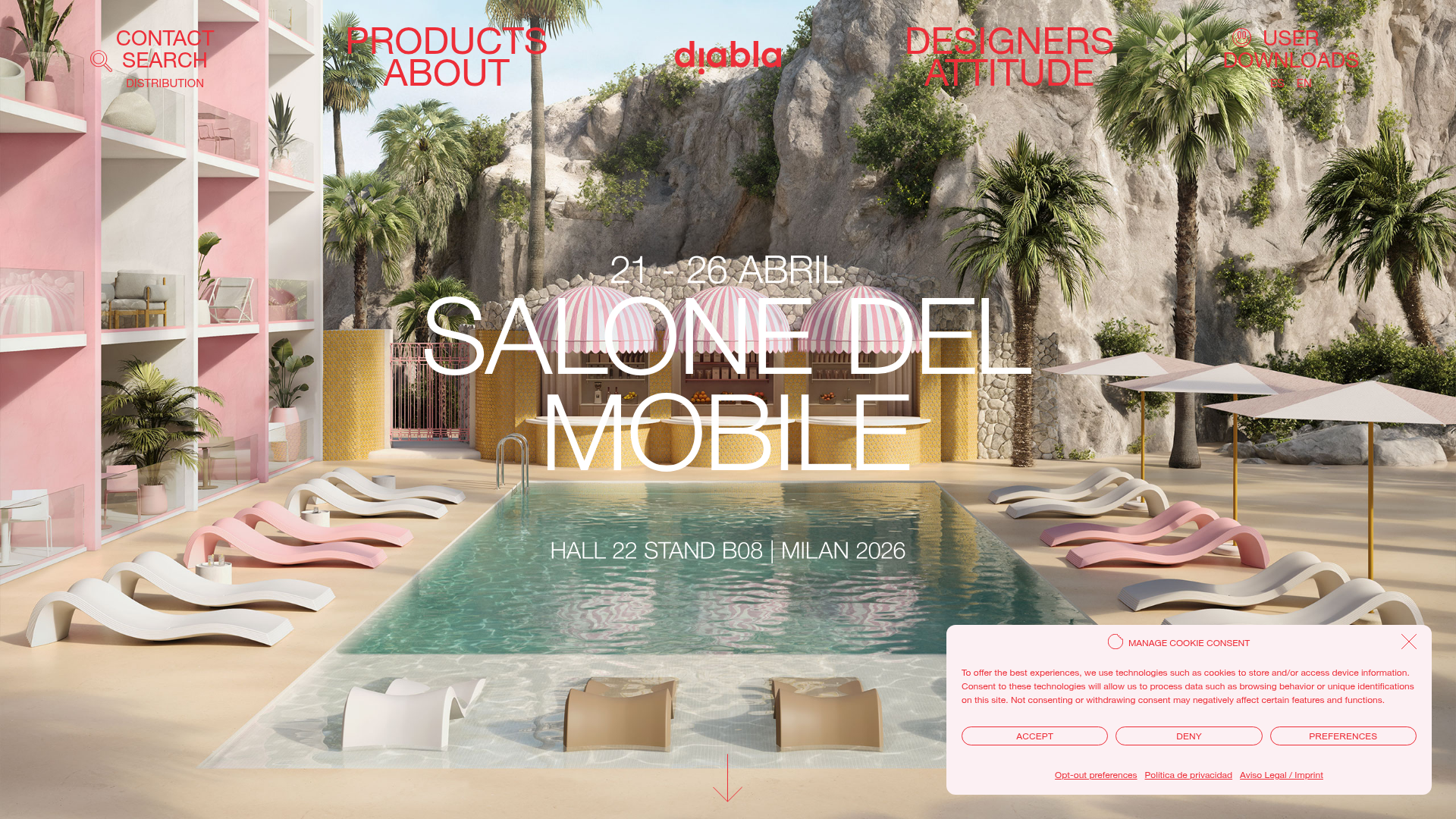
Diabla Outdoor Portfolio Showcase
A high-impact furniture showcase featuring an immersive full-screen hero slider, bold typography overlays, horizontal scroll sliders, and a minimalist luxury aesthetic for product galleries.
Overview
This website is a premium portfolio for Diabla Outdoor, utilizing high-resolution lifestyle photography combined with bold, oversized typography. It serves as an excellent clone reference for luxury brands that want to blend editorial-style imagery with a high-fashion digital interface using immersive full-screen transitions.
Design System
- Color Palette & Visual Hierarchy: The palette is dictated by the photography, often featuring high-saturation summer tones (terracotta, turquoise, and bubblegum pink). Elements like navigation and headlines use high-contrast monochromatic overlays (red or white) to maintain legibility against complex backgrounds.
- Typography System: Utilizes a combination of clean sans-serifs. Large display titles (e.g., "SALONE DEL MOBILE") use wide letter-spacing and an ultra-light weight. Navigation and utility links use all-caps, medium-weight sans-serifs for a functional, architectural feel.
- Page Structure: The site flows from a full-height
heroSlider(powered by Swiper) into specializedfeaturedBlocksfeaturing horizontal row scrolling for product categories. Section flow is strictly organized into collections, typologies, and editorial blog posts. - Reusable Components:
- Hero Slider: A
swiper-fadeimplementation that supports custom SVG overlays on top of responsive<picture>elements. - Product Cards: Minimalist vertical containers with a heavy emphasis on aspect ratio (mostly 4:5 or 1:1) and subtle text labels underneath.
- Cookie Consent Modal: A stylized bottom-right floating card with rounded corners and distinct secondary-button styling for 'Accept' and 'Deny'.
- Hero Slider: A
- Interactions & Motion: The UI uses
slowTransitionclasses for page changes. The hero section features a custom cursor (#specialCursor) that changes based on mouse position (previous/next indicators) and a floating vertical arrow suggesting downward scroll. - Implementation Clues: The HTML confirms the use of Swiper.js for almost all layout movement (horizontal carousels) and a mobile-specific orientation warning overlay to enforce a specific viewing experience.
Use Cases
- Who should clone this: Designers for high-end furniture, boutique hotels, or fashion editorial brands that rely on visual storytelling rather than heavy text blocks.
- Remixing effectively: Swap the high-key outdoor photography for dark, moody architectural shots to adapt the site for a lighting or luxury hardware brand. The red-on-image navigation is a bold choice that can be neutralized to white or black for a more classic minimalist look.
- Suggested Scope: A full-page clone is ideal for those needing a comprehensive brand experience. For a quicker implementation, focus on cloning the horizontal Swiper-based product category carousels which provide a tactile, mobile-friendly feel to a desktop site.
Related Inspirations
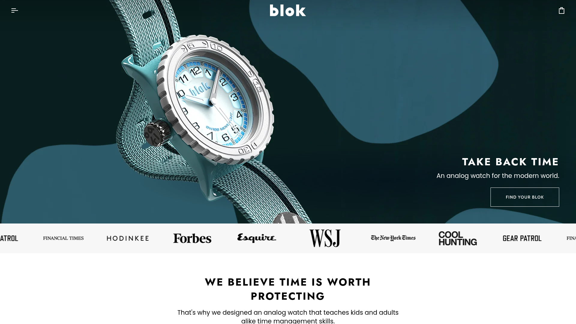
Blok Watches E-commerce Hero Landing
A clean Shopify-based storefront featuring a full-bleed parallax hero, a moving logo marquee for social proof, and tabbed product carousels with hover-to-add functionality.
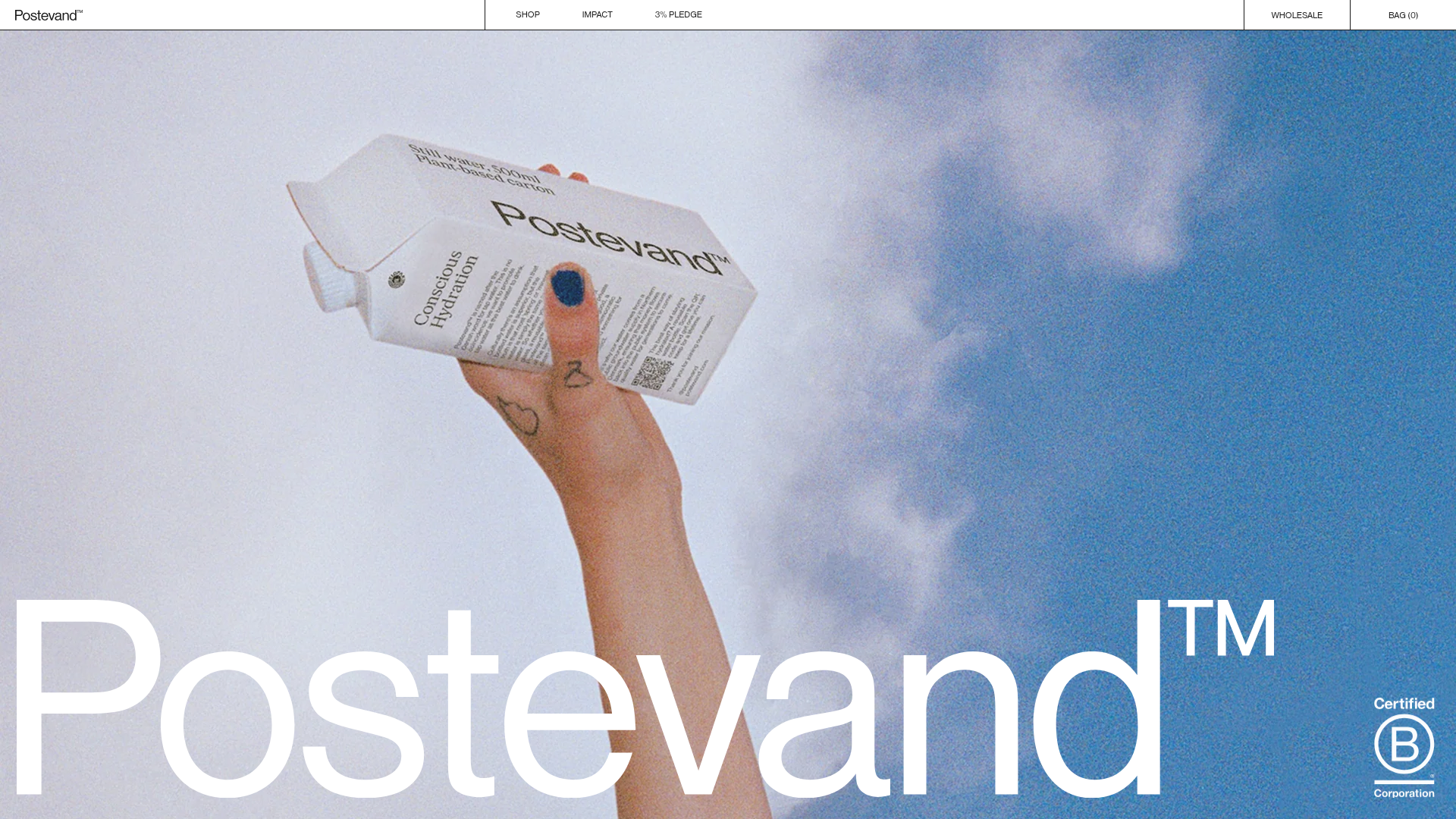
Postevand Sustainable E-commerce Landing Page
A scroll-driven Shopify landing page featuring full-width media sections, interactive product cross-sections, a minimalist grid layout, and horizontal scrolling image galleries.
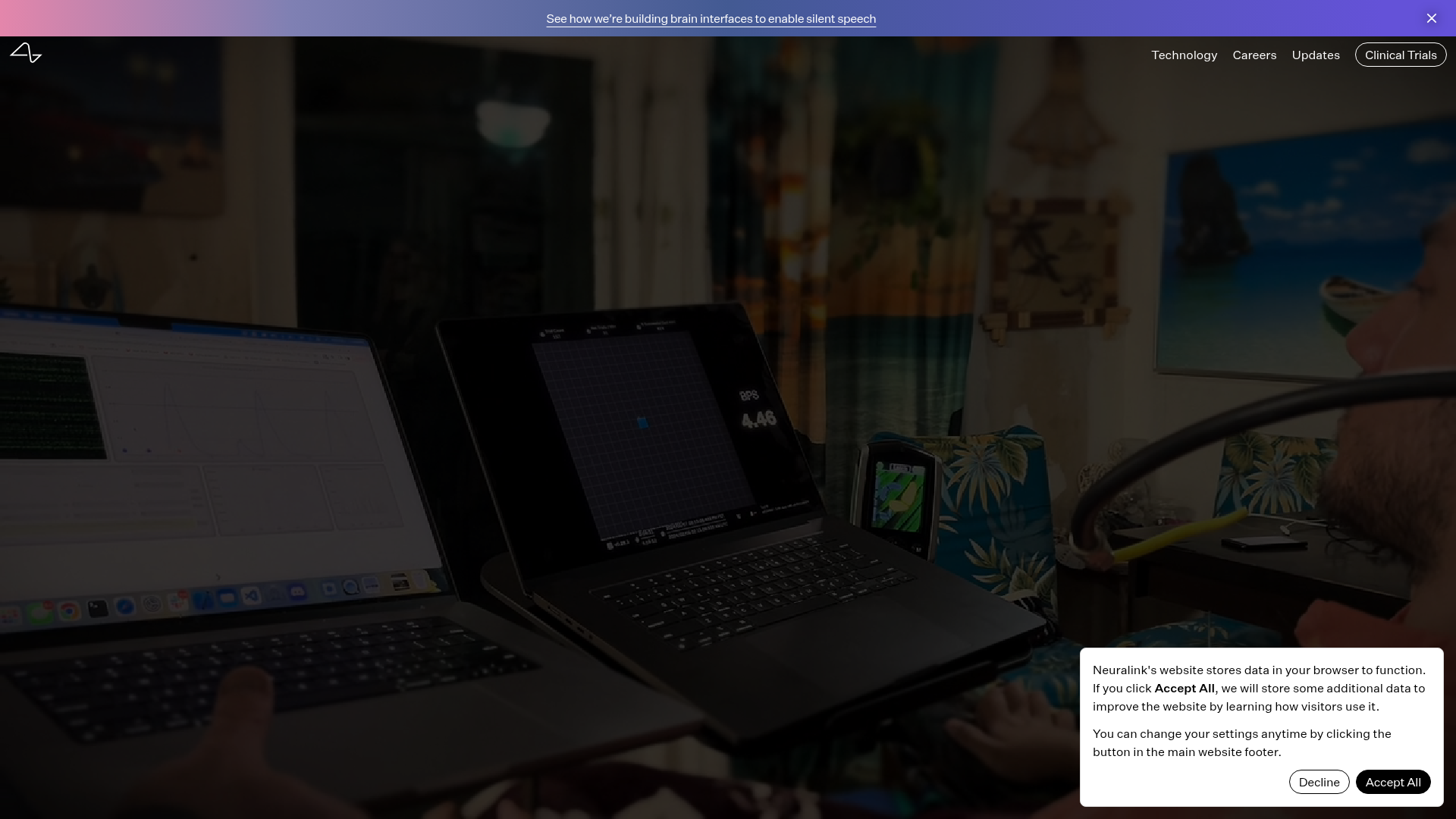
Neuralink Brain Technology Landing Page
A high-tech medical landing page featuring an immersive video hero section, typewriter animation effects, and a custom swiper carousel with integrated video testimonials.
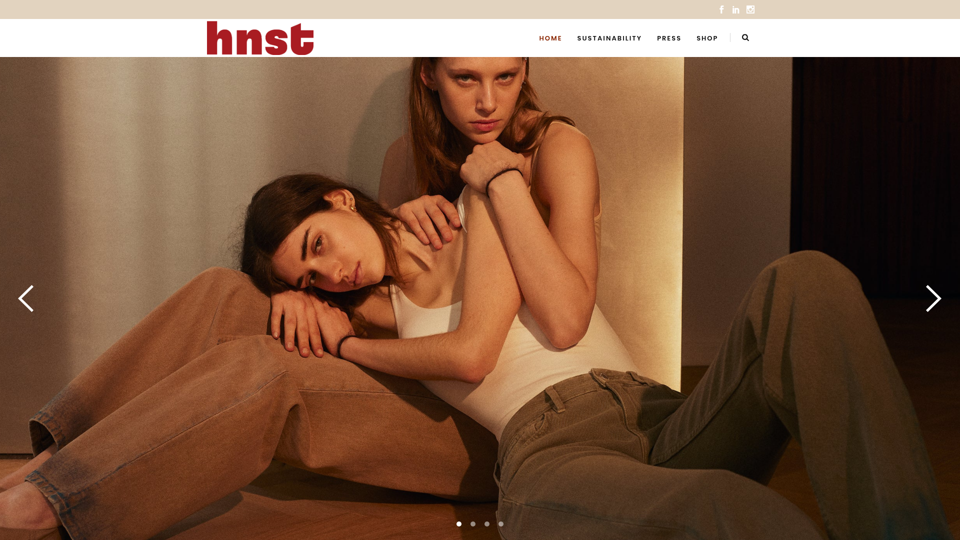
HNST Circular Fashion eCommerce Gallery
A minimalist apparel site featuring a full-screen image slider with parallax effects, grid-based product sections, and a clean typography-focused header for sustainable brand storytelling.
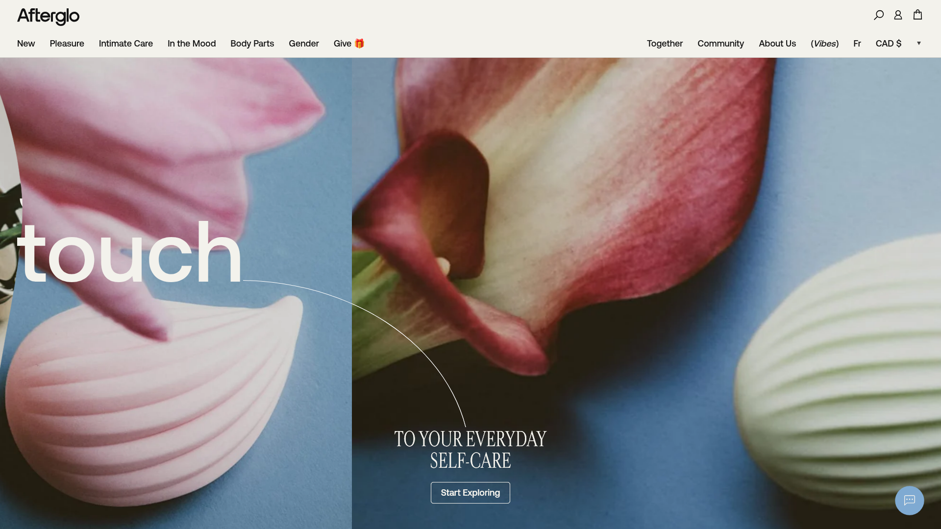
Afterglo Sensual Self-Care Storefront
An elegant e-commerce landing page featuring a split-screen horizontal scrolling hero, kinetic typography with 'vibrating' text animations, and a customized product carousel.
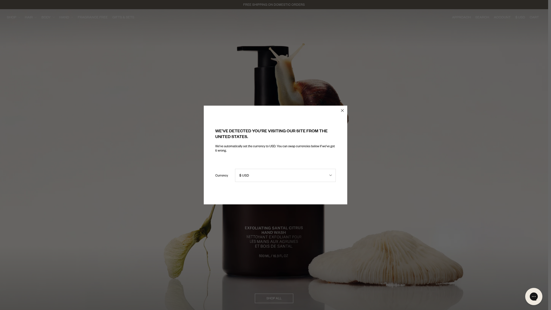
Nature of Things E-Commerce Landing
A high-end skincare storefront featuring a full-viewport hero section, scroll-triggered GSAP text animations, a slide-out mini-cart with product carousels, and minimalist category grids.
