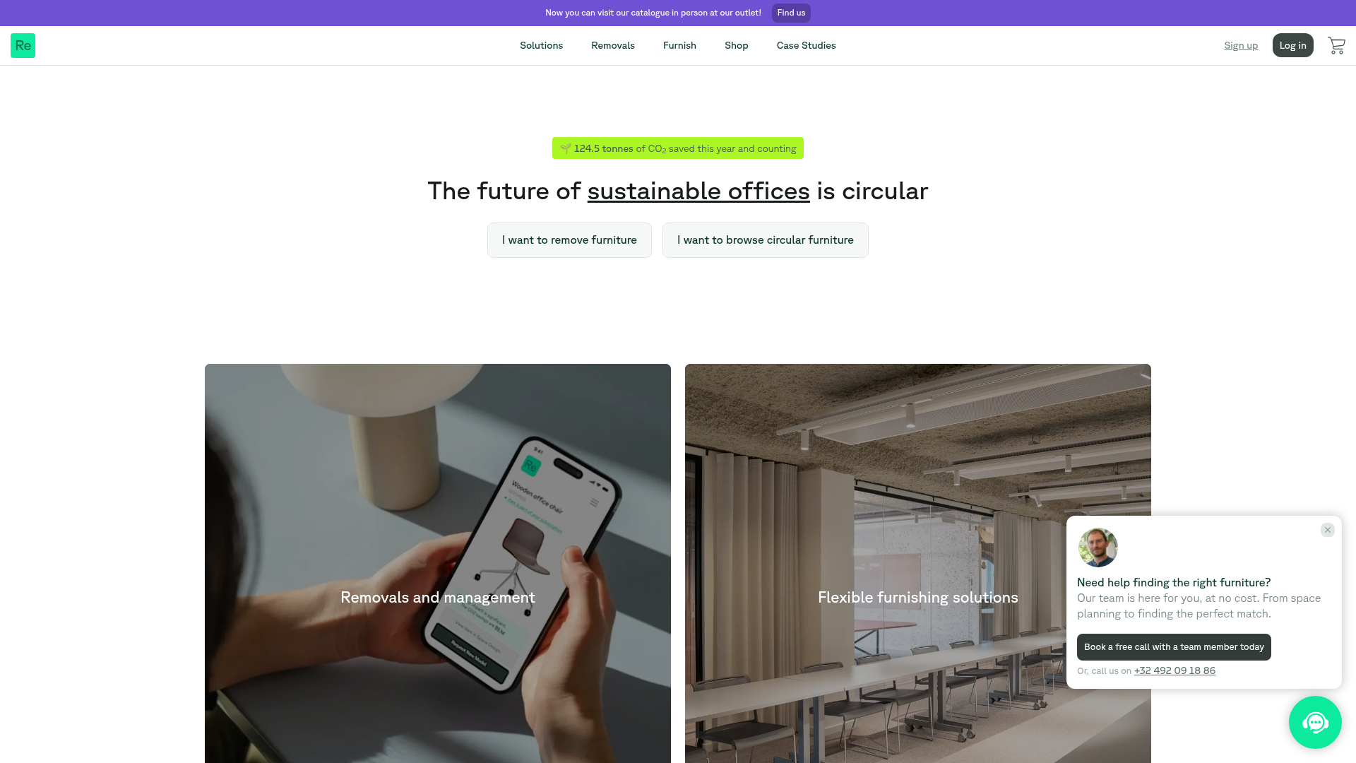
Relieve Furniture Sustainable Marketplace Landing Page
A clean sustainability-focused landing page featuring a hero with environmental impact stats, two-column visual category grid, horizontal logo slider, and a testimonial carousel.
Overview
Relieve Furniture is a clean, sustainability-driven marketplace for circular office furniture. This landing page is an excellent reference for builders because it successfully balances high-level mission statements with functional utility, using a structured minimalist aesthetic to build trust in a green-tech niche.
Design System
- Color Palette & Visual Hierarchy: The design uses a base of high-contrast white and black-800, accented by a distinctive "sustainability green" (
#22c55e) for CTAs and impact stats. A secondary purple-600 is used for text links and category headers. Visual hierarchy is established via oversized typography and ample white space, ensuring environmental statistics are as prominent as the product listings. - Typography: The system relies on a clean, sans-serif font (likely a modern geometric like Inter or similar) with a scale ranging from 1.0rem for metadata to 3.6rem for hero headings. Heavy use of underlined text and thin font weights (200-400) maintains a lightweight, modern feel.
- Page Structure & Flow: The layout follows a logical trust-building sequence: high-impact hero (with immediate CO2 savings data) -> primary action blocks -> logo carousel -> historical project gallery (Case Studies) -> product catalog snippets -> detailed impact statistics with data grid -> testimonials -> auxiliary service blocks.
- Reusable Components:
- Impact Badge: A rounded span with emoji and dynamic data (
bg-highlight-400). - Image Overlay Cards: Full-width and half-width grid items with black overlays and centered white text, featuring a hover-to-underline state.
- Product Cards: Vertical layout with a 120% aspect-ratio container and a green "CO2 saved" metadata tag.
- Floating Help Widget: A persistent
fixedbottom-right card with team member imagery and a quick-action call button.
- Impact Badge: A rounded span with emoji and dynamic data (
- Interactions: Hover states primarily involve brightness adjustments (
hover:brightness-95) and text decoration (underlining). The logo carousel and testimonial sections use horizontal slide transitions (translate3d). - Implementation Clues: The site is built with Next.js and Tailwind CSS, evidenced by class names like
flex-col,gap-y-4, andz-[100]. It uses a component-based architecture for its carousels (likely Radix UI or shadcn/ui primitives given the ARIA roles).
Use Cases
- Who should clone this: B2B SaaS platforms or environmental service providers who need to showcase both ethical impact and a physical product catalog.
- Effective Remixes:
- Real Estate: Swap furniture for properties, keeping the grid for neighborhoods and the impact stats for energy ratings.
- Donation Platforms: Repurpose the "CO2 saved" badges into "meals provided" or "dollars raised" for non-profits.
- Remix Directions: Builders can extract the "Impact Grid" (the 2x3 statistical list) to add quantitative social proof to any landing page, or reuse the two-column hero layout to manage dual-intent users (e.g., "I want to buy" vs "I want to sell").
- Clone Scope: A full-page clone is ideal for startups needing a comprehensive, professional presence, while the floating help widget and the logo carousel with gradient fades are excellent snippets for a quick UI kit expansion.
Related Inspirations

Isla Beauty Skincare E-commerce Store
A clean Shopify-based storefront featuring a split-hero landing page, a step-by-step product system carousel, and a split-screen testimonial section with localized product image sidebars.
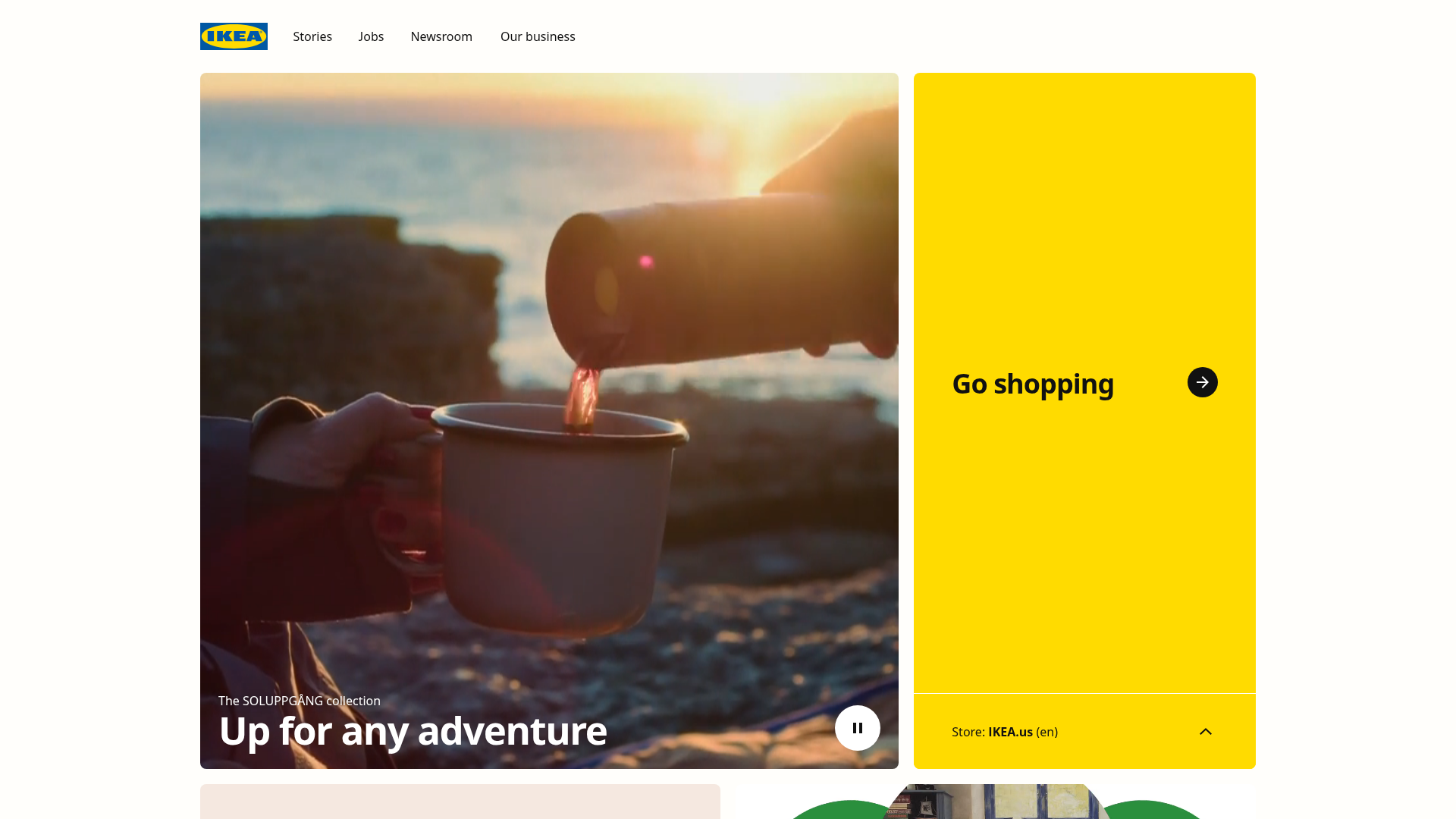
IKEA Corporate Landing Page Layout
A clean corporate portal featuring a large hero hero section with video playback, a split-screen call-to-action block, and a minimalist navigation bar.

Finn Pet Supplements Landing Page
An e-commerce landing page featuring high-contrast typography, a sticky brand logo banner, parallax scroll effects on product headers, and a clean product grid.

Vibrants Wellbeing E-commerce Landing Page
A clean Shopify-style landing page featuring a full-width hero with overlaid product cards, a horizontal product slider, and interactive cart drawer with utility progress bars.
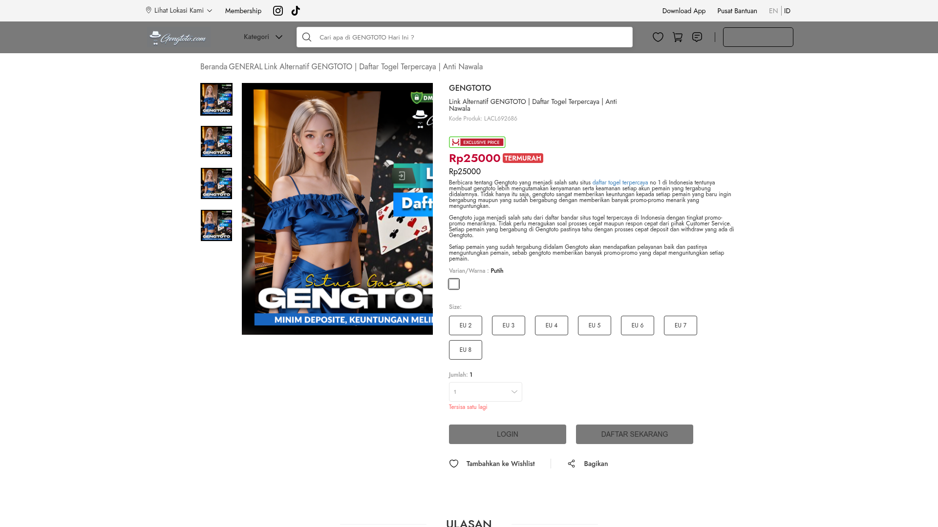
GENGTOTO Product Detail E-commerce Layout
A comprehensive product page featuring a vertical image gallery, detailed item specifications, color/size selection modules, and integrated user review and FAQ components.
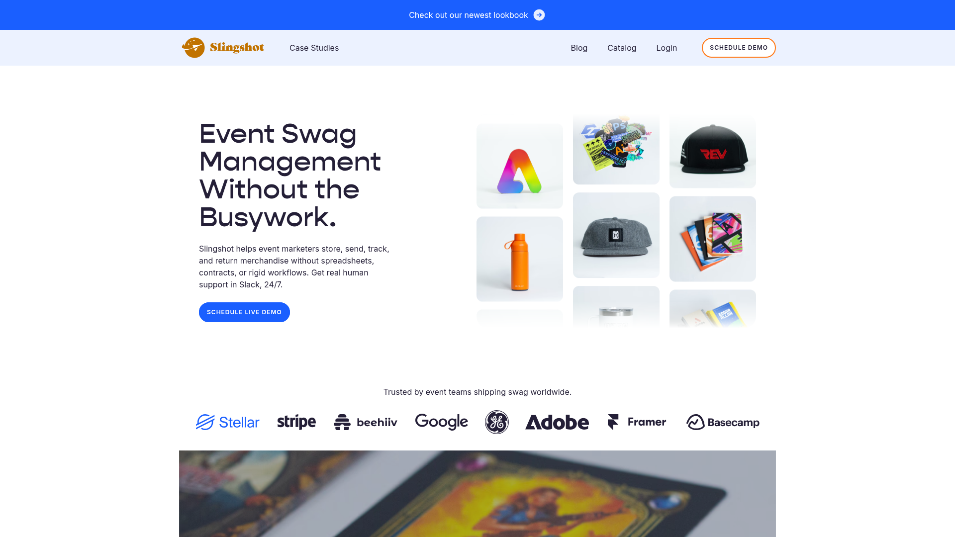
Slingshot Event Swag Hero and Logos
A clean SaaS landing page featuring a split hero layout with promotional product imagery, a call-to-action button, and a monochrome brand logo trust bar.
