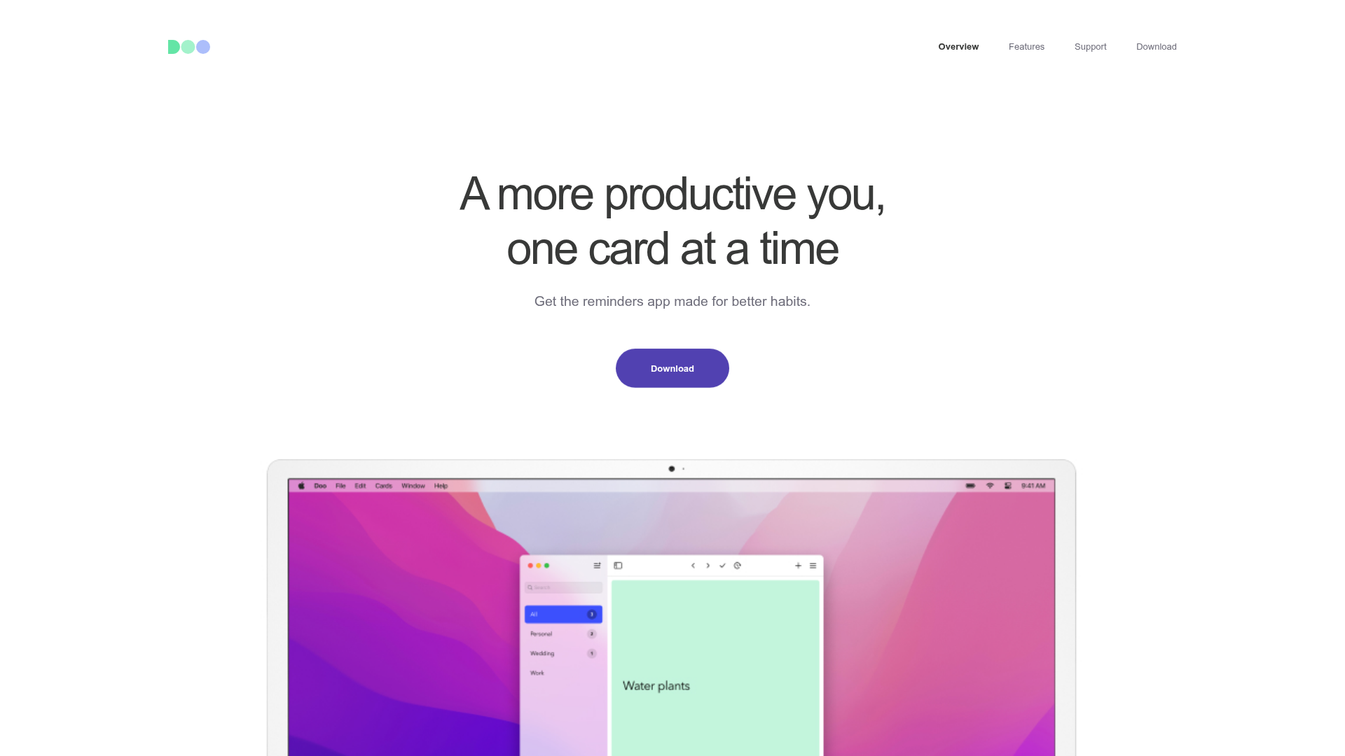
Doo App Minimalist Product Landing Page
A clean, centered product showcase featuring a parallax hero image, icon-based feature checklists, horizontal gesture illustrations, and stacked section layouts with ample whitespace.
Overview
Doo App’s landing page is a masterclass in minimalist product marketing, using a clean, centered aesthetic to highlight its task-management interface. It is a strong clone reference for developers who need to showcase a single software product through high-quality device mockups, parallax effects, and a highly structured, readable layout.
Design System
- Color Palette & Visual Hierarchy: The site uses a high-contrast white background with deep slate/black text (
#222) for maximum readability. Brand accents include a soft purple (#5856d6) for the primary call-to-action buttons and subtle pastel backgrounds for card illustrations (mint green, soft blue, and gray). - Typography System: A neo-grotesque sans-serif font family is used with a clear hierarchy. The Hero
h1uses a large scale with tight tracking for impact; secondary headings (h2) use smaller font sizes but maintain weight, while "eyebrows" (all-caps labels above headers) provide context without clutter. - Page Structure & Section Flow: The page follows a linear, stacked progression: a centered Hero with an App Store CTA, followed by a wide-format device mockup (Mac/iPad), a social proof section with press logos, into feature-specific blocks (Gestures, Speed, Privacy) that alternate between text-heavy and image-heavy layouts.
- Reusable Components:
- Pill Buttons: Large, rounded primary and secondary buttons with subtle hover states.
- Device Frames: Reusable CSS/image containers for iPhone and Mac screen mockups.
- Iconic Checklists: Simple SVG icon and description pairs for feature summaries.
- Press Quotes: A horizontally distributed list for media testimonials.
- Interaction & Motion: The site uses scroll-triggered parallax on device images and "lazy-load" animations where elements fade into view (
invisibleclass in HTML). Images are tagged withdata-attr-delay-percentto create staggered entrance effects. - Implementation Clues: The HTML uses a
content-wrapperwithinset-1-colandinset-2-colutility classes to manage consistent padding and centering across the page. It relies on adisplay-flexutility for grid-like alignment without a heavy CSS framework.
Use Cases
- Who should clone this: Independent app developers, SaaS startups with a single flagship tool, or designers looking for a clean portfolio structure that emphasizes visual assets over long-form copy.
- Effective Remixes: This layout works perfectly for utility apps, productivity tools, or hardware products. A developer could swap the device mockups for a physical product and change the soft purple accent to a brand-specific primary color.
- Remix Directions:
- Quick Section Clone: The "Private by Design" or "Small Features" blocks are highly portable for any about/features page.
- Full-Page Clone: Ideal for a new mobile app launch where the focus is on transferring the user to the App Store.
- Suggested Scope: Start by cloning the centered Hero and the
major-feature borderedsection structure, as these provide the core layout pattern used throughout the page.
Related Inspirations

Finn Pet Supplements Landing Page
An e-commerce landing page featuring high-contrast typography, a sticky brand logo banner, parallax scroll effects on product headers, and a clean product grid.
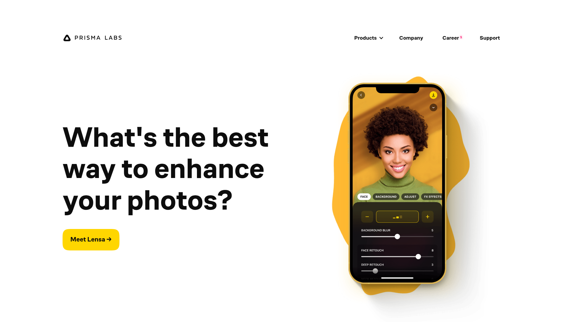
Prisma Labs App Showcase Landing
A clean SaaS landing page layout featuring large typography, magnetic hover buttons, and high-fidelity mobile app mockups with animated video blob backgrounds.
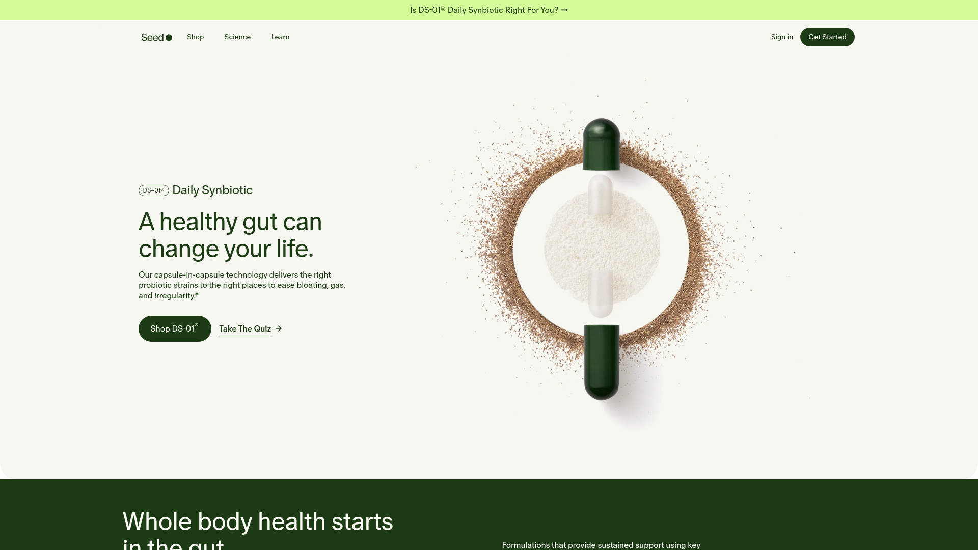
Seed Health Landing Page
An elegant wellness landing page featuring a full-viewport parallax hero, vertical swiper transitions, an interactive product carousel, and a custom video gallery for customer stories.
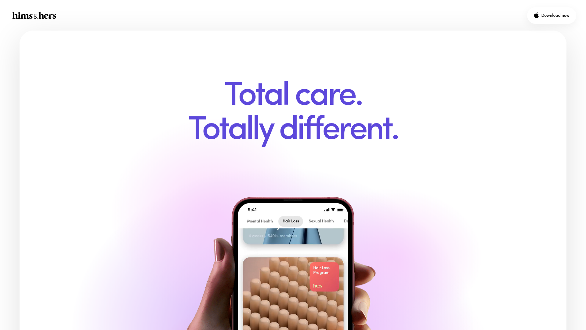
Hims & Hers App Landing Page
A clean health-tech landing page featuring high-contrast typography, sticky phone mockups with scroll-triggered animations, and sleek card-based content sections.
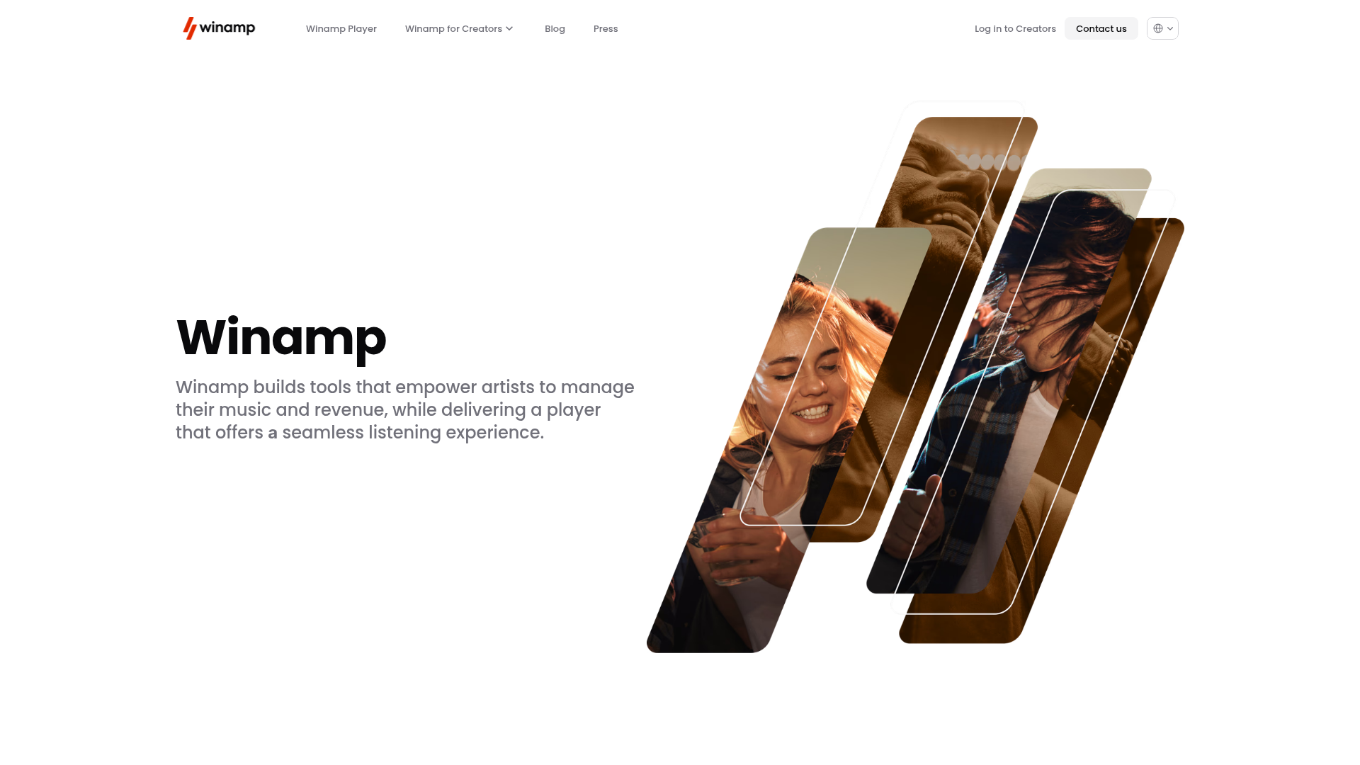
Winamp Modern Media Landing Page
A minimalist hero section featuring a split-screen layout with an offset diagonal image gallery, clean typography, and a sticky navigation menu.
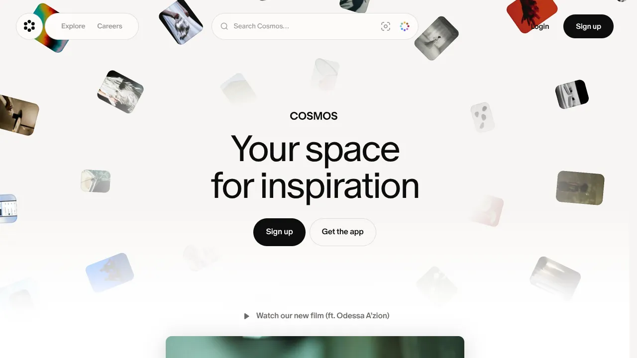
Cosmos Visual Inspiration Landing Page
Features a floating image hero with canvas animations, a centered search bar integration, and multi-column scroll reveals for showcasing visual assets.
