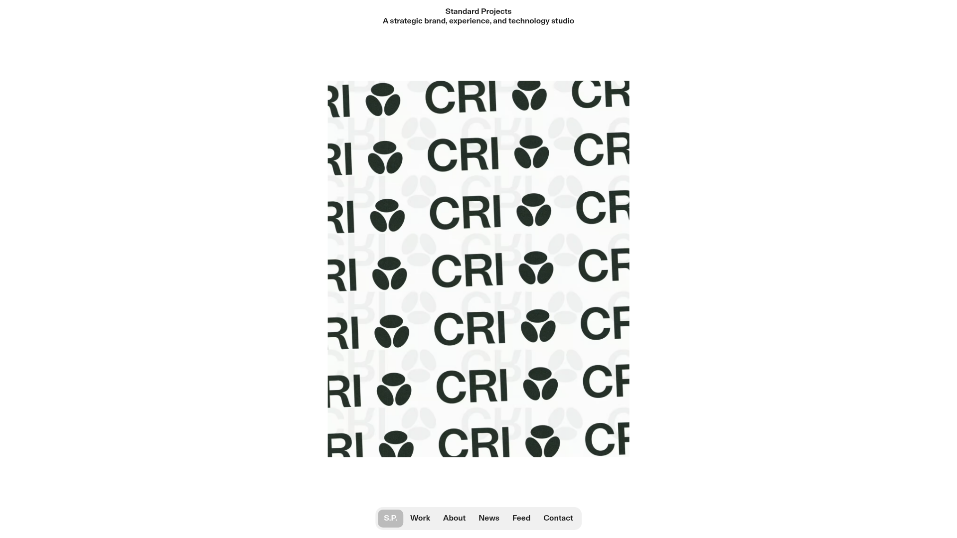
Standard Projects Portfolio with Sticky Hero
A minimalist studio layout featuring a full-height animated carousel, sticky header typography, and a dynamic masonry element grid for case studies.
Overview
This portfolio for Standard Projects features a sophisticated, minimal studio layout characterized by a full-height "hero" cover and a high-density project grid. It is an excellent clone reference for creatives seeking a high-end, editorial-style presentation that balances heavy visual media with clean, structured typography.
Design System
- Color Palette & Visual Hierarchy: The site uses a high-contrast monochromatic base (pure white
#ffffffbackground with deep black or dark green text), allowing the vibrant brand photography and video case studies to provide the primary visual interest. - Typography System: A neo-grotesque sans-serif ([likely a custom or premium execution of a type system mentioned in the code like
_Small_Headingand_Largeclasses]) is used throughout. Headers use tight leading (1.1) and center alignment in the hero, while the secondary section features a large, left-aligned statement header for impact. - Page Structure:
- Fixed Header: A minimalist title and tagline that remains static at the top.
- Hero Cover: A 100vh row containing a center-aligned image carousel (
lay-carousel-wrap) that transitions quickly (200ms autoplay). - Introduction: A secondary row featuring a large-scale manifesto-style text block with a clear "Read more" CTA.
- Dynamic Masonry Grid: A multi-column
elementgrid(5 columns on desktop) displaying a mix of static images and autoplaying HTML5 videos. - Floating Navigation: A pill-shaped fixed bottom navigation bar containing links like Work, About, and Contact.
- Reusable Components:
- Interactive Carousel: A fade-transition image slider that adapts to portrait and landscape orientations.
- Pill Navigation: A compact, fixed-bottom menu container with subtle hover states.
- The Grid: A responsive masonry layout that handles mixed aspect ratios and nested video tags flawlessly.
- Interactions: The design relies on autoplaying silent videos and refined hover states on the element grid. The transition from the 100vh hero to the scrolling content uses a "cover-region" logic common in high-end portfolio builders.
Use Cases
- Who should clone this: Design studios, independent art directors, and boutique technology agencies who want a "media-first" landing page that feels like a digital lookbook.
- Effective Remixes: Perfect for architectural portfolios or high-fashion brand sites. The structured density of the grid can be adapted for e-commerce "new arrivals" or lookbooks by swapping project captions for product names and prices.
- Practical Directions: Builders should prioritize cloning the fixed-bottom navigation and the 100vh hero structure. To remix, one could change the grid density (e.g., from 5 columns to 2) to give individual projects more breathing room or swap the monochromatic theme for a bold, brand-specific color flood.
- Suggested Clone Scope: A full-page clone is recommended to maintain the specific vertical rhythm between the fixed header, the full-height hero, and the masonry footer.
Related Inspirations
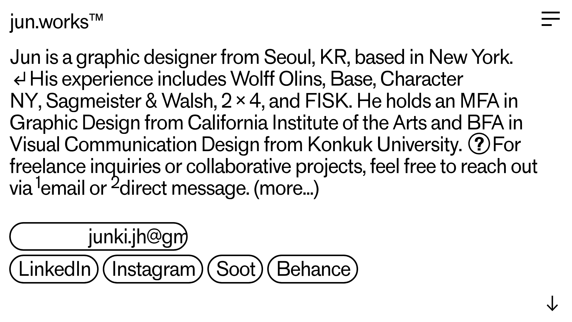
Jun Works Portfolio Landing Page
Minimalist graphic design portfolio featuring a text-heavy layout with image-on-hover tooltips, a pill-shaped marquee contact card, and a categorized hashtag tag cloud for project navigation.
Ekipa Agency Artist Roster Site
A minimalist agency portfolio featuring a dynamic block-based logo, colorful background transitions, and a hover-activated image preview grid for an artist roster.
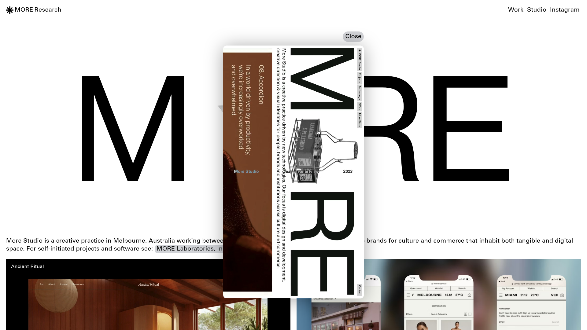
More Studio Creative Agency Portfolio
A high-end creative portfolio featuring oversized experimental typography, immersive video modals, accordion-based project lists, and unique cursor-following hover effects.
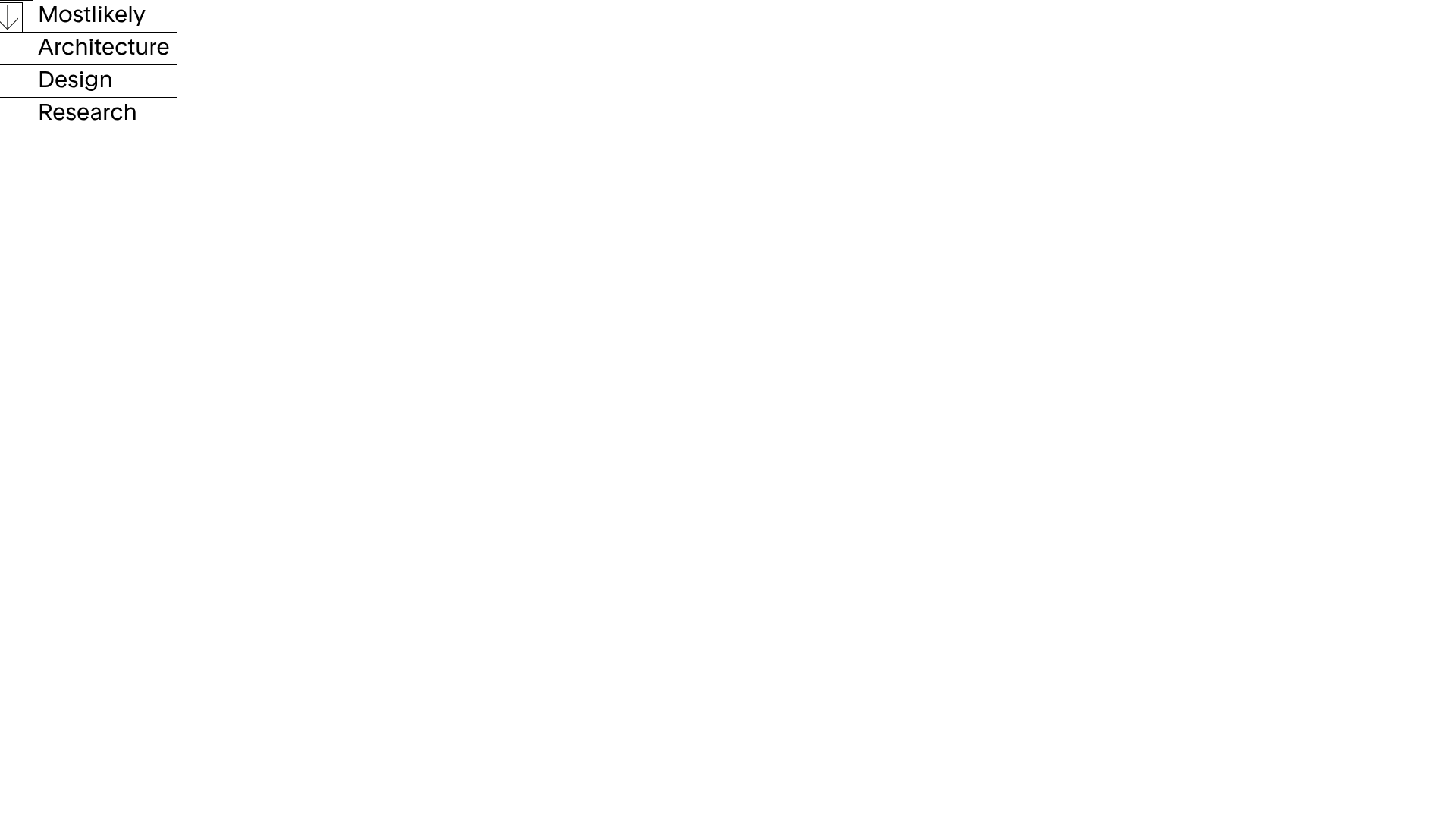
Mostlikely Architecture Portfolio Site
A minimalist portfolio layout featuring a multi-layered cube interaction, vertical image scrolling with lazy-loading, and a grid-based screensaver view for design and research projects.
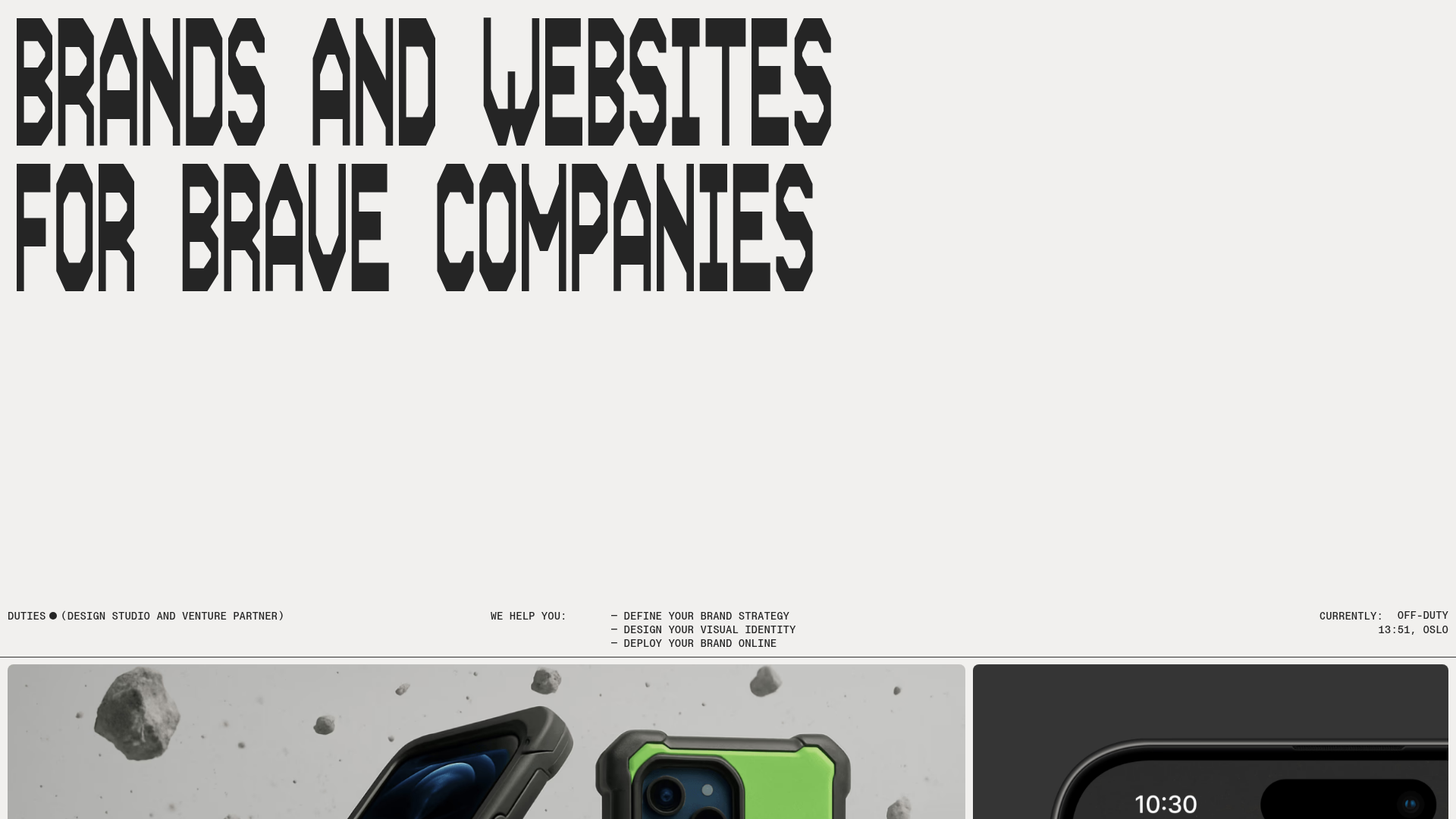
Duties Studio Agency Landing Page
A high-impact agency template featuring bold typography, a minimal technical footer, and a clean grid layout for visual case studies.
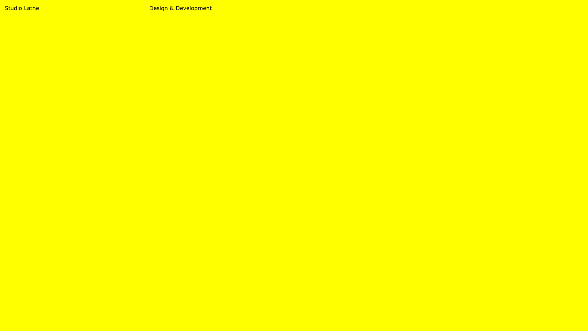
Studio Lathe Minimalist Portfolio List
A high-contrast, minimalist portfolio layout featuring a dense list-based project index with flexible category labeling and a full-screen yellow background.
