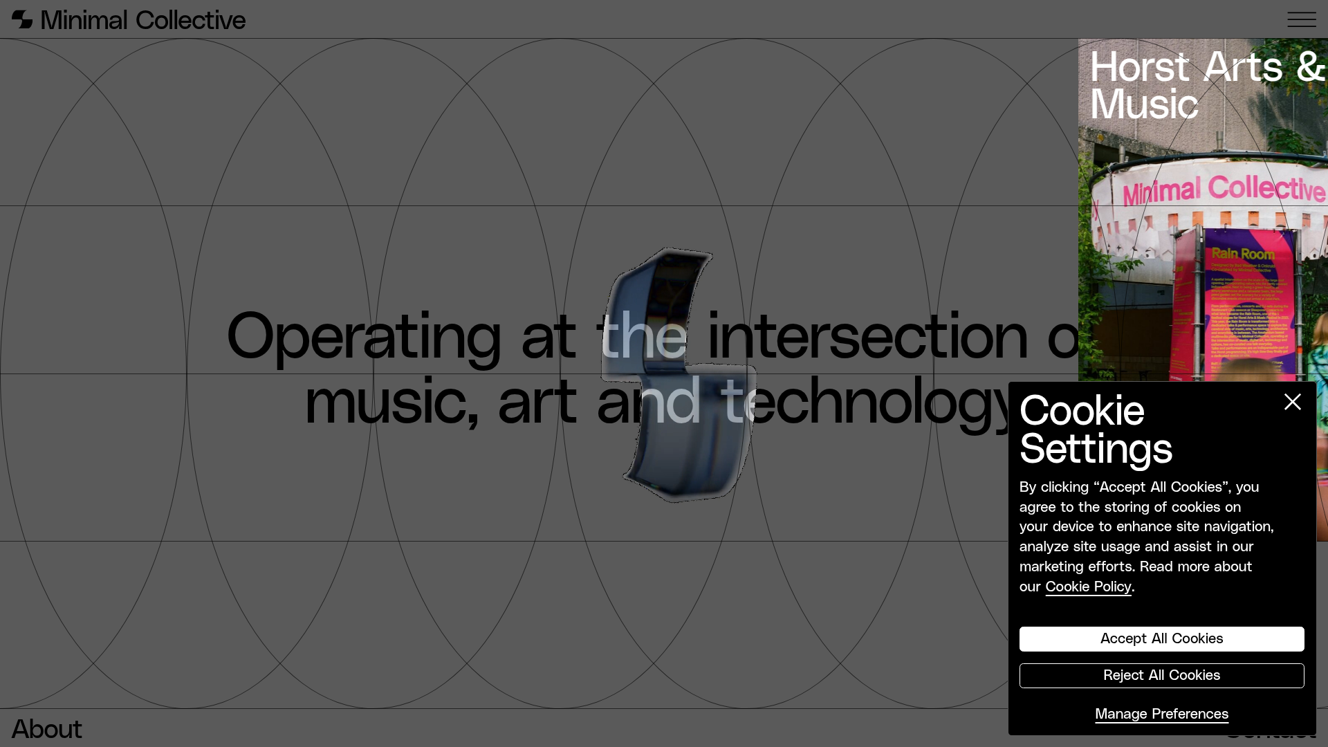
Minimal Collective Media Grid Portfolio
A high-end creative portfolio featuring a dynamic grid layout, parallax scroll animations, image hover overlays, and a minimalist full-screen page transition system.
Overview
Minimal Collective is a high-end creative portfolio and media platform that masterfully blends a brutalist aesthetic with sophisticated motion design. It serves as an exceptional reference for builders looking to implement complex parallax depth, dynamic grid layouts, and seamless full-screen page transitions within a content-rich environment.
Design System
- Color Palette & Visual Hierarchy: The site uses a high-contrast monochromatic base (
background-color-grey,text-color-black) occasionally inverted for CTA sections like the black-background newsletter forms (background-color-black). Visual hierarchy is established through extreme typography scaling and generous whitespace. - Typography: Features a clean, modernist sans-serif. Headings use a tiered scale:
heading-xlargefor section titles,heading-largefor article titles, andheading-smallfor secondary labels. Most headings utilize a "masking" hover effect where text shifts vertically within its container. - Page Structure: The layout is organized into distinct content sections separated by thin horizontal borders. A prominent feature is the
foreground-vertical-lines_wrapper, which creates a persistent 4-column wireframe overlay across the entire experience. - Reusable Components:
- Media Cards: Responsive containers (
image-ratio-portrait,image-ratio-landscape) with complex hover states including image overlays and staggered text animations. - Tag Duo: A unique double-tag system (
tag-blackandtag-white-grey) that toggles visibility on hover. - Full-Screen Transitions: A four-column curtain transition (
page-transition_column1-4) that covers the screen during navigation. - Newsletter Forms: Minimalist inline email inputs with dedicated success/error states.
- Media Cards: Responsive containers (
- Interaction Patterns:
- Parallax Scroll: Elements use
will-change: transformand GSAP-style attributes to move at varying speeds (e.g.,animation-parallax-move-up). - Hover States: Includes image scaling, overlay reveals, and the "shifting text" link animation where one line of text is replaced by another from below.
- Parallax Scroll: Elements use
- Implementation Clues: The HTML reveals a sophisticated Webflow-based build utilizing the
fs-cc(Finseed Cookie Consent) andfs-cmsfilterattributes. It heavily uses a utility-first class naming convention (e.g.,padding-custom1,margin-top,is-grow).
Use Cases
- Who should clone this: Creative agencies, independent artists, architectural firms, or digital magazines requiring a "prestige" brand feel.
- Remix Directions:
- Brand Swap: Replace the grey/black palette with vibrant neons for a cyberpunk look or earth tones for a lifestyle brand.
- Information Architecture: Adapt the 4-column grid into a 2-column layout for simpler portfolios while keeping the parallax motion logic.
- Partial Reuse: Extract the
page-transition_componentfor use on any site to provide an immediate high-end feel between page loads.
- Clone Scope: A full-page clone is recommended to capture the interplay between the background grid lines and the moving content; however, the
home-feed_itemcards are excellent small-scale clones for any CMS-driven list.
Related Inspirations
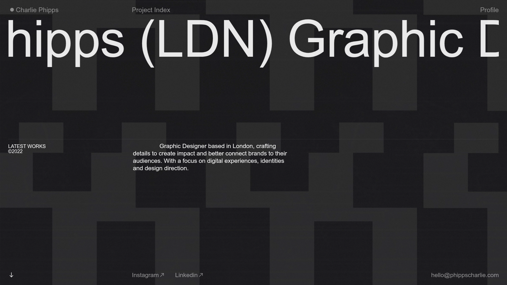
Charlie Phipps Portfolio Hero Layout
A dark-themed portfolio featuring a large horizontal scrolling marquee header, full-bleed video backgrounds, and a clean typography-focused grid for case studies.
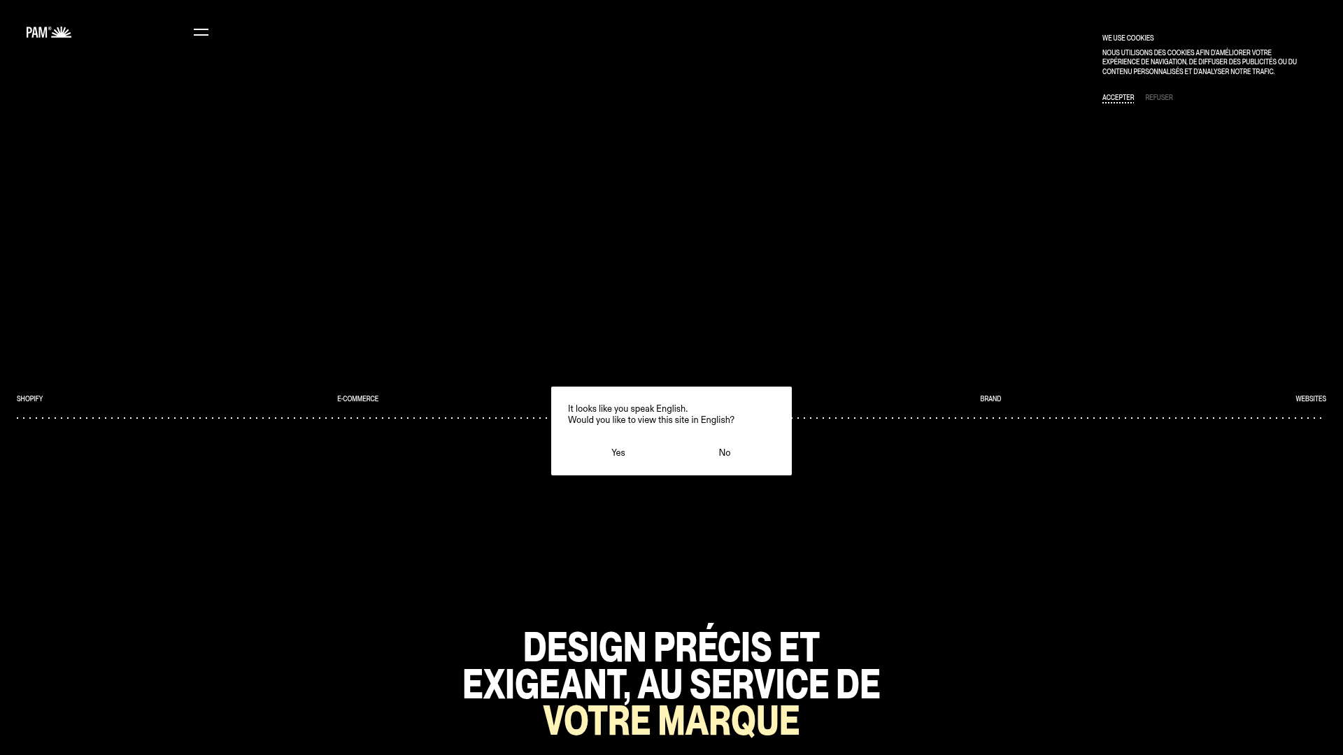
Pam Agency Portfolio Hero
A high-contrast Shopify agency landing page featuring a full-width marquee hero, horizontal service cards, and a sleek yellow-accented slide-out contact form.

Niklas Rosén Designer Portfolio Index
A minimalist, responsive grid-based portfolio index featuring a clean 16-column layout, typographic list components, and a custom dark mode transition.
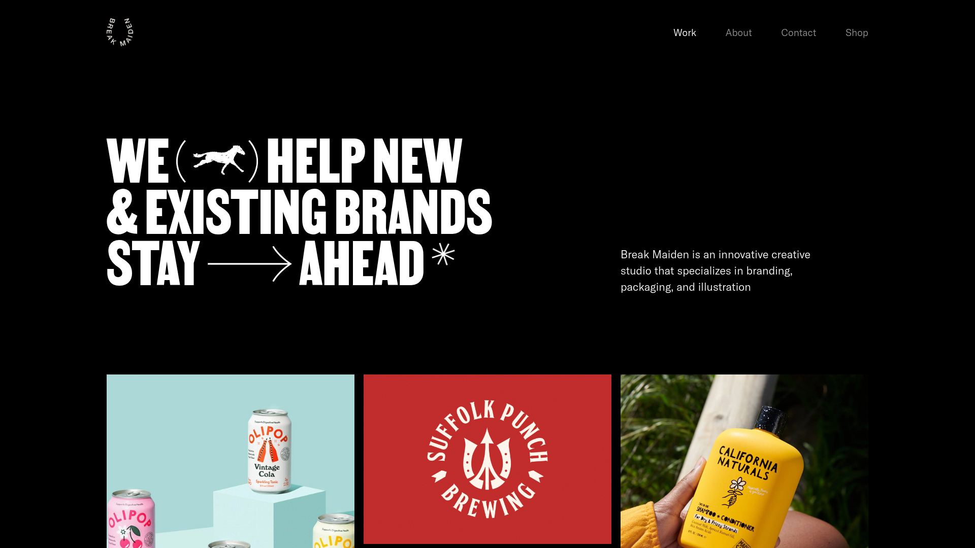
Break Maiden Agency Portfolio Hero
A high-impact dark mode hero section featuring oversized typography with inline GIF icons and a responsive grid for display-heavy case studies.
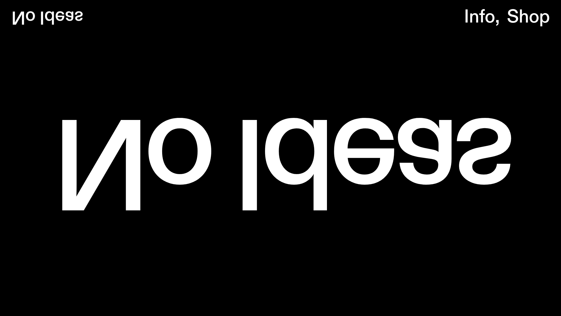
No Ideas Design Portfolio Carousel
A minimalist, full-screen portfolio featuring a high-impact typography hero and a large-scale Bootstrap carousel with video and image support.
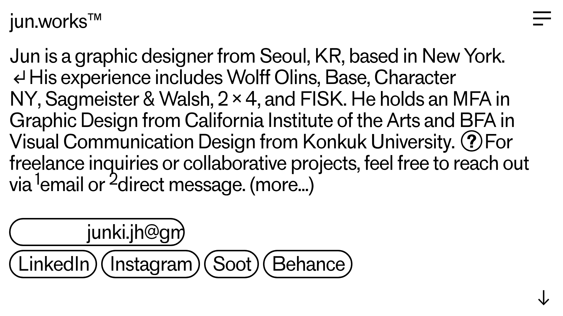
Jun Works Portfolio Landing Page
Minimalist graphic design portfolio featuring a text-heavy layout with image-on-hover tooltips, a pill-shaped marquee contact card, and a categorized hashtag tag cloud for project navigation.
