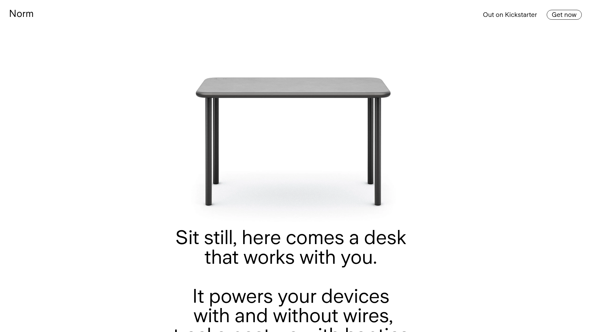
Norm Minimalist Product Landing Page
A clean, high-contrast hardware showcase featuring a scroll-triggered vertically stacked layout, sticky navigation bar, and integrated haptic/feature bullet points.
Overview
Norm is a minimalist, high-contrast hardware landing page that uses a vertical scroll-triggered story-telling layout. It is a powerful reference for cloneable design because it balances sophisticated white space with dynamic content reveal, making it ideal for premium physical product showcases.
Design System
- Color Palette & Visual Hierarchy: The site employs a stark #FFFFFF white and #000000 black palette to establish maximum contrast. Hierarchy is driven by scale, transitioning from light backgrounds for technical details to full-bleed black backgrounds for brand emotional appeal.
- Typography: Uses a clean, sans-serif font family (custom_50109) with a wide range of weights. Large display headings (up to 120px) are used for hero statements, while a 16px to 24px scale handles utility text and feature descriptions.
- Page Structure: The site is built on a vertically stacked
articlestructure. It begins with a hero product shot and high-level value prop, moves into a feature-focused interactive section with numerical hotspots, and concludes with pricing/CTAs on dark backgrounds. - Reusable Components:
- Sticky Navigation: A minimalist top bar with a left-aligned site title and right-aligned pill-shaped CTA (
border-radius: 57px). - Feature Hotspots: Circular button components (labeled 1-4) positioned over product imagery to trigger specific text highlights.
- Pill Buttons: Broad, rounded-corner buttons (
border-radius: 12px) used consistently for primary actions like "Get now on Kickstarter." - Cookie Consent: A persistent floating container in the bottom-left corner with a distinct "It's fine" button.
- Sticky Navigation: A minimalist top bar with a left-aligned site title and right-aligned pill-shaped CTA (
- Interaction Patterns: The layout uses a
viewer-type-vertical-stickyconfiguration where content persists on the screen while internal elements (text and images) translate or fade based on scroll progress. This is managed through absolute-positionedanimation-containerelements and offsets. - Implementation Clues: The site appears to be built using a low-code design tool (Readymag), evidenced by the
rmwidgetclass prefixes and complex absolute-position coordinate systems for every element.
Use Cases
- Who should clone this: Builders launching high-end D2C hardware, single-product e-commerce sites, or industrial design portfolios that require an "Apple-like" premium feel.
- Effective Remixes:
- Brand Adaptation: Swap the monochrome palette for a brand's primary color as the background for the
neighbourpages to shift the mood while keeping the layout. - Info Architecture: Adapt the numbered hotspot section to explain software features by replacing the desk image with an app dashboard screenshot.
- Brand Adaptation: Swap the monochrome palette for a brand's primary color as the background for the
- Target Clone Scope:
- Full-Page: Best for a chronological product story.
- Section Clone: The "Everything in its right place" dark-mode feature breakdown is a stand-alone pattern perfect for highlighting high-quality materials (e.g., AL 6063 aluminum) and specifications.
Related Inspirations
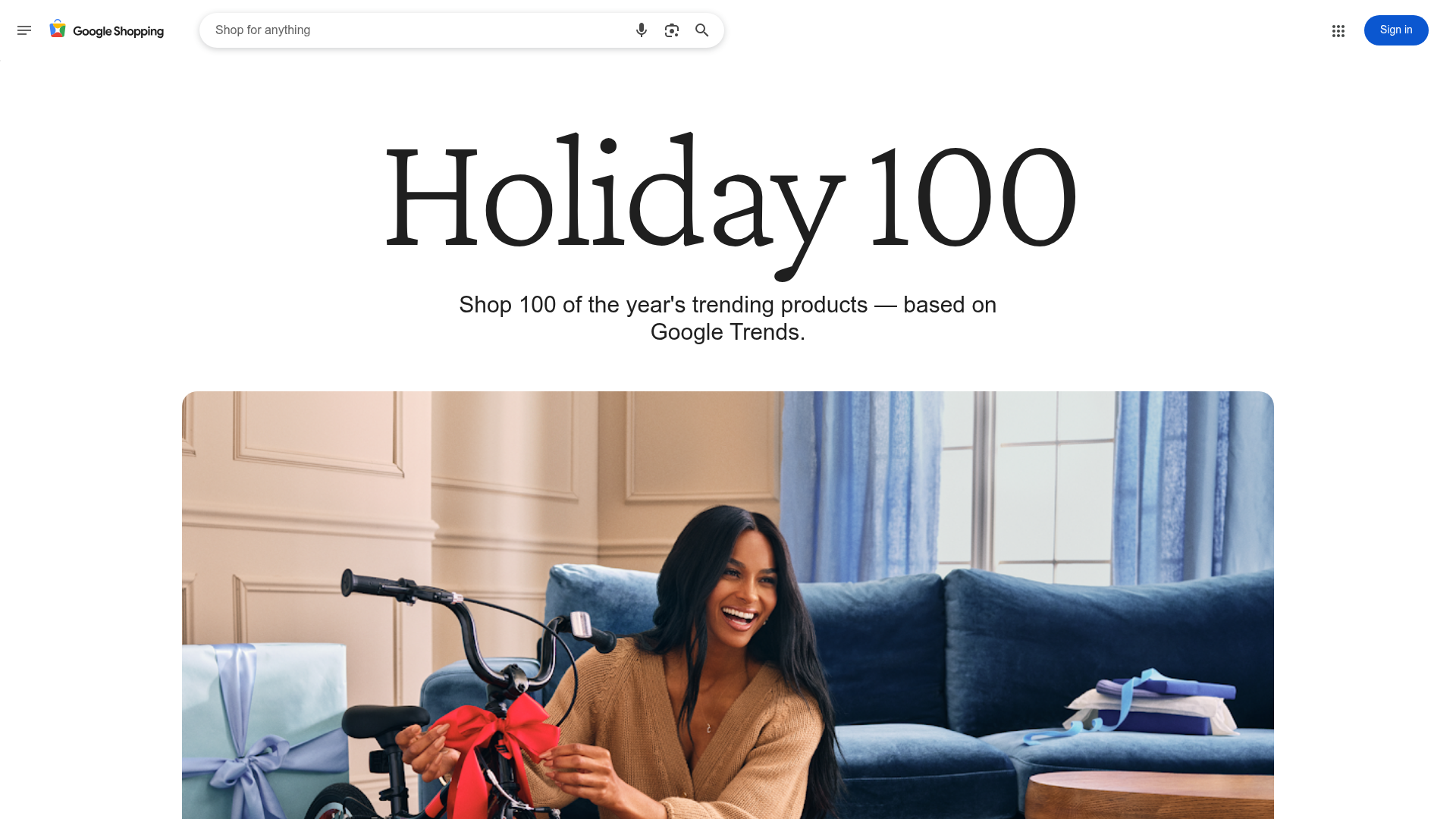
Google Holiday 100 Curator Landing Page
A minimalist e-commerce showcase featuring a wide hero section, clean search integration, and a bold typography-driven header designed for trending product collections.
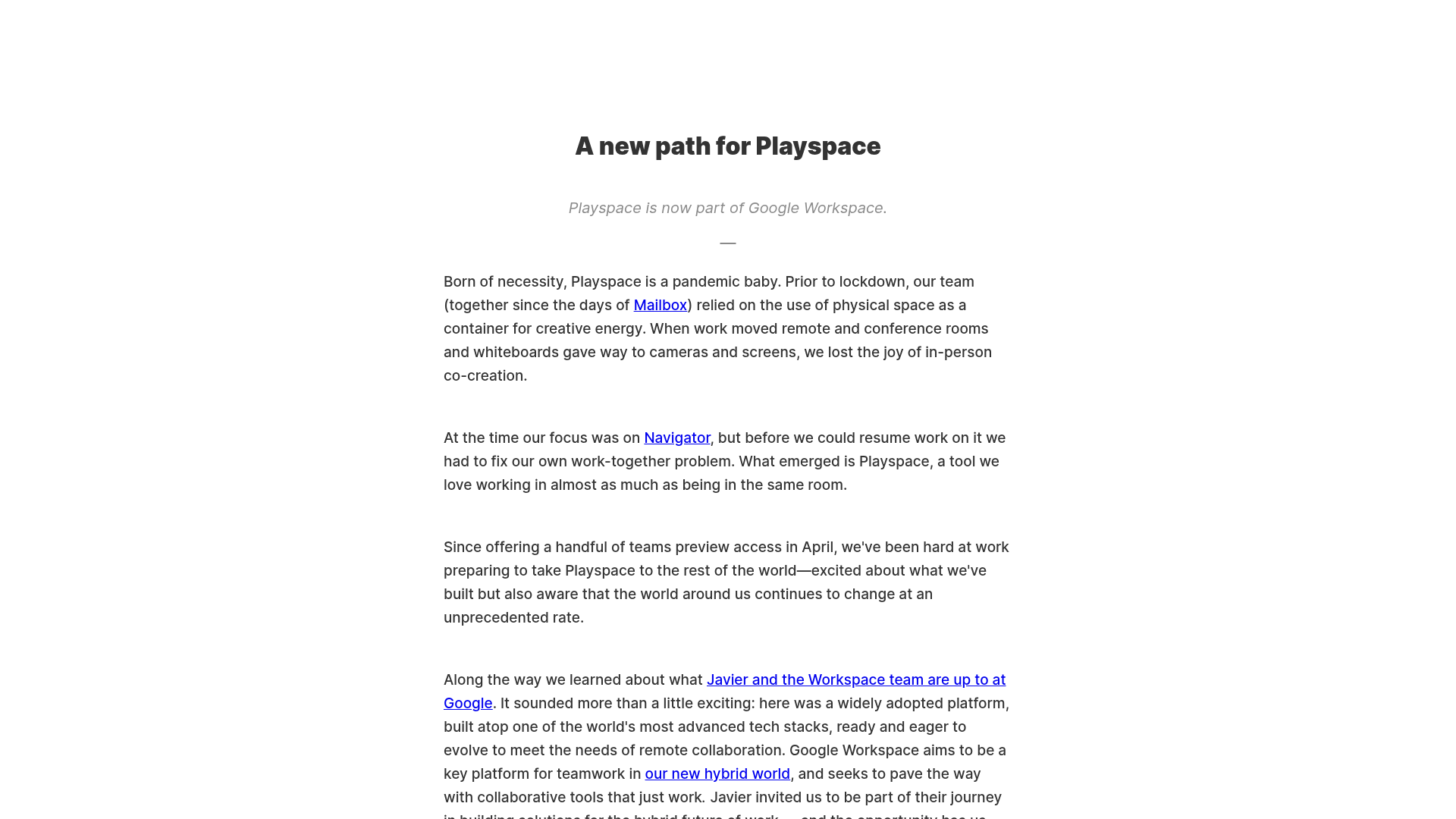
Playspace Acquisition Announcement Minimalist Layout
A clean, center-aligned announcement template featuring a vertical stack of rich text content and linked text elements on a neutral background.
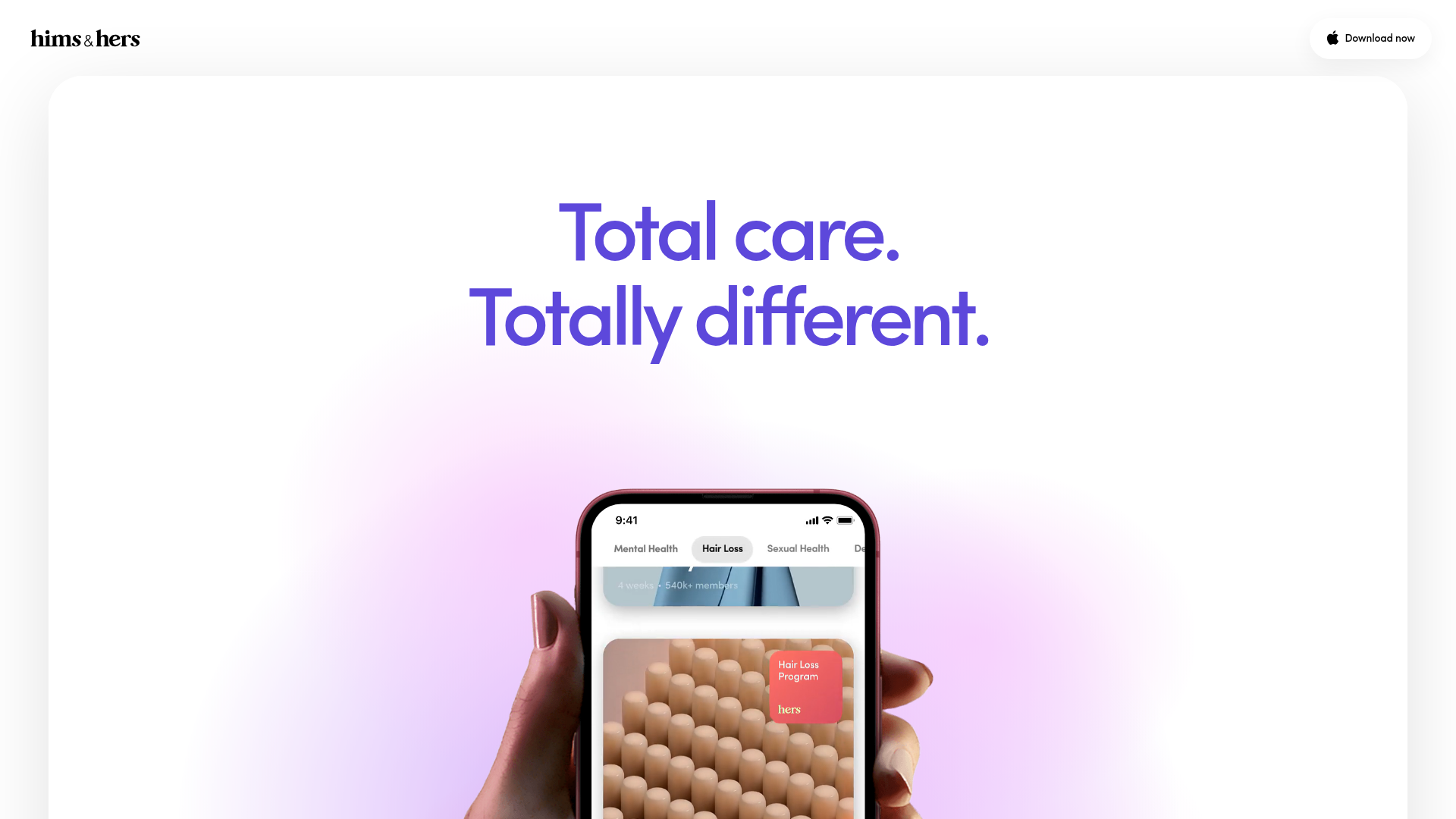
Hims & Hers App Landing Page
A clean health-tech landing page featuring high-contrast typography, sticky phone mockups with scroll-triggered animations, and sleek card-based content sections.

Finn Pet Supplements Landing Page
An e-commerce landing page featuring high-contrast typography, a sticky brand logo banner, parallax scroll effects on product headers, and a clean product grid.
Hourly App Landing Page
A minimalist iOS app landing page featuring a bold typographic hero, responsive grid-based screenshot displays, and custom SVG illustrations with CSS animations.
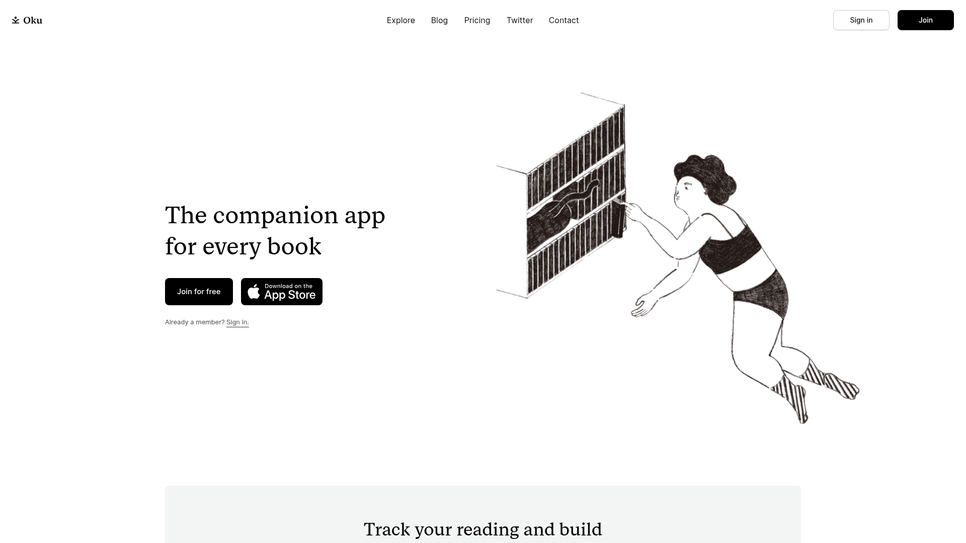
Oku Minimalist Book Tracking Landing Page
A clean, typography-focused landing page featuring a minimalist header, illustrated hero section, and clear call-to-action buttons for app downloads.
