Hims & Hers App Landing Page
A clean health-tech landing page featuring high-contrast typography, sticky phone mockups with scroll-triggered animations, and sleek card-based content sections.
Overview
This landing page is a high-end medical-tech showcase for the Hims & Hers mobile app. It serves as an excellent reference for builders looking to implement scroll-driven storytelling, featuring sticky phone mockups that animate in sync with content cards to bridge the gap between web marketing and mobile app features.
Design System
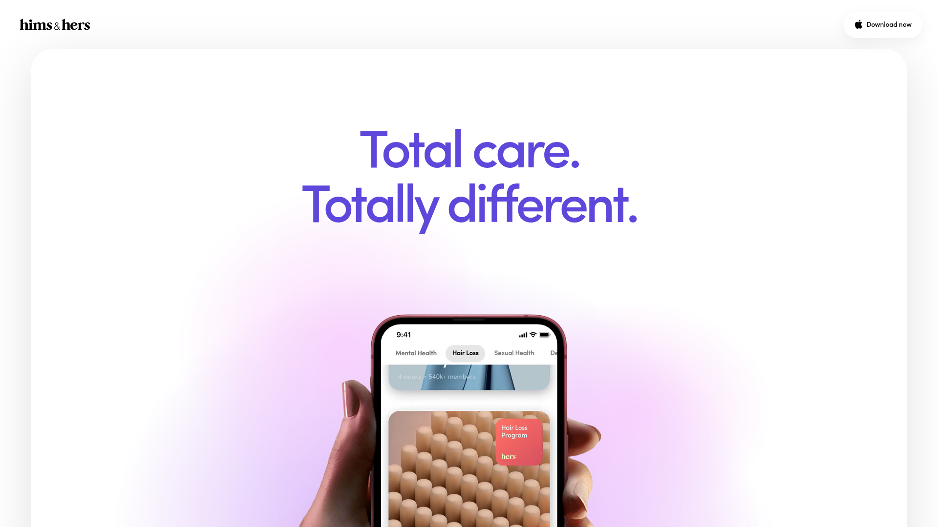
- Color Palette & Visual Hierarchy: A clean, high-contrast palette using deep blacks and vibrant purples for typography and accents. The background uses a soft, off-white gradient with a large rounded-corner container (visible in the screenshot) to create a modern app-like feel.
- Typography System: Utilizes a bold, geometric sans-serif for headlines (e.g., "Total care. Totally different."). The scale is significant, with large h2 headers and smaller, readable body text for the FAQ and list sections. The brand logo employs a distinct serif typeface for contrast.
- Page Structure: The site flows from a hero headline to horizontal sections (Programs, Care, Member Shop). Each section follows a repetitive pattern: a large section title header, followed by a primary content card containing a sticky mockup, and ending with a descriptive footer paragraph.
- Reusable Components:
- Sticky Phone Mockup: A centrally positioned device frame (using
card-content-phone-sticky) that remains fixed while users scroll through descriptive text lists. - Categorized Tabs: Segmented control style buttons (e.g., Mental Health, Hair Loss) visible within the mobile screen mockup.
- Accordion FAQ: A clean list-based FAQ component with toggleable arrows (
faq-list-arrow) and state-based visibility.
- Sticky Phone Mockup: A centrally positioned device frame (using
- Interaction Patterns: The HTML suggests heavy use of opacity transitions (e.g.,
style="opacity: 0;"on video elements and lists) indicates a scroll-triggered animation system. As the user reaches different scroll positions, specific app interface videos and copy blocks fade into view. - Implementation Clues: The structure uses a container-based layout with specific IDs (
#program,#care,#shop) and utility classes like.card-content-phone-shimto manage the spacing required for the sticky positioning mechanics.
Use Cases
- Who should clone this: SaaS developers launching a mobile app, health-tech startups, or digital lifestyle brands needing to demonstrate a complex mobile UI in a simple, scrollable format.
- Effective Remixes: This pattern is perfect for any product that is "mobile first." You can swap out the phone mockup for a desktop browser frame for a web-app focus, or use the card-based structure to showcase a hardware product's design details.
- Practical Directions:
- Brand Swap: Replace the purple/black palette with a high-energy neon for fintech or earthy tones for wellness.
- IA Adaptation: Instead of three long sections, use the sticky mockup component for a single "Feature Deep Dive" section within a larger site.
- Clone Scope: A full-page clone is ideal for those wanting a narrative-driven landing page. However, cloning the
card-content-phone-stickylogic alone provides a powerful reusable component for any product page.
Related Inspirations
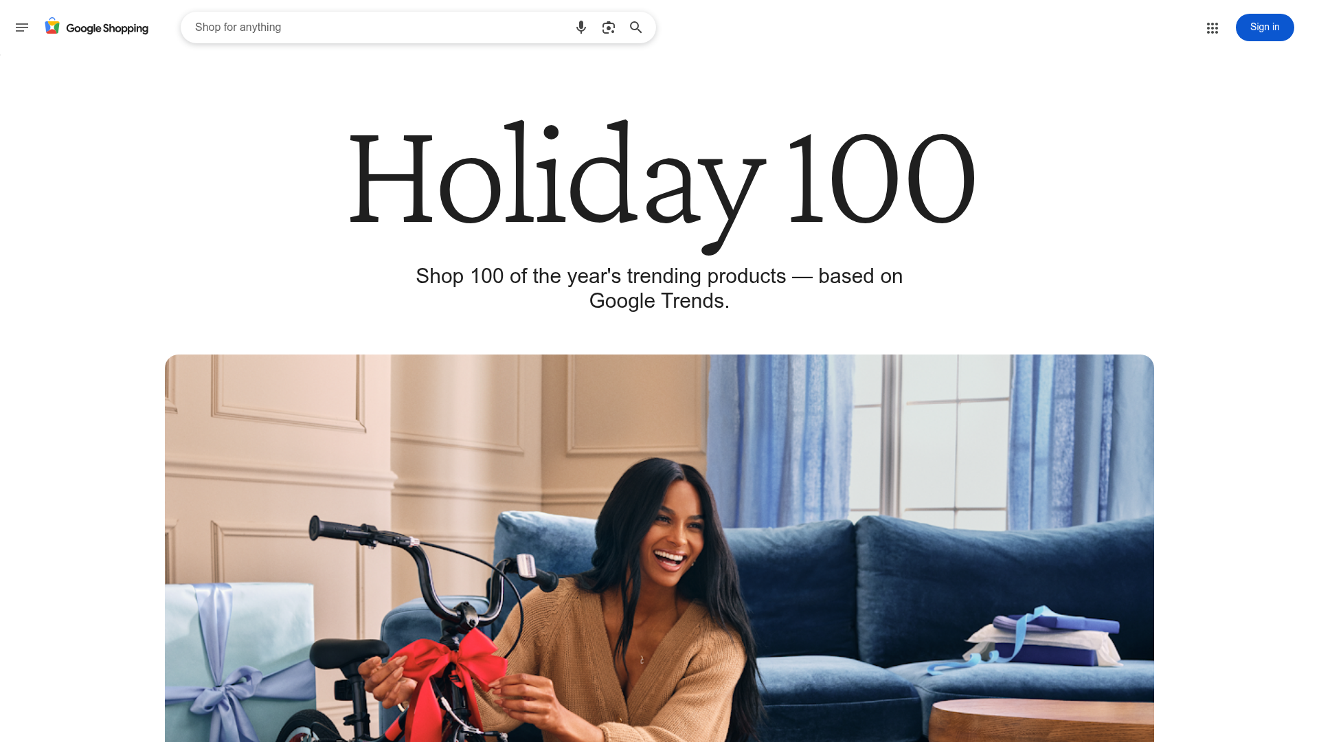
Google Holiday 100 Curator Landing Page
A minimalist e-commerce showcase featuring a wide hero section, clean search integration, and a bold typography-driven header designed for trending product collections.

Finn Pet Supplements Landing Page
An e-commerce landing page featuring high-contrast typography, a sticky brand logo banner, parallax scroll effects on product headers, and a clean product grid.
Playspace Acquisition Announcement Minimalist Layout
A clean, center-aligned announcement template featuring a vertical stack of rich text content and linked text elements on a neutral background.
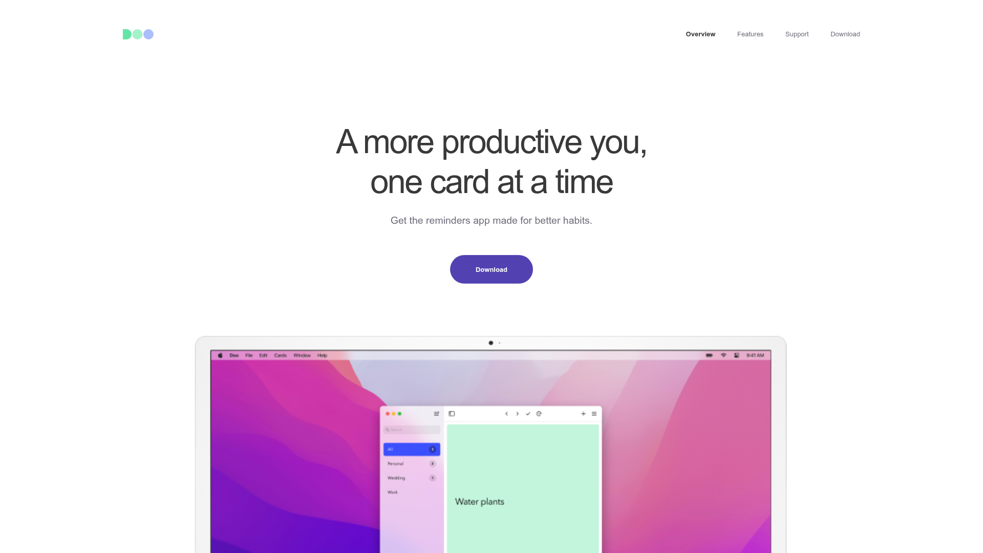
Doo App Minimalist Product Landing Page
A clean, centered product showcase featuring a parallax hero image, icon-based feature checklists, horizontal gesture illustrations, and stacked section layouts with ample whitespace.
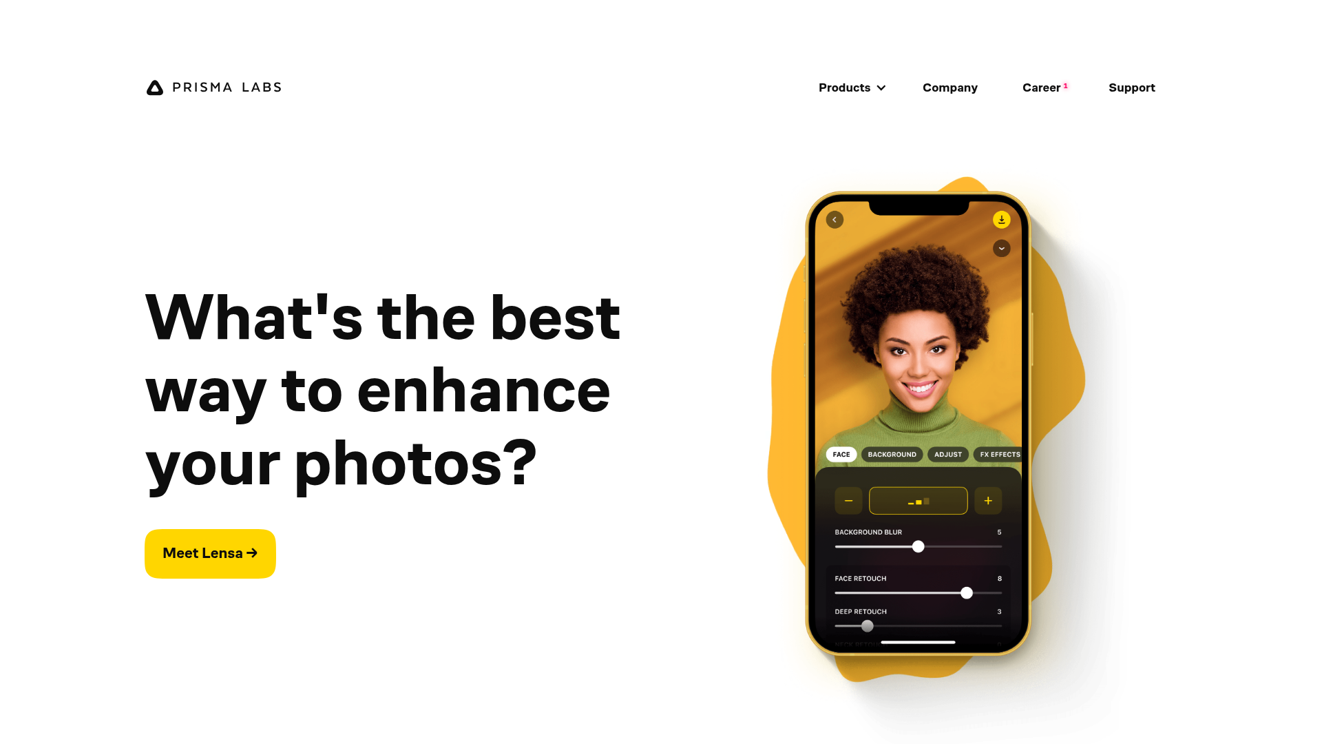
Prisma Labs App Showcase Landing
A clean SaaS landing page layout featuring large typography, magnetic hover buttons, and high-fidelity mobile app mockups with animated video blob backgrounds.
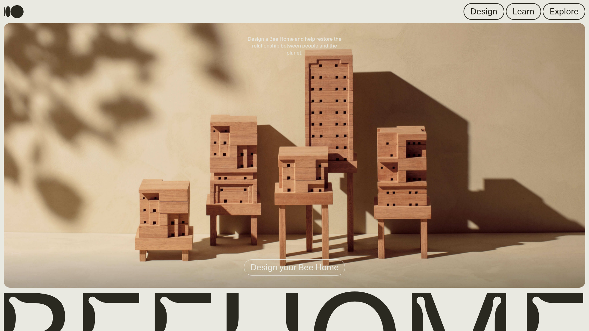
Bee Home Modular Design Landing Page
A minimalist landing page featuring an animated hero section, custom typography, and a modular component architecture built with Gatsby and Emotion CSS.
