Oku Minimalist Book Tracking Landing Page
A clean, typography-focused landing page featuring a minimalist header, illustrated hero section, and clear call-to-action buttons for app downloads.
Overview
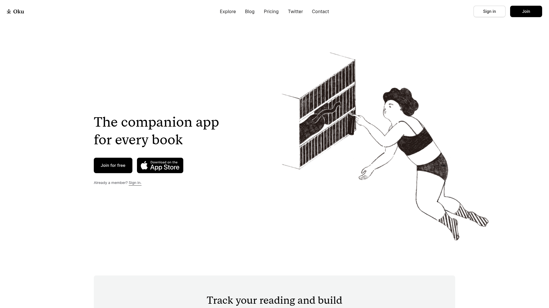
This landing page is for Oku, a minimalist book-tracking companion app. It serves as a premier reference for a "content-first" design approach, using high-quality line-art illustrations and generous whitespace to create a calm, sophisticated user experience. Builders should clone this to master the art of combining traditional serif typography with modern minimalist UI layouts.
Design System
- Color Palette & Visual Hierarchy: The site uses an off-white/cream background (
#F5F5F5or similar) to reduce eye strain compared to pure white. It employs a high-contrast monochrome scheme for primary elements: solid black buttons with white text and deep black titles. Essential branding uses minimalist black icons. - Typography: The design relies on a dual-font system. A classic, high-readability Serif is used for headers (
h2) to evoke the feeling of a printed book, while a clean, geometric Sans-Serif handles navigation, button labels, and body text. The hierarchy is established through extreme scale shifts between the large hero statement and smaller, functional utility text. - Page Structure & Flow:
- Minimalist Header: Logo on the left, centered navigation links, and right-aligned CTA buttons.
- Hero Section: Split layout with text on the left and a large, hand-drawn illustration on the right.
- Feature Blocks: Alternating layouts (left text/right image and vice versa) featuring oversized product screenshots.
- Social Proof: A Twitter testimonial section using a dual-column layout with profile avatars and handles.
- Dynamic Carousel: A continuous horizontal marquee showcasing book covers and user avatars to signify active community use.
- Footer Q&A: Simplified 3-column informational block addressing user concerns (Privacy, Sustainability).
- Reusable Components:
- Button Variants: Flat black primary buttons and ghost-style outlined secondary buttons.
- Marquee Wrapper: A
marquee3kimplementation in the HTML that creates a high-density visual list of community activity. - Feature Cards: Image-heavy blocks with centered headings and descriptive body text.
- Implementation Clues: The site uses React (evident from the
rootdiv andchunk.cssnaming) and an atomic CSS-in-JS utility framework (likely Emotion or Styled Components, indicated bycss-prefixed classes likecss-w57acr).
Use Cases
- Who should clone this: Developers building utilities for hobbyists (journaling, gardening, collecting) where a "zen" and non-intrusive aesthetic is paramount.
- Effective Remixes: Perfect for personal portfolio sites or niche community platforms. The serif typography can be swapped for a bold slab-serif to become a modern news site, or a refined sans-serif for a SaaS dashboard landing page.
- Remix Directions: Reuse the alternating feature block pattern for any product walkthrough. The dynamic marquee section is highly effective for any product that needs to show "proof of scale" without using a traditional table or list.
- Clone Scope: A full-page clone is ideal for those wanting to capture the specific emotional tone of "literary minimalism," but the header and marquee sections are the most valuable standalone components for partial reuse.
Related Inspirations

Slite SaaS Knowledge Base Landing Page
A clean SaaS hero section with a conversational headline, secondary call-to-action buttons, and a structured software interface preview featuring user testimonials.

Good Glyphs Font Showcase Landing Page
A single-page layout featuring an interactive type tester, donation form with custom amount logic, and a contributor gallery using swiper-based glyph previews.
Dropmark Visual Organization Landing Page
Features a clean minimalist hero section with split-action buttons, a vibrant vector illustration footer, and an interactive horizontal flickity carousel for case studies.

Google Holiday 100 Curator Landing Page
A minimalist e-commerce showcase featuring a wide hero section, clean search integration, and a bold typography-driven header designed for trending product collections.

Finn Pet Supplements Landing Page
An e-commerce landing page featuring high-contrast typography, a sticky brand logo banner, parallax scroll effects on product headers, and a clean product grid.
Someone & Others Studio Landing Page
A minimalist studio portfolio featuring scroll-reveal typography, overlapping sticky case study cards, and a vibrant glassmorphism CTA with animated glow rings.
