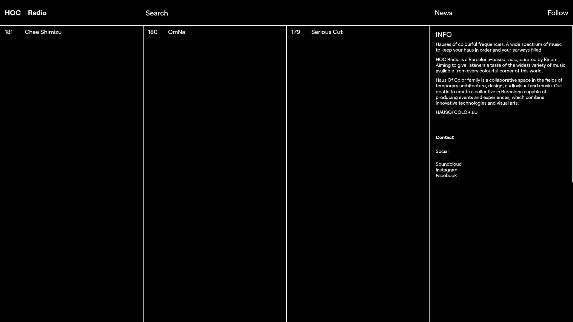
HOC Radio Minimalist Vertical Grid
A dark-themed, minimalist audio archive layout featuring ultra-thin vertical column dividers, a collapsible sidebar, and a clean typography-focused navigation menu.
Overview
HOC Radio is a minimalist web archive for music mixes, utilizing a high-contrast dark theme and a strictly vertical column structure. It is a powerful reference for builders seeking an ultra-organized, typography-driven layout that avoids the visual clutter of standard grids in favor of a clean, editorial look.
Design System
- Color Palette and Visual Hierarchy: The system is monochromatic, featuring a jet-black background (#000000) with stark white text. Hierarchy is established through spatial distribution rather than color, using thin white 1px border lines to delineate vertical columns.
- Typography System: A clean, neo-grotesque sans-serif (resembling Helvetica or Inter) is used throughout. Navigation items use a bold weight for the brand name ("HOC Radio") and standard weights for top-level links. Metadata for the archive items (e.g., "181 Chee Shimizu") is set in small, uppercase-friendly sizes to maintain a functional, catalog-like aesthetic.
- Page Structure and Section Flow: The layout is split into full-height vertical columns. The first three columns represent sequential archive entries (181, 180, 179), while the final right-hand column serves as a persistent "INFO" sidebar containing a description, contact links, and social redirects.
- Reusable Components: The core component to clone is the "Vertical Gallery Column"—a container designed to handle large-scale vertical content with fixed-width headers. The top navigation bar is equally valuable, demonstrating a balanced four-point anchor system (Left, Center-Left, Center-Right, Right).
- Interaction and Motion Patterns: The design suggests a horizontal scroll or a swipe-based navigation rhythm. Each column acts as a distinct bucket, likely triggering audio playback or expanding detailed tracklists upon interaction.
- Implementation Clues: Based on the DOM structure, the site uses a simplified
divhierarchy with a global wrapper. The clear vertical division reflects a Flexbox or CSS Grid implementation whereheight: 100vhandborder-right: 1px soliddefine the visual rhythm.
Use Cases
- Who should clone this pattern: Developers building digital archives, portfolio sites for minimalist designers, or niche streaming platforms that prioritize list-based discovery over visual thumbnails.
- Remixing effectively: This layout can be effectively remixed for an architecture portfolio by replacing the black background with light grey and using the columns for project categories instead of radio episodes.
- Practical remix directions: Swap the white text for brand-specific accent colors to soften the high contrast. Builders could also adapt the info sidebar into a collapsible mobile drawer while keeping the vertical desktop grid.
- Suggested clone scope: A quick section clone of the navigation bar and the multi-column layout structure is recommended for those wanting to establish a professional, structured landing page quickly.
Related Inspirations
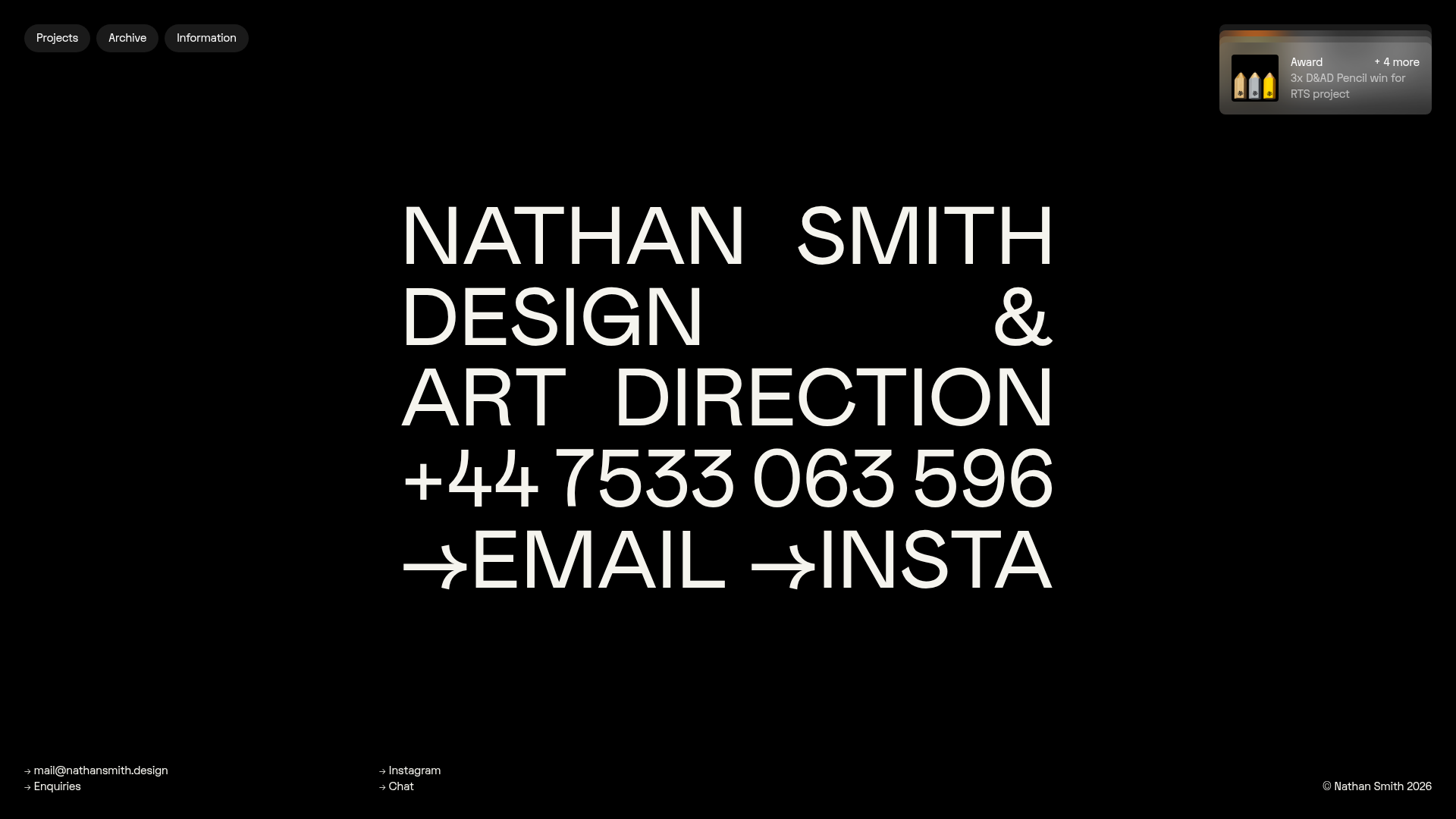
Nathan Smith Design Portfolio Homepage
A bold typography-led hero section with a hover-active portfolio grid featuring dynamic background color transitions and a slide-out contact form.
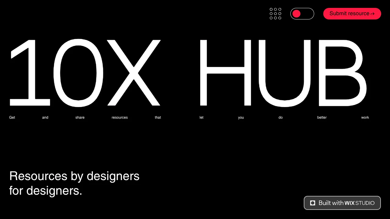
10X Hub Minimal Performance Resource Gallery
A high-contrast dark mode resource hub featuring big typography, a filtered repeater list for discovery, and a comprehensive multi-step submission form.

Good Glyphs Font Showcase Landing Page
A single-page layout featuring an interactive type tester, donation form with custom amount logic, and a contributor gallery using swiper-based glyph previews.

Niklas Rosén Designer Portfolio Index
A minimalist, responsive grid-based portfolio index featuring a clean 16-column layout, typographic list components, and a custom dark mode transition.
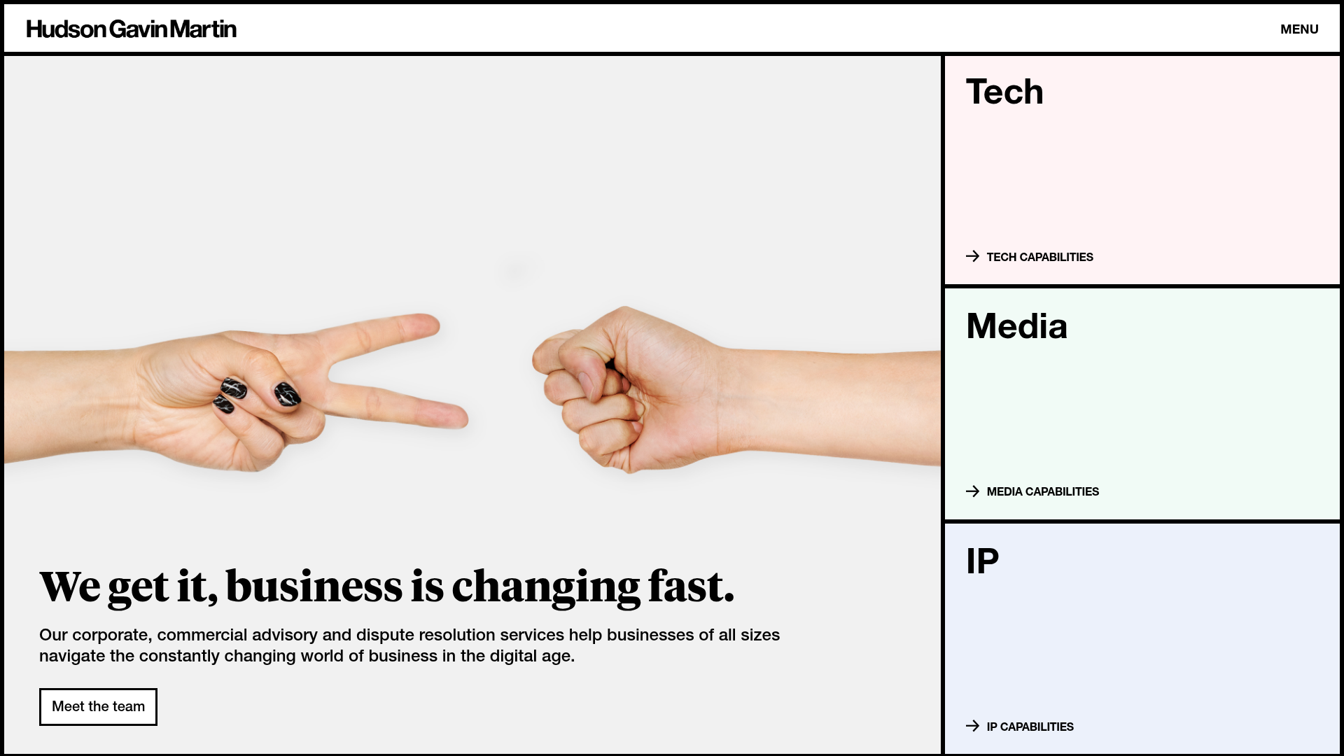
Hudson Gavin Martin Corporate Law Landing
A professional service homepage featuring a minimalist grid-based hero, color-themed navigation blocks, and a bento-style insights feed with subtle hover interactions.
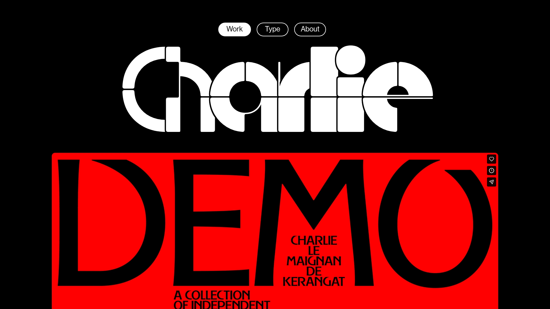
Charlie Le Maignan Portfolio Archive
A minimalist dark-mode portfolio featuring high-contrast typography, a geometric logo header, and an integrated full-width video gallery showcasing independent creative work.
