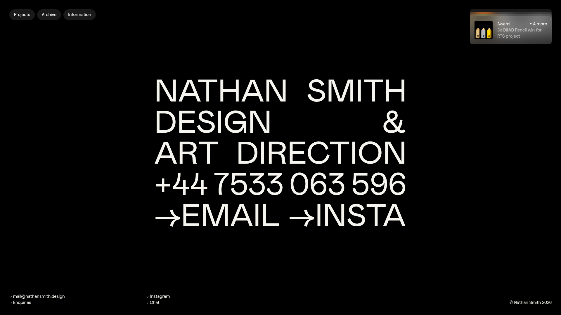
Nathan Smith Design Portfolio Homepage
A bold typography-led hero section with a hover-active portfolio grid featuring dynamic background color transitions and a slide-out contact form.
Overview
This portfolio homepage belongs to designer Nathan Smith, featuring a high-impact, typography-first approach that prioritizes immediate brand communication. It is a premier reference for the "brutalist-minimalist" aesthetic, showcasing how a bold hero section can transition into a dynamic, color-adaptive project grid.
Design System
- Color Palette & Visual Hierarchy: The site uses a high-contrast black-and-white foundation for the hero section. Digital accessibility is baked into the project grid, where each card (
portfolio-grid-card) contains hidden data attributes (generate-bg-color,generate-fg-color) that trigger a full-screen background color shift upon hover, creating an immersive, content-driven experience. - Typography: The system relies on a heavy, sans-serif grotesque typeface used in all-caps for the hero (
text-super). The scale is massive, filling the viewport to serve as both content and graphic element. Secondary information uses a smaller, cleaner sans-serif (text-mediumandtext-small) for readability. - Page Structure: The flow is linear and focused: a fixed navigation header, a full-viewport hero panel with contact links, followed by a dense vertical grid of portfolio items. A slide-out contact panel (
section-form-panel) is hidden off-screen until triggered. - Reusable Components:
- Interactive Hero: The large text blocks for "EMAIL" and "INSTA" function as primary navigation targets.
- The Dynamic Card: A grid item using a video or image reveal over a solid color block that dictates the page's theme color via hover triggers.
- Slide-out Form: A structured
form-panelwith custom-styled radio buttons and large-text input fields for high-touch inquiries.
- Interaction & Motion: The site uses intense scaling effects (
scale3d(1.2, 1.2, 1)) on grid items during scroll or hover. The background color transitions are smooth, likely driven by a utility class likeapply-color-transitionfound in the HTML. - Implementation Clues: Built with Webflow (evidenced by
w-dyn-listandw-inline-blockclasses), the site utilizes a CMS-driven grid where each item's specific color signature is stored as a variable to update the global background.
Use Cases
- Who should clone this: Independent creatives, art directors, and design studios who want to lead with their name and a bold personality rather than a standard image-gallery layout.
- Effective Remixes: This pattern works well for luxury fashion lookbooks, experimental architecture firms, or high-end production agencies.
- Practical Directions: One could remix the hero section by swapping the static typography for an interactive 3D text element while retaining the grid's color-switching logic. The contact form is a standalone piece that can be added to any minimalist site needing a sophisticated lead-capture method.
- Clone Scope: A developer could perform a quick section clone of the
hero-panelfor a landing page, or a full-page clone to study the intricate state-management between theportfolio-grid-itemand the globalmain_wrapperbackground colors.
Related Inspirations
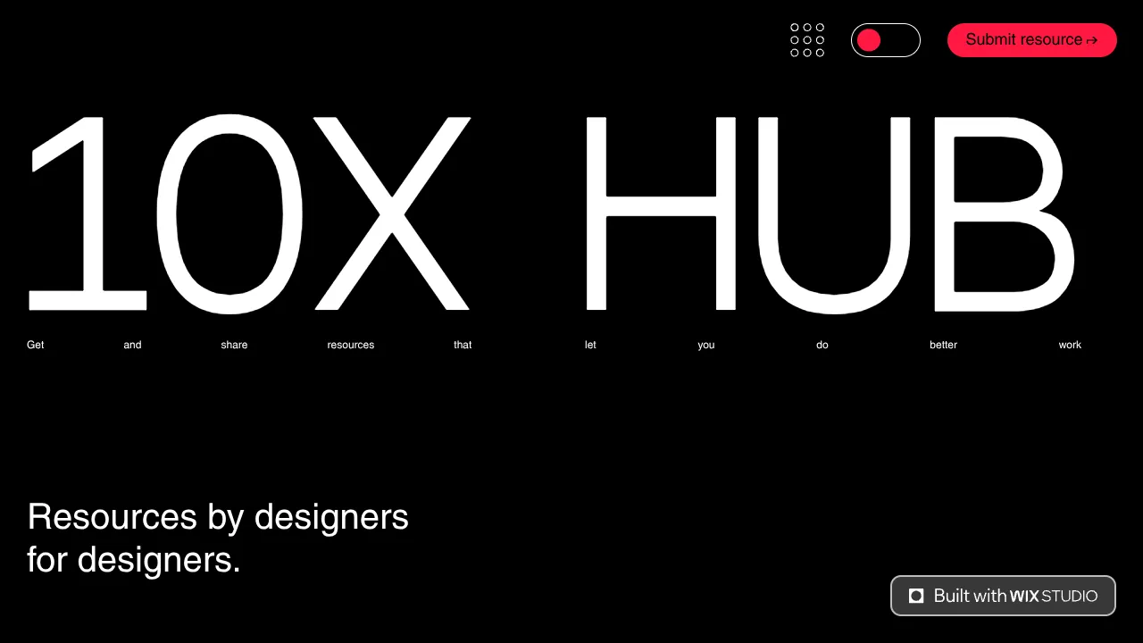
10X Hub Minimal Performance Resource Gallery
A high-contrast dark mode resource hub featuring big typography, a filtered repeater list for discovery, and a comprehensive multi-step submission form.

Niklas Rosén Designer Portfolio Index
A minimalist, responsive grid-based portfolio index featuring a clean 16-column layout, typographic list components, and a custom dark mode transition.
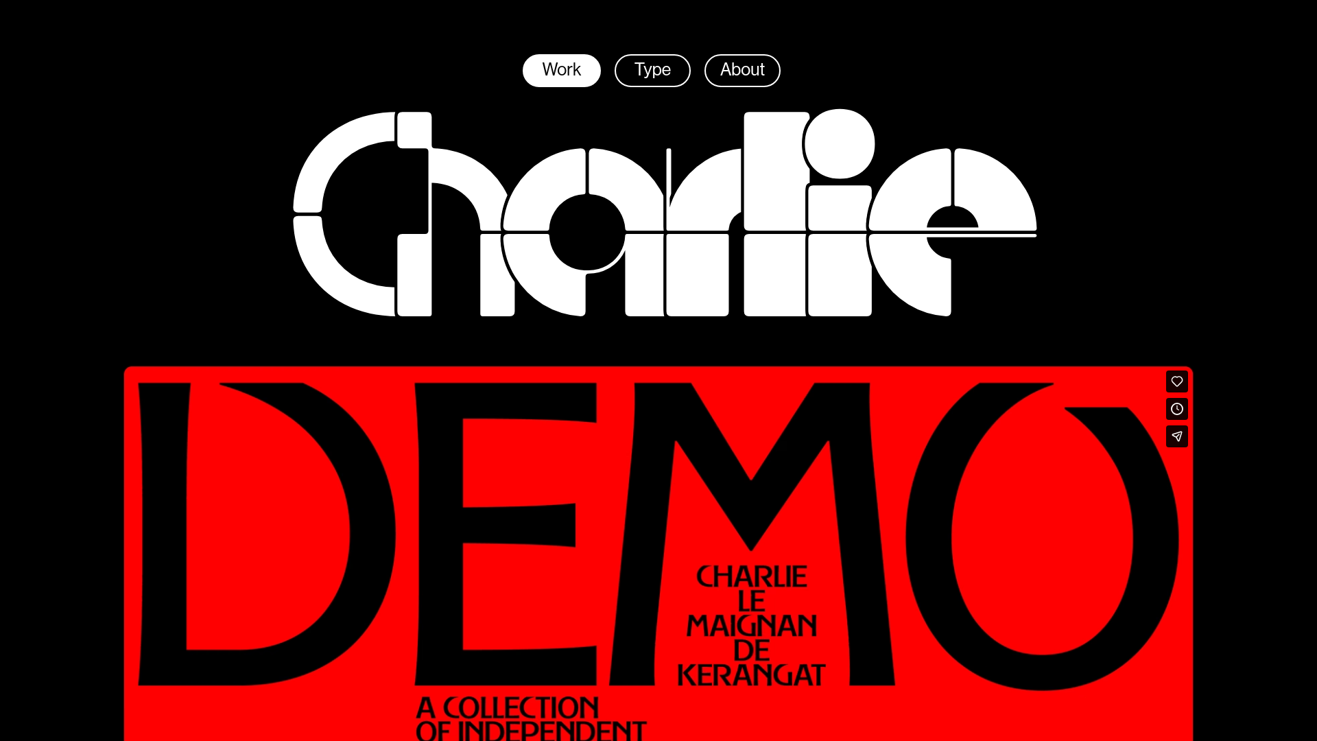
Charlie Le Maignan Portfolio Archive
A minimalist dark-mode portfolio featuring high-contrast typography, a geometric logo header, and an integrated full-width video gallery showcasing independent creative work.
Minimalist Dark Designer Portfolio Grid
A clean, dark-themed portfolio featuring a bold typography hero section and a staggered two-column image grid with subtle entrance animations.

Jakub Reis Portfolio Case Study Gallery
A dark-themed designer portfolio featuring a typography-focused loading animation and a staggered masonry grid for project case studies.
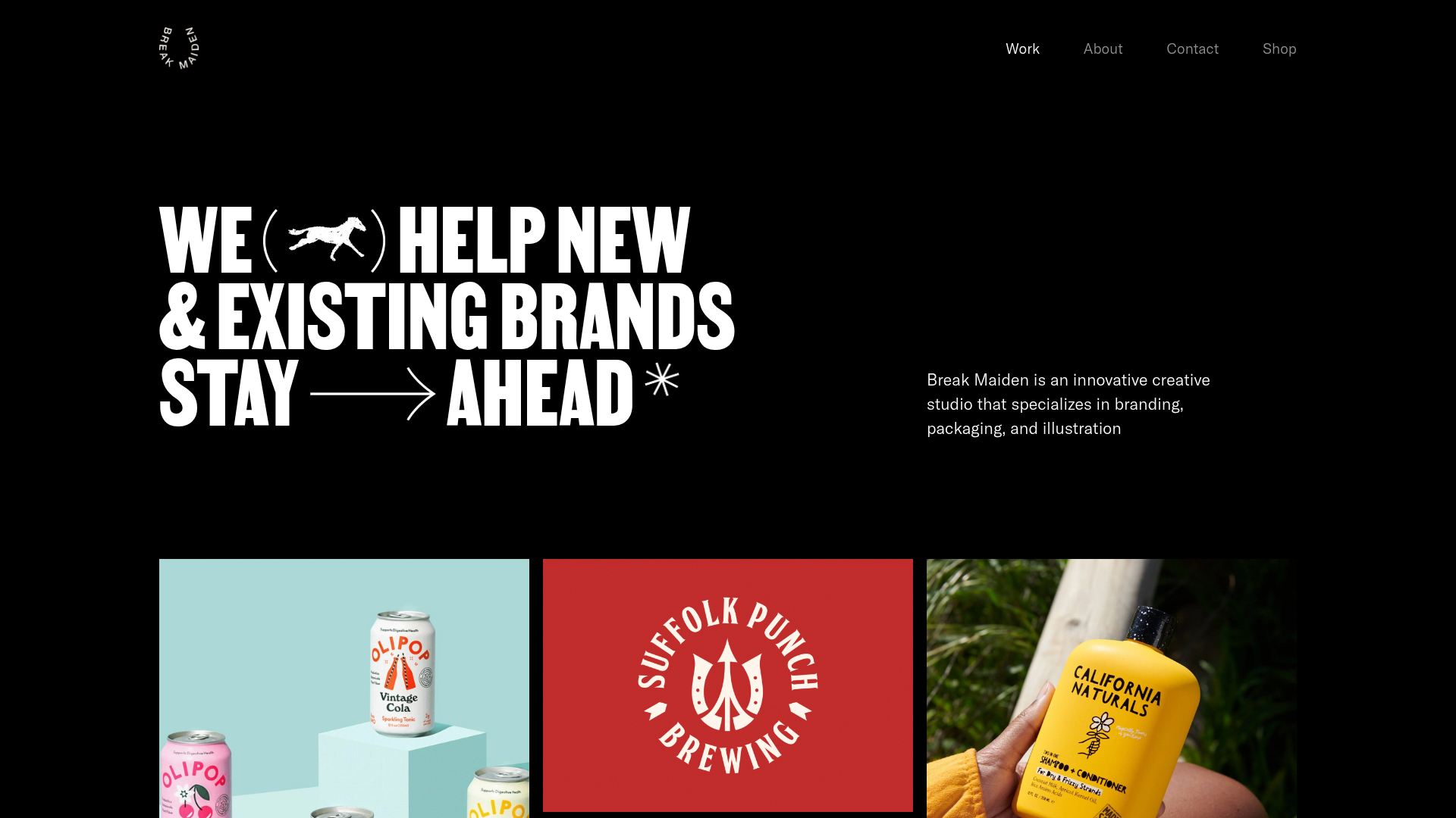
Break Maiden Agency Portfolio Hero
A high-impact dark mode hero section featuring oversized typography with inline GIF icons and a responsive grid for display-heavy case studies.
