Caserne Design Studio Portfolio
A minimalist, high-impact portfolio featuring a dynamic masonry grid of project thumbnails with overlay text and a clean, oversized typography-driven footer.

Overview
Caserne is a high-end design portfolio that utilizes a sophisticated, asymmetrical masonry grid to showcase project thumbnails of varying sizes. It serves as an excellent reference for builders looking to create a visually dense yet organized gallery that balances high-quality imagery with a brutalist, typography-centric layout.
Design System
- Color Palette & Visual Hierarchy: The site uses a high-contrast monochromatic base (pure black and white) to ensure project photography remains the focal point. Bright accents are reserved for project thumbnails (like the 'Avril' orange and 'Mate Libre' greens), while text remains subtle in white or light grey against dark backgrounds.
- Typography System: The design uses a clean, sans-serif font family. The hierarchy is established through weight and placement rather than extreme scale shifts: small, uppercase labels for navigation and categories, and capitalized serif/sans-serif hybrids for large-scale branding in the footer. The footer features an oversized SVG logo that acts as a graphic anchor.
- Page Structure:
- Minimal Sticky Header: A thin black bar with distributed text links for 'Work', 'Culture', 'Notes', 'Studio', and 'Contact'.
- Dynamic Masonry Grid: A collection of
home-collect-itemdivs. Projects are categorized viadata-sizeattributes (Small, Medium, Large) which control the grid spanning. - Metadata Overlays: Each project card (
featured-work-info-wrap) contains a category label with a bullet point (• Work) and a brief sub-title. - Expansive Footer: A data-rich footer containing studio philosophy, contact info, and socials, ending with a massive brand mark.
- Reusable Components:
- The Grid Item: A modular card component containing an
<a>link, afeatured-work-img, and an info wrapper. - The Horizontal Nav: A spacious, edge-to-edge navigation bar suitable for sites with 5-7 top-level pages.
- The Grid Item: A modular card component containing an
- Implementation Clues: The HTML structure reveals a Webflow-based build using
w-dyn-listfor CMS-driven content andw-row/w-colfor the footer layout. The use ofdata-sizeattributes suggests a custom CSS grid or flexbox logic that handles item proportions dynamically.
Use Cases
- Who should clone this: Independent creative directors, architecture firms, and boutique design agencies who want to convey a premium, "gallery-style" aesthetic.
- Effective Remixes: This pattern works well for luxury e-commerce lookbooks, editorial magazines, or high-concept fashion brand portfolios.
- Remix Directions:
- Info Architecture: Swap the visual-heavy grid for a text-based list on hover for a more minimalist "anti-design" feel.
- Brand Style: Replace the black background with soft pastels or earth tones to pivot from "high-fashion" to "lifestyle/wellness."
- Component Re-use: Clone the footer specifically if you need a way to present dense corporate information (address, phone, mission statement) without it feeling cluttered.
- Clone Scope: A full-page clone is recommended to capture the specific rhythm of the masonry grid, but the footer layout can be extracted as a standalone component for any professional services website.
Related Inspirations

Clase Agency Branding Portfolio
A minimalist design agency portfolio featuring a typographic hero section, full-width image articles, sticky title bars, and integrated scrolling text marquees for a clean editorial layout.

Lundqvist & Dallyn Studio Portfolio
Minimalist design studio portfolio featuring a custom video loader, world clock navigation, and a fluid masonry-style grid for high-quality photography and type design showcases.

AcolorBright Design Agency Portfolio
Minimalist bento-style portfolio layout featuring numerical section headers, horizontally scrolling project teasers, and a clean grayscale client logo grid.
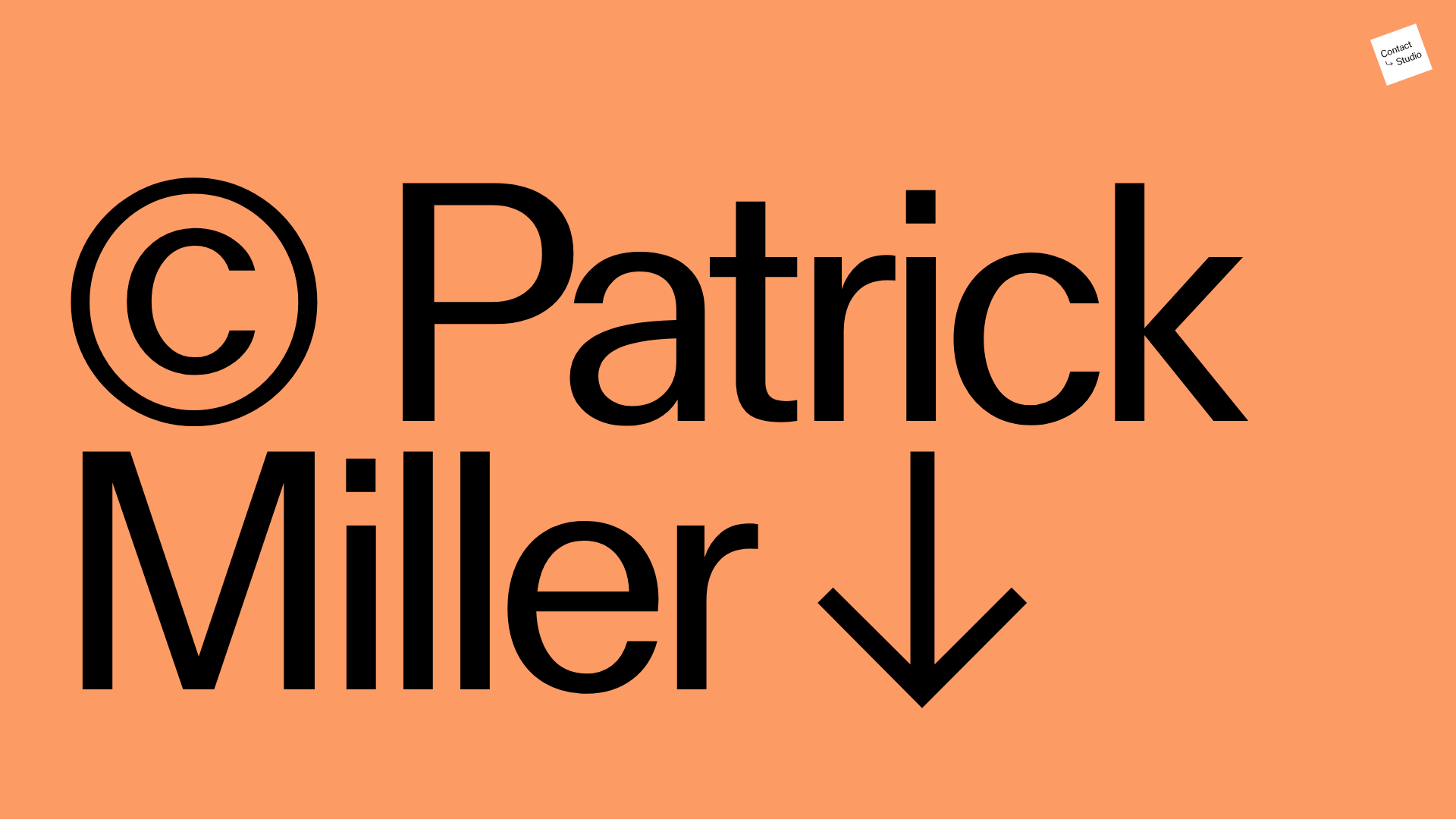
Patrick Miller Photography Portfolio Template
A minimalist, full-bleed photography portfolio featuring a split-screen grid, scroll-triggered section transitions, and integrated Swiper.js image carousels for project galleries.
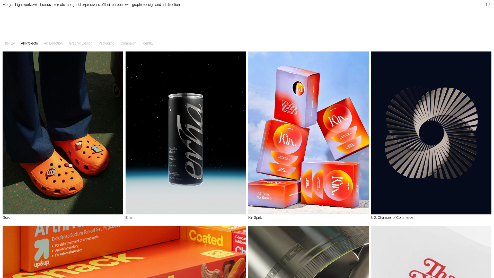
Morgan Light Design Portfolio Grid
A minimalist portfolio layout featuring a multi-column masonry-style grid with categorised project filters, image-based hover states, and smooth slide-based navigation.
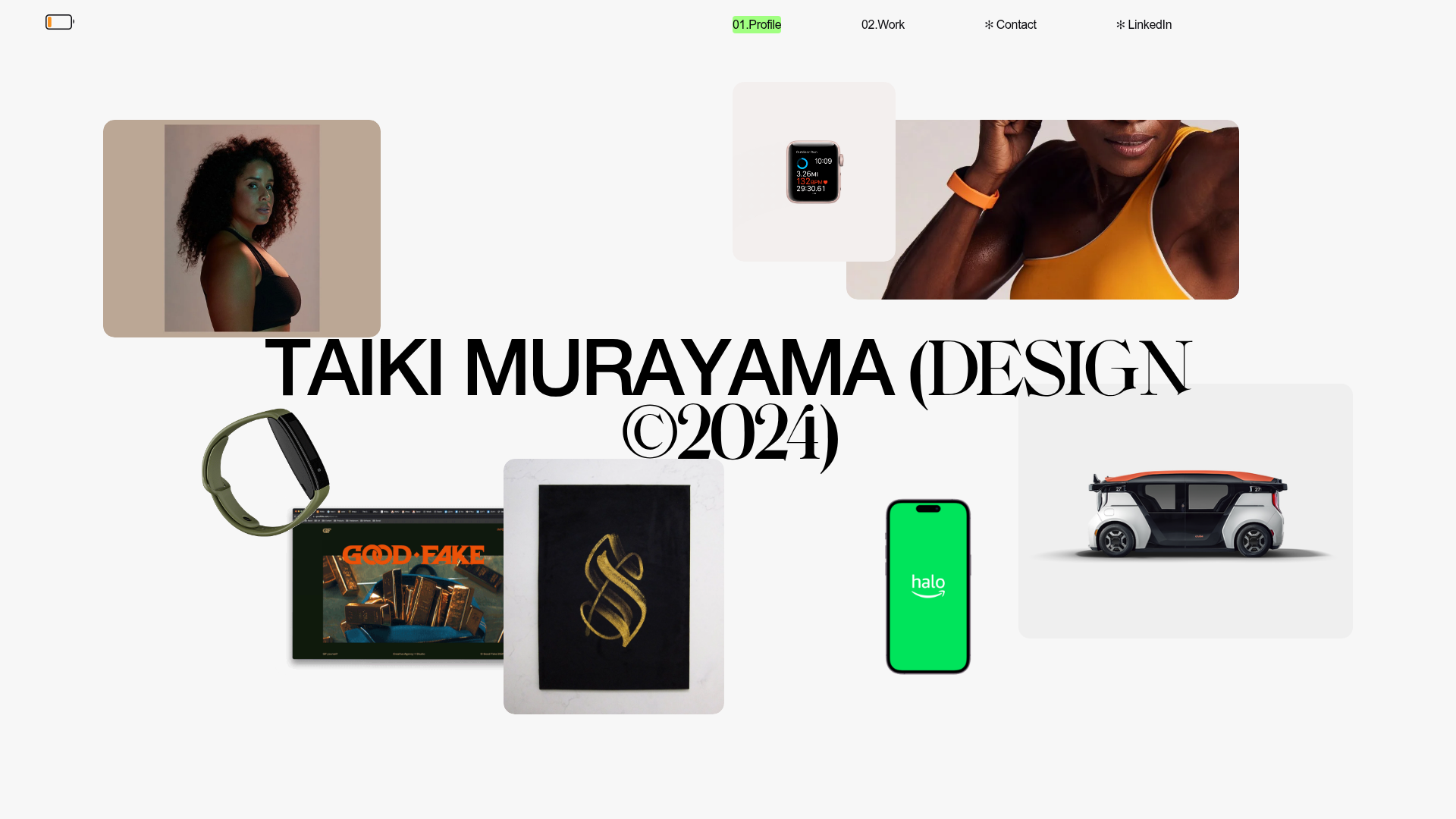
Taiki Murayama Portfolio Bento Grid
A minimalist designer portfolio featuring a dynamic bento-style layout for project imagery, integrated accordion project lists, and high-contrast typography.
