Morgan Light Design Portfolio Grid
A minimalist portfolio layout featuring a multi-column masonry-style grid with categorised project filters, image-based hover states, and smooth slide-based navigation.
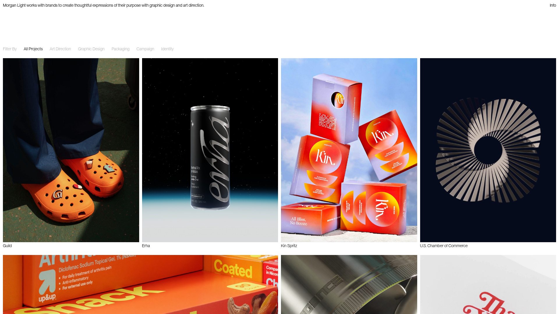
Overview
This portfolio site showcases a minimalist, high-impact grid layout designed for visual artists and design studios. It features a sophisticated multi-column masonry-style approach that elegantly handles variable media including high-resolution images and autoplaying video. It is an excellent clone reference for building a performance-oriented, media-heavy gallery with a clean, Swiss-style typography.
Design System
- Color Palette & Visual Hierarchy: The system uses a strict monochrome base (pure white background, black text) to ensure that the vibrant, multi-colored project thumbnails provide the primary visual interest. Text hierarchy is minimal, with projects denoted in a single small font size and a light gray secondary color (#B5B5B5) for metadata and filters.
- Typography: The layout uses a clean, modern sans-serif typeface (referenced as
font-neuein the HTML). Titles are significantly smaller than the imagery, prioritizing visual work over descriptive text. Leading is tight (1rem) reinforcing the dense, grid-like aesthetic. - Page Structure: The site flows from a persistent top header containing brand purpose, into a flexible filtering bar, followed by a responsive grid. The grid alternates between single-column thumbnails (
aspect-[0.738]) and double-width feature banners (col-span-2), creating a rhythmic break in the masonry. - Reusable Components:
- Media Cards: Built with
aspect-ratiocontainers to maintain grid stability before images load. - Category Filters: A horizontal list of text-only filters that toggle state between black (active) and light gray (inactive).
- Slider Integration: Utilizes
keen-sliderfor horizontal sliding within individual grid cells, allowing users to view multi-image projects without leaving the main page.
- Media Cards: Built with
- Interaction & Motion: The UI employs
backdrop-blur-xlandblur-image-mask-desktopclasses to create a sophisticated blur-on-hover effect. Transition durations are snappy (75ms to 150ms) to ensure the interface feels responsive. - Implementation Clues: The project is built with Next.js and Tailwind CSS (evidenced by utility classes like
md:grid-cols-4andmd:pt-[10rem]). Media is served via Sanity.io CDN for optimized image delivery.
Use Cases
- Who should clone this: Independent designers, art directors, and boutique creative agencies who need a high-end, gallery-first web presence.
- Effective Remixes: This pattern can be effectively remixed for fashion lookbooks, architecture firm archives, or high-end product catalogs where photography defines the brand identity.
- Remix Directions: Replace the static masonry grid with a horizontal scroll for mobile, or swap the background to a dark/muted tone to change the mood while keeping the
col-span-2logic to highlight specific case studies. - Clone Scope: The most valuable element to clone is the responsive grid system and the
keen-sliderintegration within cards, which provides interactive depth without the complexity of traditional modal-based navigation.
Related Inspirations

Clase Agency Branding Portfolio
A minimalist design agency portfolio featuring a typographic hero section, full-width image articles, sticky title bars, and integrated scrolling text marquees for a clean editorial layout.

Caserne Design Studio Portfolio
A minimalist, high-impact portfolio featuring a dynamic masonry grid of project thumbnails with overlay text and a clean, oversized typography-driven footer.

Lundqvist & Dallyn Studio Portfolio
Minimalist design studio portfolio featuring a custom video loader, world clock navigation, and a fluid masonry-style grid for high-quality photography and type design showcases.

AcolorBright Design Agency Portfolio
Minimalist bento-style portfolio layout featuring numerical section headers, horizontally scrolling project teasers, and a clean grayscale client logo grid.
Manna Architects Minimalist Portfolio Grid
A clean, single-page architecture portfolio featuring a centered intro, a varied multi-column image gallery with captions, and a detailed project service breakdown.
Websmith Studio Portfolio Site Template
A clean studio portfolio featuring a responsive bento-style project grid, interactive process cards, and a split-screen testimonial section built with Tailwind CSS.
