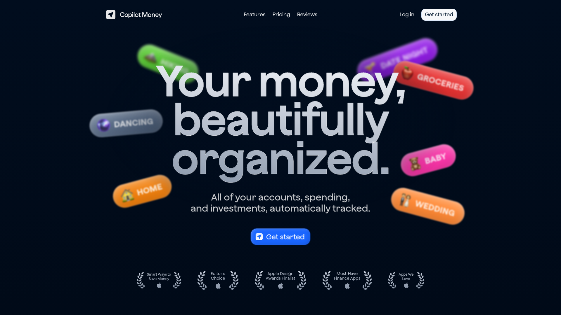
Copilot Money Finance Landing Page
A dark-themed finance landing page featuring a centered animated hero section with floating category badges, integrated trust badges, and a clean minimalist navigation bar.
Overview
This is a high-performance landing page for Copilot Money, an automated finance tracker. It is a premier reference for builders due to its sophisticated use of dark mode aesthetics, depth-of-field visual effects, and its ability to communicate product value through high-impact typography and floating brand-specific UI elements.
Design System
- Color Palette & Visual Hierarchy: The site uses a deep navy-to-black background (#000000 to #03080e), creating a premium canvas for vibrant, multi-colored neon category badges (orange, pink, purple, green). The primary action is highlighted with a bright blue CTA button (#2563EB), ensuring clear goal conversion against the dark backdrop.
- Typography System: A bold, semi-rounded geometric sans-serif (resembling Inter or Public Sans) is used. The hero headline features tight letter-spacing and a massive scale to command attention, while secondary copy remains light and breathable with increased line height for readability.
- Structure & Flow: The layout follows a classic centered hero configuration. The flow starts with a minimalist top-level nav, followed by the large visual headline, a secondary functional subtitle, and a primary CTA. Trust signals (Apple Awards and Editor’s Choice badges) are anchored at the bottom of the fold to build immediate credibility.
- Reusable Components:
- Glassmorphic Badges: The floating 'Dancing', 'Groceries', and 'Wedding' pills use subtle gradients and blurs that can be reused for any category-based product.
- Navigation Bar: A transparent sticky header with simple text links and a high-contrast ghost button ('Get Started').
- Trust Section: A horizontal row of SVG-based laurel wreaths and Apple logos that are perfectly scaled for social proof.
- Interaction & Motion: The design implies a parallax or floating animation for background badges. The primary CTA button features high-contrast hover states, and the use of blurred background elements suggests a focus on depth-of-field transitions.
Use Cases
- Who should clone this pattern: SaaS developers building premium consumer tools, fintech startups focusing on personal finance, or mobile app developers looking to showcase a 'best-in-class' iOS aesthetic.
- What products can remix it effectively: Portfolio trackers, health and wellness apps, productivity dashboards, and luxury subscription services.
- Practical remix directions: Swap the finance-related badges (like 'Groceries') for industry-specific tags such as 'Deep Work', 'HIIT', or 'Crypto'. The dark background can be shifted to a brand-specific deep hue (like forest green or deep burgundy) while maintaining the white typography for high legibility.
- Suggested clone scope: The hero section is the standout feature and should be cloned as a complete module; the trust badge row is a highly reusable secondary component for any landing page needing immediate authority.
Related Inspirations

Vercel AI Cloud Landing Page
A modern landing page featuring a minimalist dark-themed navbar, a grid-overlay hero section with radial color gradients, and high-contrast typography for customer success stories.
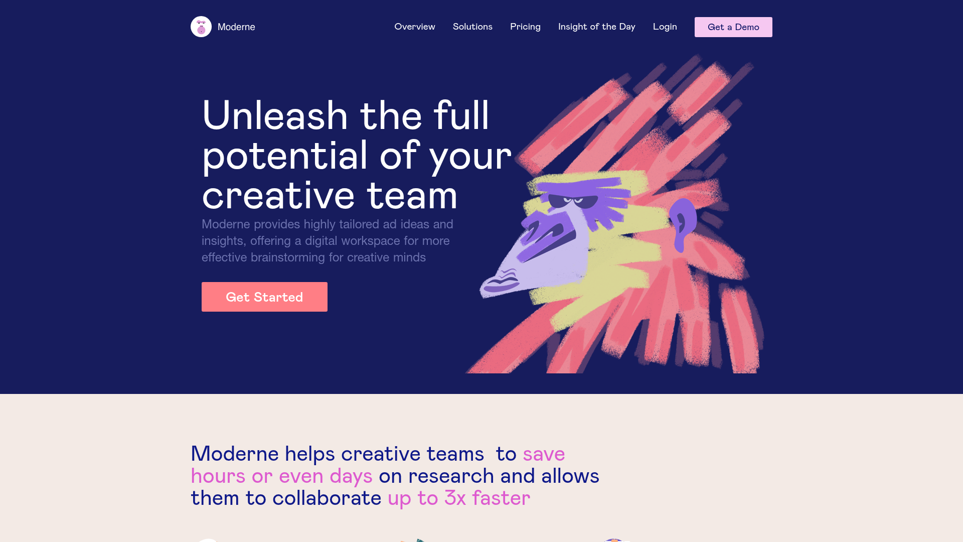
Moderne Creative Landing Page
A high-contrast landing page featuring a dark hero section with an artistic illustration overlay, distinct alternating content blocks, and a visual comparison bar chart component.
EverAfter AI Customer Portal Hero
A SaaS landing page template featuring a glowing product carousel, auto-scrolling logo marquee, accordion-based feature reveals, and an embedded scheduling widget.
LaunchDarkly SaaS Landing Page Hero
A dark-themed developer marketing layout featuring a glowing blurred background, sticky pill-shaped navigation, tabbed feature showcases, and a horizontal logo marquee.
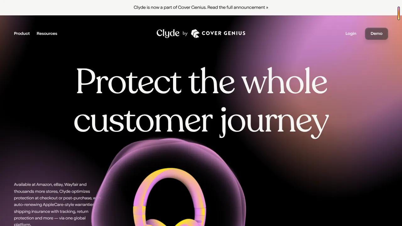
Clyde Insurance Landing Page with Animated Hero
A dark-themed landing page featuring a prominent serif headline, a product-focused animated blob hero, and a clean minimalist navigation bar.
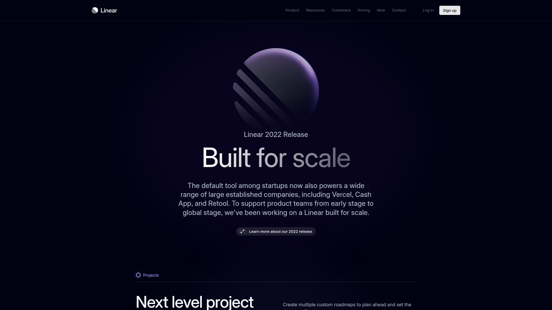
Linear 2022 Product Release Page
A high-end dark mode product launch page featuring a 3D glassmorphic logo, sleek typography, and a structured layout for feature announcements.
