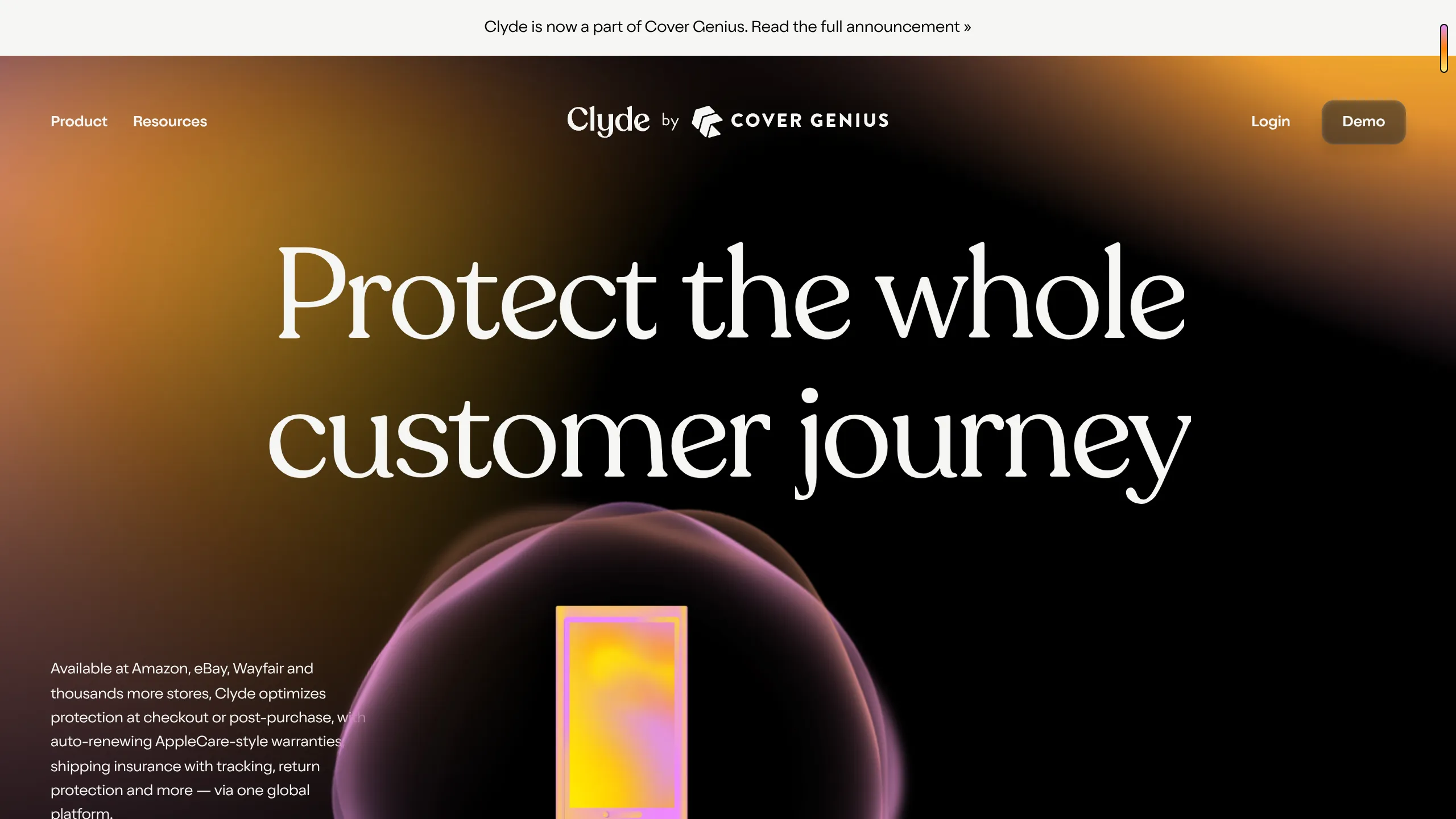
Clyde Insurance Landing Page with Animated Hero
A dark-themed landing page featuring a prominent serif headline, a product-focused animated blob hero, and a clean minimalist navigation bar.
Overview
This is a high-end, dark-themed landing page for Clyde, an insurance and warranty platform. It is an exceptional clone reference because it successfully blends a minimalist layout with sophisticated motion design, such as animated gradient backgrounds and scrolling image mosaics, to create a premium "enterprise-tech" feel.
Design System
- Color Palette & Visual Hierarchy: The site uses a deep black background (
#000000) paired with vibrant, neon-accented gradients in purple, pink, and yellow. Hierarchy is established through high-contrast white text for primary headings and muted gray/book-weight text for secondary descriptions. - Typography: The design features a distinct contrast between a sophisticated serif font for primary headlines (
h1,h2) and a clean, modernist sans-serif for body copy and navigation. Headlines use wide tracking and large scales (h2-alt) to anchor the page, while functional labels use all-caps eyebrow styling. - Page Structure: The flow begins with an immersive Hero section containing a 3D-style animated product orb, followed by a brand logo carousel, a multi-column scrolling mosaic of product screenshots, a text-reveal tagline section, and finally a vertically stacked feature section with sticky/scroll-triggered slide transitions.
- Reusable Components:
- Navigation Bar: A sticky header with nested dropdown panels for 'Product' and 'Resources'.
- Glassmorphic Buttons: Rounded buttons with subtle box shadows and dark backgrounds.
- Scrolling Mosaic: A sophisticated three-column grid where images move at different speeds (
data-scroll-speed) during scroll. - Stepped Discovery Cards: A horizontal scroll/sticky interaction that reveals content layers one by one.
- Interaction & Motion: The site relies heavily on scroll-linked animations. Evidence from the HTML (
data-scroll,splitting) shows character-level text animations and parallax effects on the mosaic columns. Gradients are rendered on canvas elements, suggesting a performant, custom-coded background animation. - Implementation Clues: Built using Next.js (
__nextID) and Radix UI primitives. It utilizes the "Splitting" library for text effects and a custom scroll-management system (likely Locomotive Scroll or GSAP ScrollTrigger) to handle the varied scroll speeds and progress bars.
Use Cases
- Who should clone this: B2B SaaS companies, fintech platforms, or luxury consumer electronics brands looking to establish immediate visual authority and a "premium" brand identity.
- Remixing effectively: This pattern is perfect for hardware-software hybrid products (e.g., smart home devices, fitness tech) where high-quality product photography can be placed in the scrolling mosaic columns.
- Practical remix directions:
- Brand Swap: Change the purple/pink gradients to brand-specific secondary colors while keeping the black background for a different "dark mode" aesthetic.
- Info Architecture: Adapt the "Why Clyde?" sticky section for product-step tutorials or feature deep-dives.
- Section Reuse: Clone the scrolling image mosaic independently to showcase a portfolio or a large feature set without using a standard grid.
- Clone Scope: For a fast win, clone the Hero and the brand carousel. For a full brand overhaul, clone the entire page including the complex sticky feature transitions and canvas-based gradients.
Related Inspirations

Vercel AI Cloud Landing Page
A modern landing page featuring a minimalist dark-themed navbar, a grid-overlay hero section with radial color gradients, and high-contrast typography for customer success stories.
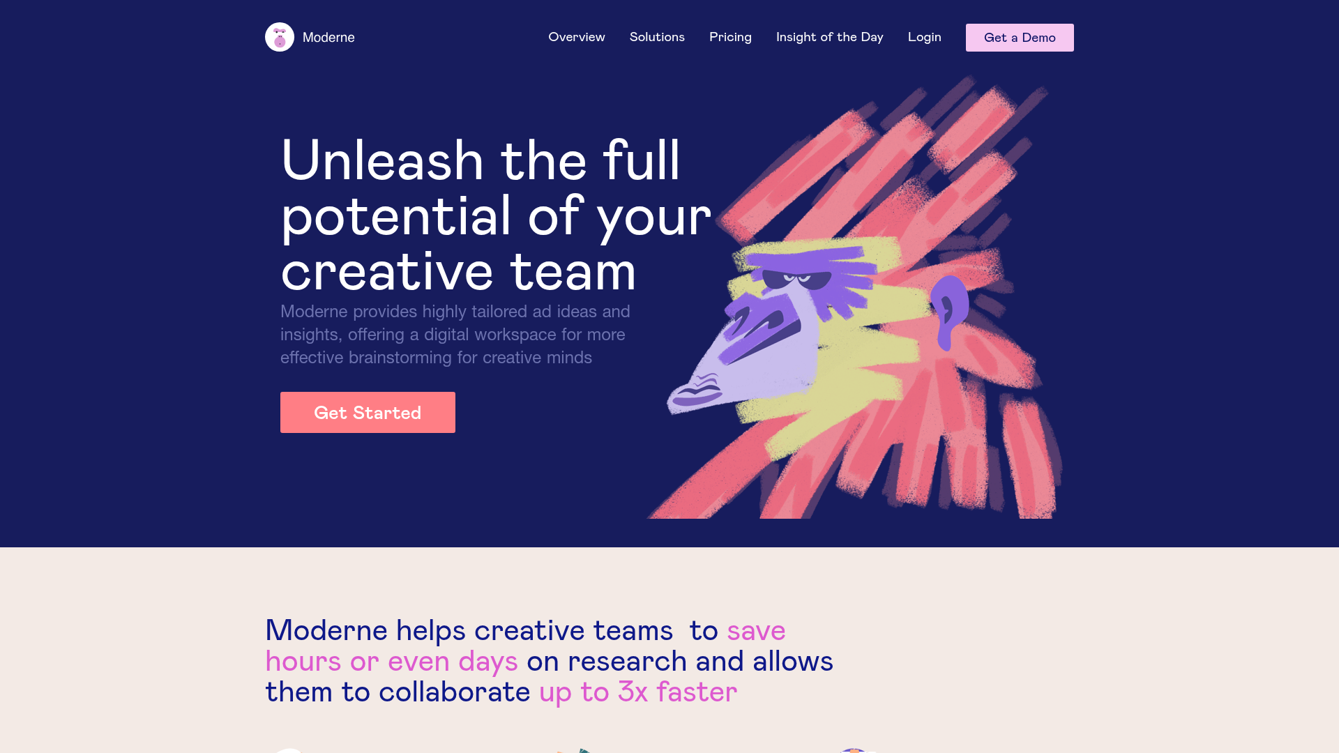
Moderne Creative Landing Page
A high-contrast landing page featuring a dark hero section with an artistic illustration overlay, distinct alternating content blocks, and a visual comparison bar chart component.
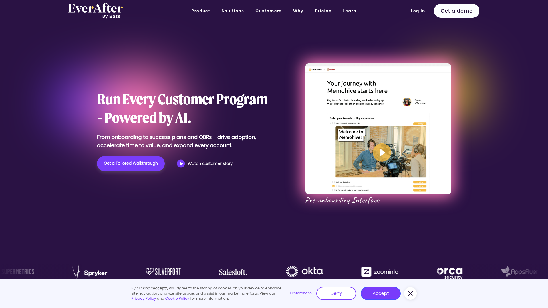
EverAfter AI Customer Portal Hero
A SaaS landing page template featuring a glowing product carousel, auto-scrolling logo marquee, accordion-based feature reveals, and an embedded scheduling widget.
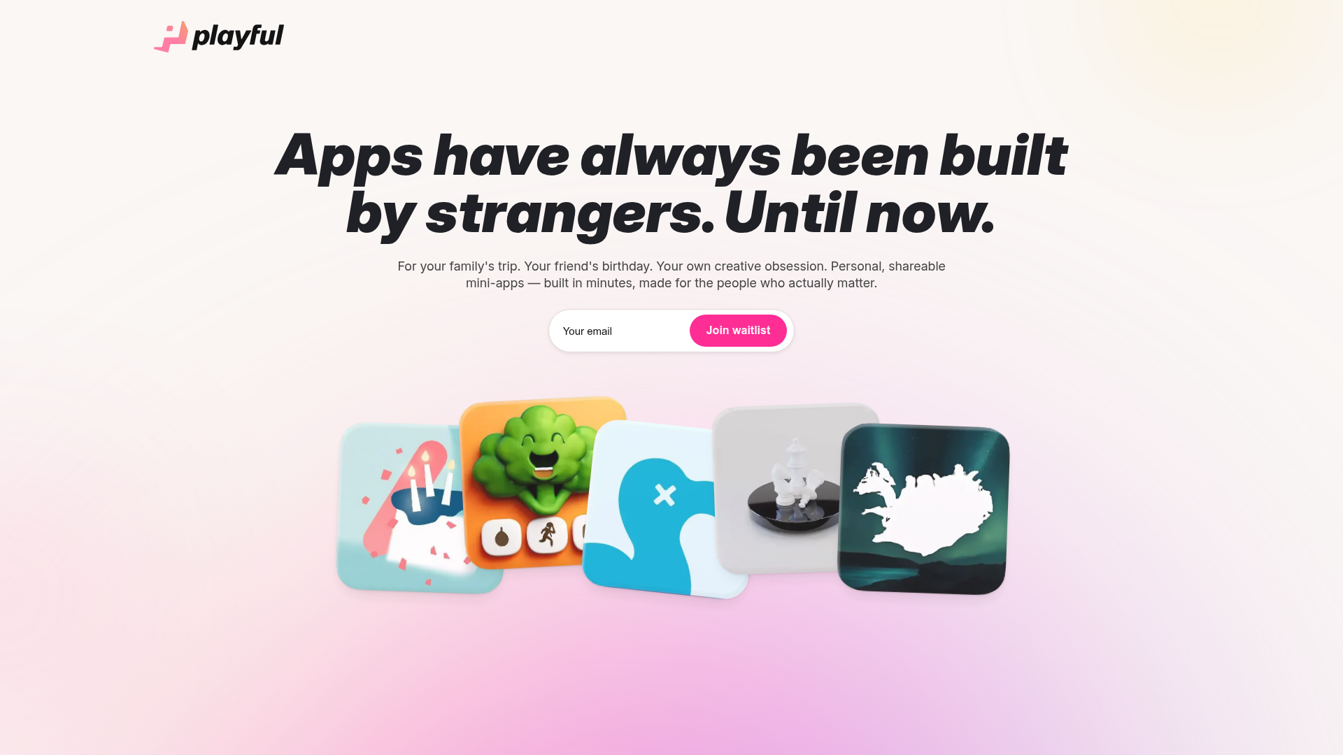
Playful Waitlist Landing Page
A minimalist landing page featuring an interactive magnetic hero image gallery, a marquee text slider, and a scroll-triggered blurred text reveal animation.
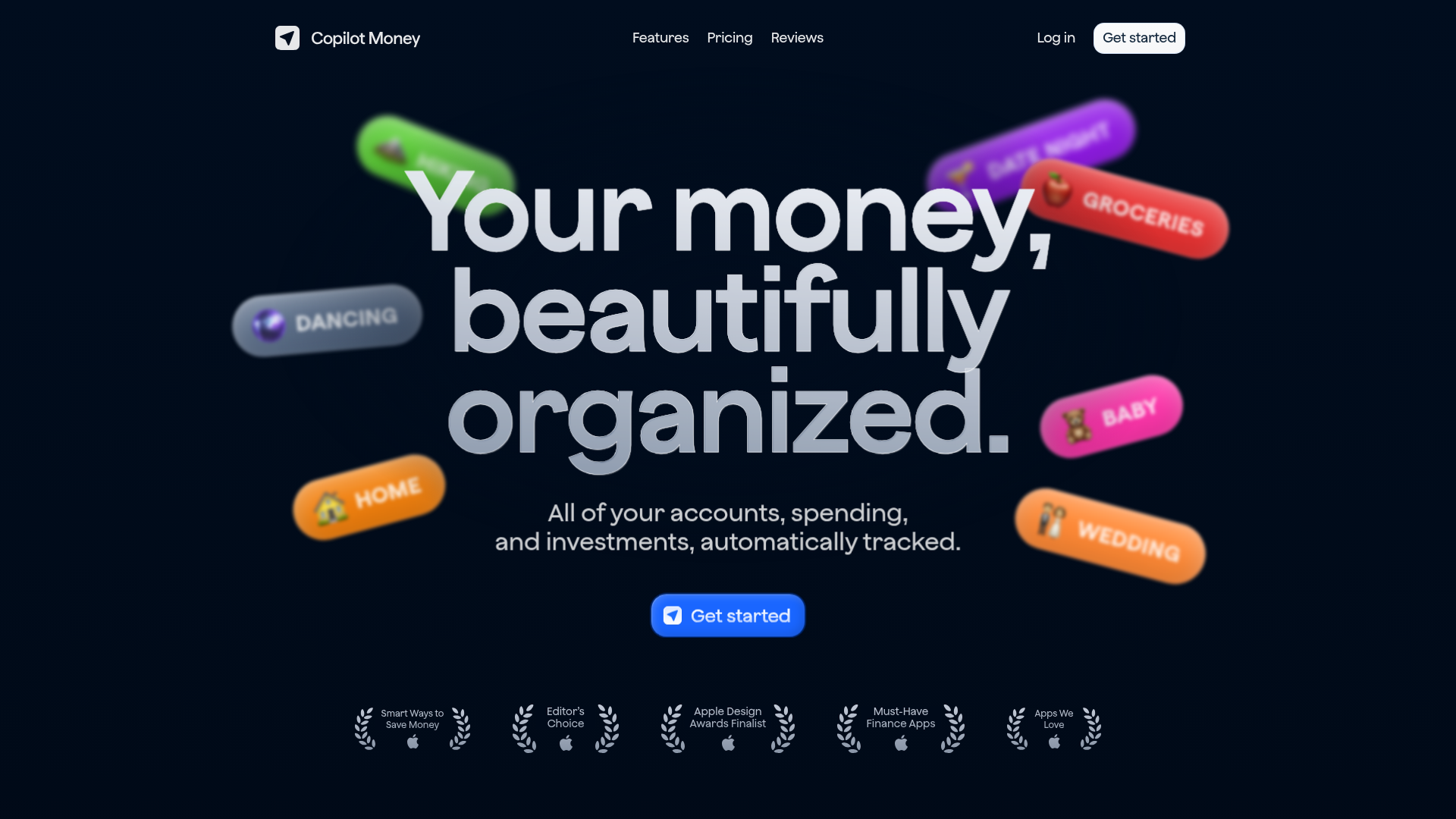
Copilot Money Finance Landing Page
A dark-themed finance landing page featuring a centered animated hero section with floating category badges, integrated trust badges, and a clean minimalist navigation bar.
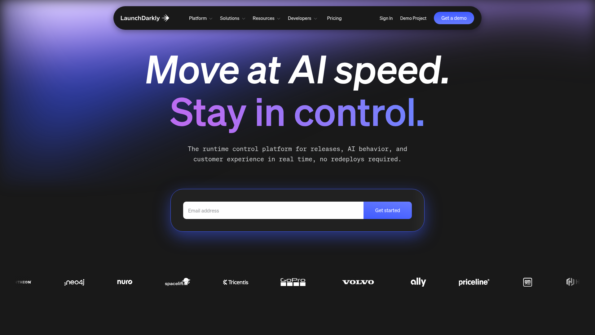
LaunchDarkly SaaS Landing Page Hero
A dark-themed developer marketing layout featuring a glowing blurred background, sticky pill-shaped navigation, tabbed feature showcases, and a horizontal logo marquee.
