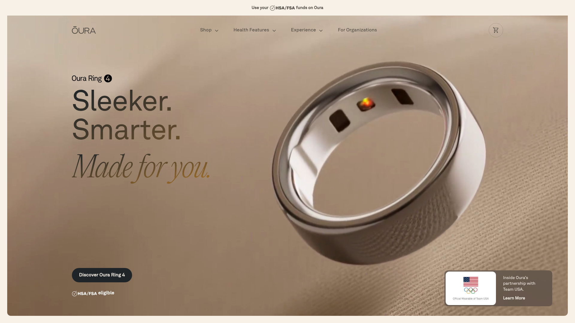
Oura Ring Minimalist Product Splash
A high-end hardware hero section featuring an oversized floating 3D product asset, serif typography, and a subtle top bar for HSA/FSA eligibility notifications.
Overview
This landing page is a masterclass in high-end hardware marketing, using a minimalist aesthetic to position a wearable device as a premium lifestyle object. It is a strong reference for its sophisticated use of depth, cinematic imagery, and clean whitespace that allows the product to remain the primary focus.
Design System
- Color Palette & Visual Hierarchy: The site uses a sophisticated 'Sandstone' palette (primarily
bg-sandstone-200) characterized by warm creams, muted greys, and slate accents. Hierarchy is established through size and depth, with the product asset occupying nearly 50% of the viewport, supported by dark slate-900 primary action buttons for maximum contrast. - Typography System: A dual-font strategy is employed. A clean, medium-weight sans-serif handles technical headers and labels (Sleeker. Smarter.), while a delicate, italicized serif (Made for you.) is used for emotional resonance and emphasis. Large-scale fluid typography (up to
10vwor8xl) defines the hero section. - Page Structure & Flow: The flow starts with a full-height (h-svh) cinematic hero section with an integrated 'chiclet' for social proof (Team USA partnership). This transitions into a ring explorer module featuring dual image blocks with gradient overlays, followed by a horizontal scrollable testimonial section using high-resolution lifestyle photography.
- Reusable Components:
- Hero Chiclet: A floating, translucent card (
backdrop-blur-xl) with a 3:2 aspect ratio image and a 'Learn More' CTA. - Pill Buttons: Rounded-full buttons with bold labels (
rounded-full py-3 px-6). - Grid Cards: Sections like the 'In the News' block use a bento-style layout with rounded corners (
rounded-lg) and background image focal points.
- Hero Chiclet: A floating, translucent card (
- Interaction & Motion: The HTML indicates heavy use of a
motionComponentclass, likely leveraging libraries like Framer Motion for scroll-triggered fades, blurs, and subtle transforms. Hover states on buttons shift frombg-slate-900tobg-sandstone-500. - Implementation Clues: Built with React and Tailwind CSS, utilizing utility classes for responsive layouts (
gridContainerV3,col-start-main). It uses a mobile-first approach, hiding large video assets (md:block) and swapping to mobile-specific mp4s for performance.
Use Cases
- Who should clone this: Designers building luxury e-commerce sites, high-tech hardware landing pages, or high-end health/wellness service platforms.
- Effective Remixing: This pattern works exceptionally well for 'one-hero' products (watches, furniture, custom tech). The structure can be remixed by swapping the organic 'Sandstone' colors for high-contrast neon/black to suit a gaming brand, or deep blues for a corporate SaaS product.
- Remix Directions: Reuse the 'Hero Chiclet' pattern for seasonal promotions or trust badges without cluttering the main navigation. The 'Form meets Function' section serves as a great template for explaining complex hardware features via a clean tabbed interface.
- Suggested Scope: A full-page clone is ideal for brands wanting a premium aesthetic, but the hero section independently is a powerful asset for any splash page requiring immediate visual impact.
Related Inspirations

Finn Pet Supplements Landing Page
An e-commerce landing page featuring high-contrast typography, a sticky brand logo banner, parallax scroll effects on product headers, and a clean product grid.
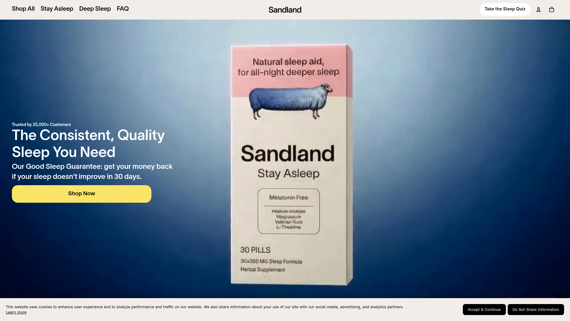
Sandland Sleep Product Landing Page
A high-conversion Shopify layout featuring split-video hero sections, logo-based social proof ribbons, and a testimonial slider integrated with biometric sleep tracker results.
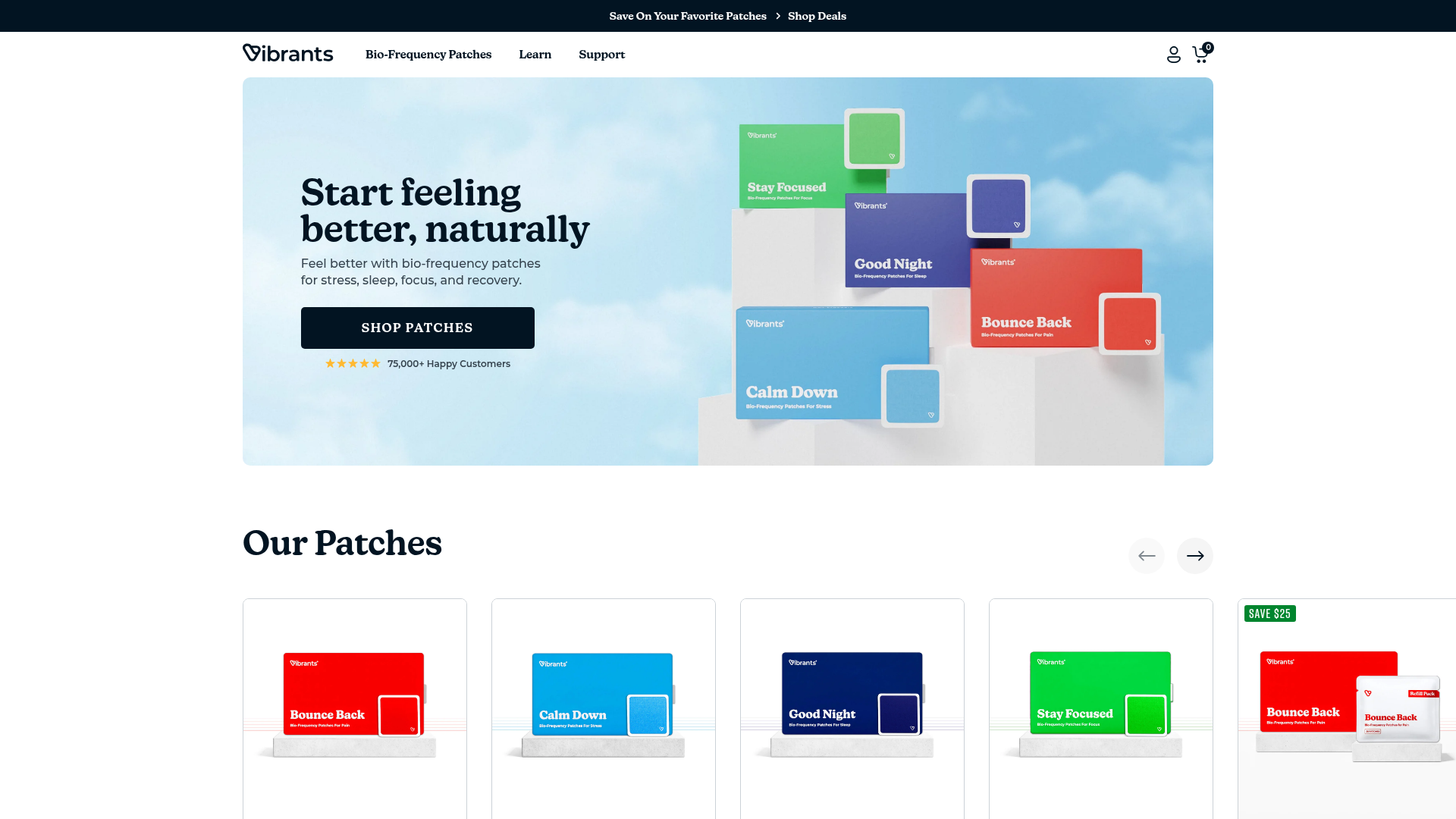
Vibrants Wellbeing E-commerce Landing Page
A clean Shopify-style landing page featuring a full-width hero with overlaid product cards, a horizontal product slider, and interactive cart drawer with utility progress bars.
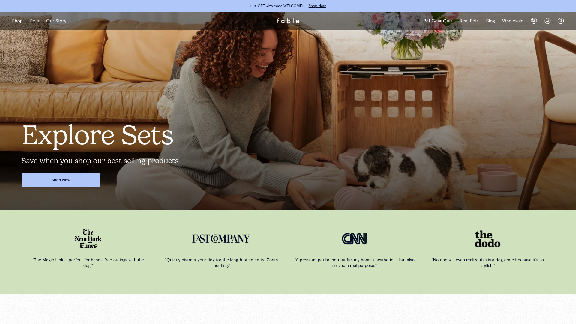
Fable Pets E-commerce Landing Page
A minimalist lifestyle pet brand template featuring a high-impact hero section, a clean logo trust bar, and a centered navigation menu.
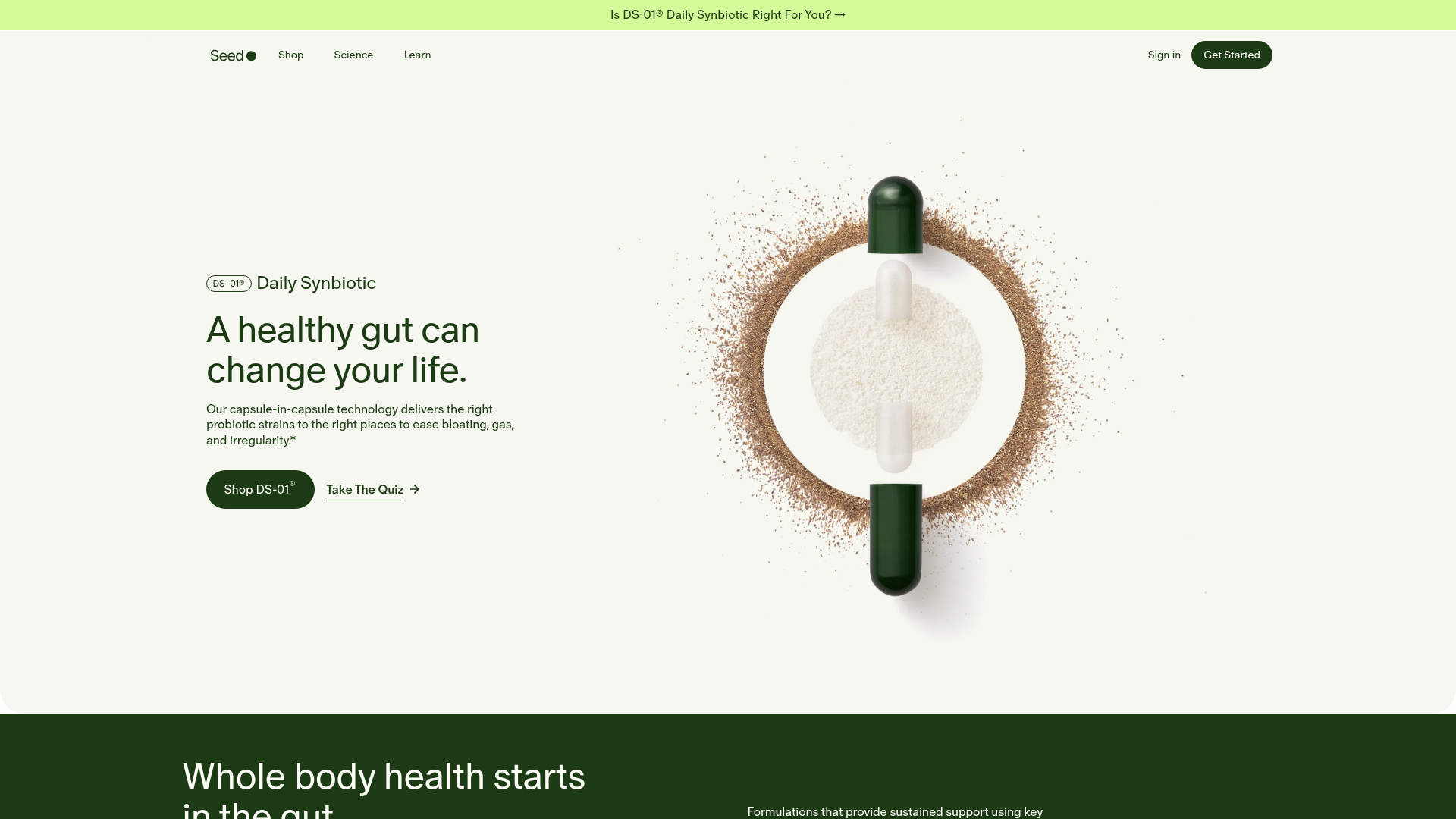
Seed Health Landing Page
An elegant wellness landing page featuring a full-viewport parallax hero, vertical swiper transitions, an interactive product carousel, and a custom video gallery for customer stories.
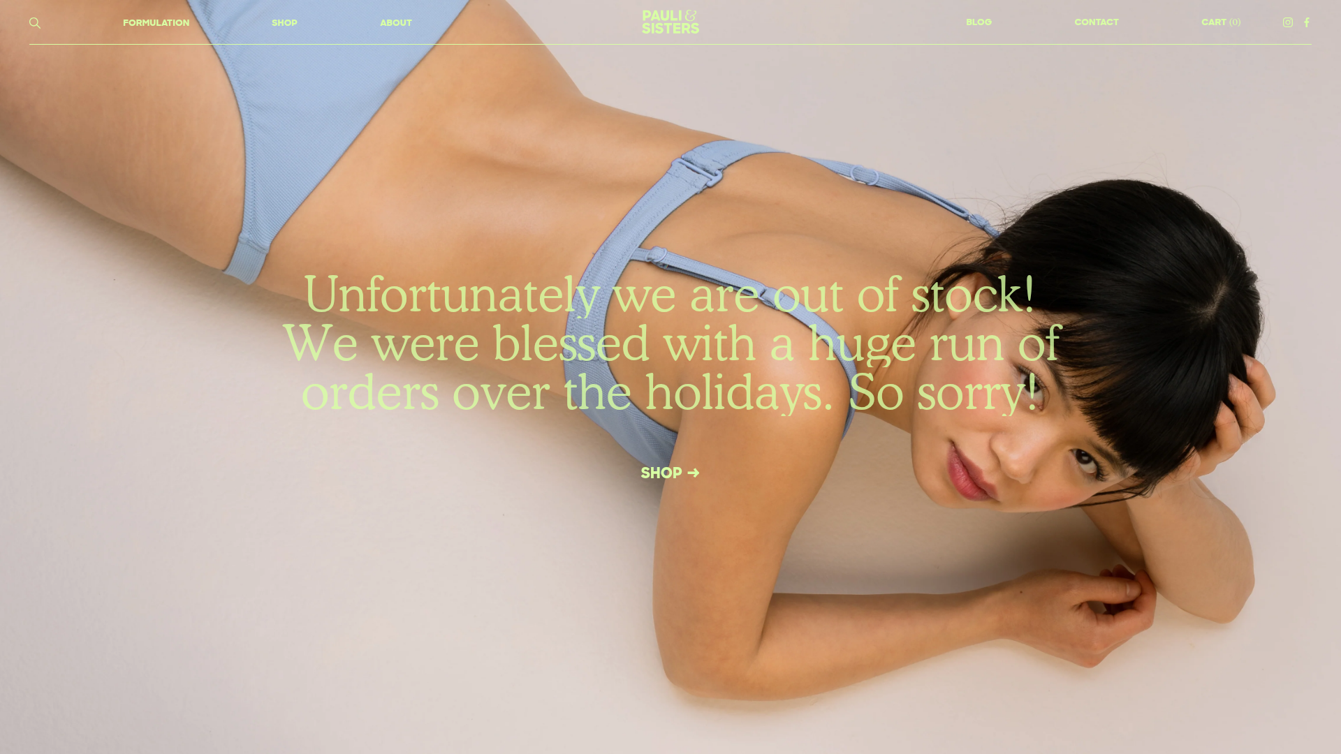
Pauli & Sisters Landing Page
A minimalist e-commerce design featuring a full-width hero image with large overlapping serif text, an interactive ingredient explorer, and a clean split-block layout.
