Mire Studio Dynamic Bento Portfolio
A creative design studio site featuring a high-contrast bento grid layout with large SVG typography, magnetic button interactions, and vibrant color-shifting project blocks.
Overview
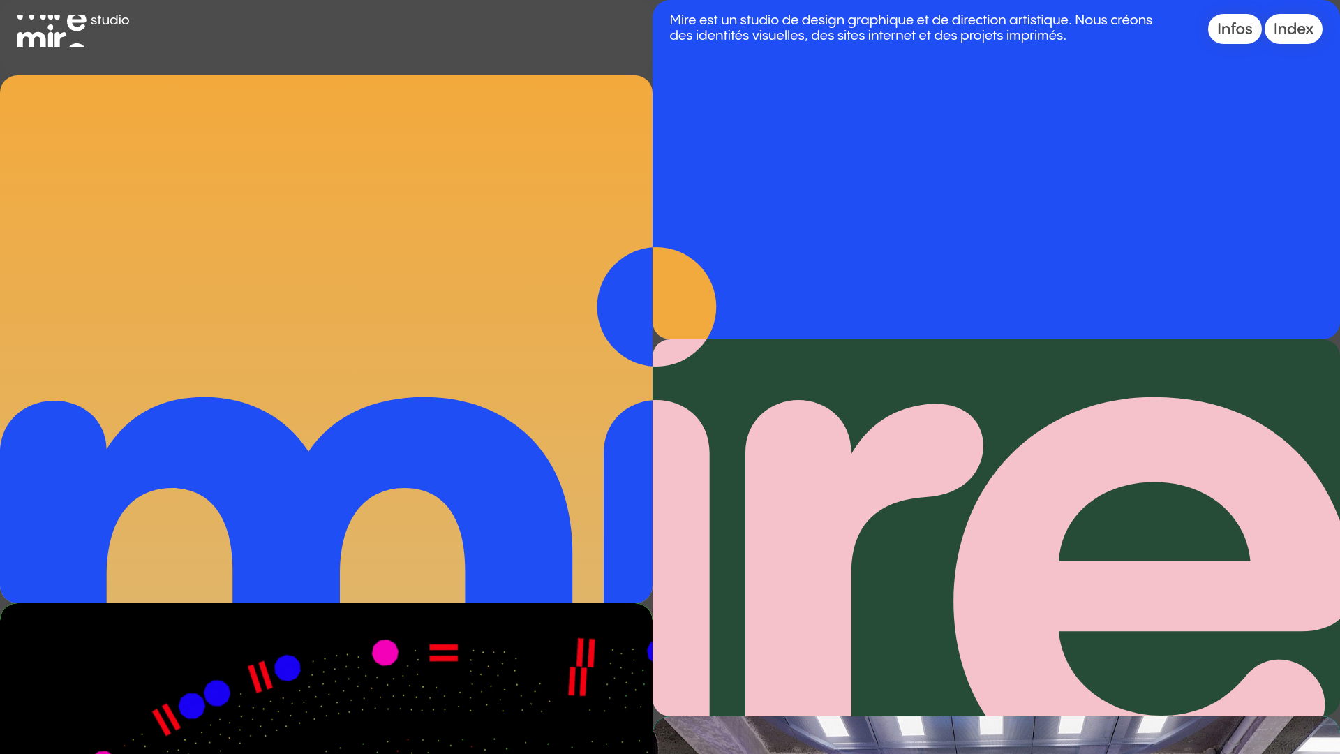
This website is a bold, modern portfolio for a graphic design studio that utilizes a high-impact bento grid layout dominated by massive SVG typography and vibrant color blocks. It is a powerful reference for builders looking to master CSS grid complexity, fluid responsive layouts, and the use of scale as a primary design element.
Design System
- Color Palette & Visual Hierarchy: The site uses a high-contrast, maximalist palette featuring electric blue (approx
#204ef5), golden yellow (#f3a93d), forest green (#264c38), and soft pink. Each grid block has a dedicated theme color that shifts as the user scrolls, creating a dynamic visual journey where the background and project containers interact. - Typography: The identity is centered around a massive, custom SVG wordmark ("mire") that spans across multiple grid cells. Secondary typography follows a clean, minimalist sans-serif for body text and navigation labels like "Infos" and "Index," keeping the focus on the colossal letterforms.
- Page Structure: The layout consists of a multi-column row structure (
main-row) containing nested blocks. Some blocks are purely decorative background-image containers, while others hold project thumbnails or studio information. The grid relies on varyingvhheights (from10vhto70vh) andflex-growvalues to create a non-uniform, masonry-style flow. - Reusable Components:
- Magnetic Buttons: Floating navigation circles and project title tags that react to cursor proximity.
- Dynamic Bento Blocks: Rectangular containers with rounded corners (
border-radius: 15px) and embedded background SVGs. - Thumbnail Containers: Aspect-ratio-preserving boxes that hold project imagery with lazy-loading transitions.
- Interaction & Motion: The site uses Barba.js for smooth page transitions and GSAP-style anime-on-enter classes for staggered block appearance. The magnetic button effect provides a tactile feel, while SVG background-color shifts (indicated by
data-biglogo-colorattributes) provide a cohesive brand experience across different project contexts. - Implementation Clues: The site is built with a custom grid framework (classes like
col-1andmain-row) and uses a layout strategy where SVG icons are embedded as base64 strings within the CSSbackground-imageof.blockelements, ensuring rapid rendering of complex vector graphics.
Use Cases
- Who should clone this: Creative agencies, independent designers, or architects who want a portfolio that feels like a physical gallery installation rather than a standard list of links.
- Remix Directions:
- Corporate Adaptation: Swap the vibrant palette for monochromatic tones and replace the massive SVG wordmark with large-scale headlines to create a sophisticated bento-style dashboard.
- Information Architecture: Use the grid for a complex landing page where each card represents a unique service or team member, maintaining the
vh%-basedheight system for a full-screen immersive feel.
- Suggested Clone Scope: A quick section clone is ideal for developers wanting to capture the "magnetic button" logic or the specific responsive grid logic (where blocks hide on mobile via
m-d-none). A full-page clone is best for those wanting to replicate the seamless page-to-page transition system.
Related Inspirations
Play Studio Minimalist Portfolio Landing
A high-impact agency layout featuring a oversized typography header, a full-width integrated Vimeo video background, and a unique expandable accordion list for industry showcases.
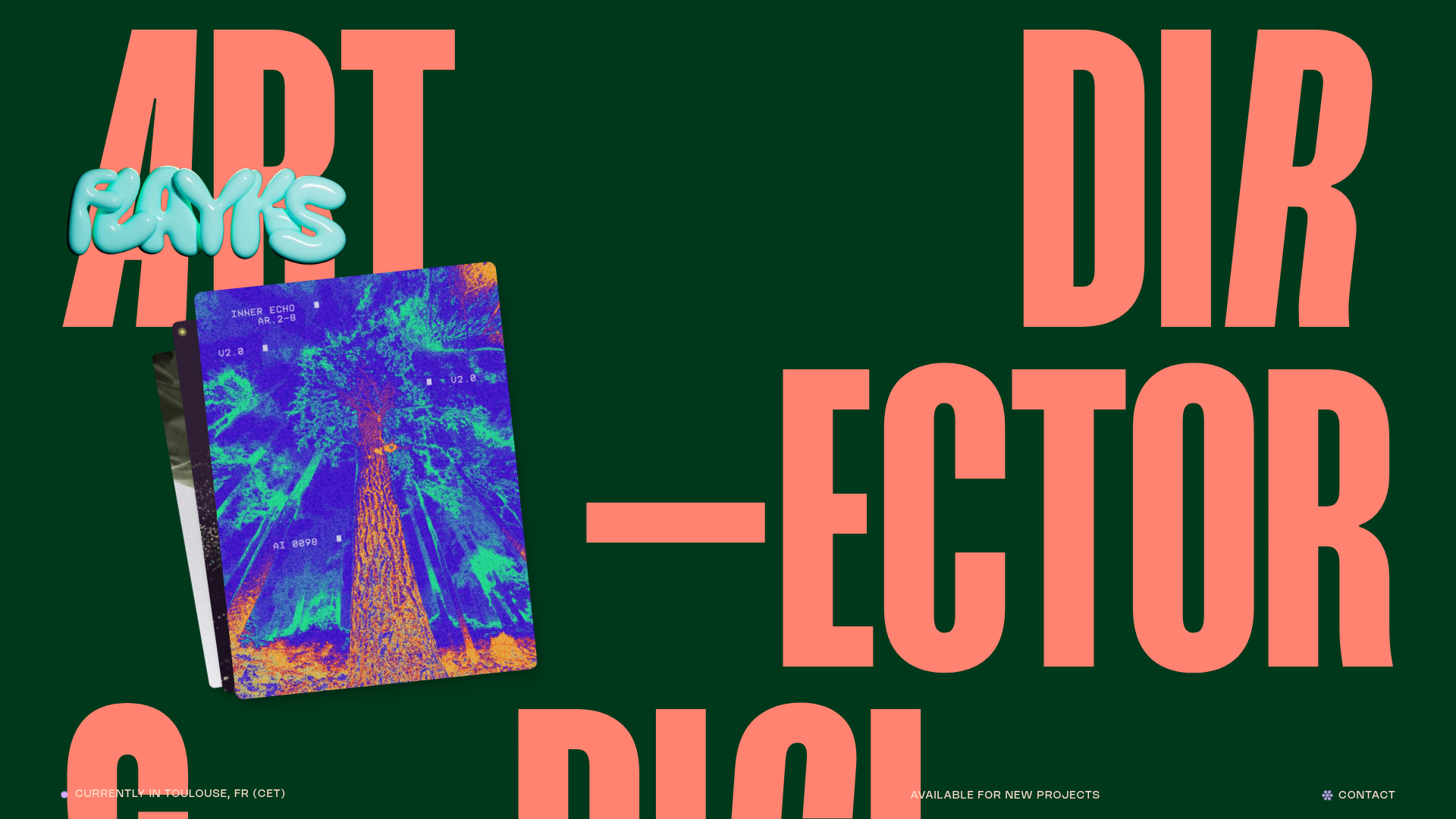
Flayks Digital Portfolio with Floating Cards
A high-end creative portfolio featuring an overlapping card stack hero, complex typography animations, and modular project showcase sections with Svelte-based interactive components.

Something Special Studios Agency Portfolio
Minimalist creative agency site featuring a grid-based landing animation, custom video backgrounds, and a hidden expandable navigation menu.
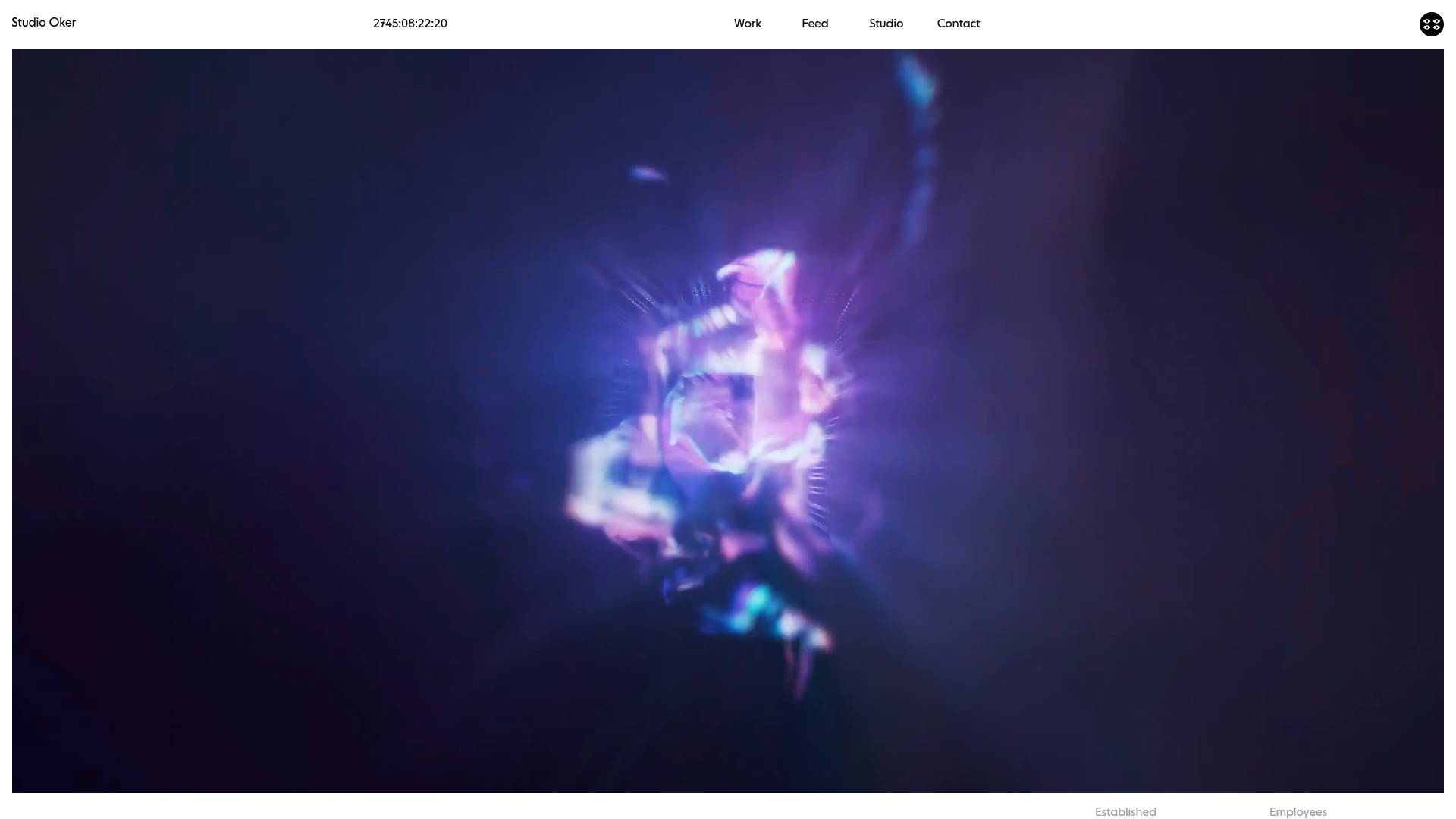
Studio Oker Creative Portfolio Landing
A minimalist studio landing page featuring an immersive full-screen video hero, horizontal glide carousel for project feeds, and a dynamic masonry project grid.
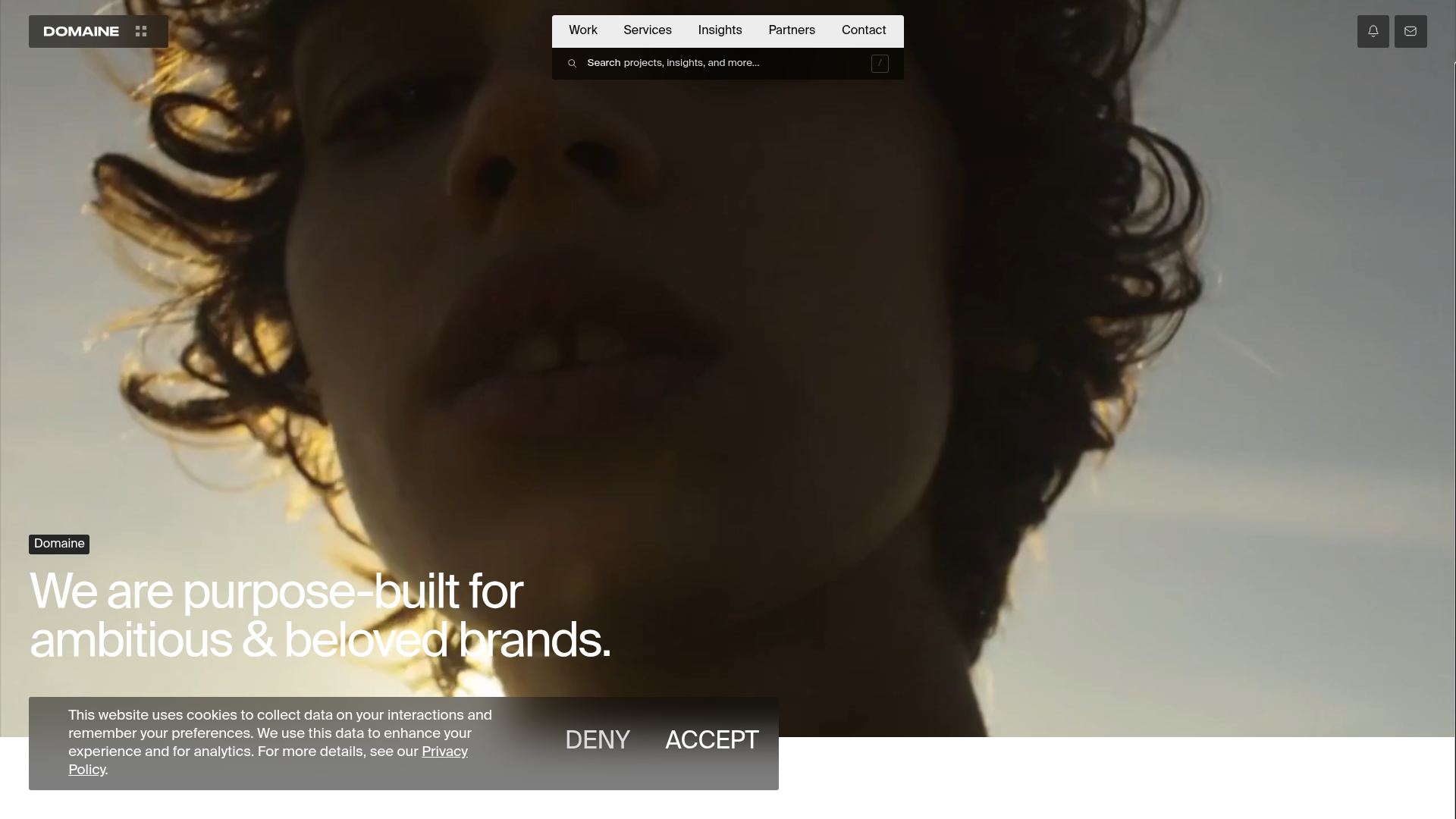
Domaine Agency E-commerce Portfolio Landing
A high-end agency site featuring a full-screen video hero, glassmorphism cookie-notices, and a project gallery with hover-triggered image states and metadata tags.

Freytag Anderson Portfolio Site
A minimalist design agency portfolio featuring full-bleed immersive video backgrounds, large typographic headers, and a vertical scrolling layout of case studies.
