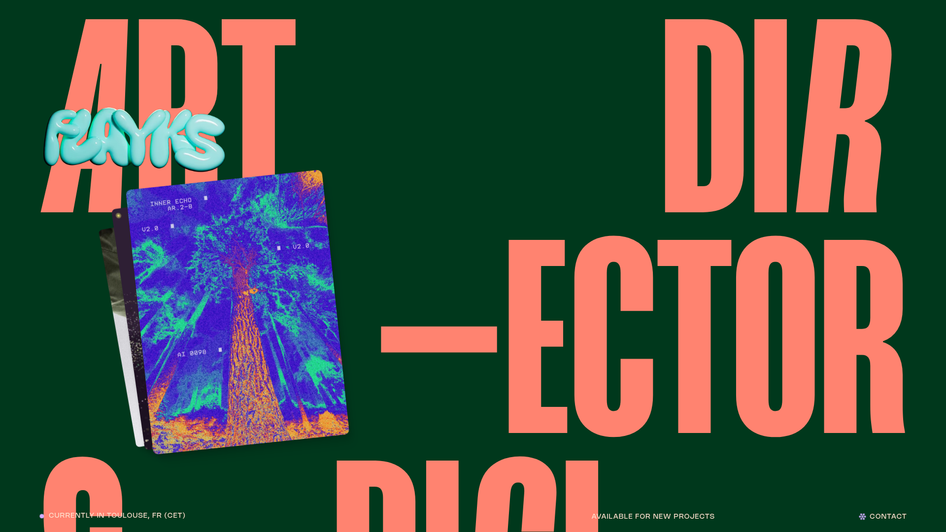
Flayks Digital Portfolio with Floating Cards
A high-end creative portfolio featuring an overlapping card stack hero, complex typography animations, and modular project showcase sections with Svelte-based interactive components.
Overview
This high-end creative portfolio serves as a masterclass in combining bold, experimental typography with a clean, functional grid system. It is a premier reference for developers looking to master Svelte-based interactive components and Astro for high-performance content delivery. The site’s primary strength lies in its cinematic presentation of project case studies through a modular, slide-based navigation system.
Design System
- Color Palette & Visual Hierarchy: The site uses a deep emerald green (
#002a3bvariant) as a base, contrasted with a high-vibrancy coral/salmon color for massive display typography. Visual hierarchy is established through extreme scale shifts—massive word-wrapped titles vs. ultra-fine caps-small technical details. - Typography System: Features a variable sans-serif font for titles that utilizes
font-variation-settings(italics) and custom kerning via CSS variables (--kern). Body copy uses a typewriter-style monospace font, giving the creative portfolio a technical, documented feel. - Page Structure:
- Introduction Hero: Massive multi-line display text with a floating card stack (
astro-islandcomponent). - Information Strip: A persistent reach-out bar showing availability and location.
- Selected Projects: A vertical stack of
articleelements, each containing a sub-carousel of images and technical descriptions. - Skills & Services: A grid of interactive
SkillCardcomponents. - Recognition & Clients: Simple semantic lists for industry validation.
- Contact: Minimalist footer with an embedded map image and large-scale call-to-action.
- Introduction Hero: Massive multi-line display text with a floating card stack (
- Reusable Components:
- Floating Card Stack: A Svelte component (
Cards.svelte) that manages overlapping z-indexes and rotation offsets for a physical "stack" effect. - Typewriter Text: A custom component (
typewriter) that splits words into spans and animates opacity on scroll/load. - Modular Project Slides: The
article.projectstructure includes a sticky meta-data sidebar and a horizontal-scrolling slide container for media.
- Floating Card Stack: A Svelte component (
- Interaction & Motion: Extensive use of
Anime.jsandSmoothScroll. Hover states on cards trigger subtle 3D transformations (--rotate-x,--rotate-y). Video assets include custom playback controls within anastro-islandwrapper. - Implementation Clues: The site is built with Astro and uses Svelte for island-based interactivity. It heavily leverages Sanity CMS for image and video delivery, using specialized attributes like
fetchpriority="high"anddecoding="async"for performance.
Use Cases
- Who should clone this pattern: Creative directors, independent designers, and boutique digital agencies who want a high-impact, "portfolio-first" brand presence.
- Effective Remixes: This pattern is ideal for luxury brand lookbooks, experimental music artist pages, or high-end architectural studio portfolios.
- Practical Remix Directions:
- Typography Swap: Replace the primary display font with a high-contrast serif for a more traditional luxury feel.
- Architecture Adaptation: Use the modular project slides as a vertical landing page for a single product launch, treating each slide as a feature highlight.
- Minimalist Scope: Clone the
reachoutcomponent and the typewriter animation for a clean, text-heavy bio page.
- Suggested Clone Scope: Start by cloning the Project Slide Module. It is the most technically complex and unique part of the layout, offering a refined way to showcase media without standard boring grids.
Related Inspirations
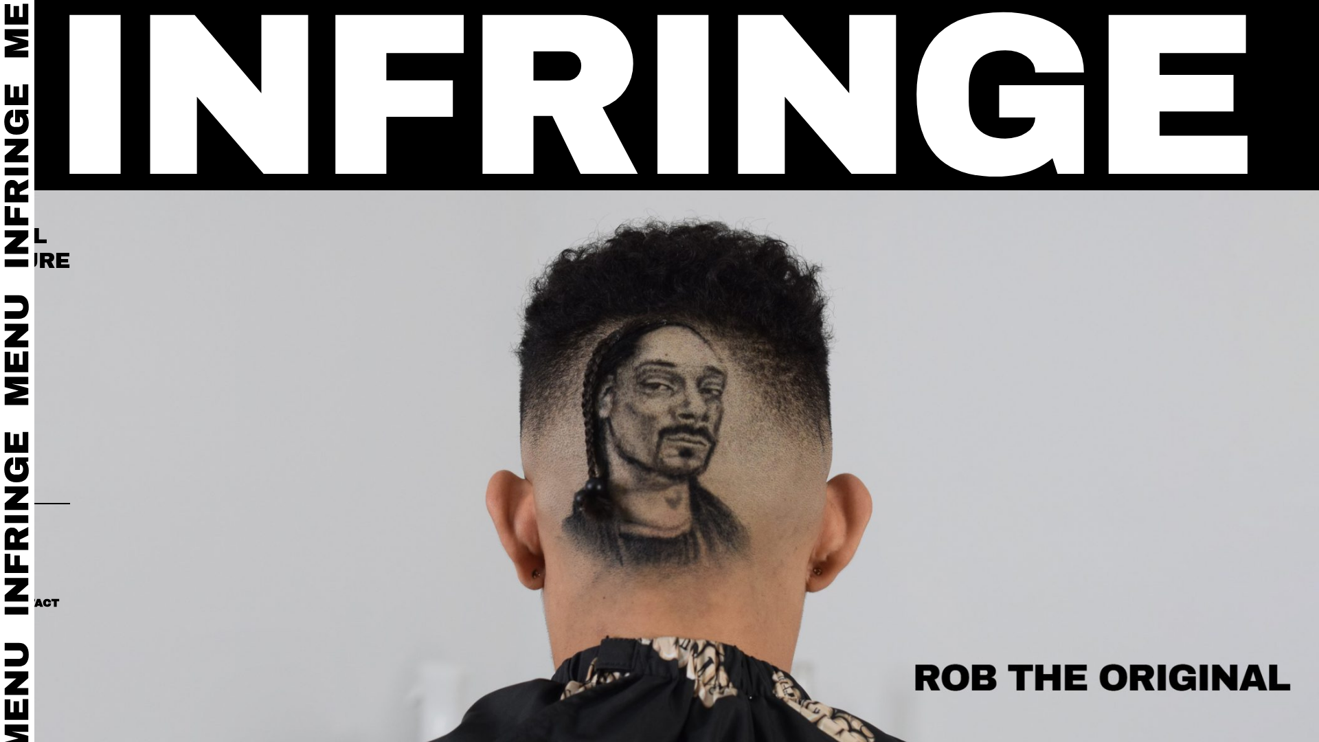
Infringe Hair Culture Portfolio Gallery
A minimalist, high-impact portfolio featuring a vertical sticky marquee sidebar and full-screen image scrolls that toggle between desktop and mobile assets.
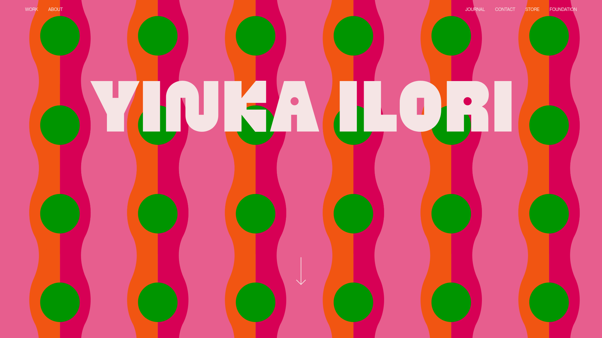
Yinka Ilori Portfolio Mosaic Grid
A vibrant portfolio featuring a scroll-activated parallax hero, bold typography, and a staggered mosaic image grid with asymmetric layouts and fade-in animations.
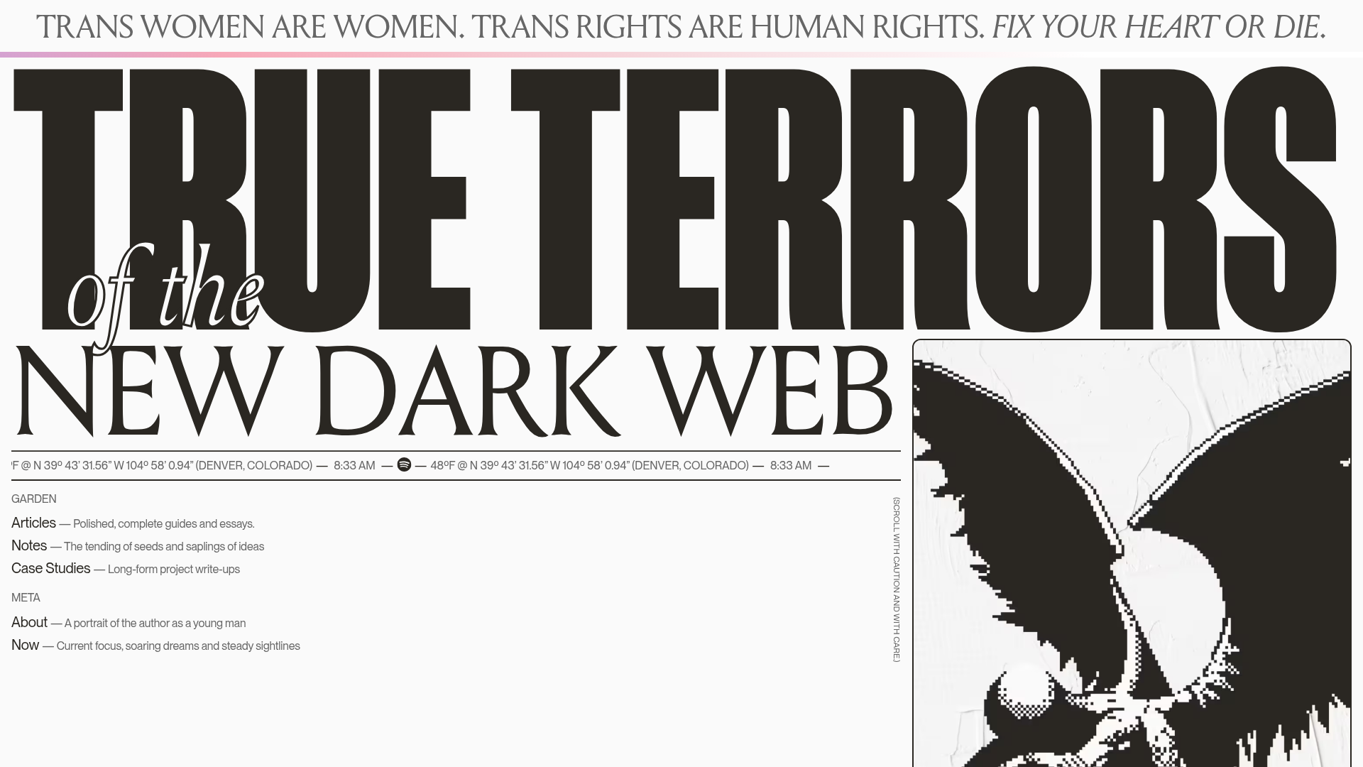
True Terrors Creative Developer Portfolio
A high-impact typography-driven portfolio featuring marquee animations, custom grid overlays, horizontal scroll case study rows, and a brutalist digital garden layout.
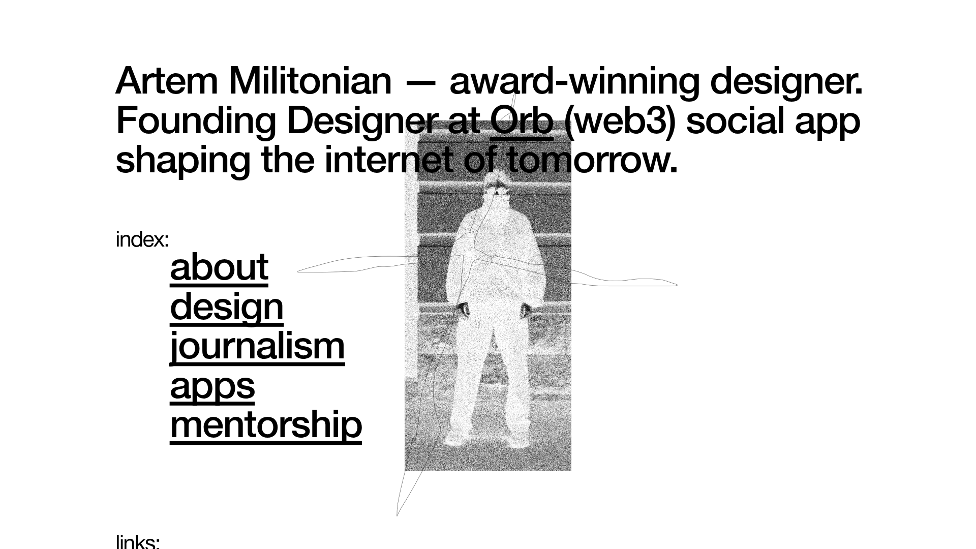
Artem Militonian Portfolio Landing Page
A minimalist, typography-focused designer portfolio featuring a layered grayscale hero image, staggered vertical navigation links, and a fixed header with utility data.

Something Special Studios Agency Portfolio
Minimalist creative agency site featuring a grid-based landing animation, custom video backgrounds, and a hidden expandable navigation menu.
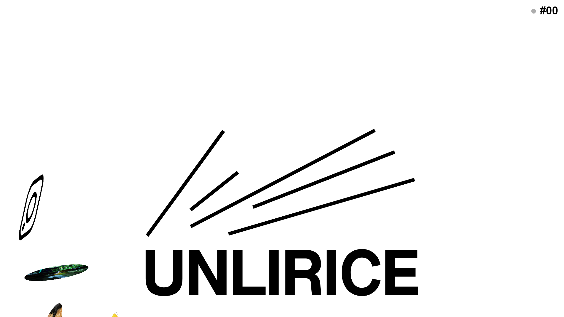
UNLIRICE Minimalist Floating Gallery Landing
A creative landing page featuring a central logo with randomized floating image components, CSS rotation animations, and an overlay-style link system.
