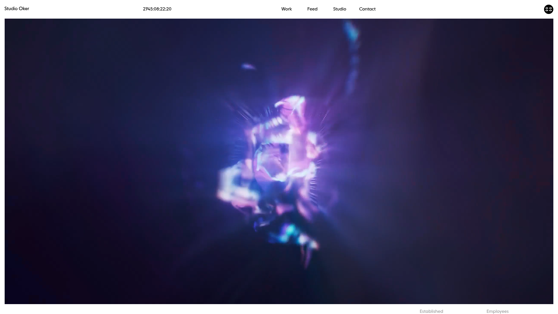
Studio Oker Creative Portfolio Landing
A minimalist studio landing page featuring an immersive full-screen video hero, horizontal glide carousel for project feeds, and a dynamic masonry project grid.
Overview
Studio Oker is a sophisticated design studio portfolio that utilizes an atmospheric, immersive video hero and a modern, minimalist layout to showcase brand work. It serves as an excellent reference for high-end creative agencies or freelancers looking to balance heavy multimedia content with a clean, structured information architecture and high-performance scrolling experiences.
Design System
- Color Palette & Visual Hierarchy: The site uses a high-contrast foundation with a pure white background and deep black/dark-grey text (
mid-greyfor secondary info). It employs a dynamic color system where specific project containers (using thedata-colorattribute) can shift the background tone to match the brand being showcased, creating a seamless transition between projects. - Typography: The system relies on a bold, geometric sans-serif for headings (e.g.,
h1.Studio Oker). A smaller, monospaced-style date and metadata format is used for technical details, while standard body copy is kept clean and legible. Large-scale typography is used strategically in theintroduction-factssection to create a sense of scale. - Structure & Flow: The site begins with a full-screen
block-videohero, followed by a factual studio overview (introduction-facts), a service-oriented text block (introduction-text), a horizontal "Feed" carousel using the Glide.js library, and finally a diverse project masonry grid titled "Work." - Reusable Components:
- The Glide Carousel: A versatile horizontal slider (
glide__slides) that displays "Feed" items with video hover states and metadata overlays. - Dynamic Project Grid: A multi-layout grid system categorizing items into
landscape-landscapeandportraitwrappers, allowing for a varied visual rhythm. - Facts Block: A structured grid for displaying studio statistics (Established, Location, etc.) that presents hard data in a clean, professional format.
- The Glide Carousel: A versatile horizontal slider (
- Interaction & Motion: Key patterns include autoplaying muted background loops (
lazy-video-wrapper), custom cursor text ("→ Play full reel") on the hero, and image-to-video hover transitions on project cards. The use of the.fade.showclass suggests CSS-based entry animations for content. - Responsive Behavior: The HTML shows dedicated placeholder images (
placeholder-mobilevsplaceholder-desktop) and responsive video IDs (data-vimeo-id-mobile), indicating a mobile-first approach to asset delivery that ensures performance on smaller screens.
Use Cases
- Creative Agencies: The horizontal feed is perfect for sharing "In-progress" updates or studio news without cluttering the main case study grid.
- Motion Designers/Photographers: The immersive video hero and the video-on-hover project thumbnails are ideal for portfolios where movement is the primary selling point.
- Architecture or Fashion Brands: The layout's mix of landscape and portrait blocks allows for showcasing different asset ratios effectively, suitable for editorial-style brand captures.
- Practical Remix Directions: Clone the
introduction-factsandintroduction-textsections to create a "Profile" page, or extract just theglide__slidecomponent to add a modern social-media-style feed to an existing site. The dynamic background color logic (swappingdata-coloron scroll or hover) can be repurposed for any color-centric brand presentation.
Related Inspirations

Sing-Sing Creative Portfolio Landing Page
A minimalist studio portfolio featuring high-contrast typography, a horizontal line-grid hero section, and responsive image components with custom cursor interactions.
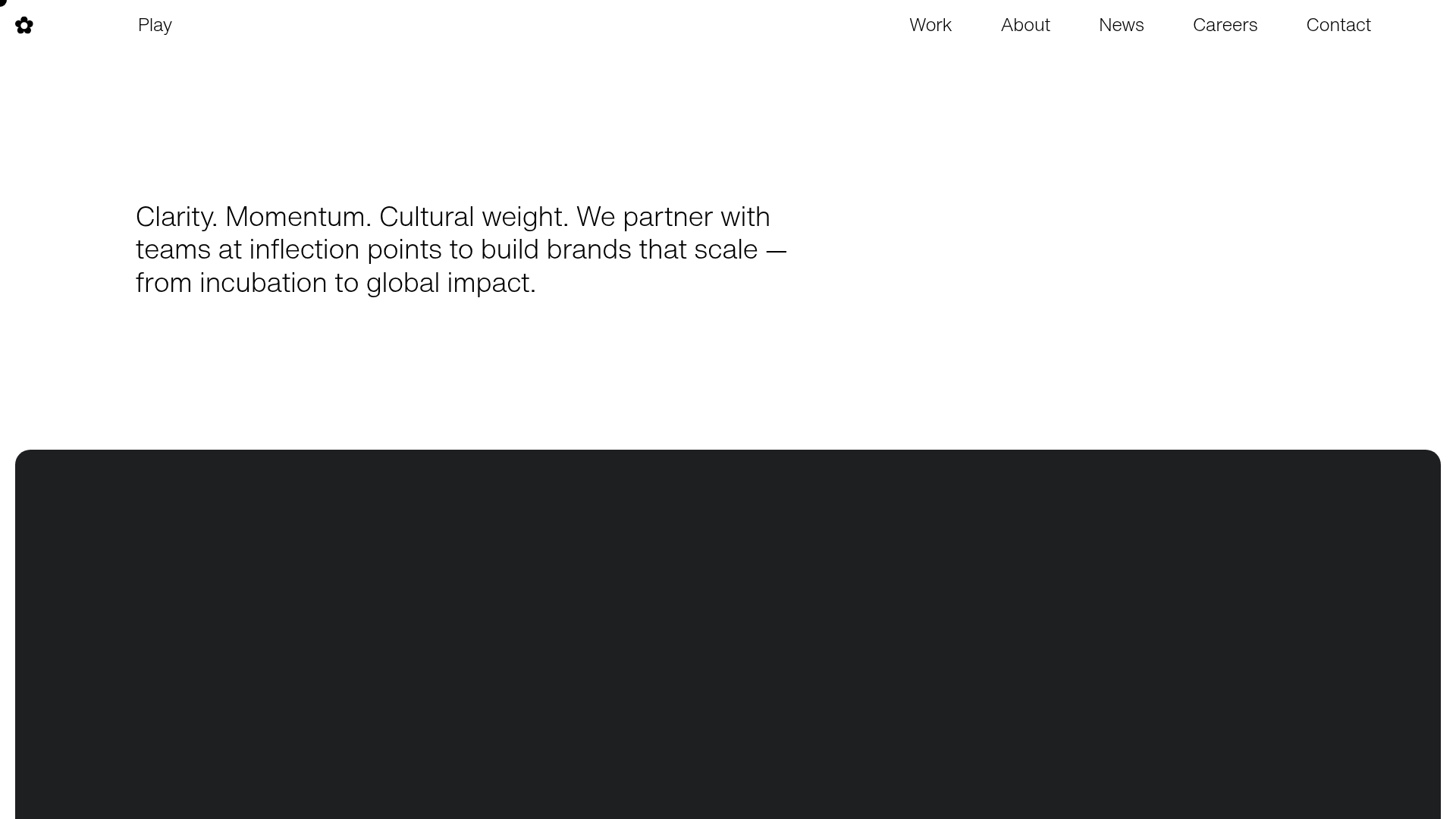
Play Studio Minimalist Portfolio Landing
A high-impact agency layout featuring a oversized typography header, a full-width integrated Vimeo video background, and a unique expandable accordion list for industry showcases.
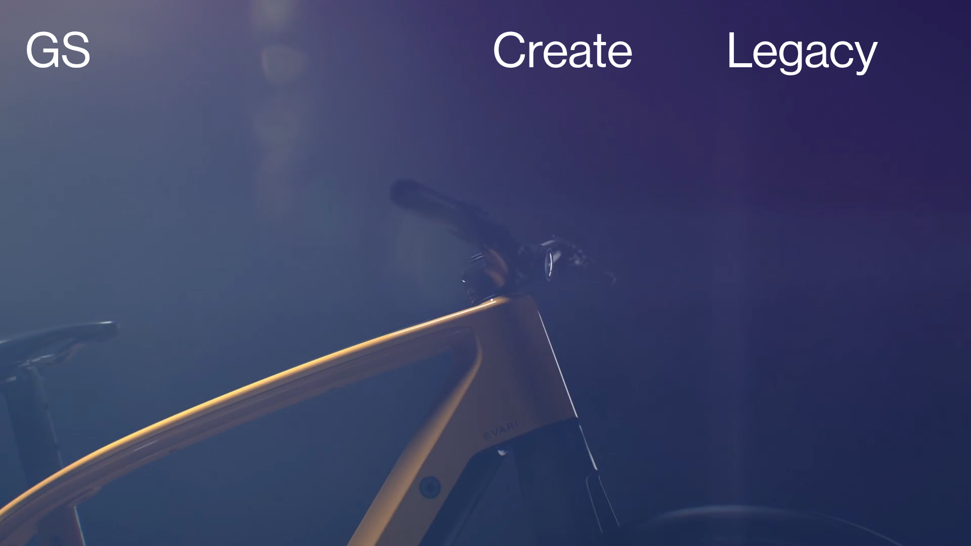
Greenspace Immersive Portfolio Landing Page
A minimalist, video-first site featuring full-screen media backgrounds, a floating navigation menu, and a hover-triggered project list with dynamic image previews.
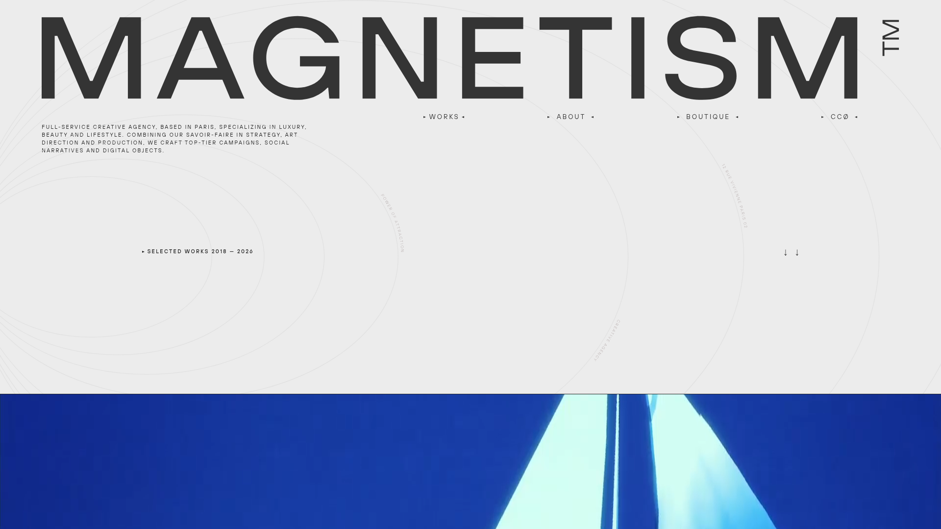
Magnetism High-End Portfolio Landing Page
A luxury-focused creative agency layout featuring a oversized typographic hero, interactive project grid with video hovers, and a sleek concentric-ring background animation.
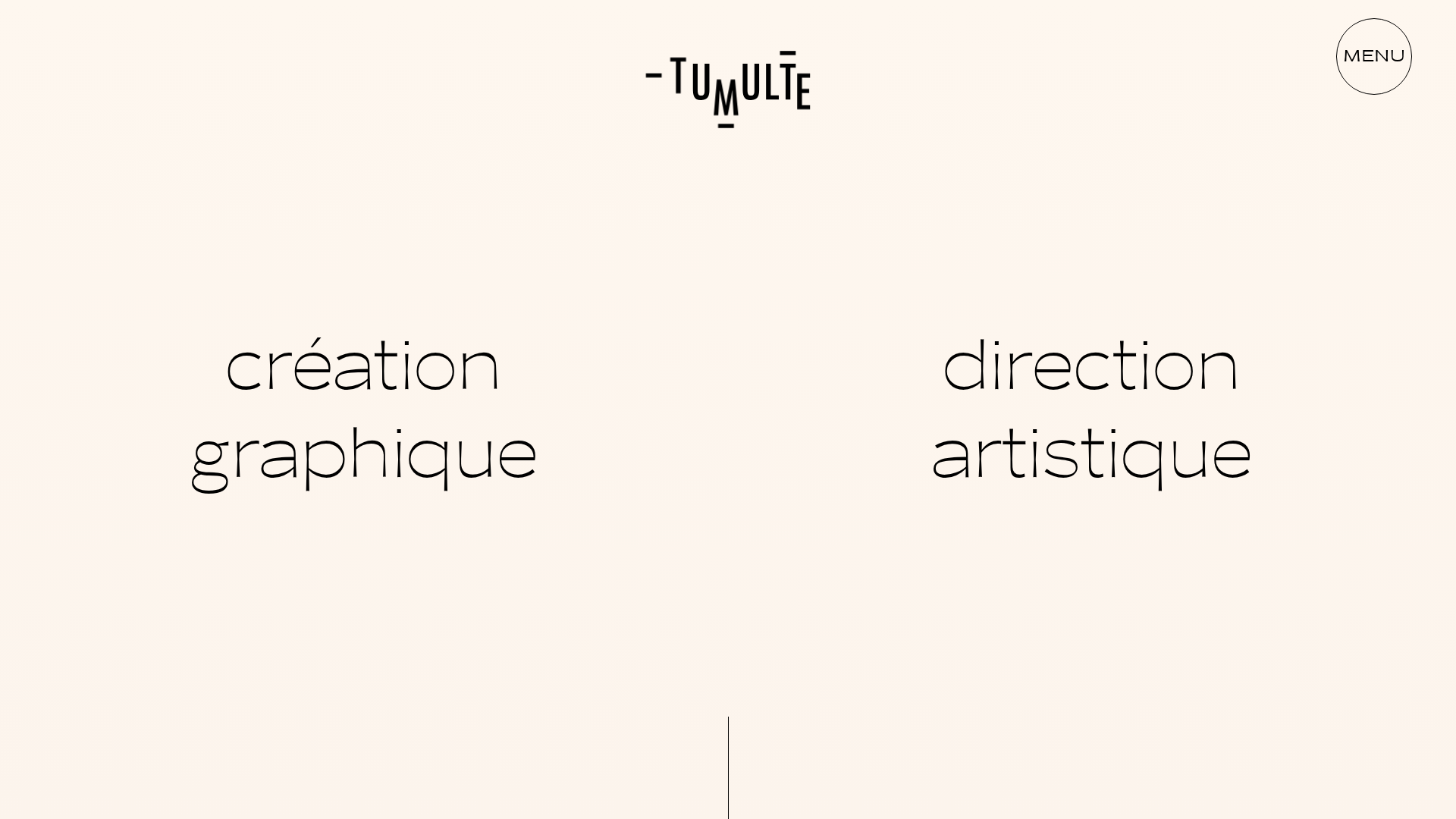
Studio Tumulte Minimalist Portfolio
A design studio portfolio featuring a split-hero landing page, custom cursor interactions, and a non-linear masonry collage layout for creative case studies.
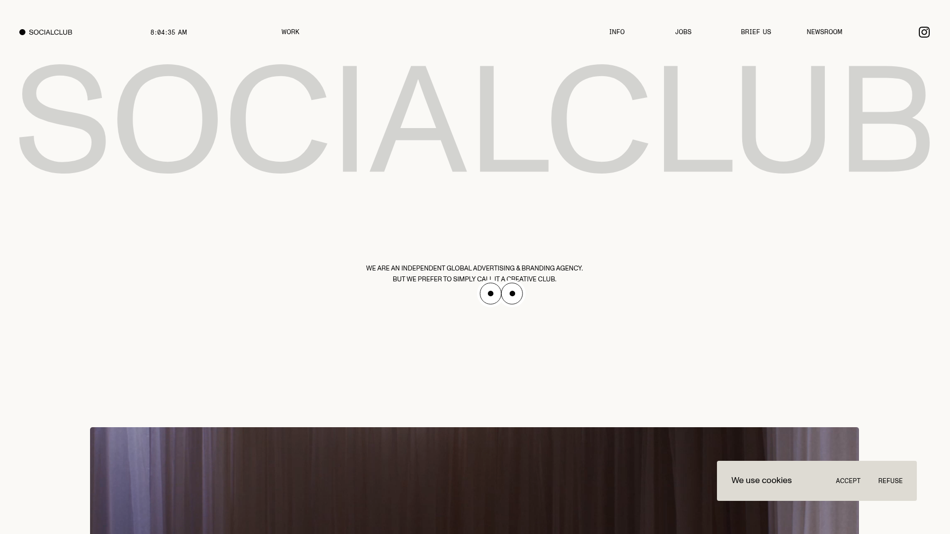
SocialClub Creative Agency Portfolio Landing
A minimalist advertising agency site featuring a large-scale typographic hero header, custom interactive cursor movements, and an asymmetrical grid of video project cards.
