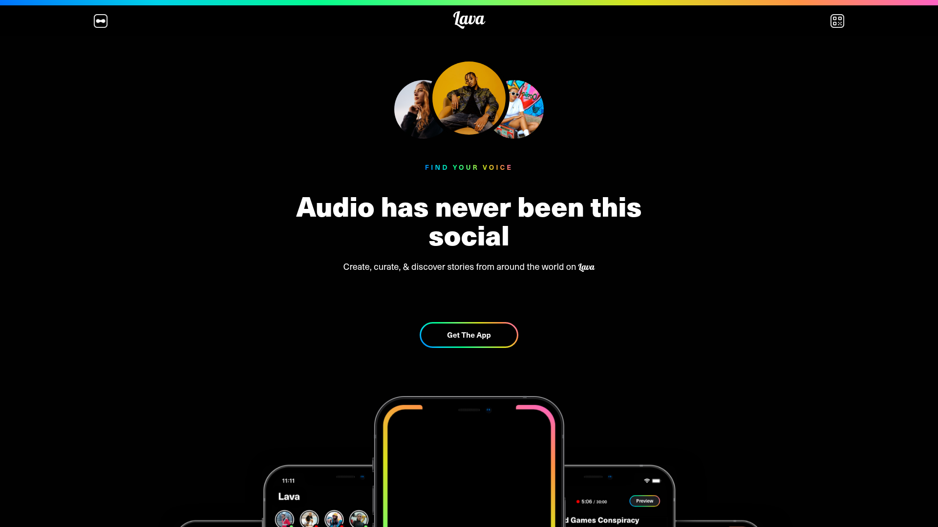
Lava Social Audio Landing Page
A dark-themed mobile app landing page featuring a centered hero section, floating phone mockups, gradient-bordered CTAs, and a bento-style feature grid.
Overview
This landing page is a high-impact, dark-themed showcase for a social audio mobile application. It is a strong reference for builders because it effectively balances bold aesthetic choices, like neon gradients and floating 3D mockups, with a clean, centered layout that drives user conversion.
Design System
- Color Palette & Visual Hierarchy: The design uses a deep black (#000000) background to make vibrant CMYK-inspired gradients (cyan, magenta, yellow) pop. Visual hierarchy is established through high-contrast white text for headlines and subtle gray for body copy, with primary actions highlighted by 'holo-border' gradients.
- Typography: The system relies on a bold, geometric sans-serif for headlines (e.g., "Audio has never been this social") to convey modern energy. Smaller uppercase sub-headers (e.g., "FIND YOUR VOICE") use letter-spacing and color-cycling for emphasis, while body text remains legible in a standard sans-serif font stack.
- Page Structure: The layout follows a classic vertical funnel: a centered hero with creator avatars, a floating 'app-suite' mobile mockup gallery, a 2x2 bento-style feature grid, alternating horizontal feature highlights with device mockups, and a final high-contrast CTA card.
- Reusable Components: Notable components include the
.holo-button(a black button with a thin gradient border), the.square-cardfeature blocks with image containers, and the.qr-holo-borderinteractive QR code block for app downloads. - Interaction & Motion: The HTML indicates several scroll-driven animations (
transform: translate3d) for the app screens in the.app-suitesection. Feature cards use a 'halo' hover effect, and there is a marquee-style scrolling playlist component (.playlist-scroll) that moves independently to simulate discovery. - Implementation Clues: The class naming conventions (e.g.,
w-node,w-form,w-inline-block) identify this as a Webflow-built site. It uses a CSS Grid system for the.value-prop-cardsand flexbox for centered hero alignment.
Use Cases
- Ideal for: Mobile-first startups, podcasting platforms, or social media apps looking for a "premium/dark mode" aesthetic to launch a waitlist or app store link.
- Effective Remixes: This design can be easily adapted for hardware products (swapping phones for gadgets) or SaaS tools by replacing the phone mockups with browser windows or dashboard screenshots.
- Practical Directions: Reuse the
.holo-buttonand gradient-bordered containers to add a 'cyberpunk' or modern tech feel to any existing site. The bento grid layout is particularly useful for summarizing complex features into digestible snapshots. - Clone Scope: A full-page clone is recommended for developers needing a ready-made marketing funnel, but the hero section and the interactive mockup suite (
.app-suite) are the most valuable individual units to remix for specific campaigns.
Related Inspirations
EverAfter AI Customer Portal Hero
A SaaS landing page template featuring a glowing product carousel, auto-scrolling logo marquee, accordion-based feature reveals, and an embedded scheduling widget.
LaunchDarkly SaaS Landing Page Hero
A dark-themed developer marketing layout featuring a glowing blurred background, sticky pill-shaped navigation, tabbed feature showcases, and a horizontal logo marquee.
Letter Private Banking Landing Page
Features a high-impact dark hero section with video backgrounds, elegant typography, and a staggered grid of service panels using varied color themes and video assets.
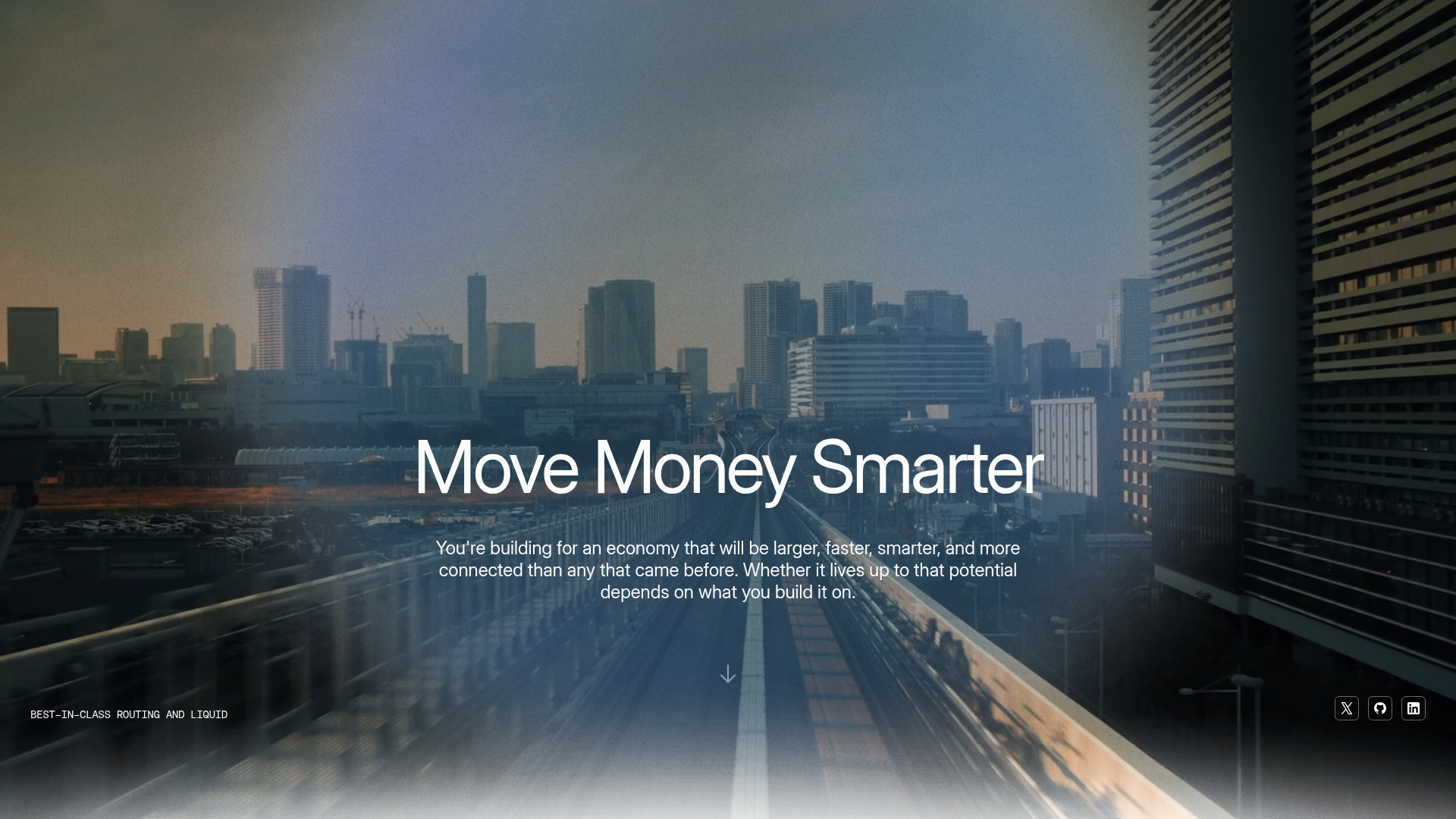
Eco Stablecoin Infrastructure Product Site
A sophisticated Web3 site featuring a video hero section, vertical scrolling accordion for product features, and a dark-to-light theme transition.
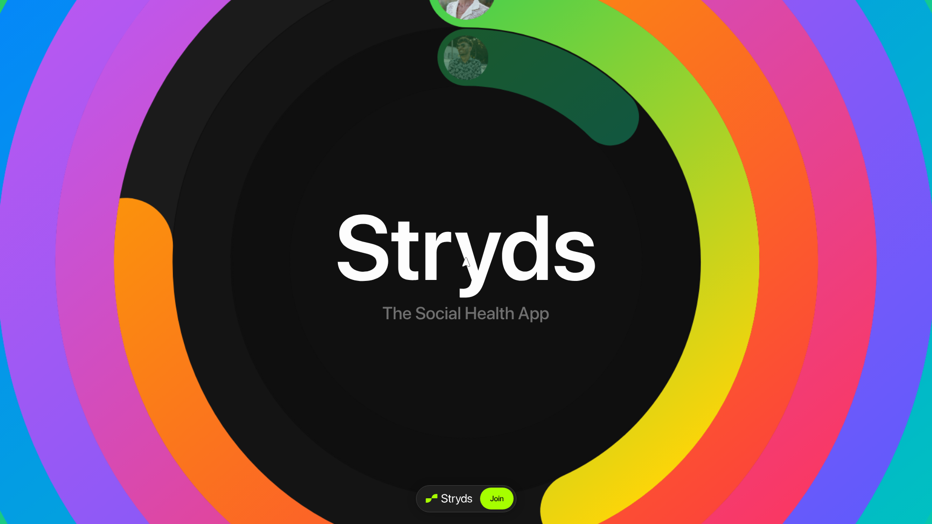
Stryds Colorful Concentric Hero Landing Page
An interactive landing page featuring a centered textual logo surrounded by vibrant, CSS-driven concentric progress rings and circular user avatars.
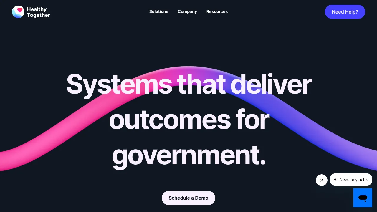
Healthy Together SaaS Landing Page
A high-end dark mode layout featuring a video waveform hero, word-by-word scroll animations, custom Mega Menu dropdowns, and a swiper-based rotating services slider.
