Eco Stablecoin Infrastructure Product Site
A sophisticated Web3 site featuring a video hero section, vertical scrolling accordion for product features, and a dark-to-light theme transition.
Overview
This site is a high-end Web3 infrastructure landing page that masterfully uses immersive video backgrounds and scroll-driven transitions to convey technical precision. It serves as an excellent reference for builders wanting to balance a "dark mode" cinematic aesthetic with a clean, high-legibility content area through its intentional theme-switching architecture.
Design System
- Color Palette & Visual Hierarchy: The site uses a dynamic "dark-to-light" transition. It starts with a charcoal and desaturated blue hero section (using class
u-bg-black) and transitions into a high-contrast white background (white-bg) for the product details. Accent colors are subtle, primarily using blue-to-purple gradients for buttons (btn_gradient) and interactive elements. - Typography System: The design relies on a clean, sans-serif typeface. Hierarchy is established through extreme scale: the hero uses
h1-xlfor massive titles, while secondary information is set in a compacteyebrowstyle (uppercase, tracked out) to denote category and sequence (e.g., "01", "02"). - Page Structure & Flow: The layout follows a sophisticated vertical flow:
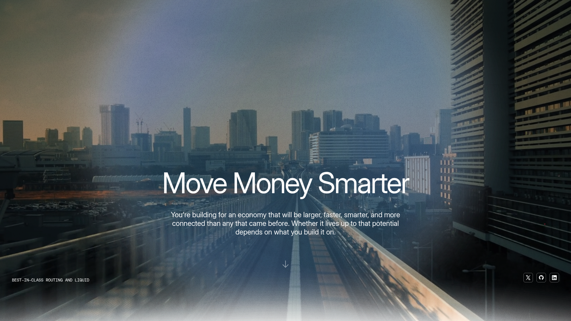
- Video Hero: Full-bleed background with centered value proposition.
- Sticky Intro Section: A large-scale typography reveal that scales and fades as the user scrolls (
about_sticky). - Product Accordion: A vertical scrolling feature area where text content on the right syncs with Lottie animations or images on the left.
- Use Case Grid: A standard two-column alternating grid for functional details.
- Reusable Components:
- Interactive Buttons: Multi-layered buttons using
btn_iconandbtn_gradientclasses for a glassmorphism effect. - The Product Accordion: A sophisticated
accordion_layoutthat uses a sticky container to keep visual assets in view while text scrolls. - Marquee Slider: A horizontal logo track (
marquee__group) for social proof/investors.
- Interactive Buttons: Multi-layered buttons using
- Interaction & Motion: The site uses scroll-triggered opacity shifts (seen in the
about-splitcharacters in HTML) and Lottie-driven icons to keep the interface feeling reactive. The transition from the dark hero to the white product section creates a significant "mood shift" that separates brand vision from technical utility. - Technical Implementation: The code uses utility-first classes (e.g.,
u-d-flex,u-p-0) and relies heavily on a sticky-positioning framework for its scroll-driven storytelling.
Use Cases
- Who should clone this pattern: Web3 protocols, fintech infrastructure providers, or SaaS platforms that need to bridge the gap between abstract "vision" and concrete "features."
- What products can remix it effectively: Developer tools, API services, or hardware tech sites where a sophisticated, cinematic first impression is key to establishing trust.
- Practical remix directions:
- Brand Swap: Replace the urban video background with abstract 3D renders or high-quality product photography.
- Architecture Adaptation: Reuse the "sticky accordion" section for a documentation landing page or a complex pricing tier breakdown.
- Simplified Approach: Extract the button and typography system for a smaller landing page while skipping the heavy video/Lottie assets.
- Suggested clone scope: This is best cloned as a full-page structure to preserve the transition logic between the dark hero and light content sections, though the Product Accordion section is a powerful standalone component for any feature-heavy site.
Related Inspirations
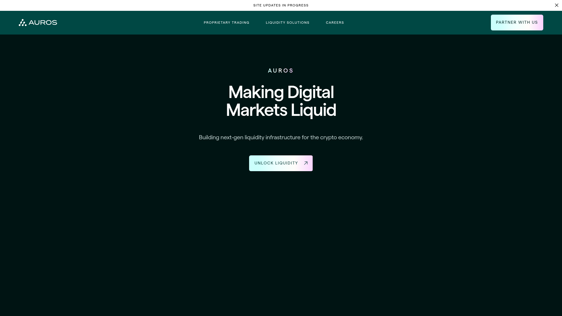
Auros Crypto Liquidity Firm Landing Page
A high-end dark mode site featuring a WebGL gradient background, horizontal text scrolls, bento grid statistics, and interactive video-integrated vertical tabs for service exploration.
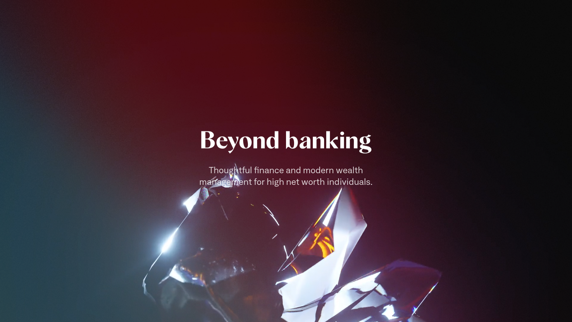
Letter Private Banking Landing Page
Features a high-impact dark hero section with video backgrounds, elegant typography, and a staggered grid of service panels using varied color themes and video assets.
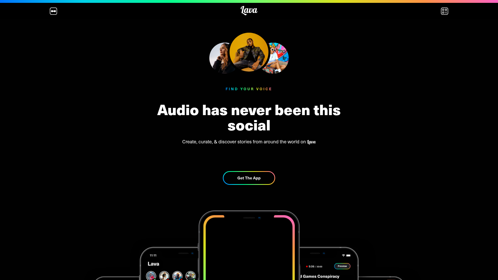
Lava Social Audio Landing Page
A dark-themed mobile app landing page featuring a centered hero section, floating phone mockups, gradient-bordered CTAs, and a bento-style feature grid.
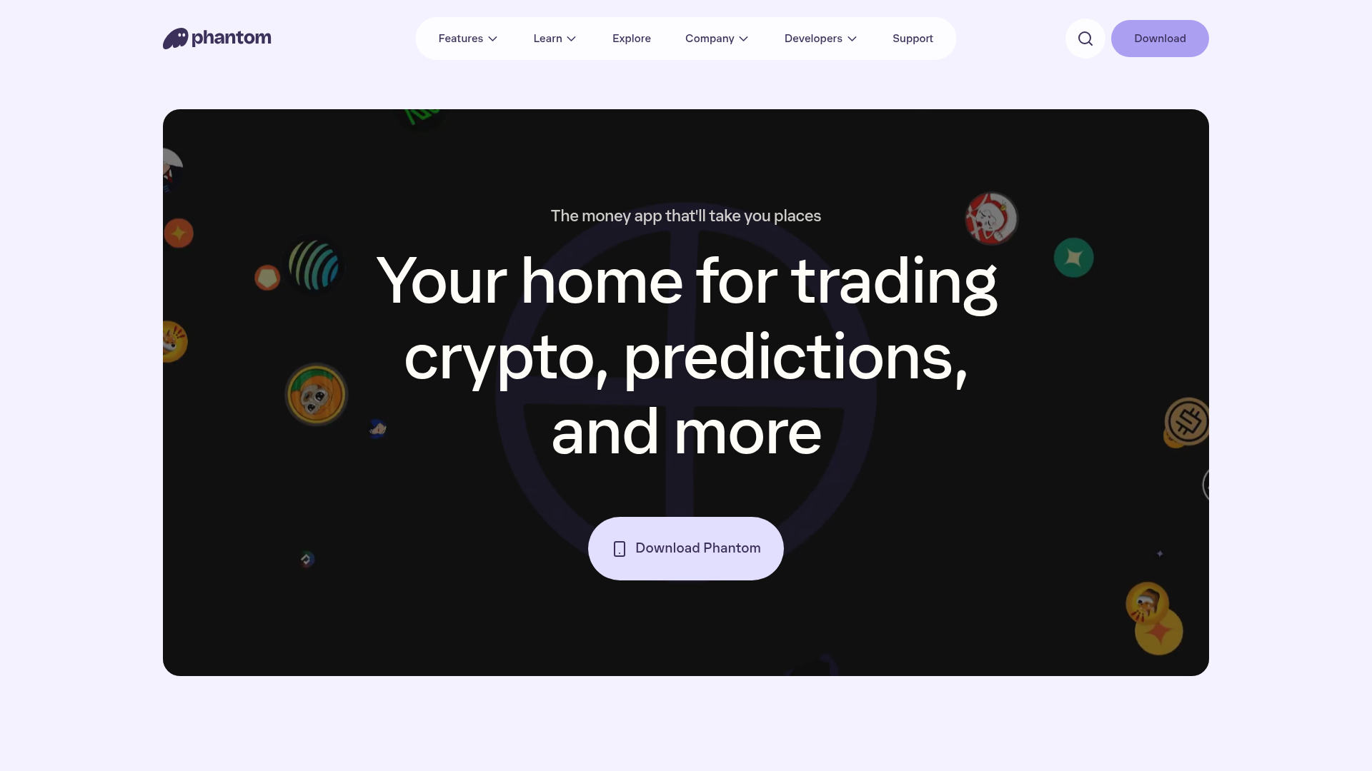
Phantom Crypto Wallet Landing Page
A dark-themed landing page featuring an animated hero section, a clean sticky navigation bar, and interactive product carousels for showcasing app features.
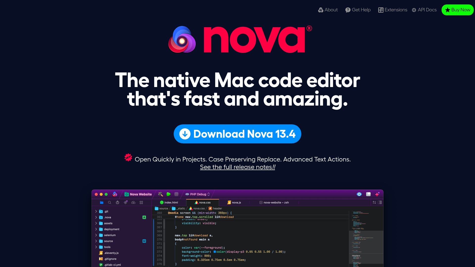
Nova Code Editor Product Landing Page
Dark-themed landing page featuring a starfield background, a flexible feature grid, interactive tabbed preference menus, and stylized product screenshot showcases with hoverable hotspots.
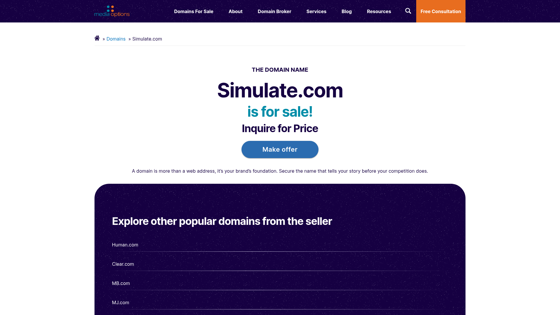
Domain For Sale Landing Page
A clean, centered landing page layout featuring a hero section for asset sales, a prominent CTA button, and a list-based showcase of related items.
