Dial It Down Netiquette Resources
A single-page resource site featuring a simple image-led landing layout, a vertical list of tip components with icons, and download sections for posters.
Overview
This single-page resource site serves as a minimalist digital toolkit for netiquette education, utilizing a high-contrast, image-led layout. Its strength as a remix template lies in its clean information architecture, which balances playful illustration with structured vertical lists, making it ideal for educational or organizational SOP (Standard Operating Procedure) pages.
Design System
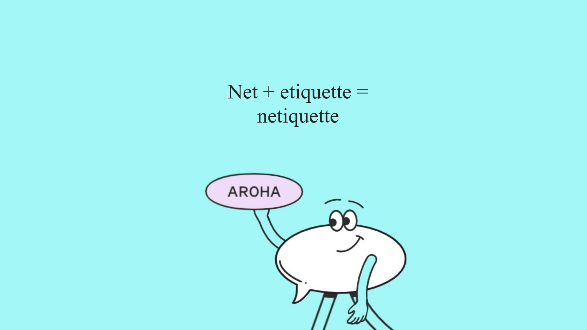
- Color Palette & Visual Hierarchy: The primary palette uses a bright, energetic teal background (
#87ede8style) contrasted against white content cards. Speech bubbles and character illustrations introduce soft pastels (light pink and white) and thick black outlines, creating a friendly, approachable aesthetic for a serious topic. - Typography: The design uses a mix of serif fonts for headings (as seen in the "Net + etiquette" graphic) and likely system sans-serif for the structured lists. The hierarchy is clear: large graphical text acts as a hero, followed by direct, instructional phrases in the
formssection. - Page Structure: The flow moves from a visual-heavy landing (
.desk/.mobileclasses) into a structured instructional list (.forms), an visual preview of physical assets (.carte), a call-to-action download section, and finally a long-form content area for SEO and deep-reading. - Reusable Components:
- Icon-Text Rows: The
.formsdiv contains a pattern of<p>tags paired with repetitive.svgicons (check-marks or bullets), separated bycleardivs—a robust pattern for list-based checklists. - Responsive Image Blocks: The use of
.mobileand.deskclasses in the HTML indicates a simple display-switch mechanism to serve different hero assets based on the viewport.
- Icon-Text Rows: The
- Implementation Clues: The HTML structure uses classic float-clearing (
.clear) and distinct container classes for sectioning. It is a straight-forward, lightweight implementation without heavy framework boilerplate, making it very easy to scrape and clean up.
Use Cases
- Who should clone this: Educators, HR professionals creating digital handbooks, and non-profits building campaign landing pages.
- Effective Remixes: This pattern can be effectively remixed into a "Brand Guidelines" page, a "Remote Work Best Practices" site, or a simple FAQ landing page.
- Remix Directions: Builders should swap out the unique character illustrations for brand-specific iconography while keeping the vertical text-icon orientation. The long-form text section at the bottom can be easily repurposed for a "Privacy Policy" or "About the Initiative" block.
- Clone Scope: For builders needing a quick win, the
.formssection is the most valuable component to clone as a standalone checklist module. For those looking for a complete campaign site, the full-page flow offers a logical progression from awareness to action (downloading resources).
Related Inspirations
Daniela and Moe Wedding Event One-Pager
A refined event site featuring a minimalist hero, interactive flip-card 'fun facts' quiz, timeline event sections with maps, and a custom-styled RSVP form.
Summer Drive Event Landing Page
A vibrant event page featuring bold typography, a smooth scroll-triggered hero section, a video car animation, and a decorative logo marquee for portfolio teams.
Schauspielhaus Zurich Saison Interactive Preview
An artistic landing page featuring parallax scrolling SVG illustrations, a unique hand-drawn aesthetic, and a horizontal carousel for showcasing seasonal event premieres.
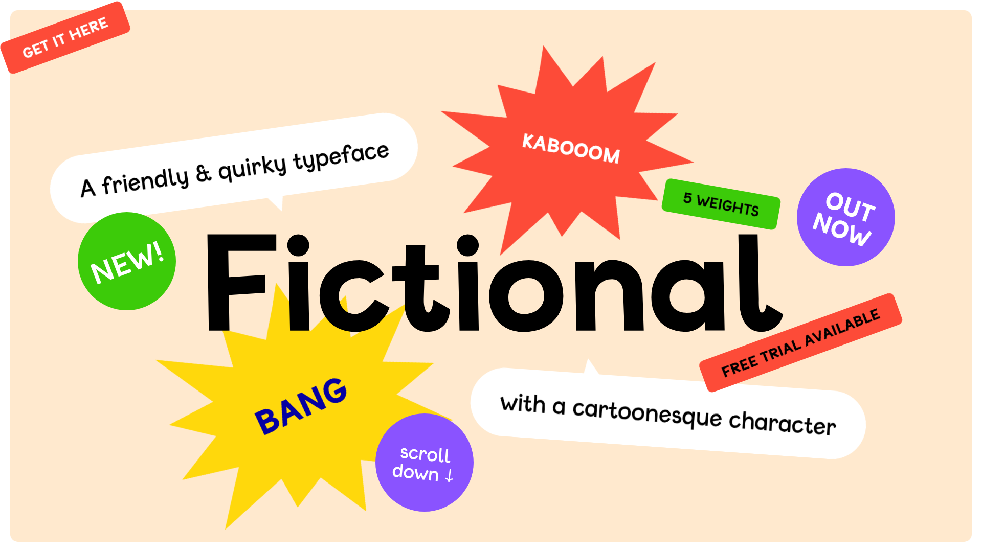
Fictional Typeface Interactive Showcase Page
A playful landing page featuring a gamified hero section with shootable elements, an editable text playground for variable fonts, and a comprehensive character set grid.
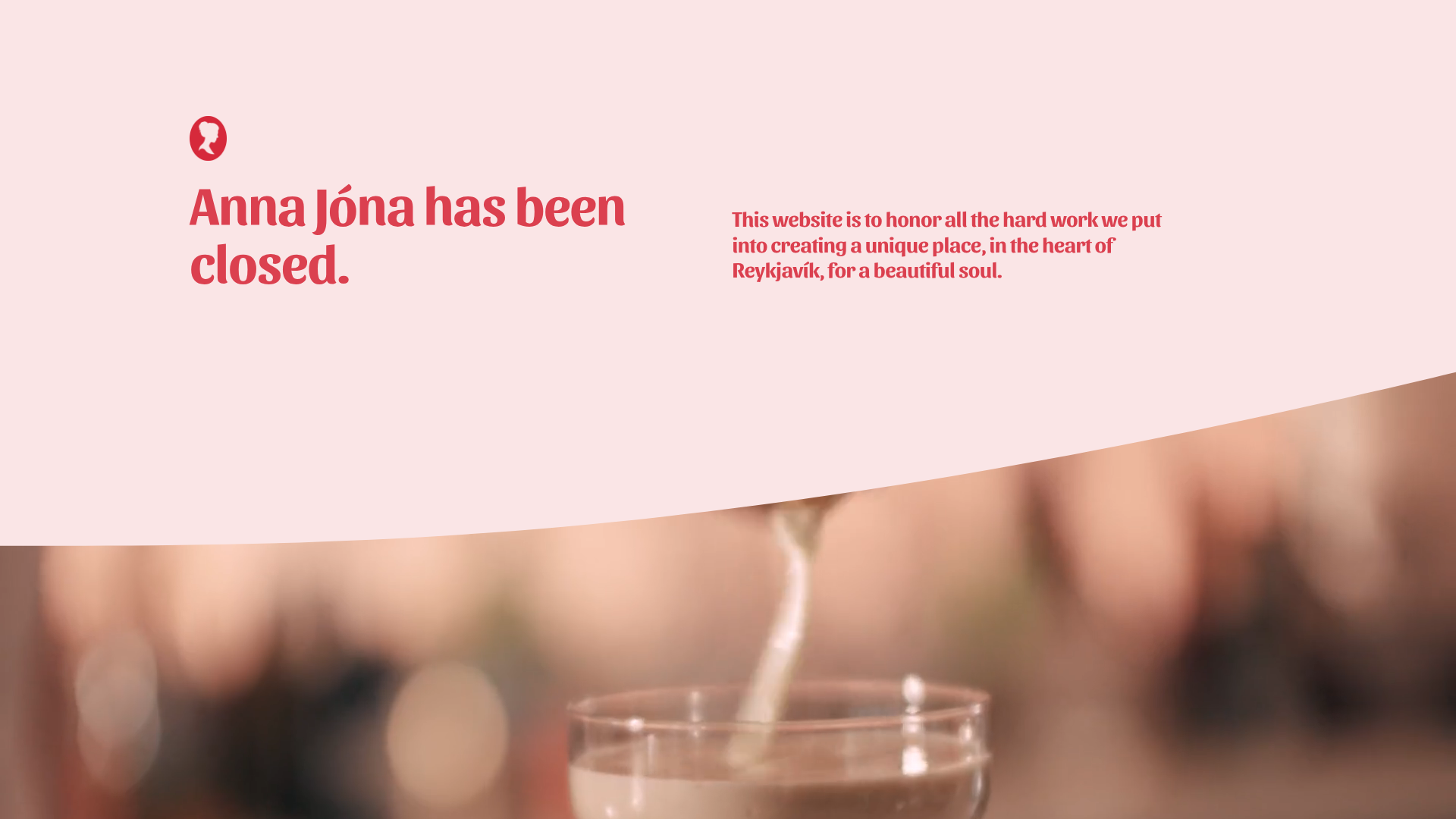
Anna Jóna Restaurant Memorial Site
A graceful Squarespace landing page featuring scalloped section dividers, high-quality interior image galleries, and a scrolling text marquee for storytelling.
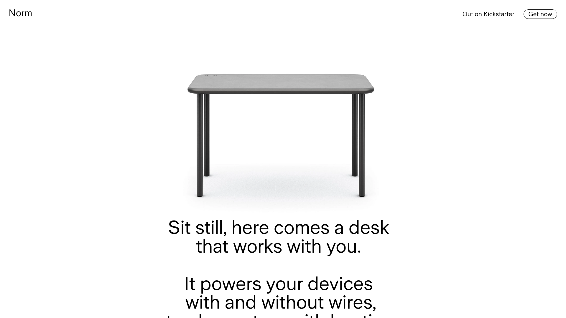
Norm Minimalist Product Landing Page
A clean, high-contrast hardware showcase featuring a scroll-triggered vertically stacked layout, sticky navigation bar, and integrated haptic/feature bullet points.
