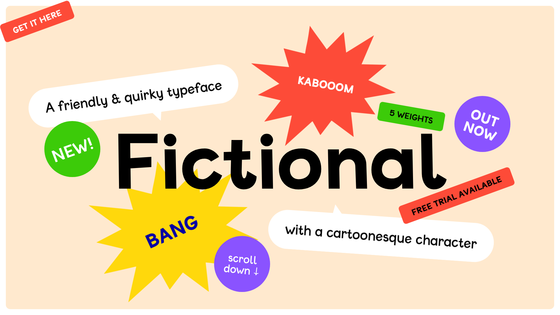
Fictional Typeface Interactive Showcase Page
A playful landing page featuring a gamified hero section with shootable elements, an editable text playground for variable fonts, and a comprehensive character set grid.
Overview
This interactive landing page is a gamified showcase for the 'Fictional' typeface, transforming a standard font specimen into an engaging 'shoot-em-up' experience. It serves as a masterclass in combining high-interactivity with product marketing, using a 'Fire Mode' to let users interactively 'destroy' and restore page elements while exploring font weights and character sets.
Design System
- Color Palette & Visual Hierarchy: The background uses a soft cream (
#FDF2D9), providing a warm canvas for a vibrant, high-contrast palette of red, neon green, bright yellow, and purple. The hierarchy is dominated by the massive centered brand name, surrounded by floating 'stickers' that use primary colors and bold shapes (stars, speech bubbles, and slanted labels) to grab attention. - Typography: The 'Fictional' variable font is the hero, ranging across five weights from Light to UltraBold. The scale is extreme, with the H1 dominating the viewport. Smaller text uses the same typeface, maintaining a cohesive, friendly, and 'cartoonesque' brand voice across all UI elements.
- Page Structure: The flow moves from a gamified Hero section (intro-stickercontainer) to a Weight Selection area (styles-style buttons), followed by an editable Variable Font playground with a range slider, and finally a comprehensive Character Set grid (charset-overview).
- Reusable Components:
- Interactive Stickers: SVG-like shapes (shouts, bubbles, rounds) with CSS transforms and rotations.
- Editable Text Blocks: Elements marked with
class="editable"that allow real-time font testing. - Variable Font Slider: A standard
<input type="range">mapped tofont-variation-settings. - Character Grid: A dense
<ul>flex/grid layout of buttons that update a large 'detail' preview on interaction.
- Interaction & Motion: The site features a 'Fire Mode' (Toggled via toolbar) where elements have a
shootableclass, reacting to clicks with sounds and removal animations. A 'score' counter tracks progress, and a 'restore' overlay provides a full-page transition for reset. - Implementation Clues: The HTML uses semantic
<section>tags and a class-based naming convention (intro-sticker_1,charset-detail). Interactivity is handled via custom data attributes likedata-max-lengthanddata-weightto drive JS-based font manipulation and character limits.
Use Cases
- Who should clone this: Type designers, independent software vendors (ISVs) launching playful apps, or creative agencies looking for an unconventional 'About' or 'Product' landing page.
- Effective Remixes: This pattern is perfect for gamifying technical documentation, interactive resumes, or digital toy stores. The 'shootable' mechanic can be swapped for 'collectible' mechanics to suit different brand tones.
- Practical Directions:
- Brand Swap: Replace the cream/primary palette with dark mode/neons for a tech-focused 'glitch' aesthetic.
- Information Architecture: Adapt the character set grid into a component library browser or an icon set previewer.
- Sectional Reuse: Clone just the 'intro-stickercontainer' to create a high-energy hero section for a standard SaaS site.
- Suggested Clone Scope: High value in cloning the full-page flow to maintain the gamified user journey (unlocking modes via interaction), but the variable font playground and character grid are excellent standalone components for any design-tooling project.
Related Inspirations
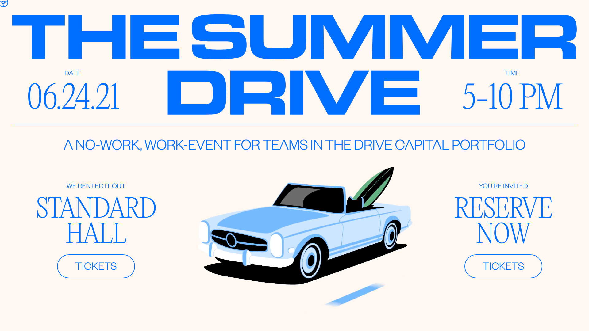
Summer Drive Event Landing Page
A vibrant event page featuring bold typography, a smooth scroll-triggered hero section, a video car animation, and a decorative logo marquee for portfolio teams.
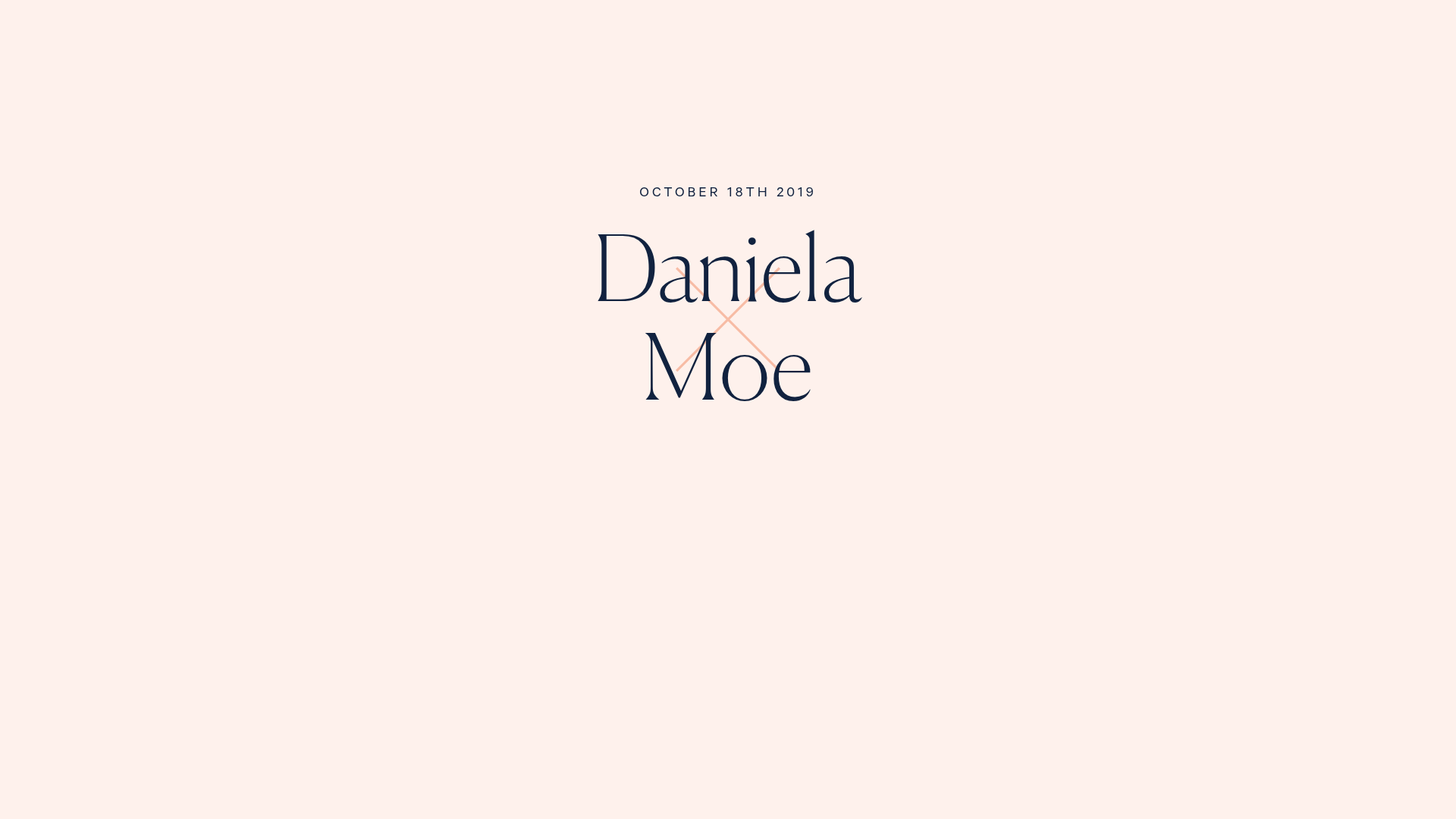
Daniela and Moe Wedding Event One-Pager
A refined event site featuring a minimalist hero, interactive flip-card 'fun facts' quiz, timeline event sections with maps, and a custom-styled RSVP form.
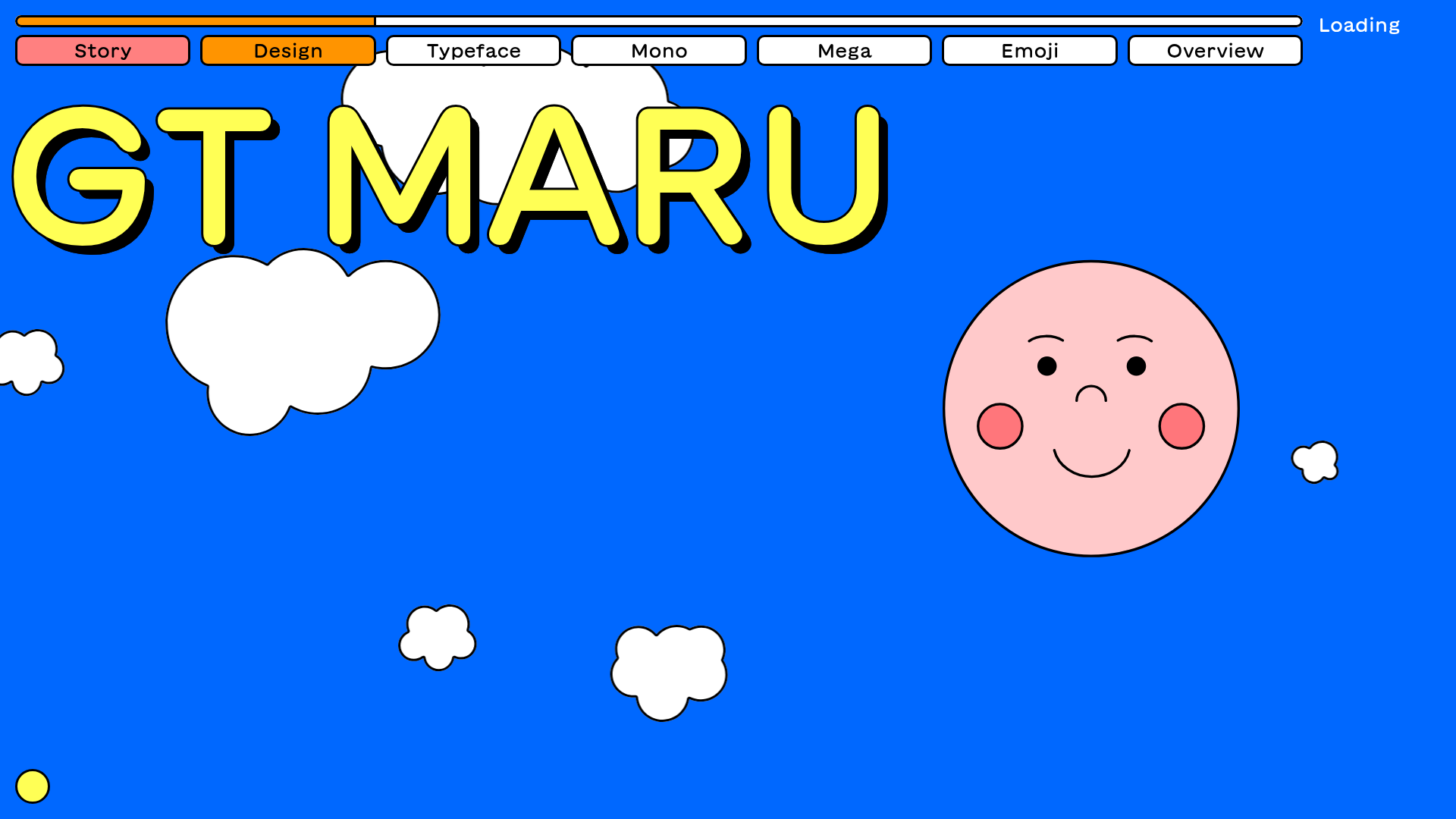
GT Maru Typeface Promotional Landing Page
A playful, multi-section landing page featuring interactive typography testers, Lottie animations, scroll-triggered sticky text blocks, and a wave-divider layout with dynamic navigation colors.
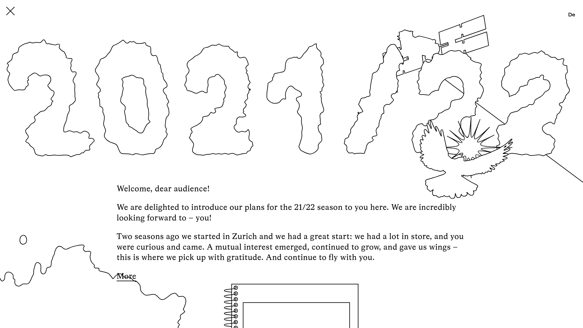
Schauspielhaus Zurich Saison Interactive Preview
An artistic landing page featuring parallax scrolling SVG illustrations, a unique hand-drawn aesthetic, and a horizontal carousel for showcasing seasonal event premieres.

IAD Lab Interactive Event Landing
A dark-themed event page featuring a Three.js WebGL hero, Svelte-powered scroll animations, a structured program timeline, and a past-edition archive list.
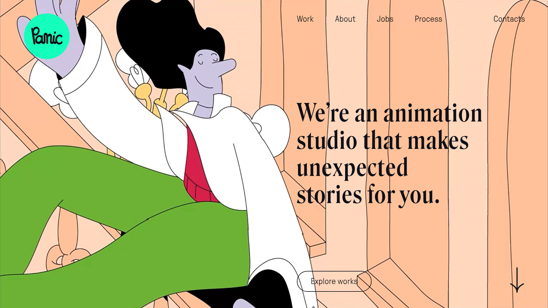
Panic Animation Studio Portfolio Showcase
A creative portfolio featuring a large-scale animated hero section, asymmetric storytelling layout, and sophisticated video-based grid components for displaying motion design works.
