Schauspielhaus Zurich Saison Interactive Preview
An artistic landing page featuring parallax scrolling SVG illustrations, a unique hand-drawn aesthetic, and a horizontal carousel for showcasing seasonal event premieres.
Overview
This website is an interactive seasonal preview for the Schauspielhaus Zurich, utilizing a distinctive hand-drawn sketch aesthetic combined with advanced parallax scrolling. It is a powerful reference for builders looking to execute art-house digital experiences that blend high-concept illustrations with smooth, scroll-driven storytelling.
Design System
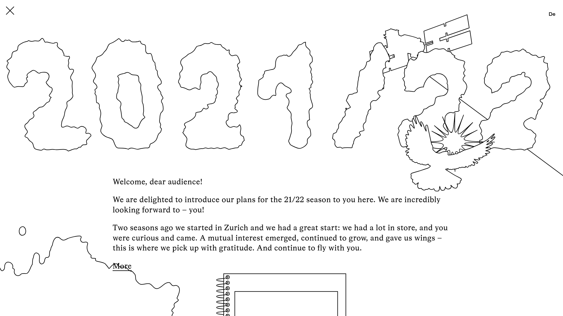
- Color Palette & Visual Hierarchy: The design uses a minimalist "sketchbook" palette—primarily high-contrast black and white. Hierarchy is established through size and line weight rather than color, with large, shaky-outlined SVG numbers ("2021/22") dominating the initial viewport to anchor the theme.
- Typography: The system features a classic serif typeface (reminiscent of Times New Roman) for body copy to provide a formal counterpoint to the organic, messy illustrations. Headers like "Premieres 2021/22" use a bold, clean sans-serif for legibility in functional areas.
- Page Structure: The flow is linear and scroll-heavy: a hero intro with parallax SVGs (birds, clouds, drones), followed by a simple text introduction, a horizontal "gallery" carousel for events, a list-based "Directors Talk" section, and finally, a grid for Youth Clubs and Subscriptions.
- Reusable Components:
- Horizontal Gallery: A CSS/JS driven slider (
.gallery-container) that usesgallery-itemclasses for date-based events. - Parallax Wrappers: Elements like
.wrapper-bird_01and.wrapper-droneusedata-enllax-ratioattributes, suggesting a dedicated library for managing X/Y axis movement based on scroll position. - Outline Icons: Buttons and close icons use a layered image approach (
.filland.outline) to create depth.
- Horizontal Gallery: A CSS/JS driven slider (
- Interaction & Motion: The site relies heavily on "multi-directional parallax." As the user scrolls vertically, some elements (clouds) move horizontally, while others move vertically at different speeds to create a 3D depth effect. Links and buttons feature simple hover states, often involving a slight shift in the hand-drawn elements.
- Mobile Behavior: The HTML shows specific
mobilevsdesktopwrappers (e.g.,.credits-mobile,.ensemble-wrapper). On mobile, the complex horizontal parallax transitions into a vertical stack or a touch-friendly swipeable carousel for the premieres.
Use Cases
- Who should clone this: Digital agencies, independent artists, and cultural institutions (theaters, museums, galleries) wanting a site that feels "handmade" rather than corporate.
- Effective Remixes:
- Brand Swap: Keep the parallax engine but replace the shaky sketches with architectural renders or clean 3D assets for a real estate or tech product launch.
- Info Architecture Adaptation: Use the horizontal carousel section independently to showcase a portfolio of projects or a product roadmap.
- Suggested Scope: A full-page clone is ideal for those wanting to master scroll-driven animations. For a quicker win, clone the
.gallerycomponent to create a high-contrast, text-led project slider. To adapt for commercial use, replace the serif font with a modern sans-serif and add a secondary brand color (like a vibrant neon) for the.outlineimage layers.
Related Inspirations
GT America Typography Tester
A layout-heavy landing page featuring interactive font testing toolkits with multi-language support, font-weight sliders, and content-editable text areas.
Hourly App Landing Page
A minimalist iOS app landing page featuring a bold typographic hero, responsive grid-based screenshot displays, and custom SVG illustrations with CSS animations.

Pa’lais Plant-Based Product Homepage
A food product landing page featuring an animated video hero, a recipe carousel with filtering icons, organic blob-shaped layout containers, and a parallax-scrolling decorative element system.
Daniela and Moe Wedding Event One-Pager
A refined event site featuring a minimalist hero, interactive flip-card 'fun facts' quiz, timeline event sections with maps, and a custom-styled RSVP form.
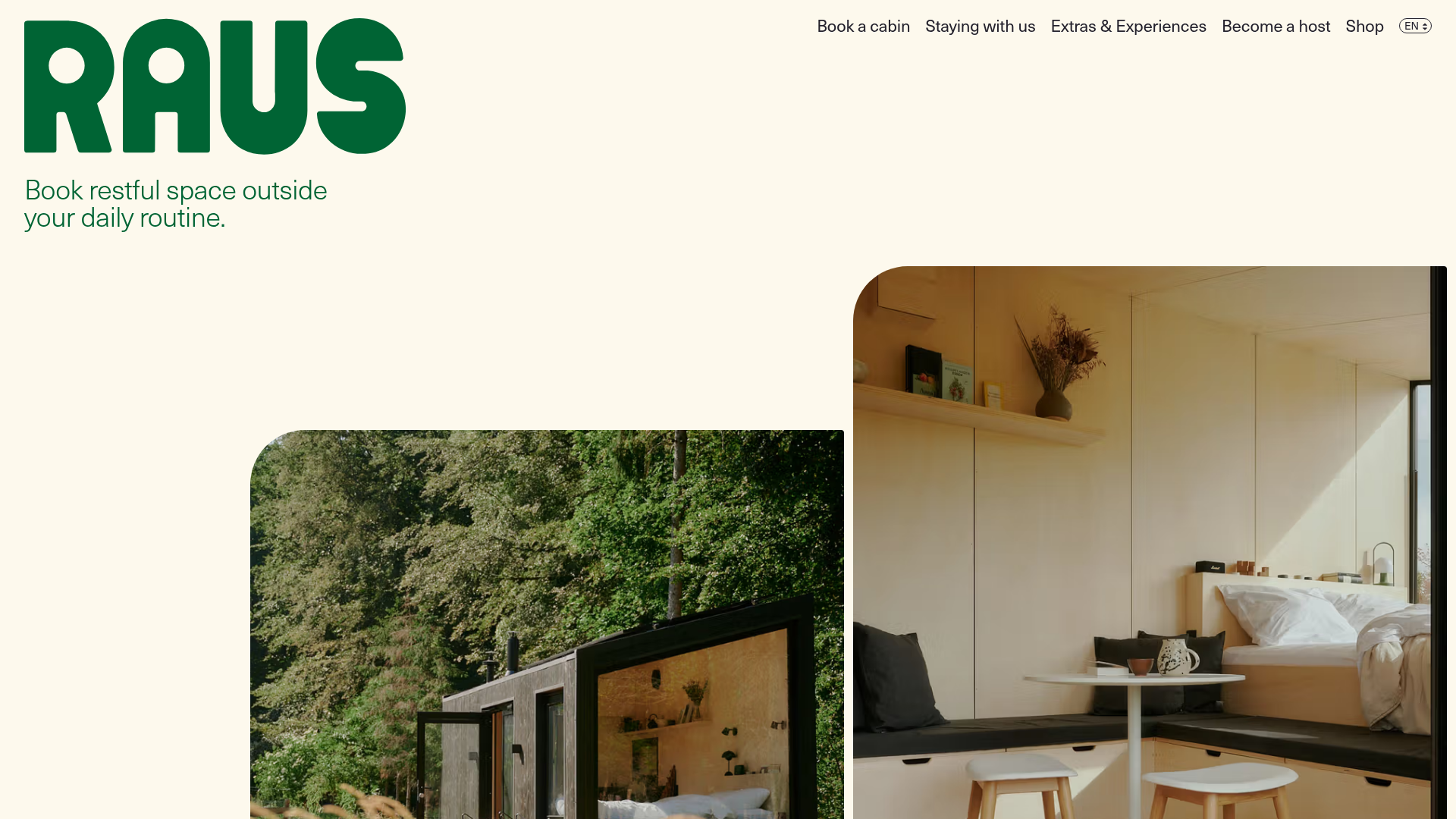
Raus Booking Site with Asymmetric Layout
A nature-focused landing page featuring a floating booking widget, stylized image masks, and an asymmetric animated gallery for showcasing cabin experiences.
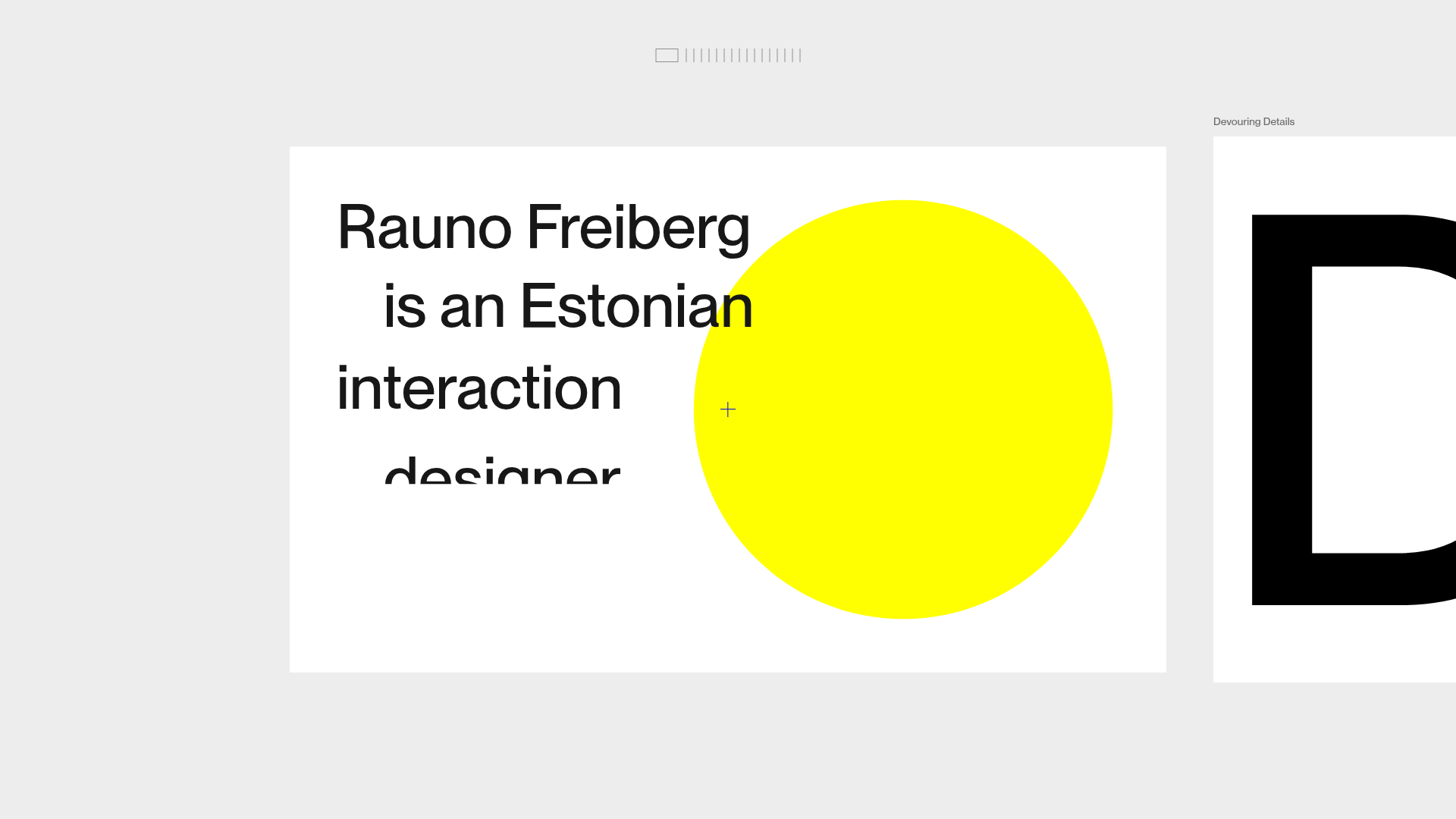
Rauno Freiberg Horizontal Scroll Portfolio
Minimalist horizontal deck layout featuring frame-based navigation, smooth clip-reveal text animations, and a top-bar progress minimap.
