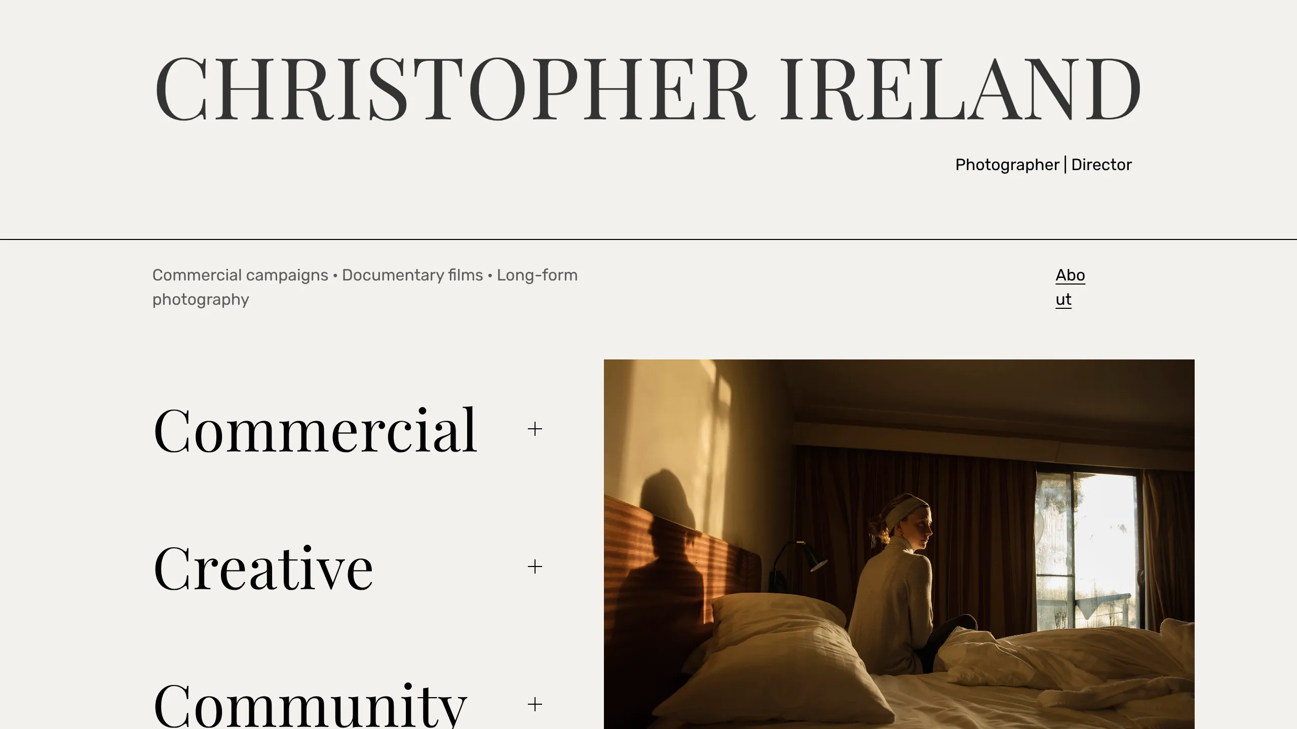
Christopher Ireland Portfolio Landing Page
A minimalist portfolio layout featuring a split-screen design with a text-based accordion navigation on the left and an image slider on the right.
Overview
This website is a minimalist professional portfolio for a photographer and director, characterized by a high-contrast serif aesthetic and a functional split-screen layout. It serves as a strong reference for creators who want to balance heavy typography with high-impact visual media without cluttering the user interface.
Design System
- Color Palette & Visual Hierarchy: The site uses a sophisticated off-white or light beige background (#F7F6F2) paired with deep charcoal or black text. The hierarchy is driven by scale; the oversized site title dominates the header, while the main navigation is tucked into an interactive accordion on the left.
- Typography: The system relies heavily on elegant, high-contrast Serif typefaces (e.g., modern Garamond or Didot variants). Large font sizes (approx. 85px for the header and 40px+ for accordion titles) create a editorial, magazine-like feel. Supporting metadata uses a clean Sans-Serif for readability.
- Page Structure: The layout follows a strict horizontal line break below the header. The main content area is split into two primary columns: a left-aligned vertical accordion list for navigation/categories and a right-aligned image container featuring a cross-fading slider.
- Reusable Components:
- Text-Based Accordion: A clean list where items (Commercial, Creative, Community) expand to reveal sub-links, using a simple plus/minus toggle.
- Asymmetric Header: A wide header that separates the brand name from the professional title and landing description using a thin horizontal rule.
- Image Slider: A 3:2 aspect ratio container with CSS opacity transitions for smooth image cycling.
- Interaction & Motion: The primary interaction is the hover-and-click state of the accordion. Images transition via a
1.5s ease-in-outopacity fade, providing a cinematic feel. Links are styled with minimal decoration, often using simple underlines or pipe separators. - Responsive Behavior: The HTML structure indicates a Squarespace-based 'Fluid Engine' layout. On mobile, the split-screen likely stacks vertically, with the image moving either above or below the navigation categories.
Use Cases
- Who should clone this: Photographers, cinematographers, architects, and high-end fashion designers who need a 'digital business card' that prioritizes mood and brand over dense information.
- Remix Directions:
- Product Showcase: Swap the photography categories for product lines (e.g., 'Furniture', 'Lighting', 'Textiles') where the right-side image updates based on the hovered accordion item.
- Agency Landing Page: Use the large serif typography for a bold agency manifesto, featuring a showreel in the right-side container instead of static images.
- Clone Scope: Designers should prioritize cloning the header-to-accordion transition and the split-screen logic. The footer and individual inner pages are standard, but the landing page's spatial distribution is the unique 'hero' element worth replicating.
Related Inspirations

Clase Agency Branding Portfolio
A minimalist design agency portfolio featuring a typographic hero section, full-width image articles, sticky title bars, and integrated scrolling text marquees for a clean editorial layout.
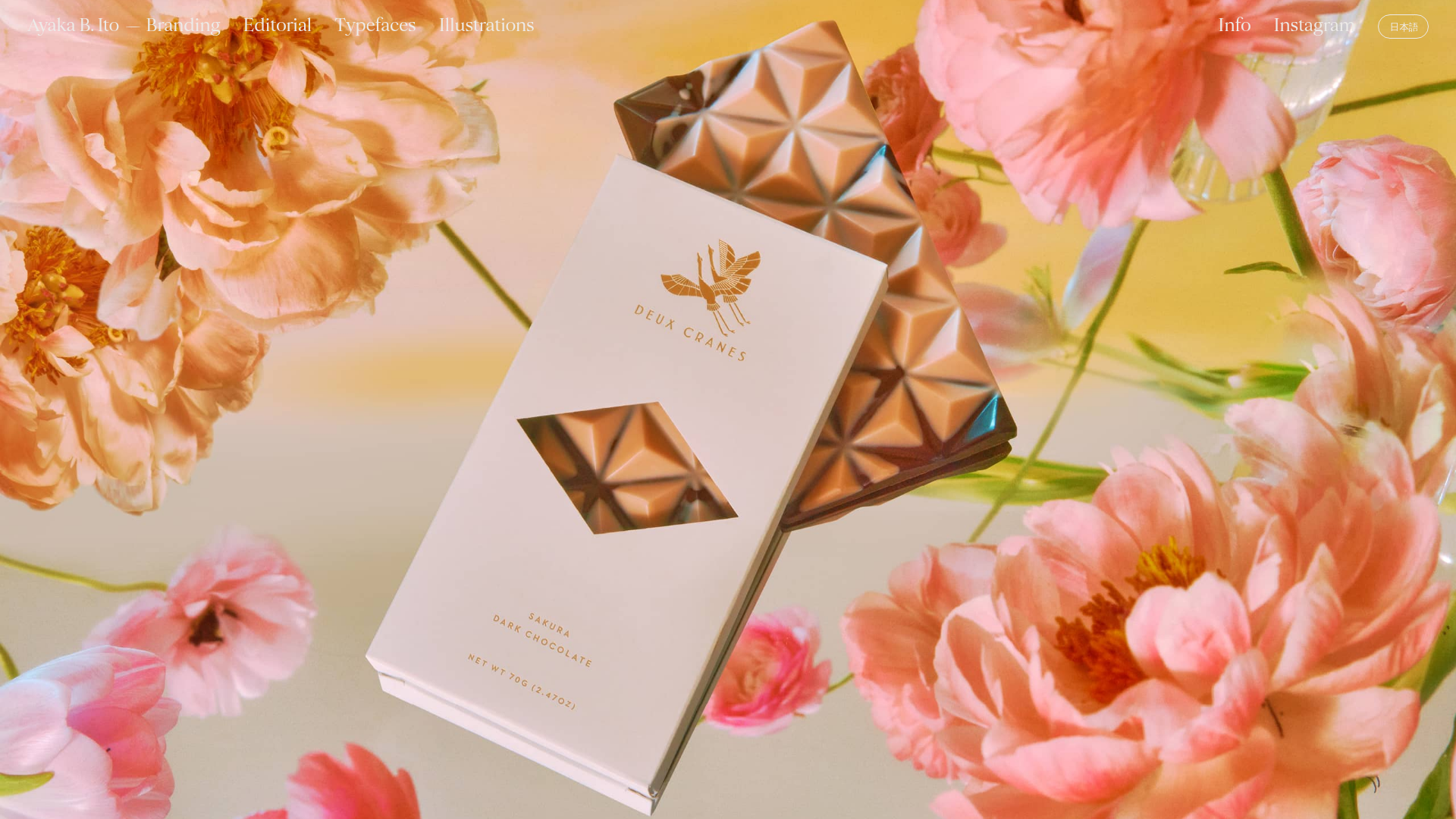
Ayaka B. Ito Creative Portfolio
A minimalist design portfolio featuring an immersive full-screen hero image, clean typographic navigation, and a structured layout for showcasing branding and editorial projects.

Lundqvist & Dallyn Studio Portfolio
Minimalist design studio portfolio featuring a custom video loader, world clock navigation, and a fluid masonry-style grid for high-quality photography and type design showcases.
Minimalist Dark Designer Portfolio Grid
A clean, dark-themed portfolio featuring a bold typography hero section and a staggered two-column image grid with subtle entrance animations.

AcolorBright Design Agency Portfolio
Minimalist bento-style portfolio layout featuring numerical section headers, horizontally scrolling project teasers, and a clean grayscale client logo grid.
Waka Waka Furniture Portfolio
A minimalist design showcase featuring a custom cursor, parallax scroll effects, and a vertical image grid layout for high-end product displays.
