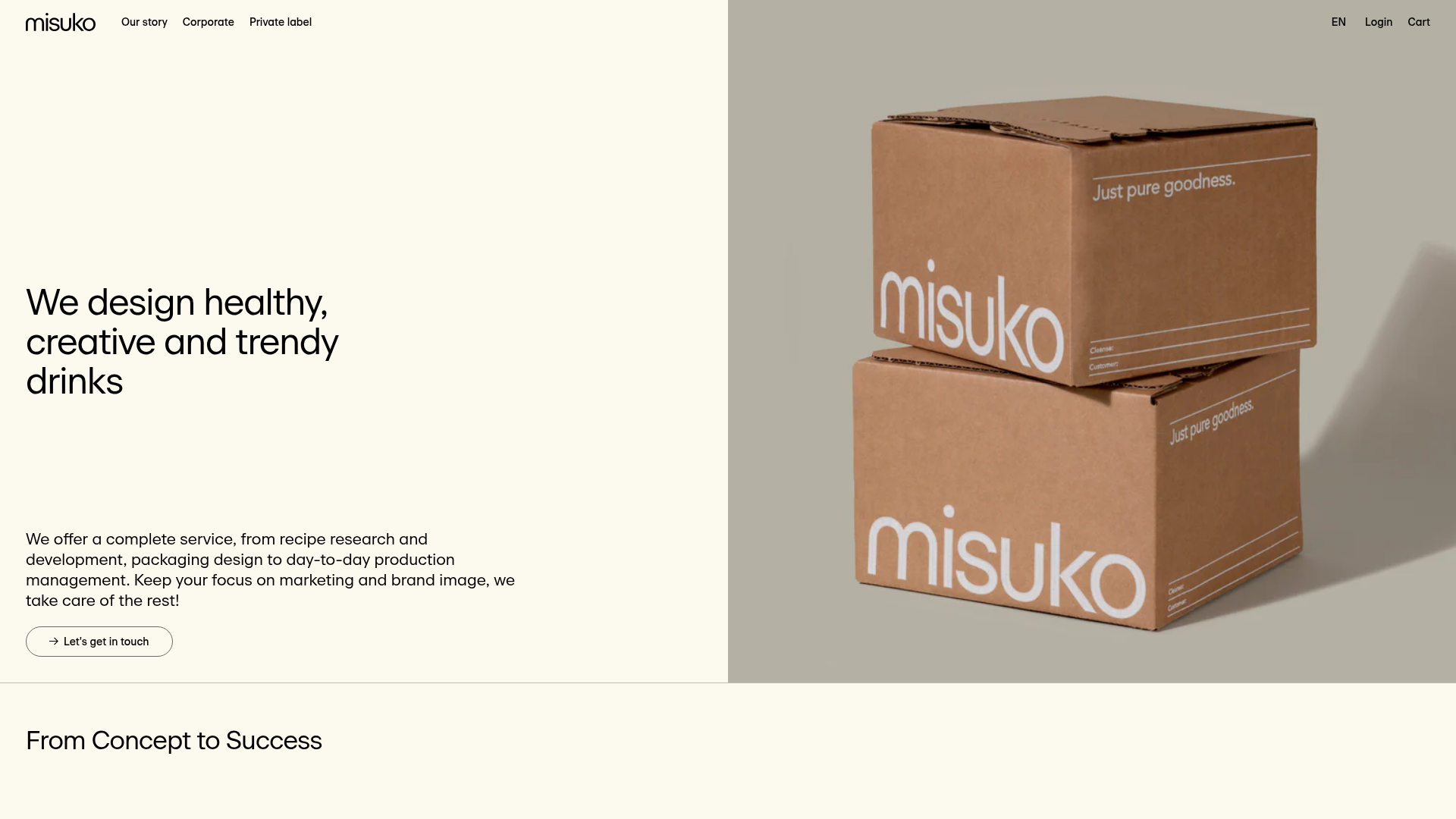
Misuko Food & Beverage Agency B2B Landing Page
A minimalist Shopify-based B2B landing page featuring a split-screen hero section, vertical service list, alternating promotional blocks, and a large-format testimonial slider.
Overview
This Shopify-based landing page is a masterclass in minimalist B2B service presentation, utilizing a clean split-screen hero and high-contrast typography. It is a strong reference for builders because it balances professional agency messaging with a modern, editorial aesthetic that feels more like a lifestyle brand than a traditional corporate consultancy.
Design System
- Color Palette & Visual Hierarchy: The site uses a warm, parchment-like off-white (
#F9F7F0approximation) background paired with deep charcoal text and earth-toned imagery. The hierarchy is established through extreme scale in headings and a strict two-column grid that separates informational text from visual proof. - Typography: A geometric sans-serif (resembling ITC Avant Garde or similar) is used with tight letter-spacing. Headings use
o-title--mediumando-title--largeclasses, while body copy remains legible and centered in generous whitespace to emphasize specific service points. - Page Structure: The flow begins with a split-screen
c-hero-section, followed by ac-splitted-sectionthat uses a vertical list for service tiers, and transitions into alternatingc-promo-sectionblocks (image left/text right and reversed) to break up the reading rhythm. - Reusable Components:
- Service/Pricing Blocks: The
c-splitted-section__itemis a clean pattern for listing service tiers with clear "Perfect for" bullets and price highlights. - Promotional Blocks: The
c-promo-sectionfeatures a balanced layout with a subtle arrow-link (o-link--arrow) and high-quality product photography. - Testimonial Slider: A large-format
swiper-containerthat places the quote as the primary hero element, removing the clutter of headshots to focus on the text.
- Service/Pricing Blocks: The
- Interaction & Motion: The design utilizes Swiper.js for smooth, touch-responsive horizontal transitions in the testimonial and blog (
l-slider) sections. Scroll behavior is likely aided by lazy-loading (lazyloadedclass) for high-resolution assets. - Implementation Clues: Built on Shopify, the code follows a BEM (Block Element Modifier) naming convention (e.g.,
c-promo-section--reverse). It uses a flexible layout system (grid-item g-fc) that makes it easy to add or remove horizontal sections without breaking the flow.
Use Cases
- Who should clone this: Creative agencies, white-label manufacturers, and consultants who need to explain complex service tiers without overwhelming the user.
- Effective Remixes: This layout is perfect for luxury food and beverage brands, boutique skincare manufacturers, or professional service firms (architects, design studios) that rely on a high-end portfolio feel.
- Remix Directions: Swap the parchment background for a bold brand color to shift from "organic/trust" to "tech/modern." The service list can be easily adapted into a tiered pricing table by adding a column-based view on desktop while maintaining the current vertical list for mobile.
- Clone Scope: The split-screen hero and the alternating promotional blocks are the highest-value elements for a quick section clone. For a complete brand overhaul, the entire flexible content (
g-fc) architecture provides a robust framework for long-form storytelling.
Related Inspirations
Monotype Variable Fonts Resource Gallery
A clean masonry grid layout featuring content cards with hover-state overlays, category filtering, and responsive image scaling for a media-rich resource center.

Clase Agency Branding Portfolio
A minimalist design agency portfolio featuring a typographic hero section, full-width image articles, sticky title bars, and integrated scrolling text marquees for a clean editorial layout.
Hudson Gavin Martin Corporate Law Landing
A professional service homepage featuring a minimalist grid-based hero, color-themed navigation blocks, and a bento-style insights feed with subtle hover interactions.

Lundqvist & Dallyn Studio Portfolio
Minimalist design studio portfolio featuring a custom video loader, world clock navigation, and a fluid masonry-style grid for high-quality photography and type design showcases.

AcolorBright Design Agency Portfolio
Minimalist bento-style portfolio layout featuring numerical section headers, horizontally scrolling project teasers, and a clean grayscale client logo grid.
Standards Platform Brand Guidelines Landing
A minimalist design featuring grid-based case studies, responsive video placeholders, an interactive logo wall, and high-contrast pricing cards for a modern SaaS aesthetic.
