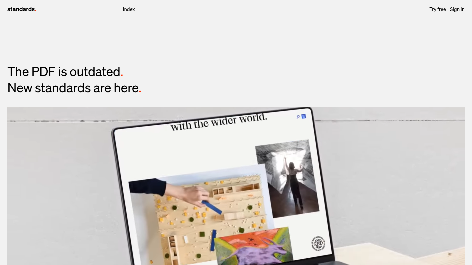
Standards Platform Brand Guidelines Landing
A minimalist design featuring grid-based case studies, responsive video placeholders, an interactive logo wall, and high-contrast pricing cards for a modern SaaS aesthetic.
Overview
This landing page is a masterclass in minimalist, high-impact design for a creative SaaS platform. It leverages a rigorous grid-based layout and stark typography to communicate authority and modernism. Builders should clone this to achieve a balance between a high-end portfolio aesthetic and clear software-as-a-service conversion funnels.
Design System
- Color Palette & Visual Hierarchy: The site uses a high-contrast foundation of pure white backgrounds and deep blacks, accented by a distinctive "Red Full Stop" brand element (seen in the
.type-redFullStopclass). Visual hierarchy is driven by extreme scale differences between giant headings and small, functional utility text. - Typography: Features a clean, geometric sans-serif (e.g., modern Helvetica or similar). Headings use immense font sizes (
h1,h2) to anchor the page, while UI elements and navigation use small, lowercase, or tracked-out variants for a Swiss-style editorial feel. - Page Structure & Flow: The layout follows a modular vertical sequence: a large-scale hero video, an interactive logo wall (
.js-logos), alternating 1-column and 2-column image/video grids for case studies, feature sections with side-by-side accordion/slider logic (.js-sequence), and high-contrast pricing cards. - Reusable Components:
- Aspect Ratio Placeholders: The
.aspectPlaceholdersystem ensures media containers maintain specific ratios (2:1 or 1:1) before content loads. - Responsive Media Grid: A flexible grid system (
.mediagrid--cols1,--cols2,--cols4) that handles mixed media effortlessly. - Pricing Cards: Minimalist blocks with simple list items and high-contrast call-to-action buttons (
.cards-layout__card).
- Aspect Ratio Placeholders: The
- Interactions & Motion: The site uses "Image-to-Video" hover effects (
.imgToVideoHover), where a static preview plays a looped video on mouse-over. It also features a custom-built logo switcher that toggles between "Brands" and "Agencies" while updating the logo grid. - Implementation Clues: Underneath its minimalism, it uses a WordPress/ACF (Advanced Custom Fields) block-based structure, relying on BEM-style naming conventions and CSS variables for media aspect ratios and animation durations (e.g.,
--logos-animation-duration).
Use Cases
- Who should clone this pattern: Creative agencies, design tool startups, architecture portfolios, and premium SaaS brands that want to emphasize visual quality over feature lists.
- Effective Remixes: This pattern works exceptionally well for visual-heavy products; you can swap the high-contrast white for a dark-mode palette or vibrant secondary colors while keeping the grid logic.
- Practical Directions:
- Adapt the Case Study Grid for any project-based portfolio where media needs to be a specific ratio.
- Reuse the Sequence Component (accordion text paired with synced video) to explain complex software features without overwhelming the user.
- Suggested Clone Scope: A quick section clone of the Interactive Logo Wall or the Image-to-Video Media Grid is ideal for adding modern polish to an existing site. A full-page clone is best for those starting a new brand identity project from scratch.
Related Inspirations

Clase Agency Branding Portfolio
A minimalist design agency portfolio featuring a typographic hero section, full-width image articles, sticky title bars, and integrated scrolling text marquees for a clean editorial layout.

Lundqvist & Dallyn Studio Portfolio
Minimalist design studio portfolio featuring a custom video loader, world clock navigation, and a fluid masonry-style grid for high-quality photography and type design showcases.

AcolorBright Design Agency Portfolio
Minimalist bento-style portfolio layout featuring numerical section headers, horizontally scrolling project teasers, and a clean grayscale client logo grid.
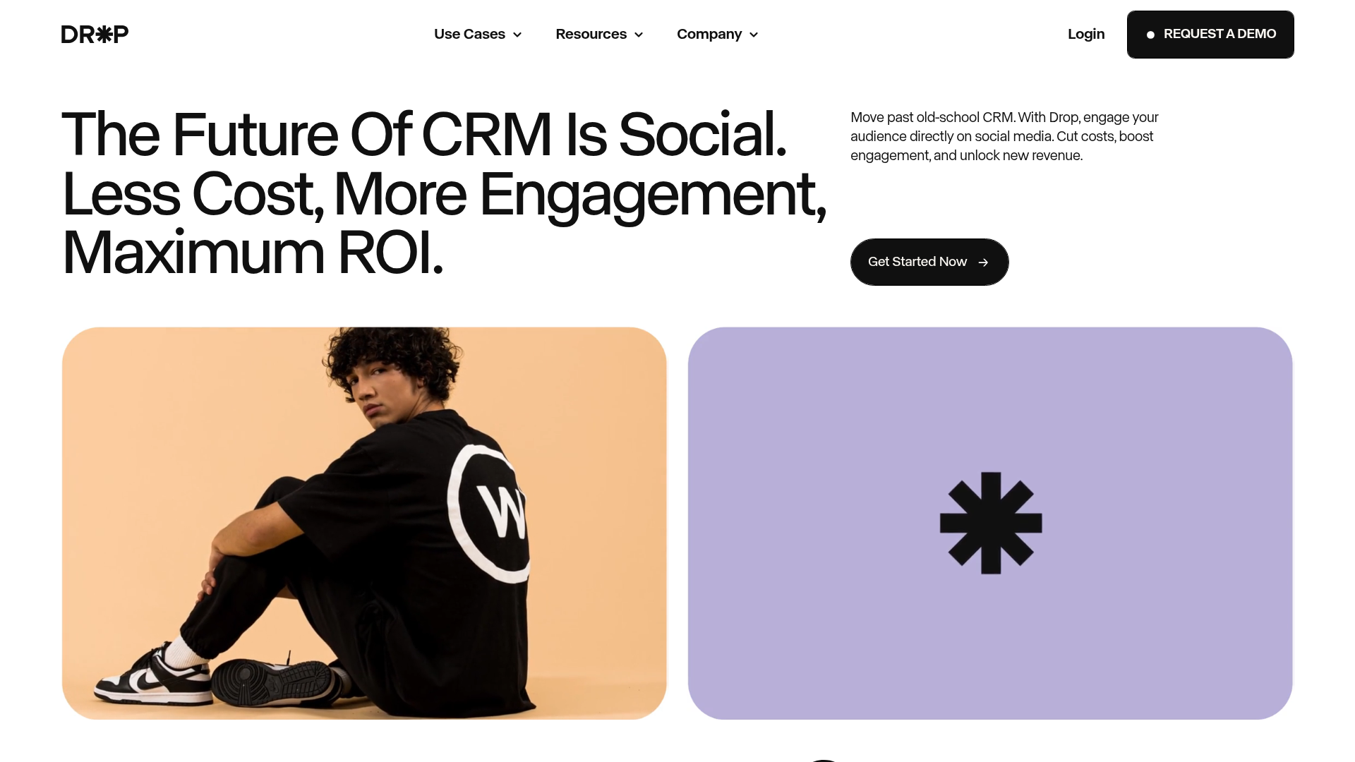
Drop Social CRM Landing Page
A modern SaaS landing page featuring a minimalist large-typography hero section, rounded bento-style image containers, and a clean navigation bar with a CTA.
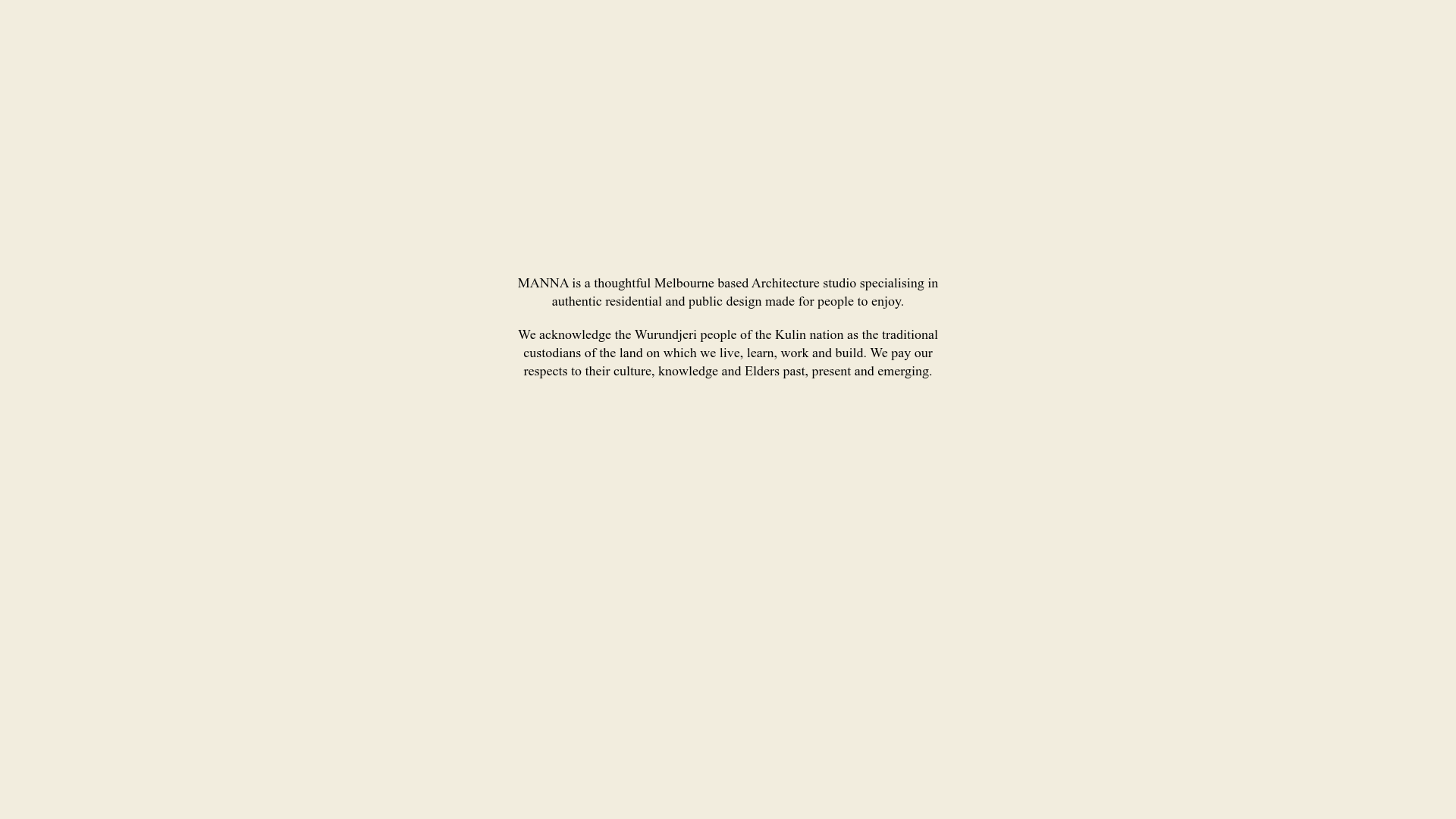
Manna Architects Minimalist Portfolio Grid
A clean, single-page architecture portfolio featuring a centered intro, a varied multi-column image gallery with captions, and a detailed project service breakdown.
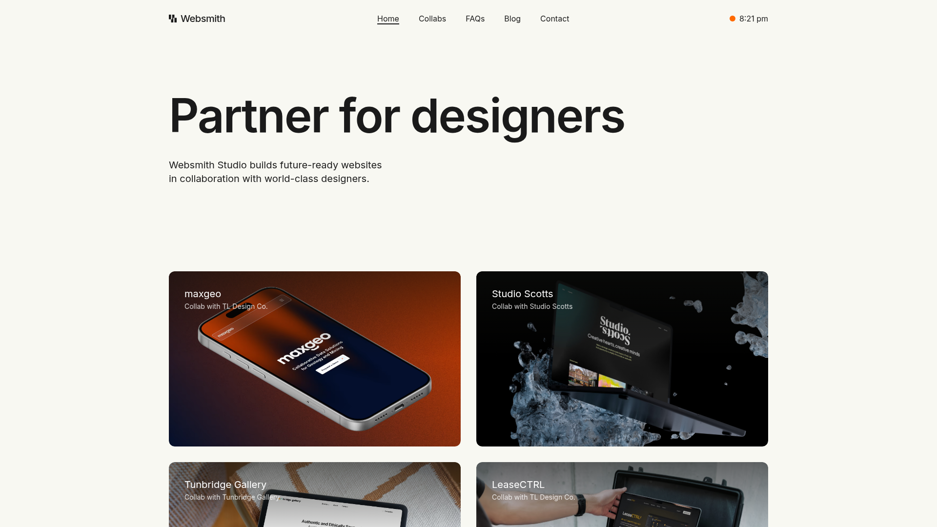
Websmith Studio Portfolio Site Template
A clean studio portfolio featuring a responsive bento-style project grid, interactive process cards, and a split-screen testimonial section built with Tailwind CSS.
