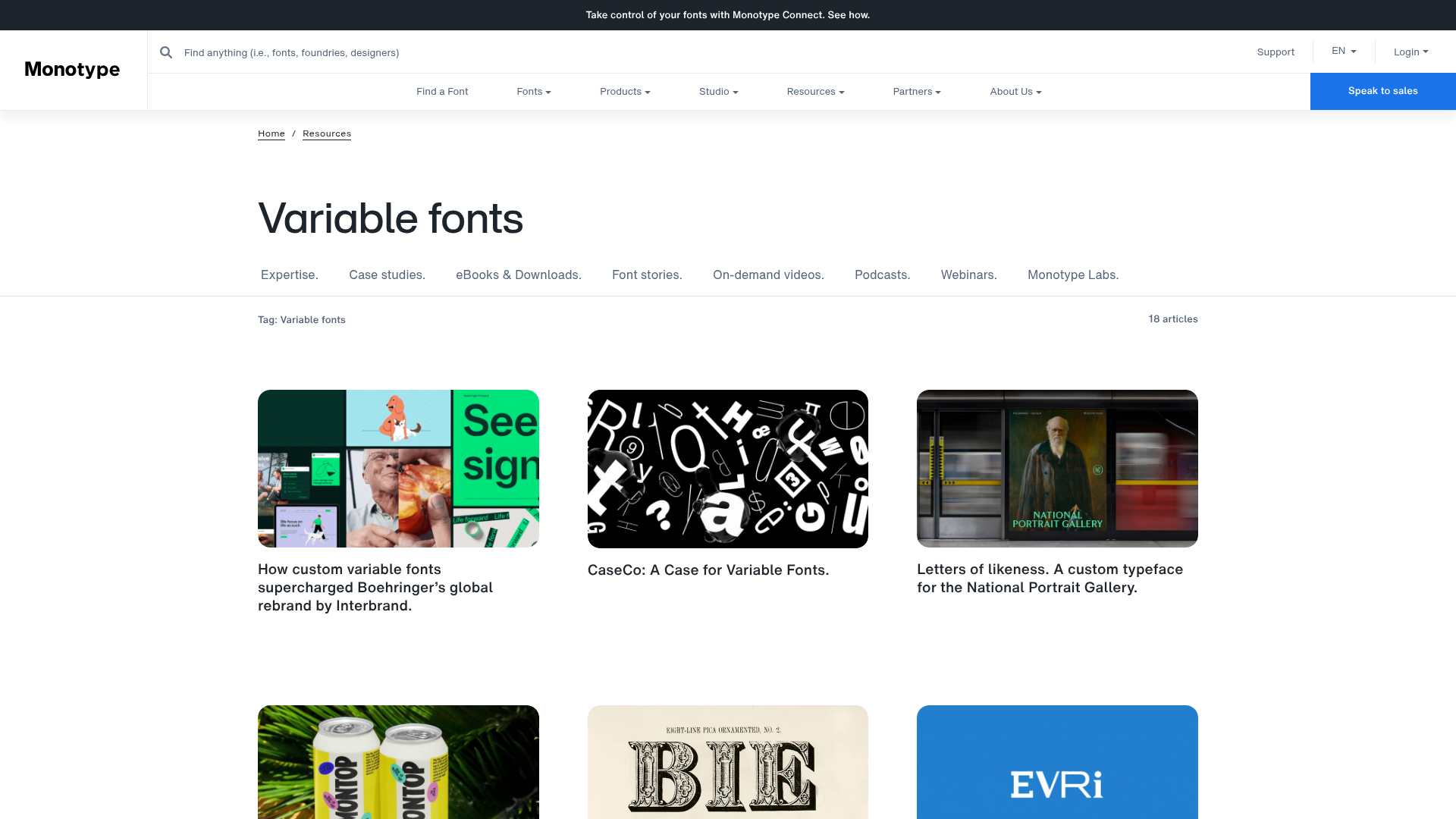
Monotype Variable Fonts Resource Gallery
A clean masonry grid layout featuring content cards with hover-state overlays, category filtering, and responsive image scaling for a media-rich resource center.
Overview
This resource gallery for Monotype showcases variable font technology through a sophisticated masonry grid system. It is an excellent clone reference for developers building media-rich content hubs, case study portfolios, or digital asset libraries that require clean categorization and high visual impact.
Design System
- Color Palette & Visual Hierarchy: A minimalist professional palette utilizing a white background (
#FFFFFF) with high-contrast black typography. Active states and primary actions use a vibrant brand blue (#0066CC). Hierarchy is established through generous whitespace and distinct font weight variations. - Typography: Heavily features sans-serif families with a clear scale: large
h1titles for the category, followed by smaller metadata (e.g., "18 articles"). Component titles use a slightly smaller, bold font that balances the large imagery. - Structure & Flow: The page follows a logical top-to-bottom flow: global navigation, breadcrumbs, page header, category filter navigation, and finally the
cols-3masonry grid containing resource cards. - Reusable Components:
- Resource Cards: The primary building block containing a
component-image-areaand acomponent-content-areawith title and description. - Filtering Nav: A secondary horizontal menu for navigating categories (Expertise, Case Studies, etc.).
- Global Header: Features a search bar, utility links (Support, Login), and a prominent "Speak to sales" CTA.
- Resource Cards: The primary building block containing a
- Interaction & Motion: The design uses a sophisticated overlay pattern. The HTML shows a
component-image-overlaycontaining anoverlay-descriptionandoverlay-cta. On hover, the image becomes obscured by a text-heavy description and a button, allowing the grid to remain clean while providing deep context on demand. - Implementation Clues: The HTML reveals a grid-based CSS structure (
views-view-grid masonry-grid horizontal cols-3) and a mobile-first responsive strategy usingpicturetags with multiplesrcsetsources for various breakpoints (320px, 768px, 1024px).
Use Cases
- Who should clone this: Agencies needing a portfolio hub, tech companies building an eBook/Whitepaper library, or designers creating a curated typography showcase.
- Remix Directions: Swap the minimal white theme for a dark mode aesthetic; replace the font-centric imagery with product screenshots for a SaaS help center; or adapt the masonry grid into a strict uniform grid for more structured content.
- Scope: A full-page clone is ideal for content-heavy sites, but the resource card with its unique hover-state overlay is a high-value module for any individual project section.
Related Inspirations
Hudson Gavin Martin Corporate Law Landing
A professional service homepage featuring a minimalist grid-based hero, color-themed navigation blocks, and a bento-style insights feed with subtle hover interactions.
Green Angel Syndicate Investment Landing Page
A clean venture capital landing page featuring a hero section with card-based navigation, a four-column stat grid, and alternating split-layout content sections with image-text pairings.
Munro Partners Financial Growth Landing Page
A professional financial services layout featuring a vertical typographic hero, animated stat counters, a data-driven fund performance table, and a colorful grid for news and investment themes.
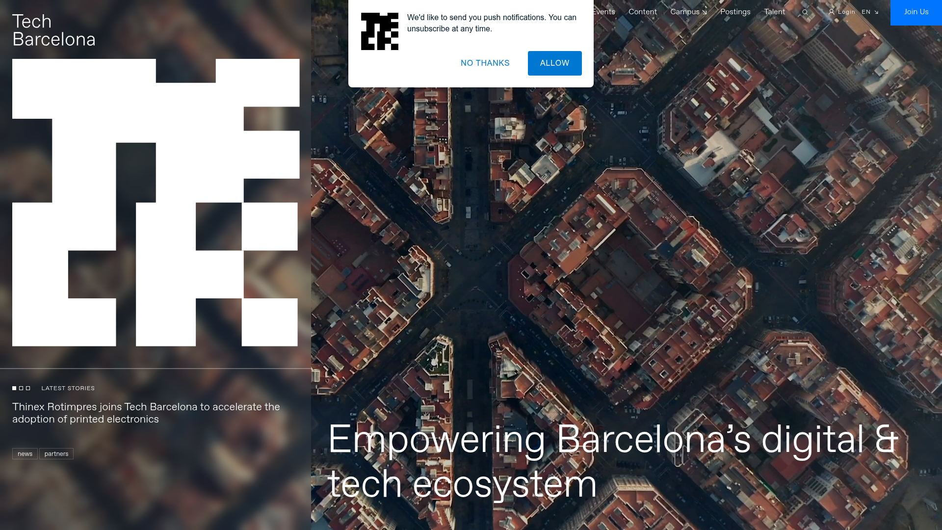
Tech Barcelona Ecosystem Hub Landing Page
A refined landing page layout featuring an immersive video background hero, marquee-style scrolling badges, and card-based sections for events and community projects.
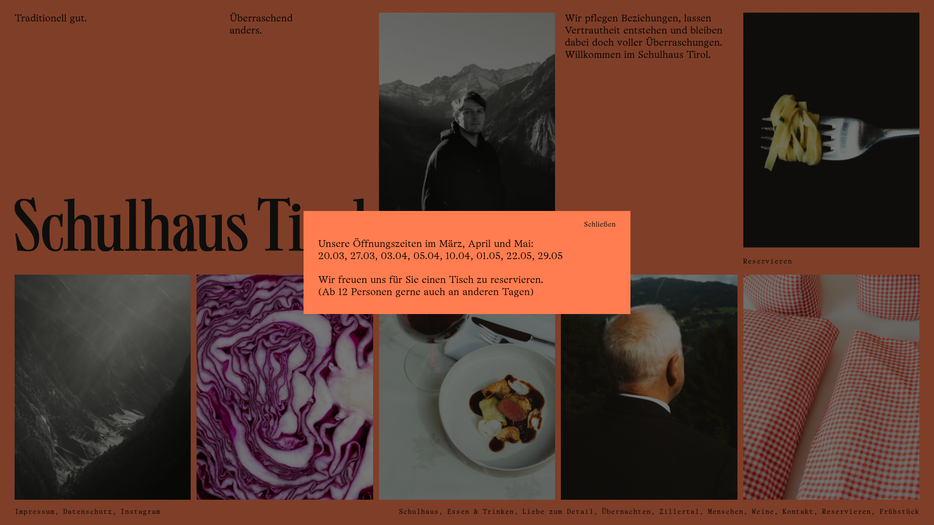
Schulhaus Tirol Restaurant Grid Layout
A terracotta-themed editorial design featuring a multi-column asymmetric grid, monochromatic photography, and a stylized reservation modal.
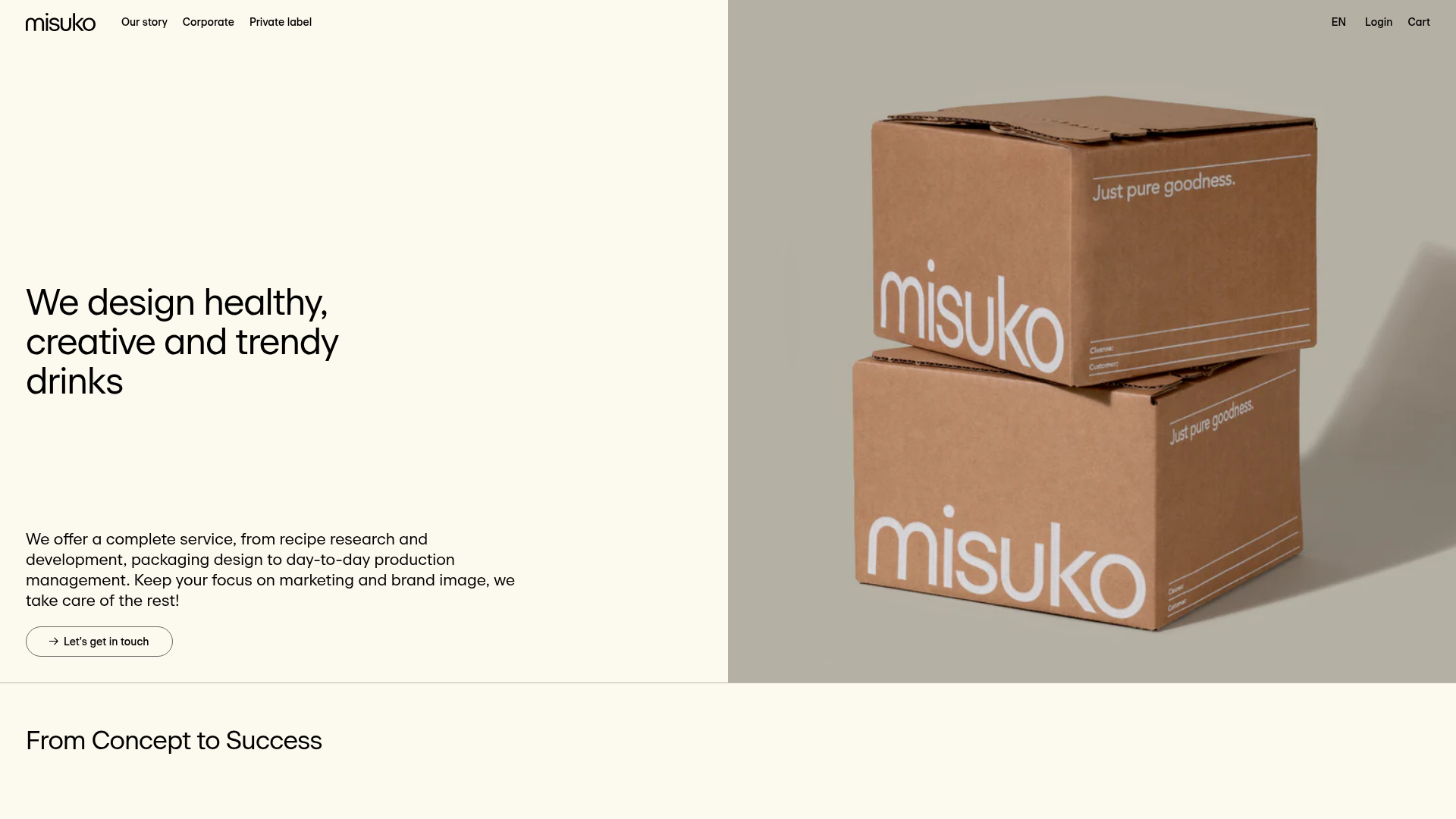
Misuko Food & Beverage Agency B2B Landing Page
A minimalist Shopify-based B2B landing page featuring a split-screen hero section, vertical service list, alternating promotional blocks, and a large-format testimonial slider.
