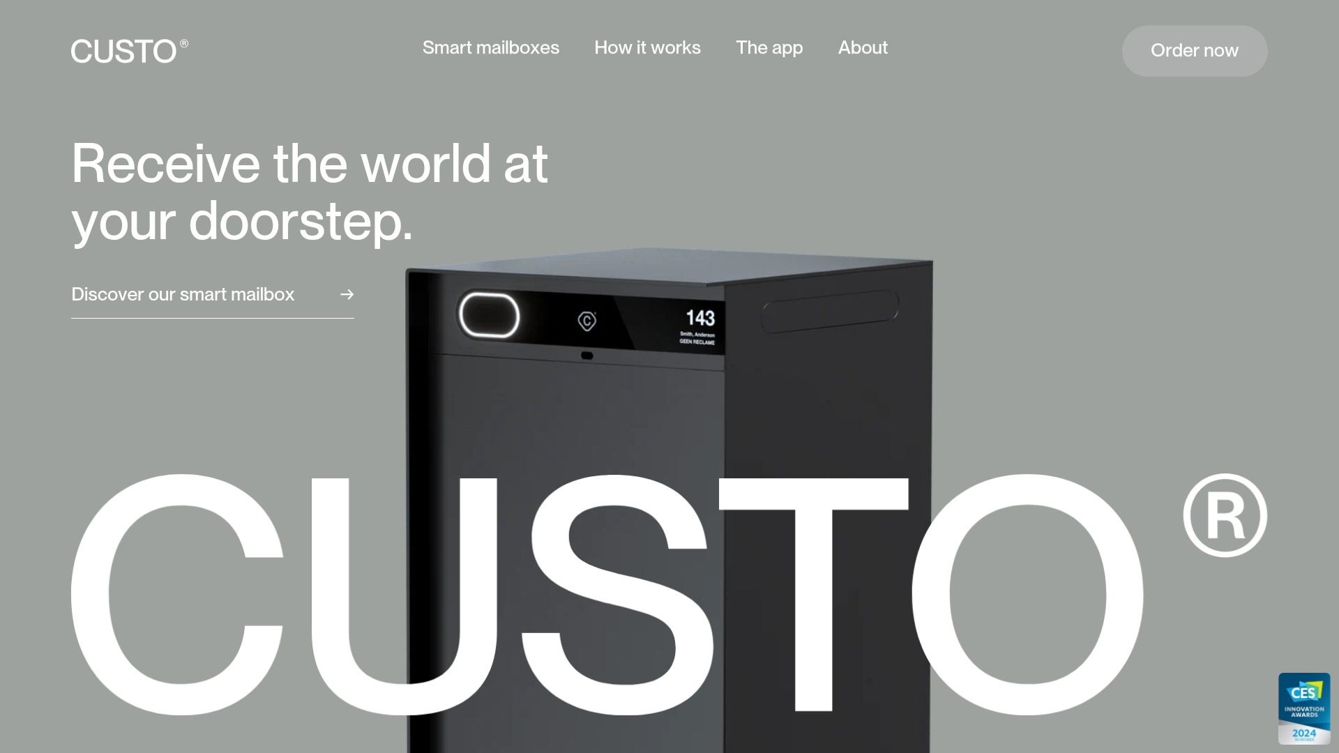
Custo Smart Mailbox Landing Page
A minimalist hardware product landing page featuring a parallax hero section, sticky step-by-step app feature descriptions, and a sophisticated grayscale aesthetic with integrated product sliders.
Overview
Custo.io is a minimalist landing page for a high-end hardware product, characterized by a sophisticated grayscale palette and immersive scroll-driven animations. It serves as an excellent reference for builders wanting to showcase a single physical product through high-quality photography, parallax effects, and structured storytelling.
Design System
- Color Palette & Visual Hierarchy: The site uses a neutral palette primarily consisting of shades of gray (around
#969994) and deep blacks, allowing white typography and high-contrast product images to pop. A subtle "CUSTO" watermark in the hero section creates a sense of depth behind the physical product. - Typography: It employs a clean sans-serif system (likely a custom variation of Helvetica or Inter). It utilizes large font sizes for headers (
t-h1) and high-contrast split-text animations for impact. Navigational elements and secondary labels use smaller, precise caps or tight tracking for a technical feel. - Structure & Flow:
- Parallax Hero: Features a floating hardware product and a large integrated logo watermark.
- Value Proposition Slider: Horizontal flickity-based image slider interspersed with bite-sized text blocks.
- Application Storytelling: A step-by-step feature section using a sticky container on the left that updates text as users scroll past large product context images on the right.
- Social Proof/Vision: A clean split-layout footer section for brand origin and investor information.
- Reusable Components:
- The Navigation Panel: Includes an "Order Now" primary button and a secondary product-switching panel that reveals high-resolution thumbnails on click.
- Secondary Buttons: Transparent backgrounds with white text and a bottom-aligned arrow icon (
t-btn--secondary). - Custom Cursor: Integrated specifically for the site with dynamic state changes (plus sign or arrow) based on hover targets (
cursor-trigger).
- Motion Patterns: Extensive use of
matrix3dtransforms andparallax-objectclasses create a smooth, high-end feel. Element appearance is handled by anappear-objectscript that triggers as content enters the viewport. - Implementation Clues: The HTML reveals a Shopify-based architecture using custom web components (e.g.,
<custo-navigation>,<parallax-object>,<smooth-scroll>). It utilizes the Barba.js library for seamless page transitions and the Flickity library for touch-ready product sliders.
Use Cases
- Who should clone this: Designers and developers building portfolios or one-page sites for high-end consumer electronics, IoT devices, or modern furniture.
- Effective Remixes: Adapt the "how it works" vertical scroll logic for luxury accessories or software features that require distinct visual context for every step. The sticky-left/scrolling-right pattern is particularly effective for explaining complex hardware features.
- Remix Directions: Swap the grayscale theme for a high-energy brand color (e.g., electric blue or neon green) while keeping the parallax hierarchy. You can also strip the Shopify specific logic to create a lightweight static site using the same layout components.
- Suggested Scope: Developers should prioritize cloning the sticky feature section and the parallax hero, as these provide the most distinctive "premium" feel with minimal content requirements.
Related Inspirations
Seed Health Landing Page
An elegant wellness landing page featuring a full-viewport parallax hero, vertical swiper transitions, an interactive product carousel, and a custom video gallery for customer stories.
HNST Circular Fashion eCommerce Gallery
A minimalist apparel site featuring a full-screen image slider with parallax effects, grid-based product sections, and a clean typography-focused header for sustainable brand storytelling.

Finn Pet Supplements Landing Page
An e-commerce landing page featuring high-contrast typography, a sticky brand logo banner, parallax scroll effects on product headers, and a clean product grid.
Sandland Sleep Product Landing Page
A high-conversion Shopify layout featuring split-video hero sections, logo-based social proof ribbons, and a testimonial slider integrated with biometric sleep tracker results.
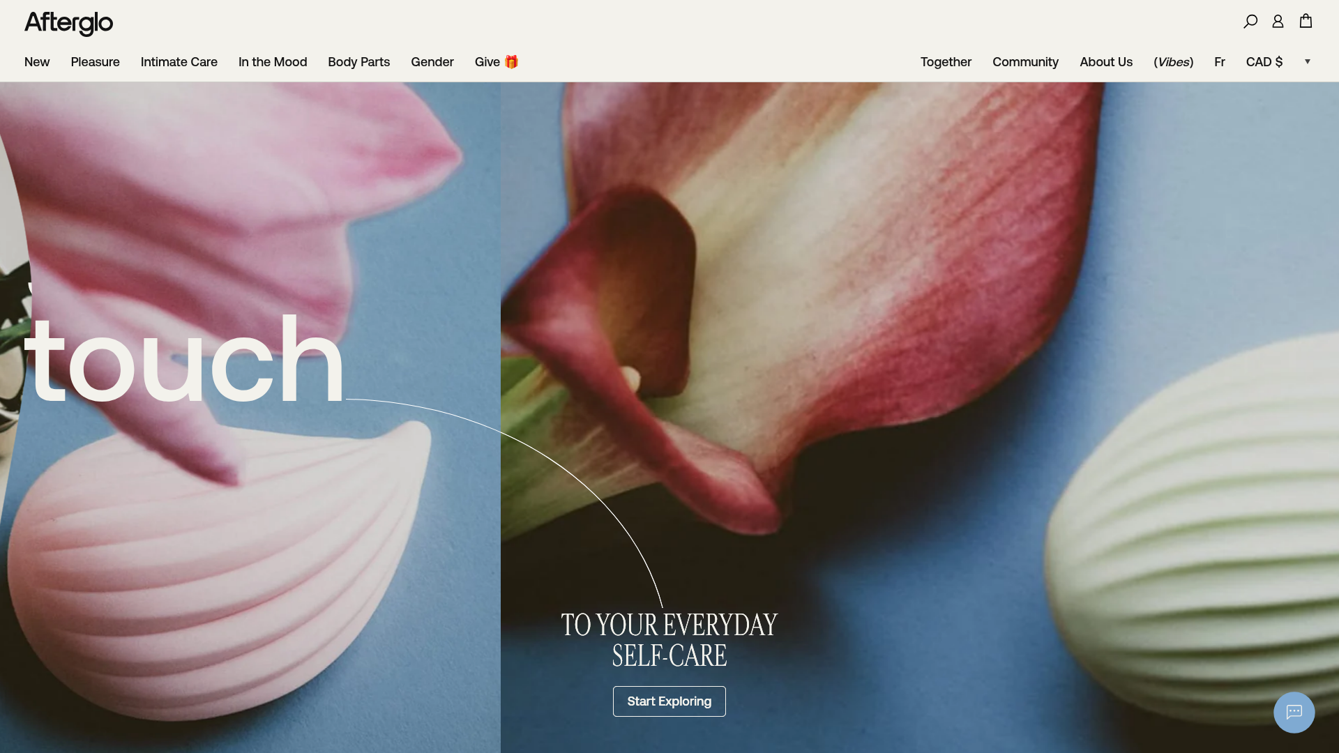
Afterglo Sensual Self-Care Storefront
An elegant e-commerce landing page featuring a split-screen horizontal scrolling hero, kinetic typography with 'vibrating' text animations, and a customized product carousel.
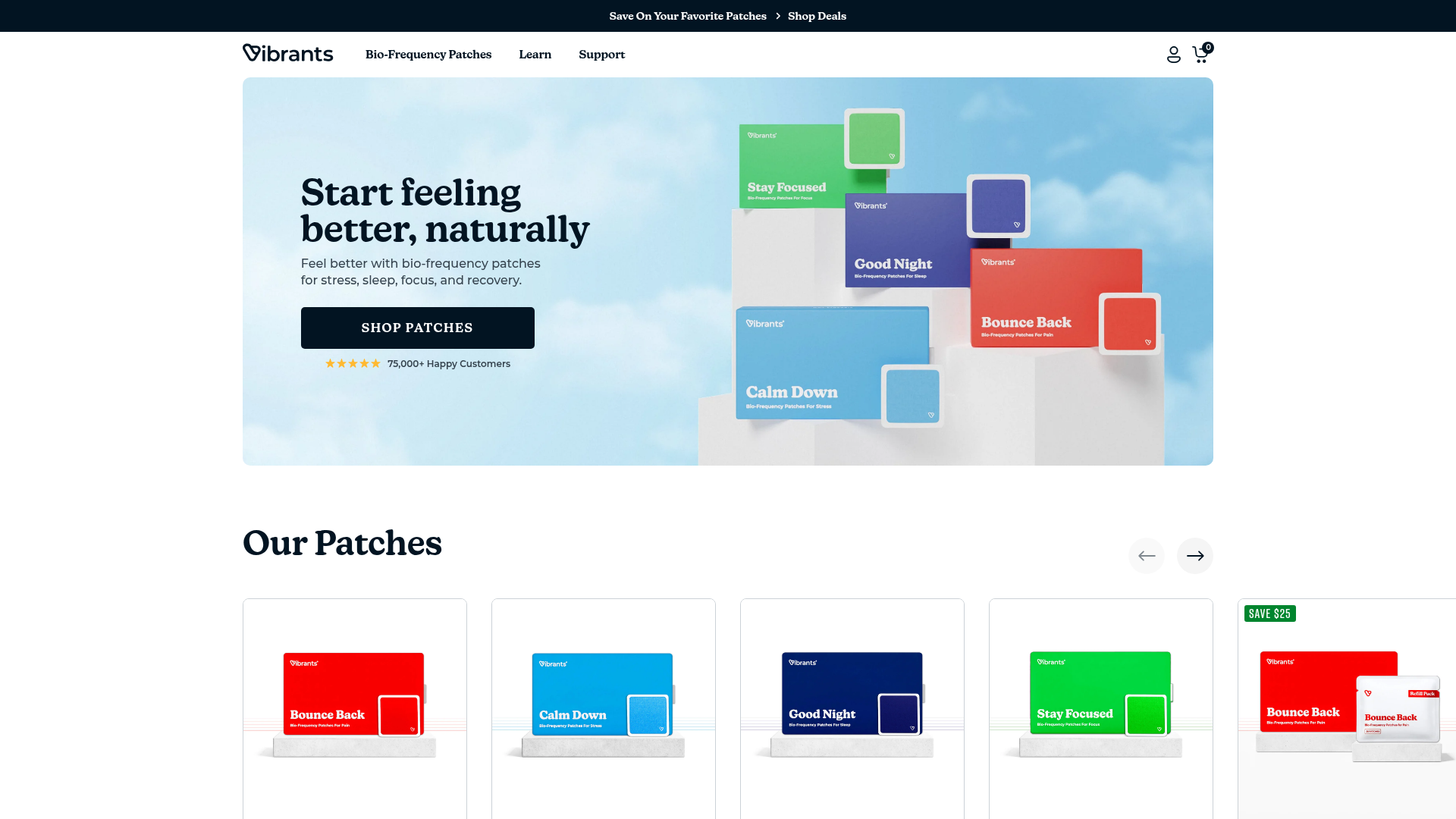
Vibrants Wellbeing E-commerce Landing Page
A clean Shopify-style landing page featuring a full-width hero with overlaid product cards, a horizontal product slider, and interactive cart drawer with utility progress bars.
