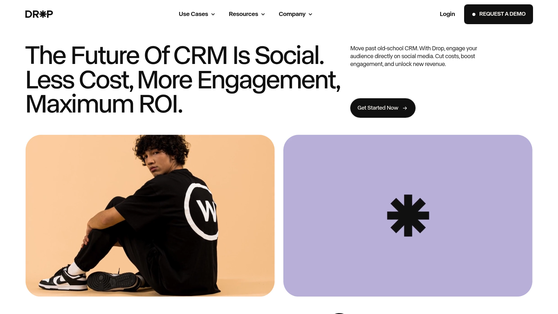
Drop Social CRM Landing Page
A modern SaaS landing page featuring a minimalist large-typography hero section, rounded bento-style image containers, and a clean navigation bar with a CTA.
Overview
This landing page is a premier example of modern B2B SaaS design for social commerce platforms, utilizing a bold, high-contrast aesthetic. It excels as a clone reference due to its sophisticated typography-driven hero section and fluid bento-grid layouts that effectively bridge the gap between utility and high-fashion branding. Builders should look to this for its seamless integration of Lottie animations and scroll-triggered content transitions.
Design System
- Color Palette & Visual Hierarchy: The design uses a high-contrast base of deep black (#101010) and off-white. This is punctuated by a functional pastel palette including a soft lavender (#B8AFDA), pale green (#C7D8C7), and a vibrant caution-yellow for specific CTA highlights. Visual hierarchy is established through extreme scale—large font sizes for value propositions contrasted with tiny, all-caps labels for utility data.
- Typography System: The site relies on a refined neo-grotesk sans-serif. It employs a "split-personality" scale where headers are oversized and tight-leaded, while body copy is set in smaller, highly legible blocks. It frequently uses italicized or stylized versions of the typeface (referenced as
title-m-ivarin HTML) to emphasize specific brand concepts like "Social" or "Simple." - Page Structure & Flow: The flow begins with a minimalist split-hero (text left, media right), followed by a client logo ticker. The core features are delivered through a sticky-tab reveal system (
tabs-home-panel) where content changes as the user scrolls, transitioning between "Organic" and "Paid" focus areas. Success stories are showcased in a sliding carousel, followed by a CMS-driven template gallery and resource grid. - Reusable Components:
- Buttons: Complex custom components with a
btn-icon-wrapthat features a horizontal sliding text-reveal and a background scale animation on hover. - Bento Media Boxes: Rounded-corner containers (
home-hero-video-bg) used for both background videos and static brand imagery. - CMS Cards: Standardized success story cards with blur-on-hover overlays and nested tag grids.
- Buttons: Complex custom components with a
- Interaction & Motion: The implementation features heavy usage of scroll-triggered transforms. Specifically, the "Old World vs New World" section uses horizontal text movement and character-level transitions (
video-scroll-span). There is a clear use of page transitions (p-transition-panel) and Lottie-based background interactions to maintain engagement during scroll depth. - Implementation Clues: Built using Webflow, indicated by classes like
w-layout-grid,w-dyn-list(indicating a CMS-heavy structure), andw-slider. The use ofdata-w-idattributes suggests complex custom interactions managed through the Webflow IX2 engine.
Use Cases
- Who should clone this pattern: SaaS startups in the marketing, sales, or social media automation space looking to establish a premium, high-authority brand identity that deviates from standard "Corporate Blue" layouts.
- Effective Remixes: Fintech platforms could adapt the feature-tabs section to compare account types; Portfolio sites for creative agencies can reuse the large-typography hero and bento image grids to showcase high-impact visual work.
- Practical Directions:
- Minimalist Remix: Strip the pastel colors and use a monochrome palette to lean into a luxury tech aesthetic.
- Architecture Adaptation: Reuse the sticky feature tabs section as a stand-alone "How it Works" block for an onboarding page.
- Suggested Clone Scope: A quick section clone of the hero and logo-grid is ideal for rapid brand-testing. For complex product explanations, a full-page clone is recommended to preserve the integrated scroll-and-tab logic.
Related Inspirations
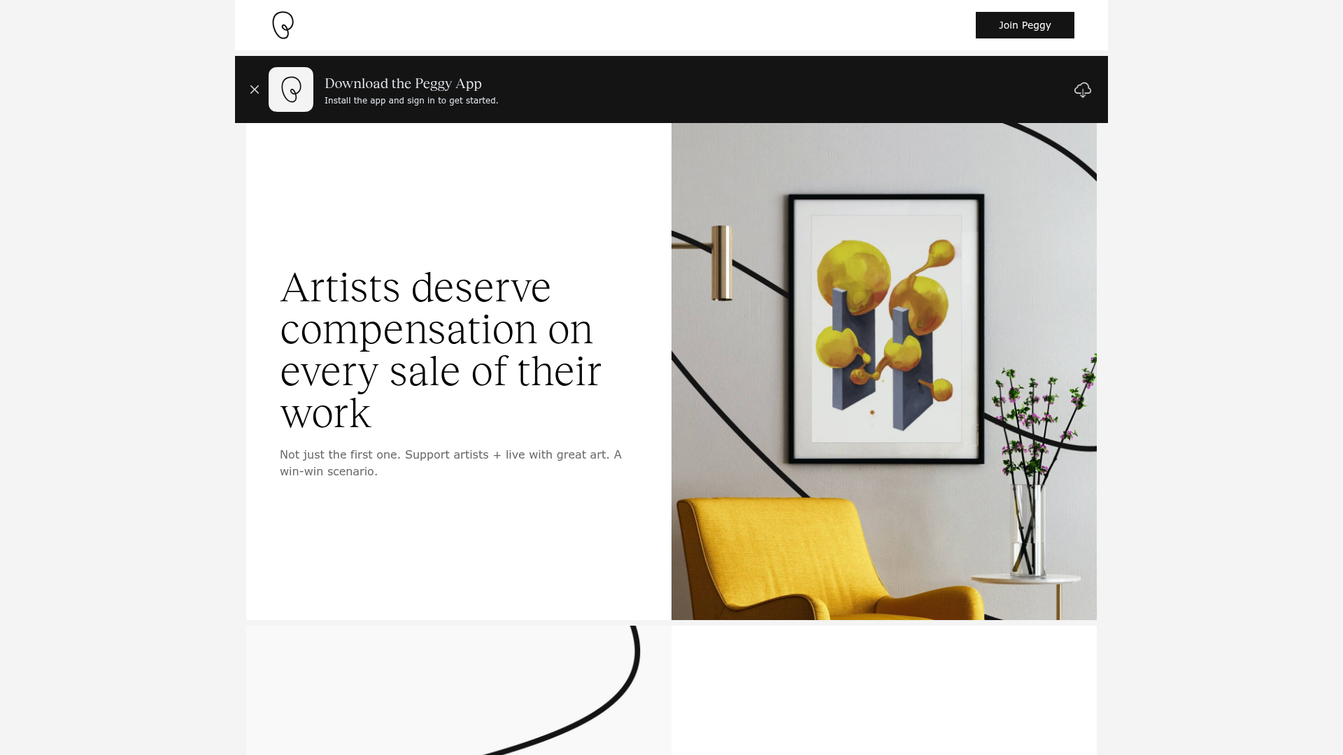
Peggy Art Royalties Pitch Page
A clean storytelling layout featuring alternating image-text sections, a three-column testimonial grid with circular avatars, and a icon-based feature grid for brand values.

Vibrants Wellbeing E-commerce Landing Page
A clean Shopify-style landing page featuring a full-width hero with overlaid product cards, a horizontal product slider, and interactive cart drawer with utility progress bars.
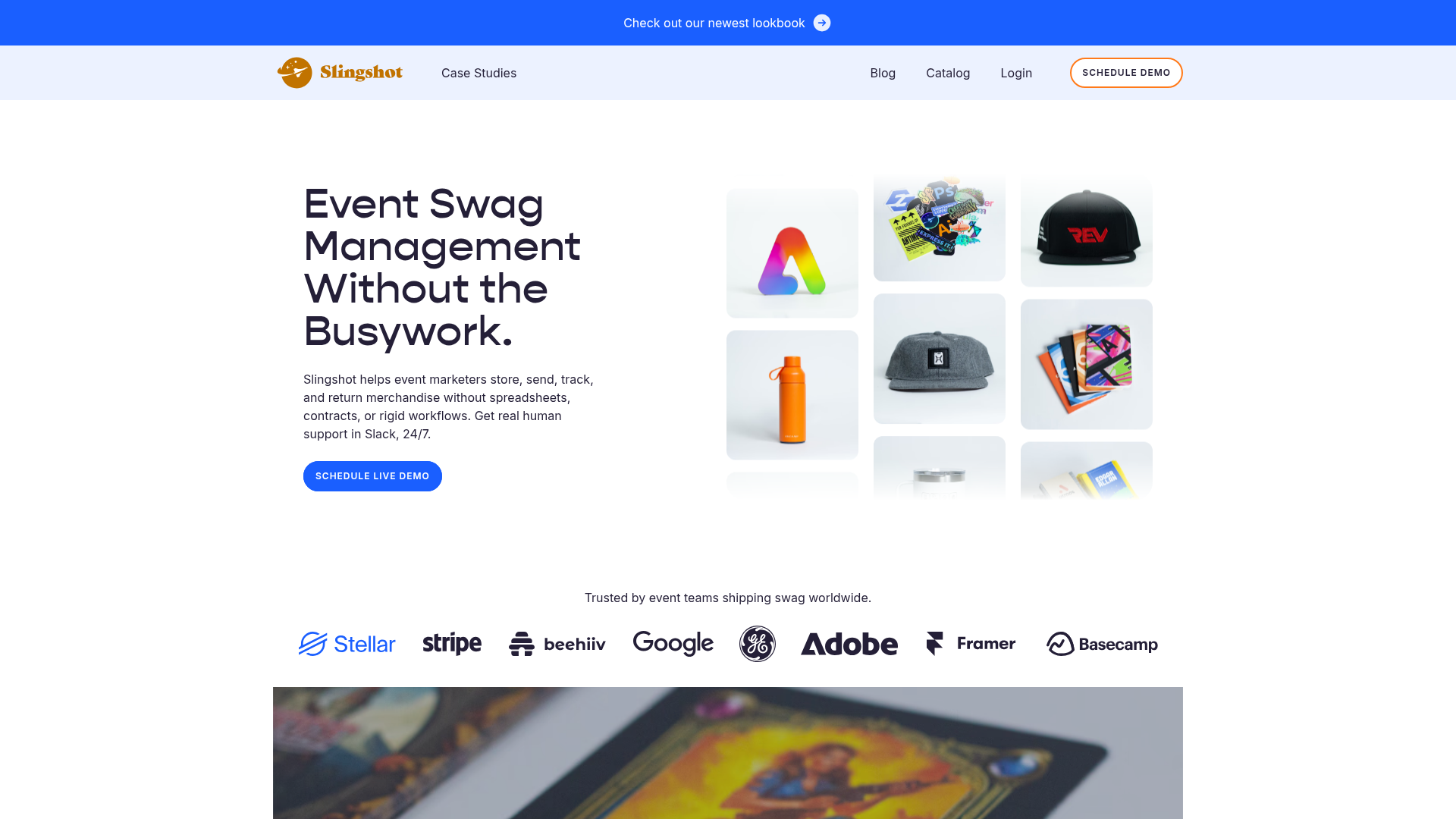
Slingshot Event Swag Hero and Logos
A clean SaaS landing page featuring a split hero layout with promotional product imagery, a call-to-action button, and a monochrome brand logo trust bar.
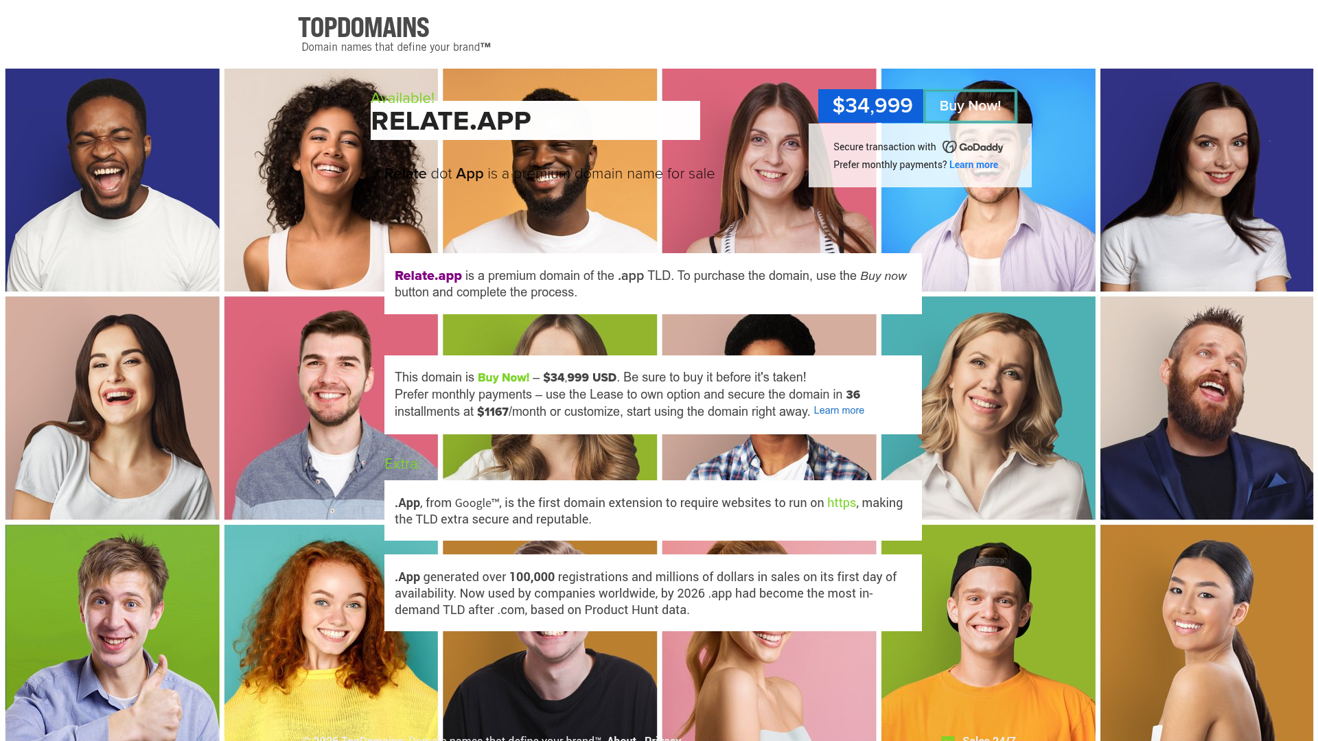
Relate.app Domain Sales Landing Page
A high-impact domain landing page featuring a centered content overlay on a dynamic human-centric background grid with clear pricing and 'Buy Now' call-to-action components.
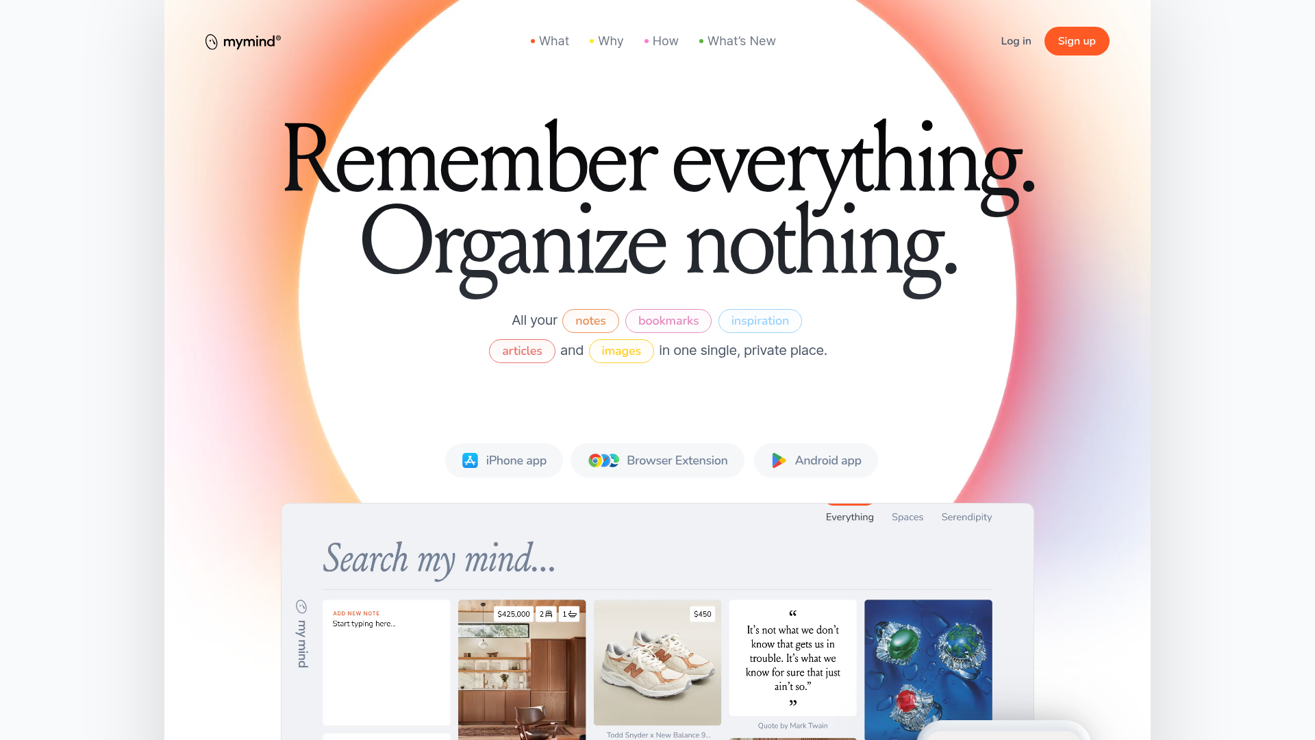
Mymind AI Tool Landing Page
A minimalist SaaS landing page featuring a soft-gradient hero section, custom pill-shaped text badges, and a dynamic bento-style search result preview grid.
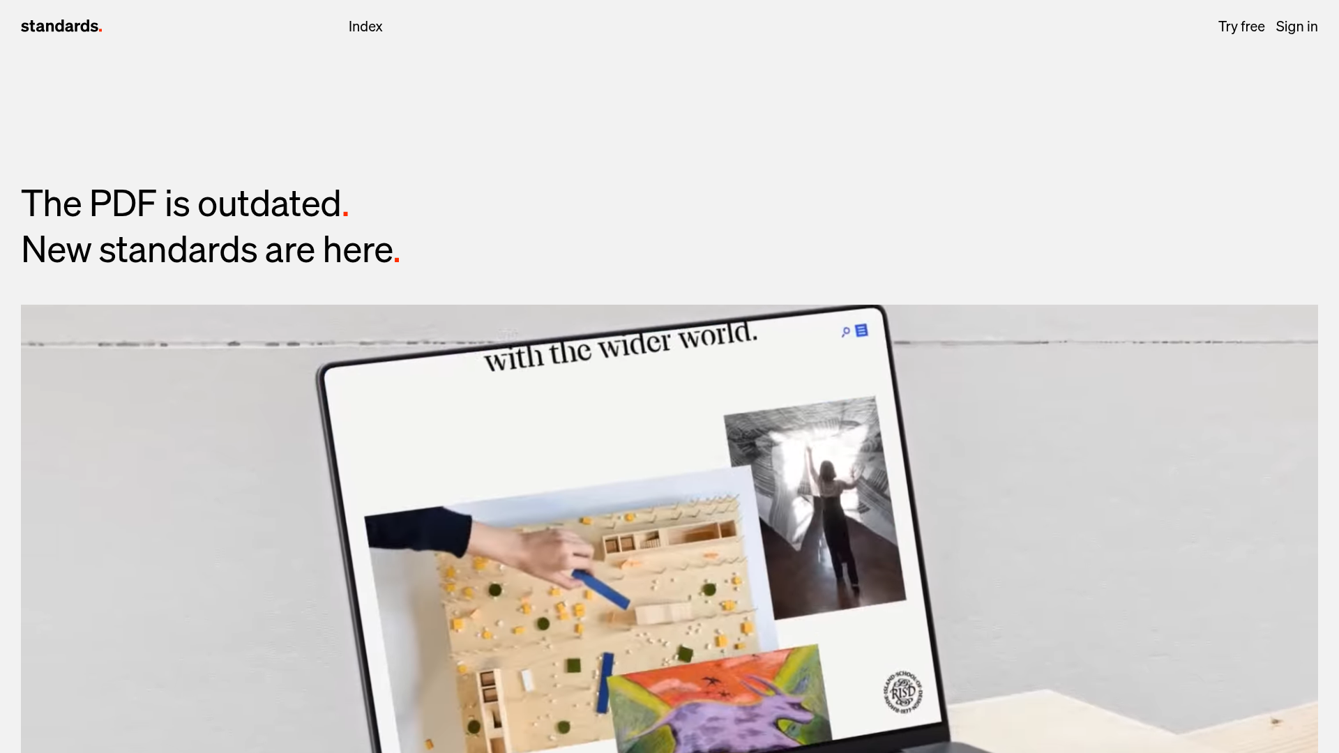
Standards Platform Brand Guidelines Landing
A minimalist design featuring grid-based case studies, responsive video placeholders, an interactive logo wall, and high-contrast pricing cards for a modern SaaS aesthetic.
