KeepGrading Creative Portfolio with Masked Graphics
A high-end studio portfolio featuring an SVG-masked opening animation, a dynamic floating image gallery, and multi-layered grid transitions for page navigation.

Overview
KeepGrading is a high-end creative studio portfolio that utilizes a sophisticated SVG-masked opening sequence to set a cinematic tone. It is an exceptional reference for builders because of its 'floating gallery' layout and multi-layered grid transitions, which offer a more dynamic alternative to traditional linear scroll-based portfolios.
Design System
- Color Palette & Visual Hierarchy: The site uses a high-contrast 'bg-primary-black' and 'primary-white' foundation with a secondary 'bg-blue' used for transition overlays. Visual focus is directed through light-leaking centered graphics against a void-like black background.
- Typography: The system relies on a serif-heavy aesthetic for main navigation and titles (e.g., 'font-serif', 'text-5xl md:text-8xl'), emphasizing an editorial or luxury feel. Scale is used to create hierarchy, with large, active navigation links appearing at lower opacity unless hovered.
- Page Structure: The layout is organized around a 'custom-grid' (12-column logic) that handles both the scattered home gallery and the structured navigation menus. The 'global-preloader' with an SVG mask sits on the top layer, followed by a 'site-content' main wrapper and a 'global-menu' overlay.
- Reusable Components:
- SVG-Masked Loader: A centered container that crops an image or video through a geometric shape.
- Floating Image Cards: Absolute-positioned elements (
class="image absolute") with individualanimation-delayattributes to create a staggered entrance. - Layered Menu Transition: A 5-column blue grid overlay (
menu-layer) that scales up to hide/reveal content. - Custom Global Cursor: A 'rounded-full' follower that changes state based on interaction.
- Interaction & Motion: The UI uses GSAP or similar logic for ‘site-transitions,’ where five vertical columns animate in sequence. Hovering over images triggers a video swap (from
global-imageto a visiblevideotag) and scales the element (transform: scale(1.3)). - Responsive Behavior: The HTML reveals a shift from 5-cell to 4-cell sizing for smaller viewports, with large serif typography downscaling from 8xl to 5xl on mobile.
- Implementation Clues: Built with Nuxt.js (evidenced by
#nuxtandnuxt-link), the site leans on Tailwind CSS for utility-first styling (absolute,top-1/2,transform,z-50).
Use Cases
- Who should clone this: Independent colorists, fashion photographers, directors, and boutique digital agencies looking for a high-impact, non-linear website entrance.
- Effective Remixes:
- Creative Agency Home: Replace the 'floating' images with project thumbnails that lead to deep-dive case studies.
- Luxury Brand Lookbook: Use the SVG masking for a seasonal campaign launch, swapping the geometric mask for a brand logo shape.
- Practical Directions: Reuse the 5-column transition layers for any site that requires smooth, branded page transitions. For a simpler project, clone only the absolute-positioned gallery logic to create a 'mood board' section within a standard scrolling site.
- Suggested Scope: A full-page clone is best for those wanting to replicate the high-touch 'experience' feel, while a quick section clone of the
svg-maskpreloader is ideal for adding flare to existing landing pages.
Related Inspirations
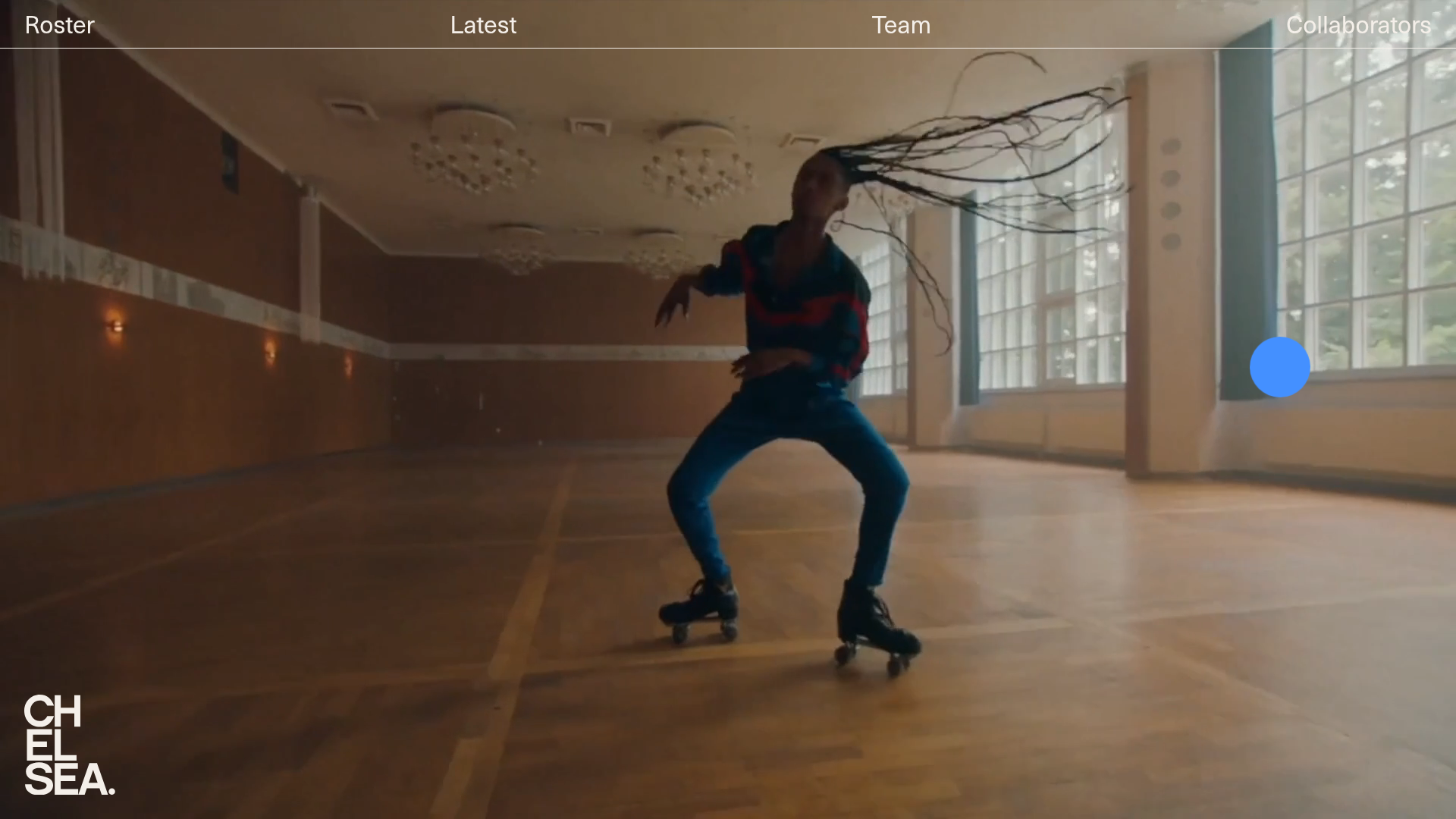
Chelsea Creative Production Agency Portfolio
A minimalist creative agency site featuring an immersive video hero background, sticky navigation, and a filtered list of directors for talent portfolios.
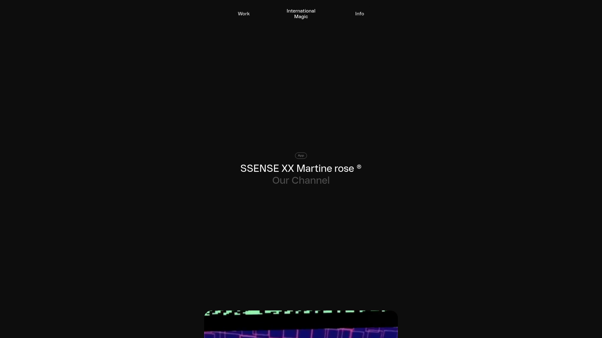
International Magic Immersive Portfolio Feed
A minimalist, dark-mode portfolio featuring a scroll-triggered grid layout with sticky video teasers and badge-categorized project headers.
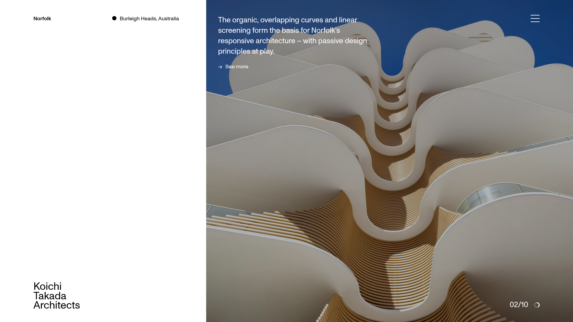
Koichi Takada Architects Portfolio Home
A high-end architectural portfolio featuring a split-screen layout with an interactive project slider, sticky typography, and smooth transition animations.

Caserne Design Studio Portfolio
A minimalist, high-impact portfolio featuring a dynamic masonry grid of project thumbnails with overlay text and a clean, oversized typography-driven footer.
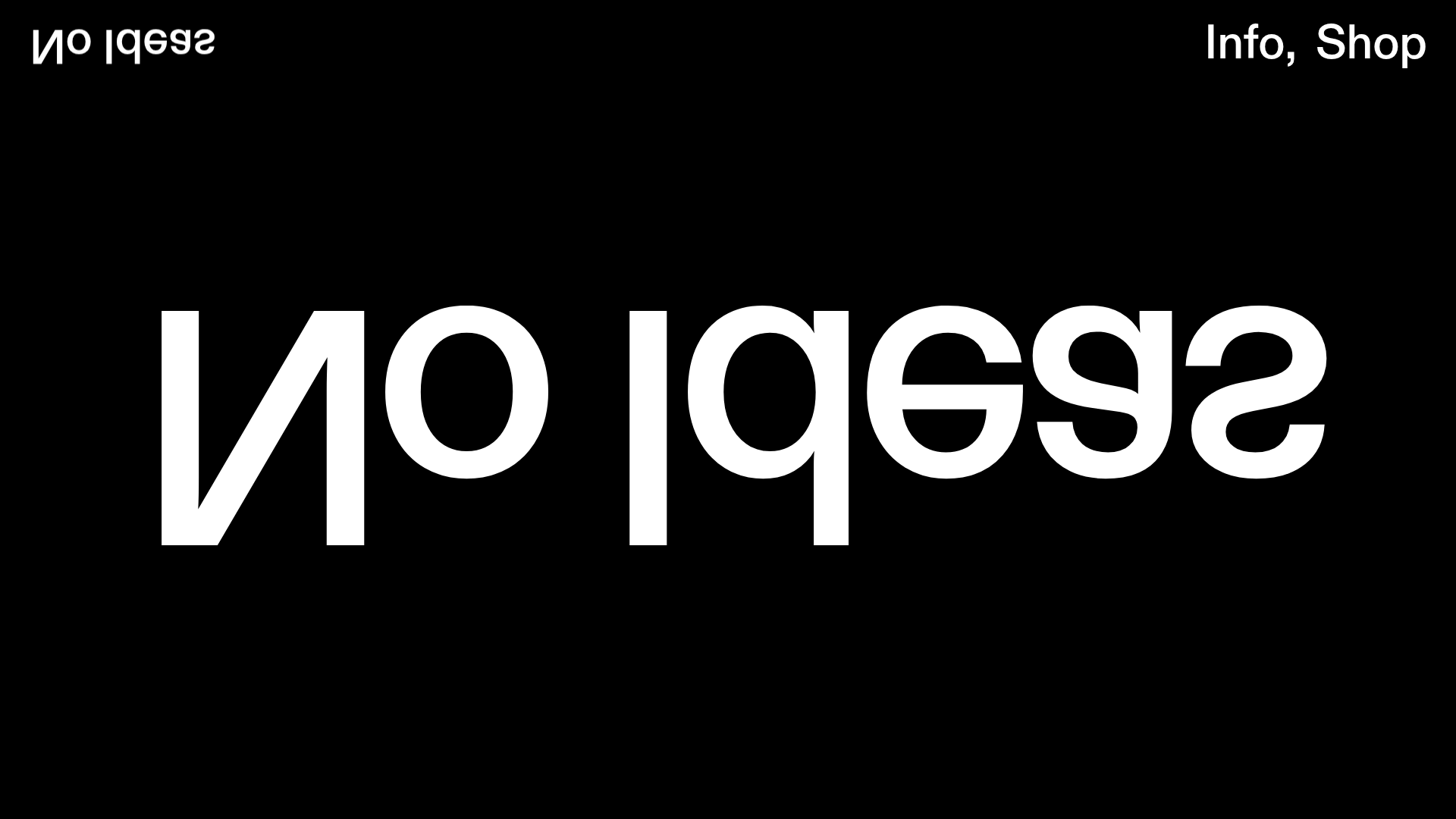
No Ideas Design Portfolio Carousel
A minimalist, full-screen portfolio featuring a high-impact typography hero and a large-scale Bootstrap carousel with video and image support.

PostNew Moving Image Portfolio Gallery
A minimalist dark-themed portfolio featuring a full-screen vertical scroll layout, video-based grid sections, and blur-effect navigation components.
