Nature of Things E-Commerce Landing
A high-end skincare storefront featuring a full-viewport hero section, scroll-triggered GSAP text animations, a slide-out mini-cart with product carousels, and minimalist category grids.
Overview
This eCommerce landing page for Nature of Things is a masterclass in high-end, minimalist luxury branding. It blends editorial-scale photography with fluid GSAP-driven animations and a refined layout that prioritizes atmospheric storytelling alongside functional commerce, making it an excellent reference for premium lifestyle or wellness brands.
Design System
- Color Palette: A sophisticated earth-toned palette led by 'Brown' and 'Oatmilk' as primary accents against clean white backgrounds. The use of low-opacity overlays (
bg-black/15) and soft gradients ensures text legibility over large-scale imagery without sacrificing visual depth. - Typography: The system utilizes a mix of serif and sans-serif styles with a heavy emphasis on
small-capsanduppercasefor headings and primary actions. Scale is used to establish hierarchy, with largeh3andh5titles contrasting against minimalist, standard-weight product descriptions. - Page Structure: The flow consists of a full-viewport hero section → Featured product grid → Brand statement block → Category navigation → Video-rich CTA. This linear progression moves the user from inspiration (hero) to action (products) to context (brand philosophy).
- Reusable Components:
- Dynamic Mini-Cart: A slide-out panel featuring a product recommendation carousel (Swiper.js) and a sticky footer with checkout total.
- Product Cards: Minimalist square/portrait grids with hidden "Add to Cart" buttons that slide into view on hover.
- Ghost Buttons: Minimalist
button--lightvariants with thin borders used across high-contrast hero backgrounds.
- Interaction Patterns: The site heavily employs GSAP and ScrollTrigger for a "reveal" effect. Elements use blur-to-focus transitions and subtle Y-axis staggering. Text often splits into words before animating upwards, creating an upscale, intentional feel.
- Responsive Behavior: The mobile implementation features a condensed hero and shifts from a 4-column desktop grid to a 2-column mobile layout. The mini-cart adaptively resizes to take up the full screen height on smaller devices.
- Technical Implementation: Built with Shopify Liquid and Tailwind CSS, the page uses Alpine.js for lightweight state management (modal toggles, currency selection) and GSAP for complex scroll-based orchestration.
Use Cases
- Who should clone this: Developers building boutique skincare, fragrance, or luxury home goods sites where visual brand identity is as important as the product specs.
- Effective Remixes: High-end fashion lookbooks, artisan jewelry collections, or architectural portfolio sites could leverage the large-format image and blur-transition patterns effectively.
- Remix Directions: Swap the 'Oatmilk' theme for high-contrast monochromes to pivot from wellness to technical gear; reuse the slide-out mini-cart architecture for any site requiring cross-sell opportunities without leaving the landing page.
- Clone Scope: A full-page clone is ideal for those needing a complete Shopify-ready homepage logic. For a quicker win, clone the hero section with its text-split animations or the responsive product card utility.
Related Inspirations
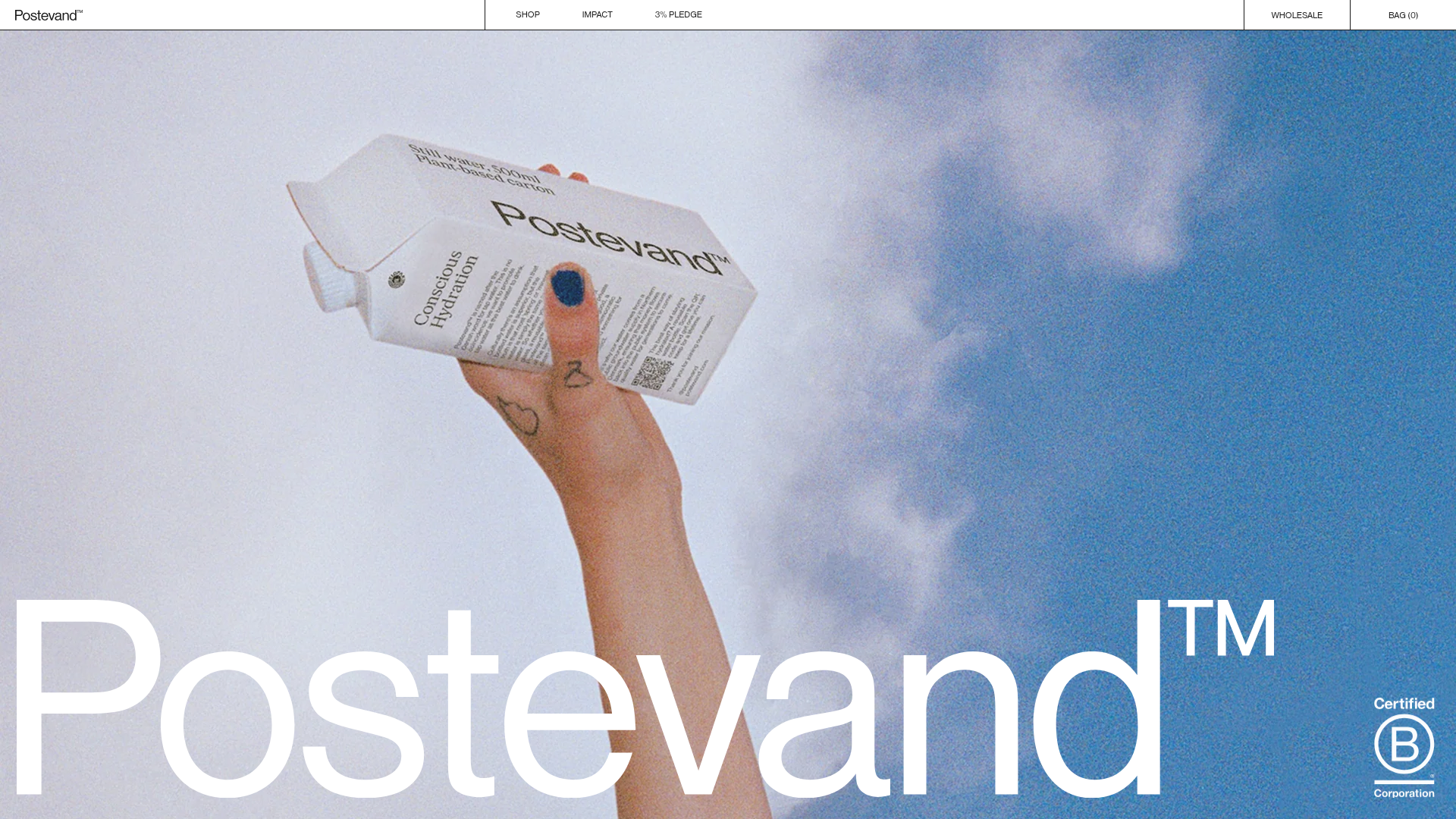
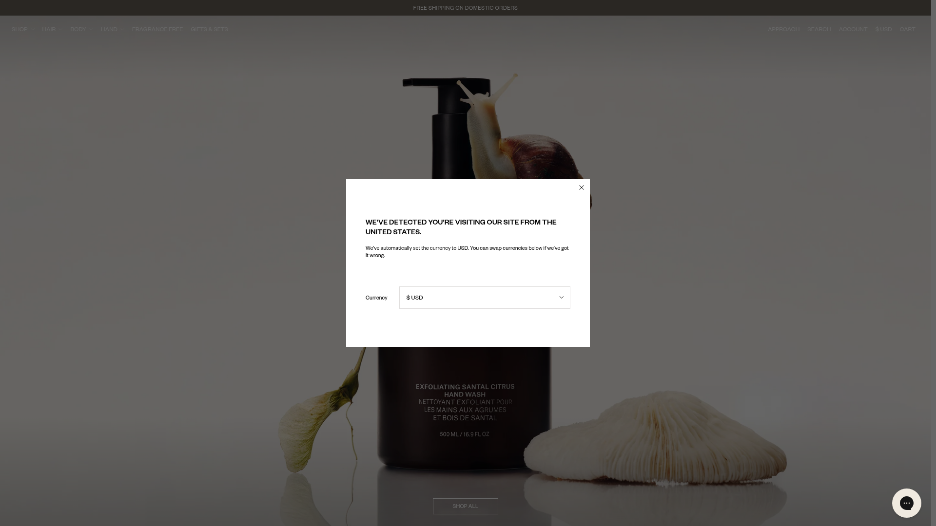
Postevand Sustainable E-commerce Landing Page
A scroll-driven Shopify landing page featuring full-width media sections, interactive product cross-sections, a minimalist grid layout, and horizontal scrolling image galleries.
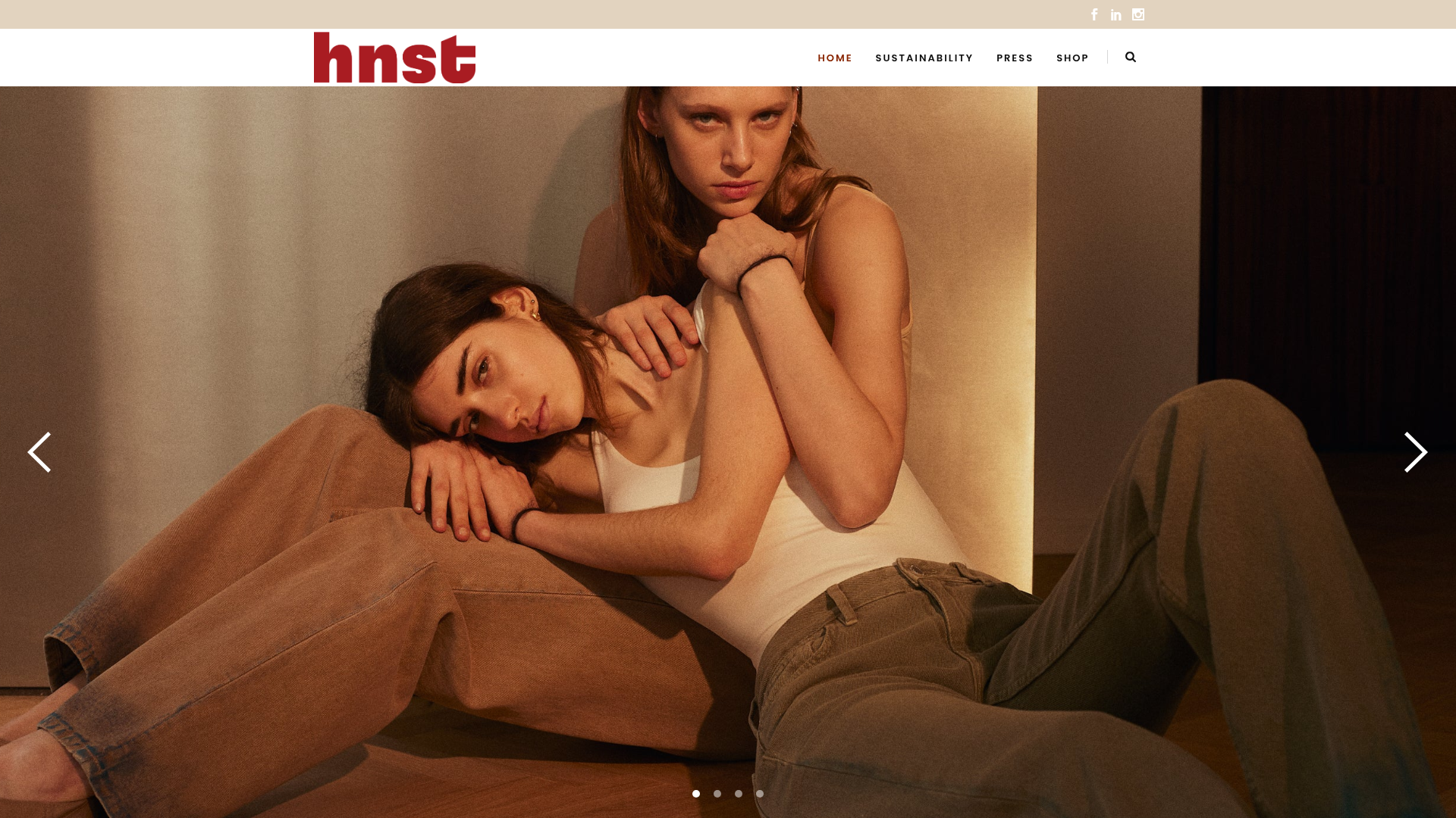
HNST Circular Fashion eCommerce Gallery
A minimalist apparel site featuring a full-screen image slider with parallax effects, grid-based product sections, and a clean typography-focused header for sustainable brand storytelling.
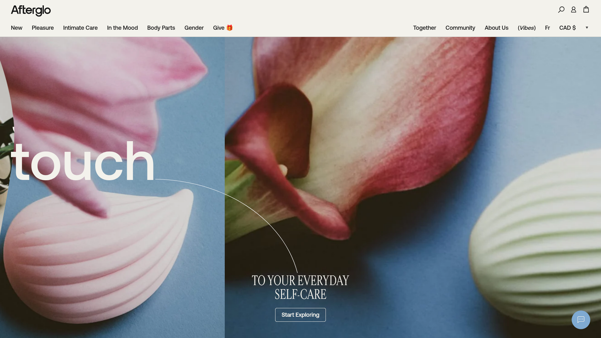
Afterglo Sensual Self-Care Storefront
An elegant e-commerce landing page featuring a split-screen horizontal scrolling hero, kinetic typography with 'vibrating' text animations, and a customized product carousel.
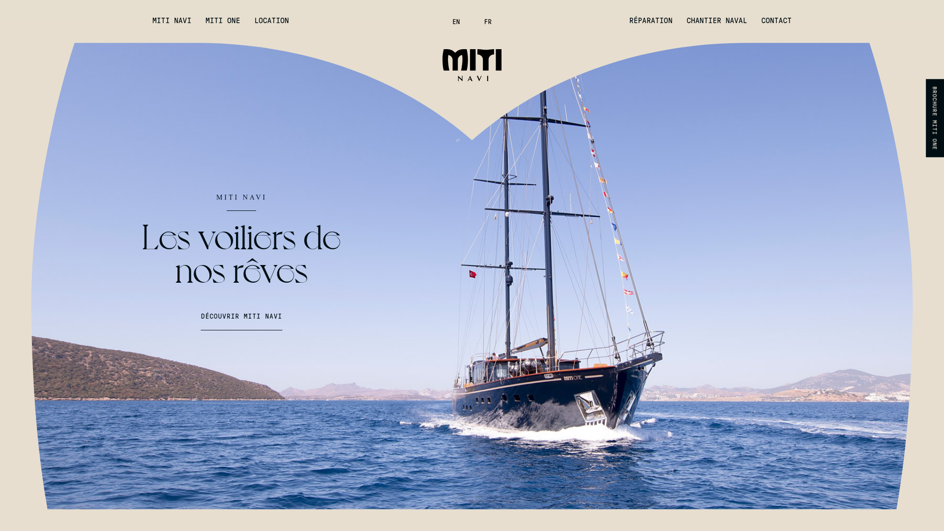
Miti Navi Luxury Nautical Portfolio
A high-end landing page featuring a curved hero mask, smooth parallax scroll effects, card-based service layouts, and sophisticated serif typography for a premium brand feel.
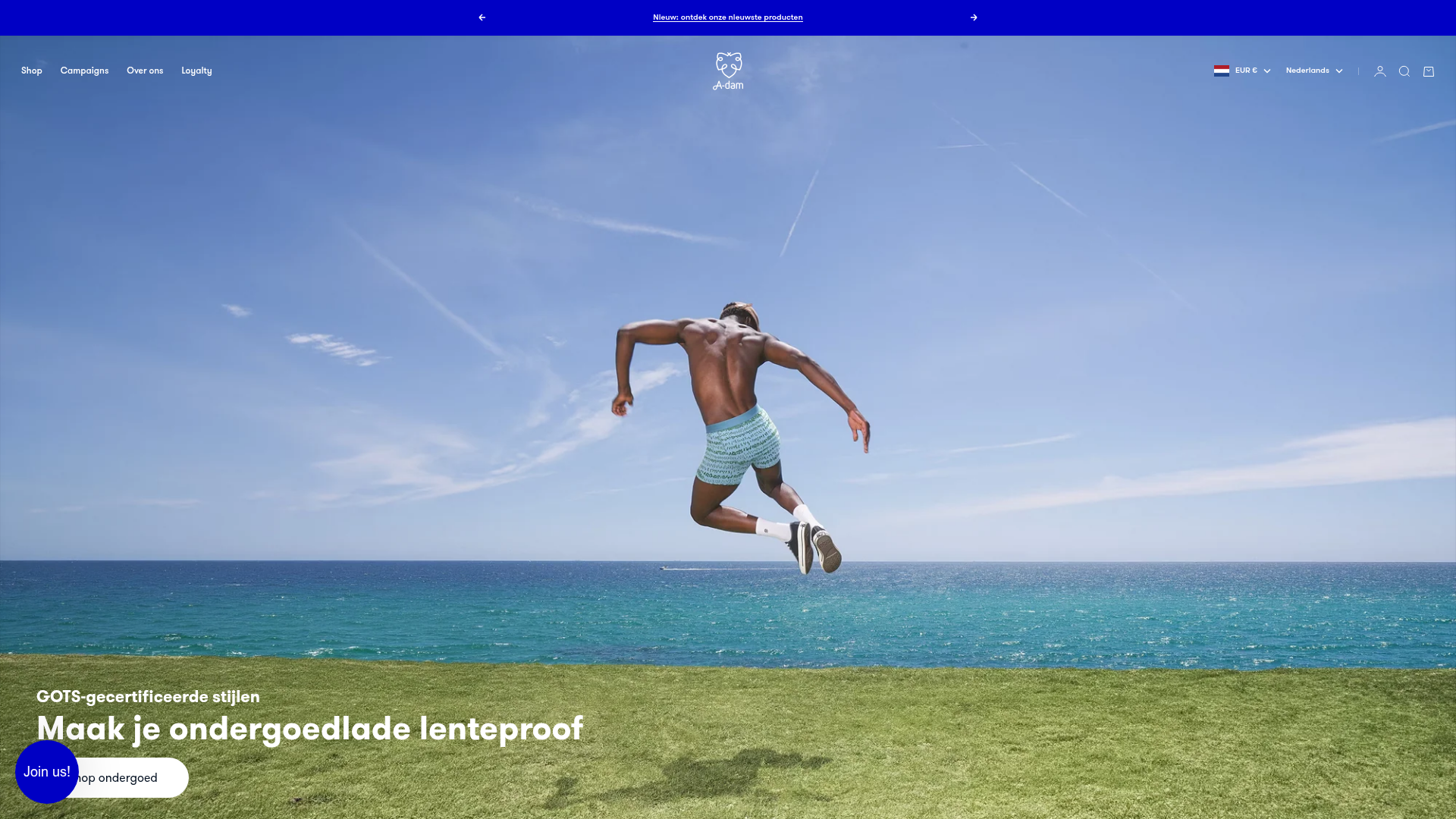
A-dam E-commerce Apparel Storefront
A clean Shopify-based layout featuring a high-impact responsive slideshow, horizontal product carousels with size-selection hover effects, and distinct collection grid sections.
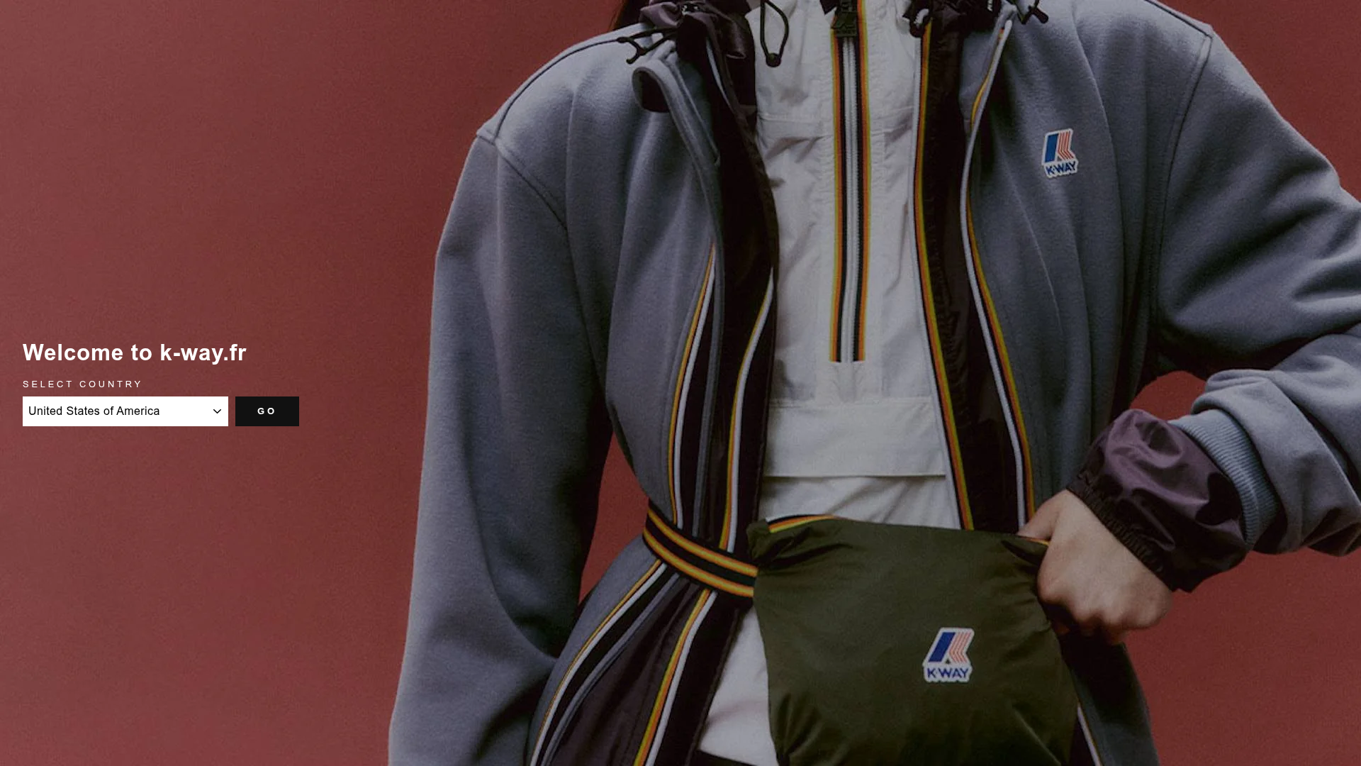
K-Way E-commerce Fashion Interface
A refined Shopify-style storefront featuring a full-bleed video hero, product grids with secondary image hover effects, and a landing page country selector.
