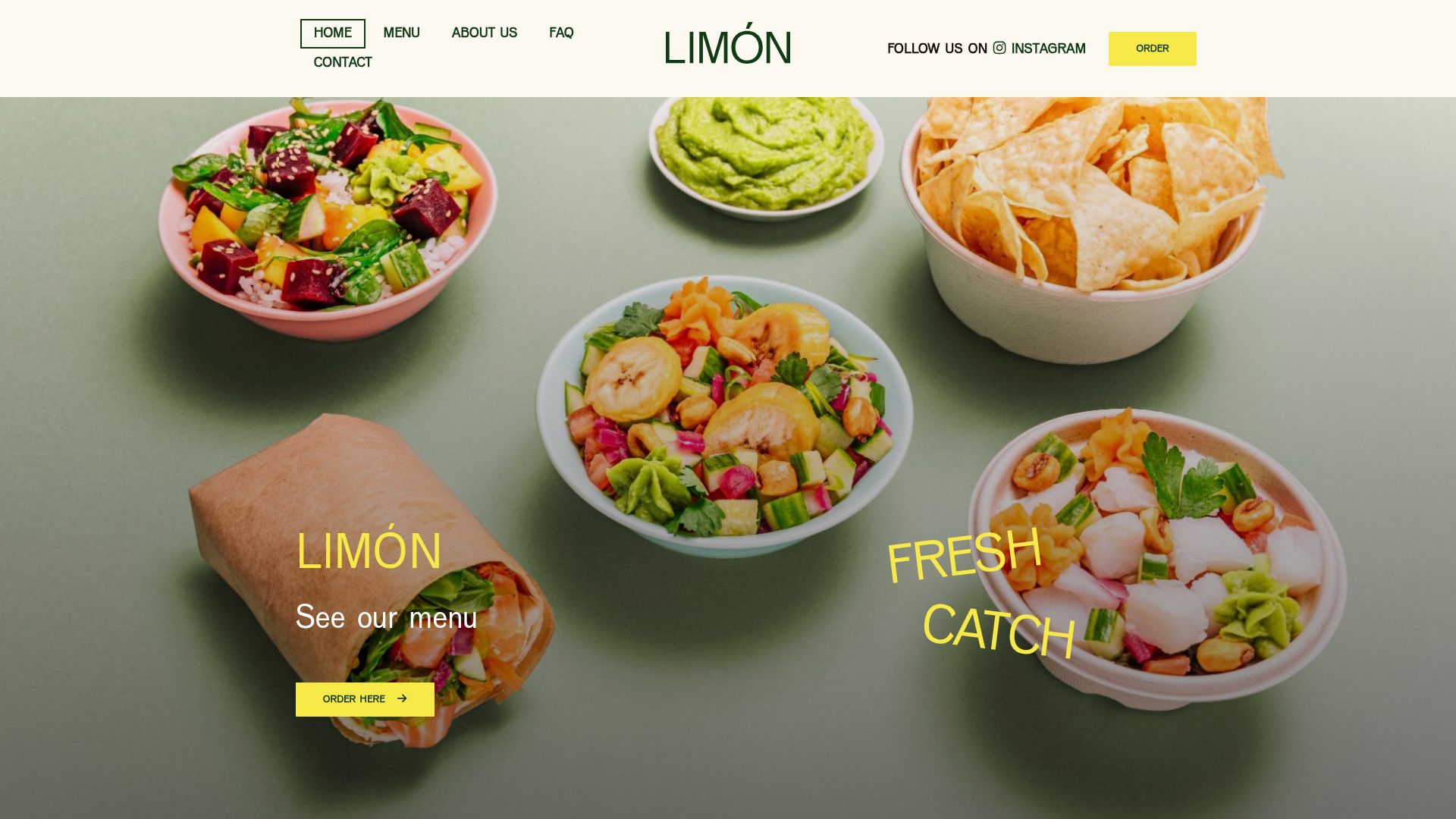
Limón Healthy Food Landing Page
A vibrant restaurant layout featuring an animated hero section with custom typography overlaps, card-based menu categories, and a structured opening hours grid.
Overview
Limón is a modern, food-focused landing page that excels in visual storytelling through a high-impact hero section and a clean, modular layout. It serves as an excellent reference for builders wanting to combine professional photography with bold, overlapping typography and a structured information hierarchy. It is a strong clone candidate for its effective use of negative space and clear call-to-action placement.
Design System
- Color Palette & Visual Hierarchy: The primary palette involves a sage green background (
#8ca188or similar) that provides high contrast for the colorful food imagery. Accents are handled with a bright lemon yellow (#f1e94b) for primary buttons and secondary text, ensuring high visibility without clashing with the natural tones of the food. - Typography System: The design uses a mix of bold sans-serif headlines and elegant, thin-weight typography. The hero section features "LIMÓN" in a tall, clean sans-serif while the "Fresh Catch" and "See our menu" labels use a playful yellow font that adds energy. Body text is kept in a readable, standard sans-serif with generous leading.
- Page Structure & Section Flow:
- Full-Screen Hero: Features a static top navigation and a large atmospheric food spread with floating text overlays.
- Intro Section: A two-column focused message explaining the brand's healthy fast-food mission.
- Menu Categories: A three-column grid featuring large imagery, category tags (e.g., "Popular"), and "Order Now" buttons.
- Logistics: A structured "Opening Hours" section using a multi-column grid to separate different location hours.
- Social Footer: A call-to-action area highlighting social media links (Instagram, Facebook, TikTok).
- Reusable Components: The square yellow buttons with arrow icons, the card-based menu category displays, and the specialized
openinghourslist items are highly modular and easy to extract. - Interaction & Motion Patterns: The HTML reveals extensive use of CSS animations via
data-animateattributes (e.g.,fadeInUp,flipInX, andfadeInLeft). Buttons have a 1000ms duration transition, suggesting a soft, premium feel during interaction. - Responsive Behavior: The HTML classes (using
col-sm-12andhidden-sm) indicate a mobile-first philosophy where images stack vertically and less critical text elements are hidden on smaller viewports to prioritize order buttons.
Use Cases
- Who should clone this: Small business owners in the food and beverage industry, particularly those with strong brand photography looking for a minimalist but premium online presence.
- Effective Remixes: This layout works well for lifestyle brands, plant nurseries, or craft breweries where product aesthetics drive the sale.
- Practical Remix Directions: Swap the sage green background for a dark charcoal or cream to completely change the mood; replace the restaurant hours with a "Services" grid for an agency; or isolate the hero section as a splash page for a new product launch.
- Suggested Clone Scope: A full-page clone is ideal for those needing a complete brand site, while the hero section alone is a valuable asset for anyone needing to master overlapping text-over-image layouts.
Related Inspirations
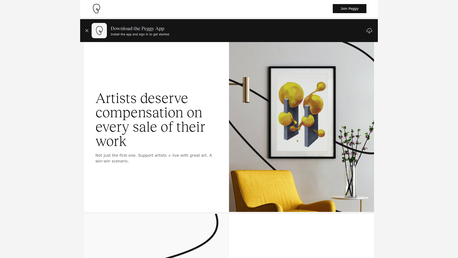
Peggy Art Royalties Pitch Page
A clean storytelling layout featuring alternating image-text sections, a three-column testimonial grid with circular avatars, and a icon-based feature grid for brand values.

Vibrants Wellbeing E-commerce Landing Page
A clean Shopify-style landing page featuring a full-width hero with overlaid product cards, a horizontal product slider, and interactive cart drawer with utility progress bars.
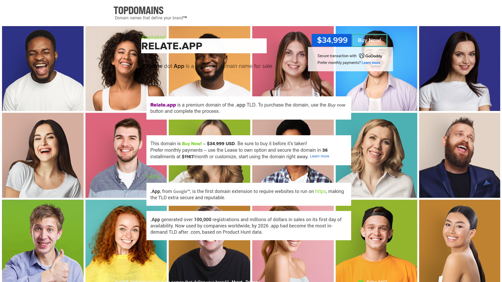
Relate.app Domain Sales Landing Page
A high-impact domain landing page featuring a centered content overlay on a dynamic human-centric background grid with clear pricing and 'Buy Now' call-to-action components.
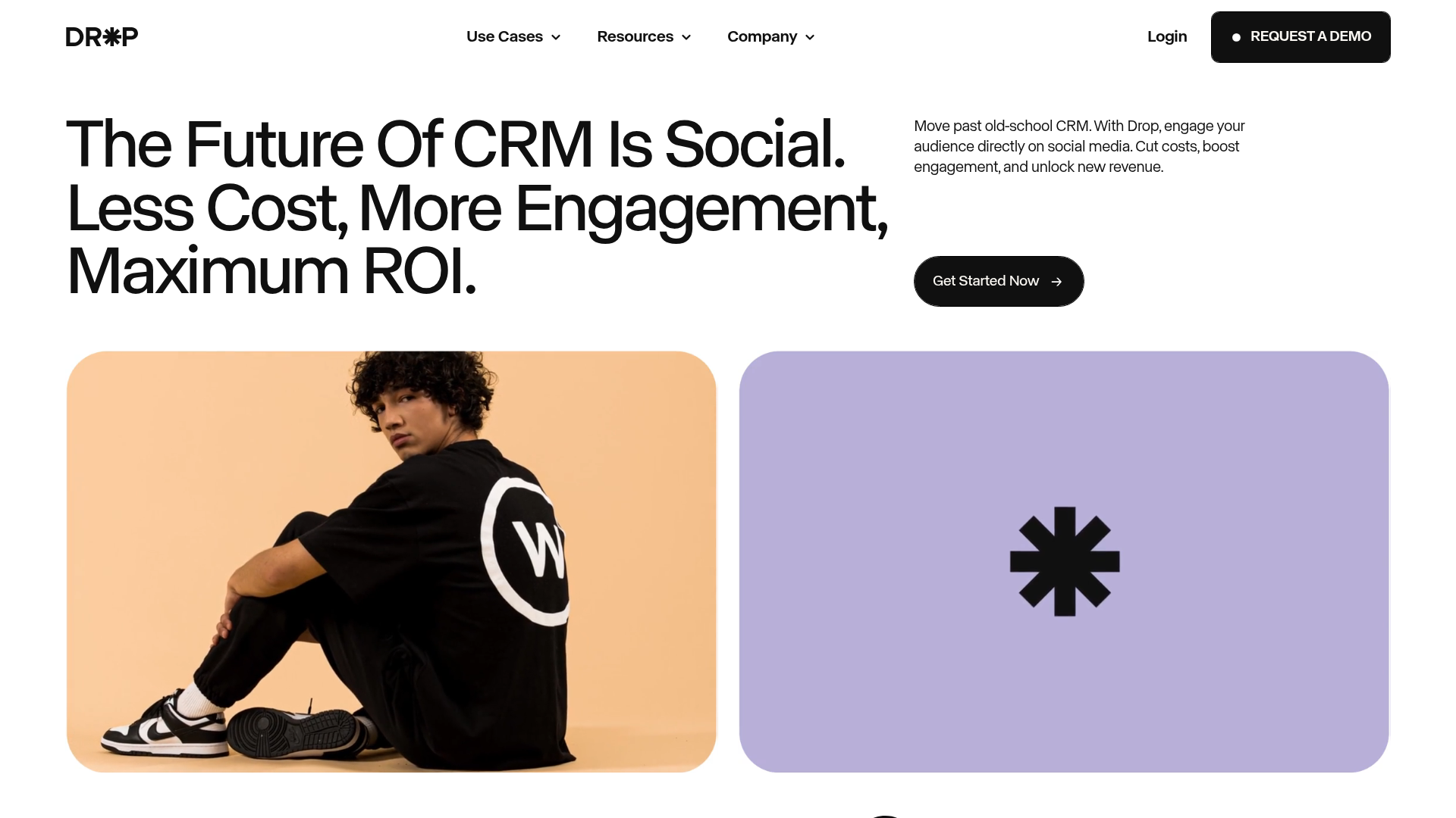
Drop Social CRM Landing Page
A modern SaaS landing page featuring a minimalist large-typography hero section, rounded bento-style image containers, and a clean navigation bar with a CTA.
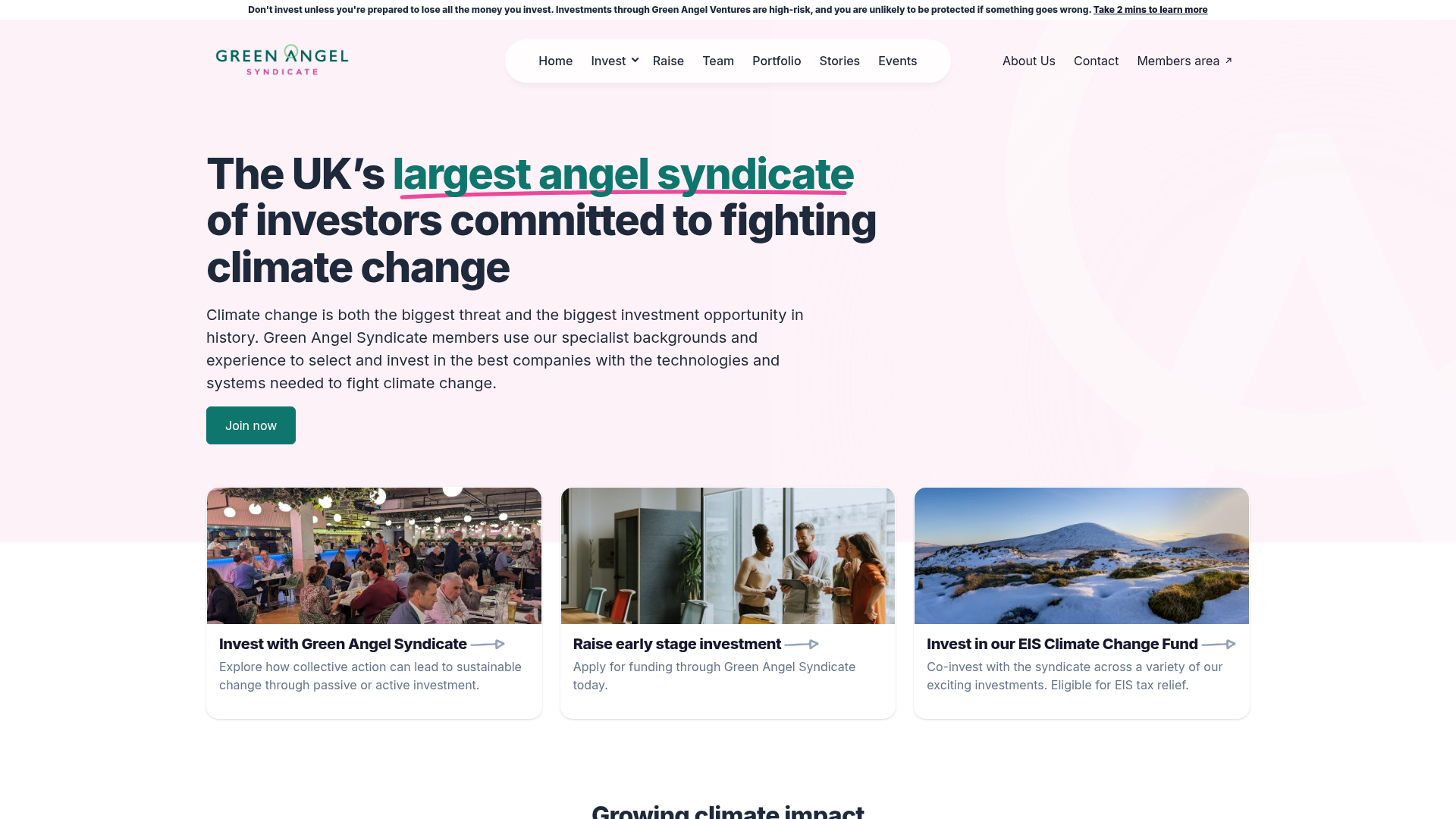
Green Angel Syndicate Investment Landing Page
A clean venture capital landing page featuring a hero section with card-based navigation, a four-column stat grid, and alternating split-layout content sections with image-text pairings.
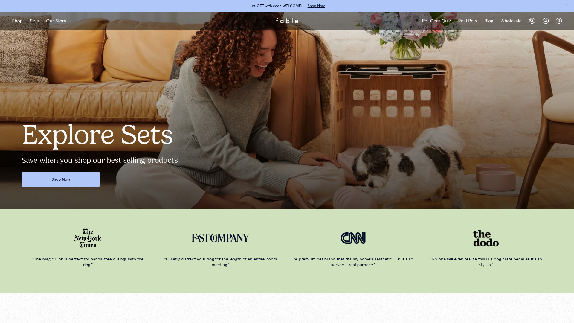
Fable Pets E-commerce Landing Page
A minimalist lifestyle pet brand template featuring a high-impact hero section, a clean logo trust bar, and a centered navigation menu.
