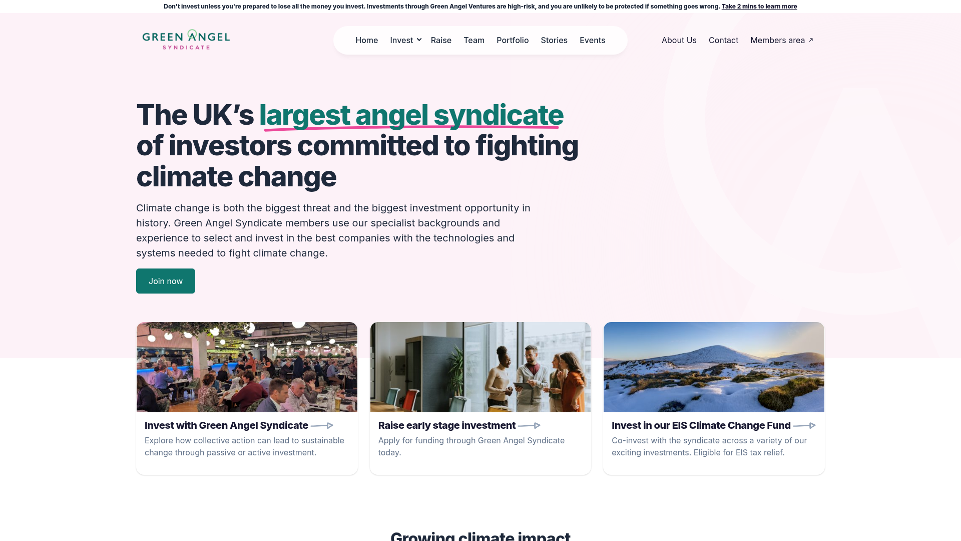
Green Angel Syndicate Investment Landing Page
A clean venture capital landing page featuring a hero section with card-based navigation, a four-column stat grid, and alternating split-layout content sections with image-text pairings.
Overview
This landing page is a clean, modern example of a venture capital and investment portfolio site for Green Angel Syndicate. It effectively balances institutional trust with environmental mission through a sophisticated soft-tinted color palette and a clear, modular content hierarchy. Builders should reference this for its professional card-based navigation, effective use of statistical callouts, and structured split-layout storytelling.
Design System
- Color Palette & Visual Hierarchy: The site uses a base of off-white and soft pink (#FFF5F6) for backdrops, creating a warmer feel than standard corporate white. This is accented by a deep teal for primary actions and headings, and a vibrant magenta underline used as a specific "hand-drawn" highlight for key value propositions.
- Typography: The system utilizes a bold sans-serif for headings (likely Montserrat or similar) with tight letter spacing for a modern look. Body text is a clean, readable sans-serif at a comfortable 16-18px scale. High-contrast font weights are used to distinguish between categories (bold) and descriptions (regular).
- Page Structure: The flow begins with a hero section that includes a 3-card quick-link navigation, followed by a data-driven impact section (stats), alternating horizontal storytelling blocks (image-text split), an award logo grid, and finally a multi-column footer/newsletter area.
- Reusable Components:
- Image-topped Cards: Uniform height cards with a high-aspect-ratio image, bold title, and short descriptive paragraph.
- Stat Grid: A 4-column layout featuring large numeric values and distinct labels for social proof.
- Check-list Feature: A 3-column grid using iconography (SVG checks) and bold headers to summarize achievements.
- Newsletter Form: A two-column component inside a container that pairs a lifestyle image with a multi-field input form (Email and Select dropdown).
- Implementation Clues: The HTML reveals a Bootstrap-based grid system (
container-fluid,row,col-lg-8) combined with AOS (Animate on Scroll) for entrance transitions. The use of Utility classes for spacing (mt-8,py-12) suggests a highly modular, utility-first CSS approach.
Use Cases
- Who should clone this: Small to medium-sized investment firms, non-profits, or ESG-focused startups that need to communicate both professional credibility and a specific social/environmental mission.
- Remix Directions:
- Corporate Pivot: Swap the soft pink and teal for navy blue and slate grey to create a traditional FinTech or Legal-Tech landing page.
- SaaS Portfolio: Replace the "Investment" cards with product feature cards and the "Stat Grid" with user growth metrics.
- Modular Adaptation: The "Impact" stat section is a standalone win; it can be cloned independently to add social proof to any existing landing page.
- Suggested Scope: A full-page clone is ideal for those building a complete company overview from scratch, as the section flow is logically optimized for conversion (Value Prop -> Proof -> Navigation -> Success Stories -> Capture).
Related Inspirations
Monotype Variable Fonts Resource Gallery
A clean masonry grid layout featuring content cards with hover-state overlays, category filtering, and responsive image scaling for a media-rich resource center.
Peggy Art Royalties Pitch Page
A clean storytelling layout featuring alternating image-text sections, a three-column testimonial grid with circular avatars, and a icon-based feature grid for brand values.
IKEA Corporate Landing Page Layout
A clean corporate portal featuring a large hero hero section with video playback, a split-screen call-to-action block, and a minimalist navigation bar.
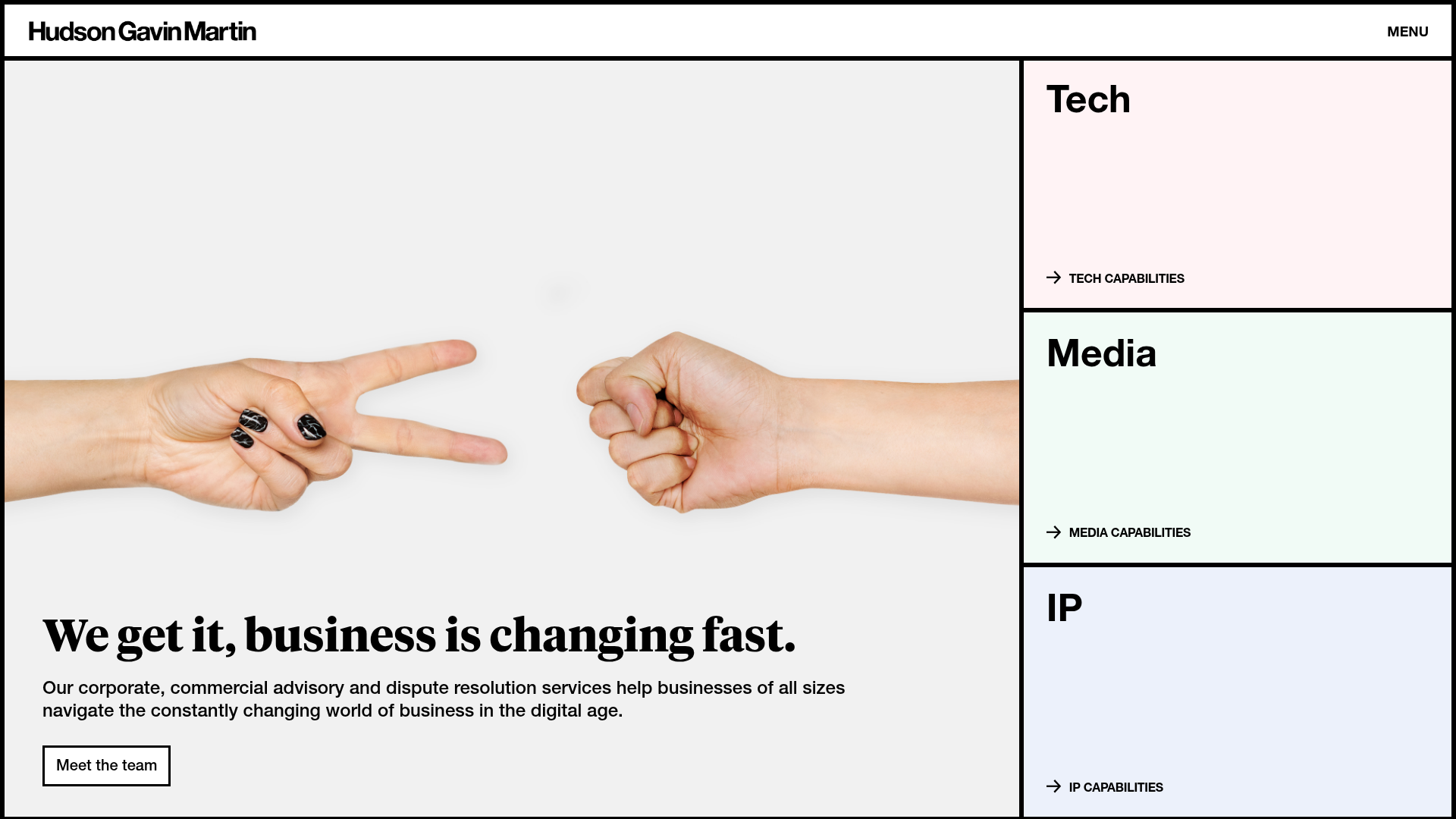
Hudson Gavin Martin Corporate Law Landing
A professional service homepage featuring a minimalist grid-based hero, color-themed navigation blocks, and a bento-style insights feed with subtle hover interactions.

Vibrants Wellbeing E-commerce Landing Page
A clean Shopify-style landing page featuring a full-width hero with overlaid product cards, a horizontal product slider, and interactive cart drawer with utility progress bars.
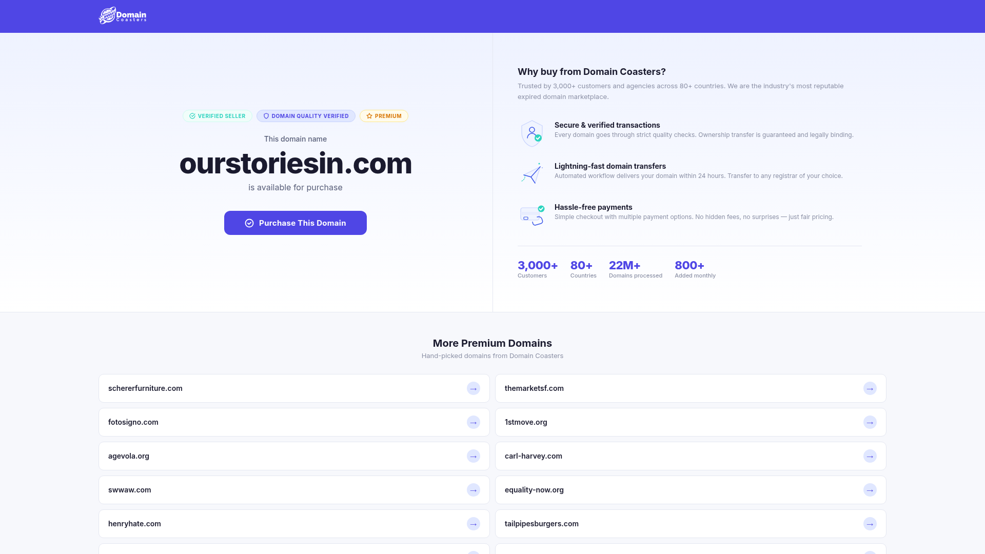
Domain Coasters Landing Page Layout
A clean domain marketplace landing page featuring a split-screen hero with trust badges, statistical counters, and a responsive grid of card-based links for additional inventory.
