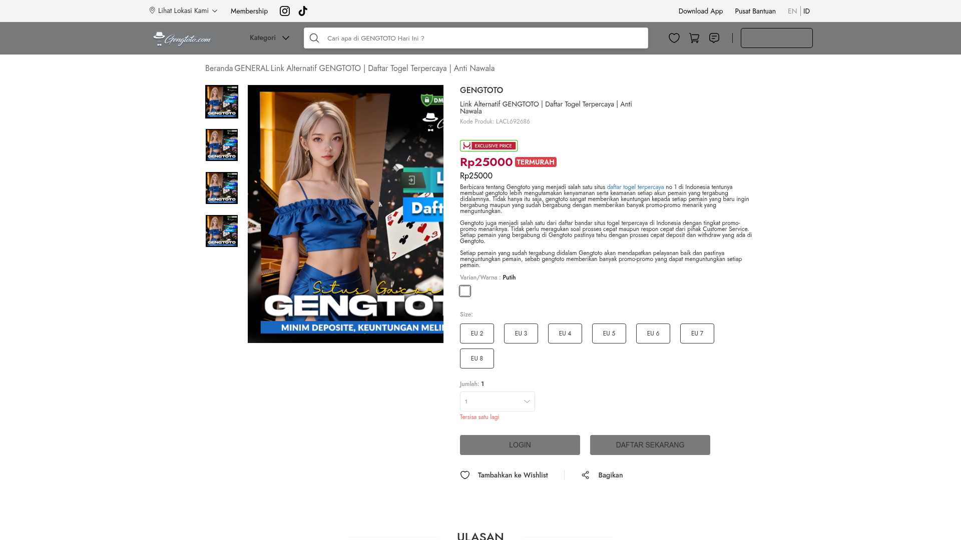
GENGTOTO Product Detail E-commerce Layout
A comprehensive product page featuring a vertical image gallery, detailed item specifications, color/size selection modules, and integrated user review and FAQ components.
Overview
This website features a classic e-commerce Product Detail Page (PDP) layout designed for high conversion. It is a strong reference for developers because it provides a clean, standard structure for presenting digital or physical goods, complete with inventory status, pricing labels, and trust-building components like reviews and FAQs.
Design System
- Color Palette & Visual Hierarchy: The site uses a clean white and light grey background base to emphasize high-contrast elements. Key calls-to-action (Login/Register) use a neutral charcoal grey (
#7a7a7a), while urgency is conveyed through red accents for discount badges ("TERMURAH") and stock warnings ("Tersisa satu lagi"). - Typography: Uses a clean sans-serif stack. Visual hierarchy is established through font weight (bolding for product names and prices) and size scaling between the H1 title and the descriptive body text. Subtitles and product codes utilize a smaller, lighter grey font for secondary importance.
- Page Structure: The layout follows a logical flow: breadcrumb navigation → dual-column product section (vertical image thumbnails on left, details and CTA on right) → user reviews (ULASAN) → expandable FAQ section.
- Reusable Components:
- Vertical Gallery: A column of small thumbnails that update the hero image.
- Selection Pills: Rounded rectangular boxes for size selection with active states.
- Price Badges: Composite components showing "Exclusive Price" logos alongside discounted pricing.
- FAQ Accordions: HTML
<details>and<summary>elements for efficient information density.
- Responsive Behavior: The design is built to stack vertically on mobile. The image gallery transitions from a side-by-side desktop view to a swipeable or stacked mobile layout (indicated by
none-smandblock-smclasses in the HTML). - Implementation Clues: The site is built using Vue.js (evidenced by the
data-v-attributes) and Nuxt.js (id="__nuxt"). This suggests a component-based architecture where sections likearticle-reviewandarticle-product-informationare modular.
Use Cases
- Who Should Clone This: Developers building specialty storefronts, digital service landing pages, or niche affiliate portals that require clear trust signals.
- Effective Remixes: This pattern works for high-consideration items where customers need both visual confirmation (gallery) and technical details (Accordions/FAQs) before converting.
- Remix Directions:
- Brand Swap: Replace the neutral greys with high-saturation brand colors for a more modern "Gen-Z" e-commerce aesthetic.
- IA Adaptation: Use the review grid pattern for "Customer Testimonials" on a portfolio site or agency landing page.
- Pricing Focus: Adapt the "Exclusive Price" block for SaaS subscription tiers.
- Suggested Clone Scope: A full-page clone is recommended to capture the integrated flow from product discovery to trust-building (Reviews/FAQ). For a quicker implementation, the Product Information module (Price + Color/Size selectors + CTAs) is the most valuable standalone section.
Related Inspirations
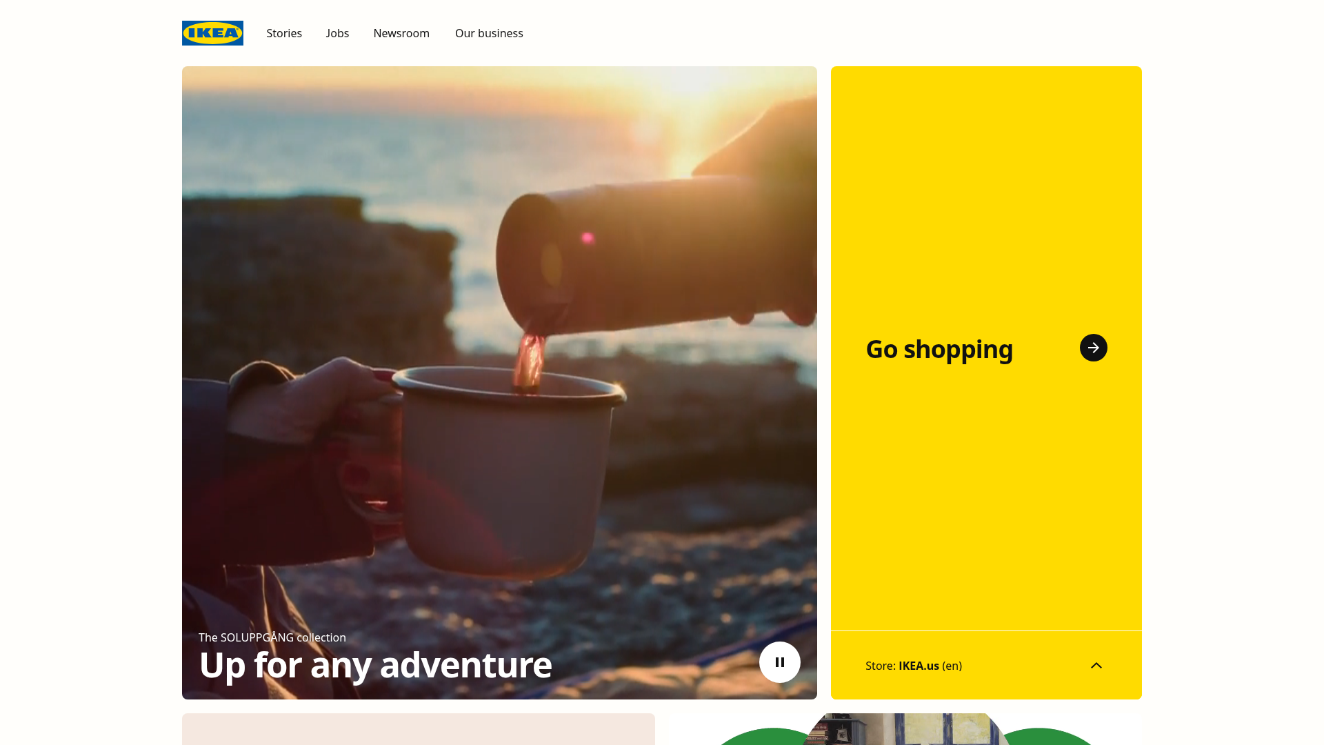
IKEA Corporate Landing Page Layout
A clean corporate portal featuring a large hero hero section with video playback, a split-screen call-to-action block, and a minimalist navigation bar.
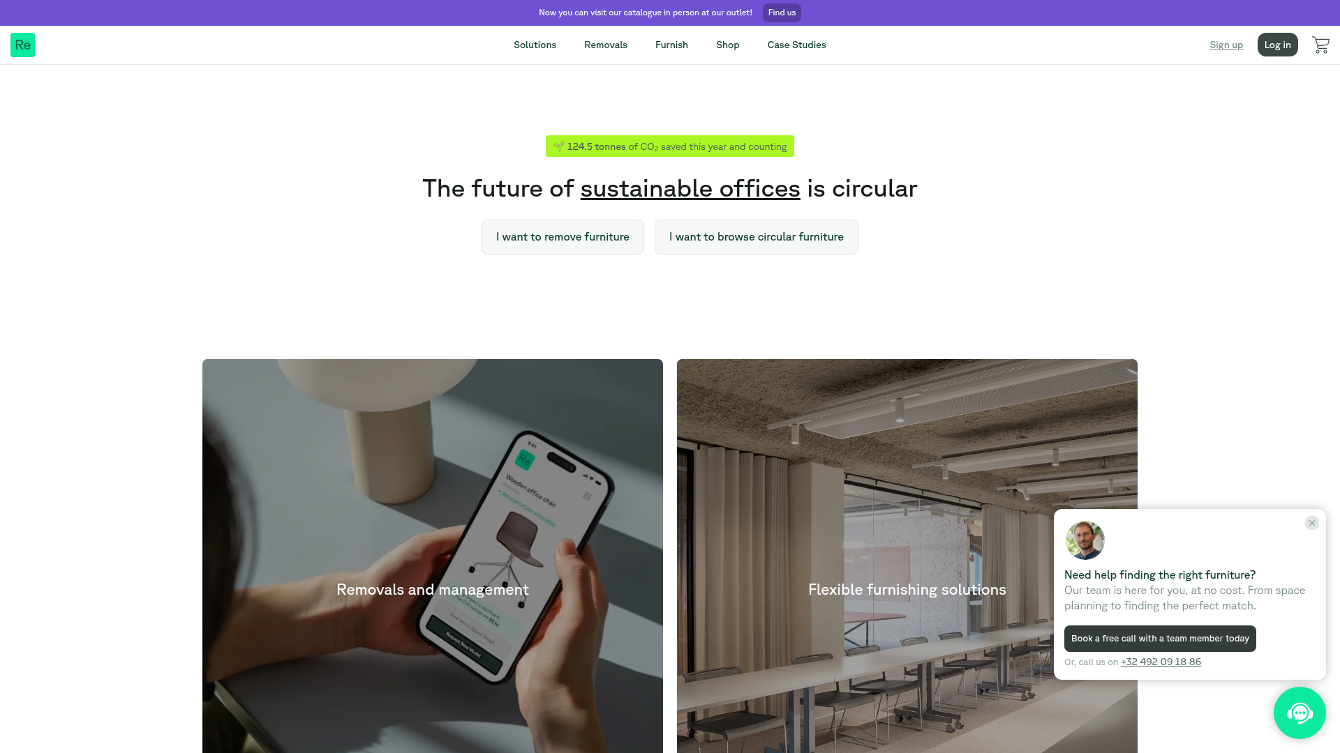
Relieve Furniture Sustainable Marketplace Landing Page
A clean sustainability-focused landing page featuring a hero with environmental impact stats, two-column visual category grid, horizontal logo slider, and a testimonial carousel.

Vibrants Wellbeing E-commerce Landing Page
A clean Shopify-style landing page featuring a full-width hero with overlaid product cards, a horizontal product slider, and interactive cart drawer with utility progress bars.
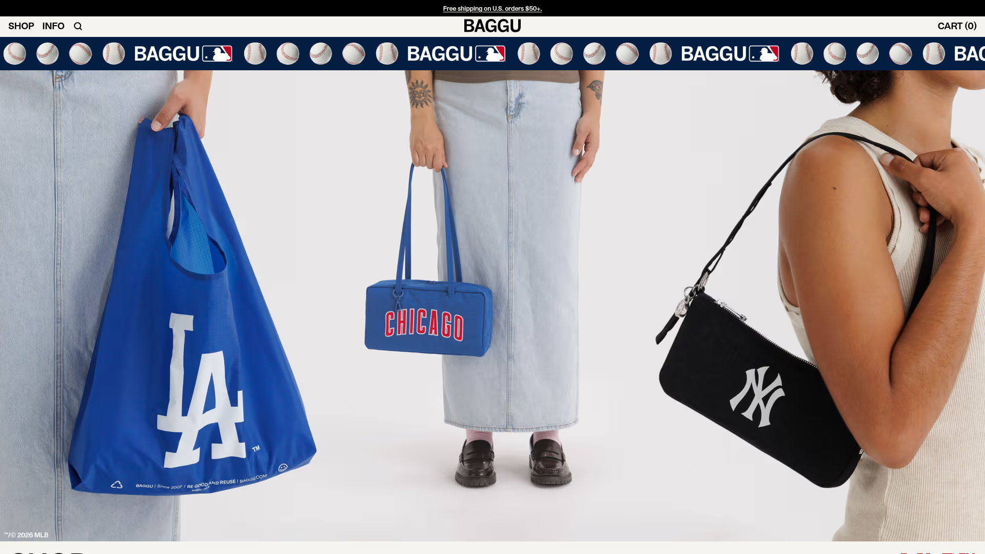
BAGGU Minimalist E-commerce Hero Template
A clean retail landing page layout featuring a full-width high-impact hero section, a sticky integrated banner, and a minimalist navigation header optimized for product launches.
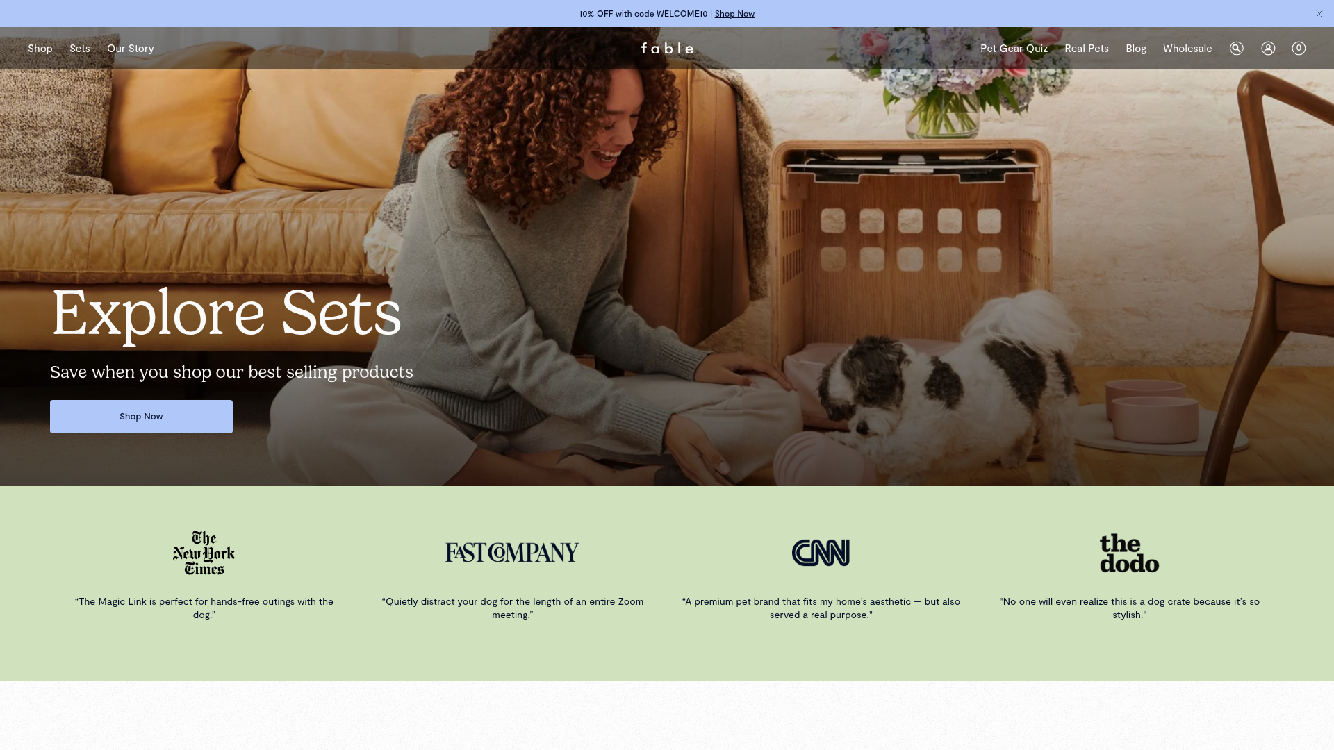
Fable Pets E-commerce Landing Page
A minimalist lifestyle pet brand template featuring a high-impact hero section, a clean logo trust bar, and a centered navigation menu.
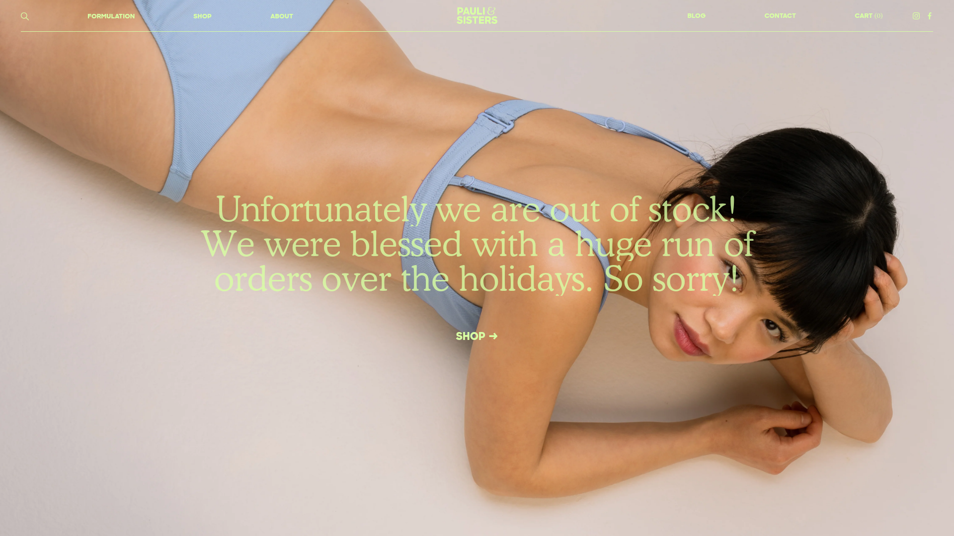
Pauli & Sisters Landing Page
A minimalist e-commerce design featuring a full-width hero image with large overlapping serif text, an interactive ingredient explorer, and a clean split-block layout.
