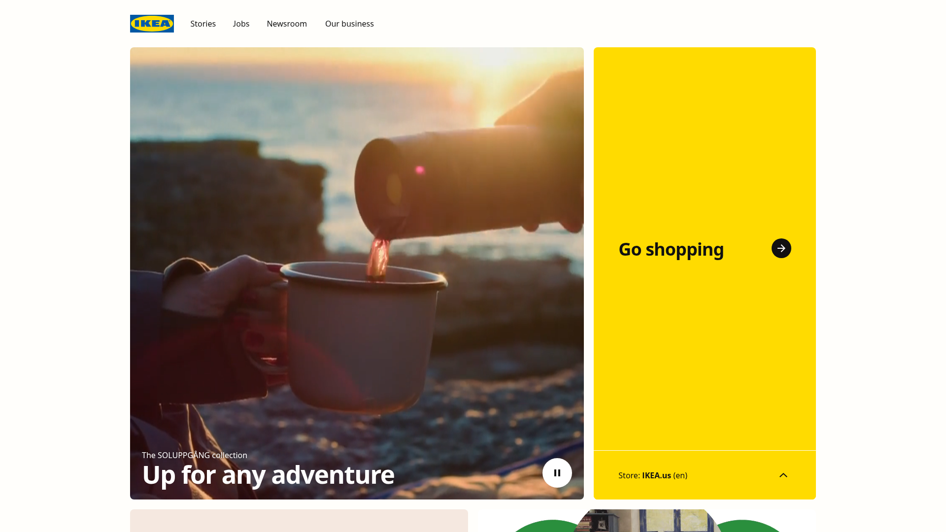
IKEA Corporate Landing Page Layout
A clean corporate portal featuring a large hero hero section with video playback, a split-screen call-to-action block, and a minimalist navigation bar.
Overview
This corporate portal for IKEA showcases a clean, grid-based layout that prioritizes high-quality lifestyle imagery and clear navigational paths. It is an excellent reference for builders looking to balance corporate communications (news/stories) with direct e-commerce entry points through its distinct split-screen hero structure.
Design System
- Color Palette & Visual Hierarchy: The design uses a high-contrast palette of IKEA's signature yellow (#FFDA1A) and blue (#0058AB). White space is used generously in the header, while a bold yellow block creates a secondary focal point that balances the heavy imagery on the left.
- Typography System: Recommends a clean, sans-serif font (likely IKEA Sans or a similar grotesque style). The hierarchy is established through extreme scale, such as the large "Up for any adventure" H1 overlaid on the image and the bolded "Go shopping" CTA.
- Page Structure: The layout follows a top-down flow starting with a minimalist text-only header, followed by a hero section split 65/35 between a media player and a solid-color CTA block. Below this, a modular grid likely continues for stories and business updates.
- Reusable Components:
- The Split-Hero: A robust container that combines a background video/image with a functional sidebar.
- Navigation Bar: A lean, text-based navigation menu with perfectly balanced kerning and spacing.
- Circular Icon Buttons: The play/pause and arrow buttons utilize a rounded circular container for a modern, tactile feel.
- Interaction Patterns: The design suggests a video background in the hero (indicated by the pause button) and minimal hover states on text links. A store selector toggle in the yellow block indicates a simple accordion or dropdown state change.
- Implementation Clues: The layout relies on a modern CSS Grid or Flexbox approach to maintain the precise alignment between the media container and the yellow CTA block.
Use Cases
- Who should clone this: Brands that need to separate their "corporate story" from their "retail front," or nonprofits that want to feature a mission statement alongside a donation portal.
- Effective Remixes: Travel agencies could swap the coffee-pouring hero for destination footage; software companies could replace the yellow block with a "Get Started" lead capture form.
- Remix Directions: Swap the signature IKEA yellow for a brand-specific primary color; the split-screen ratio can be adjusted (e.g., 50/50 balance) depending on the priority of the secondary CTA.
- Suggested Scope: A quick section clone of the split-hero is highly recommended for landing pages that need immediate visual impact without losing functional navigation.
Related Inspirations
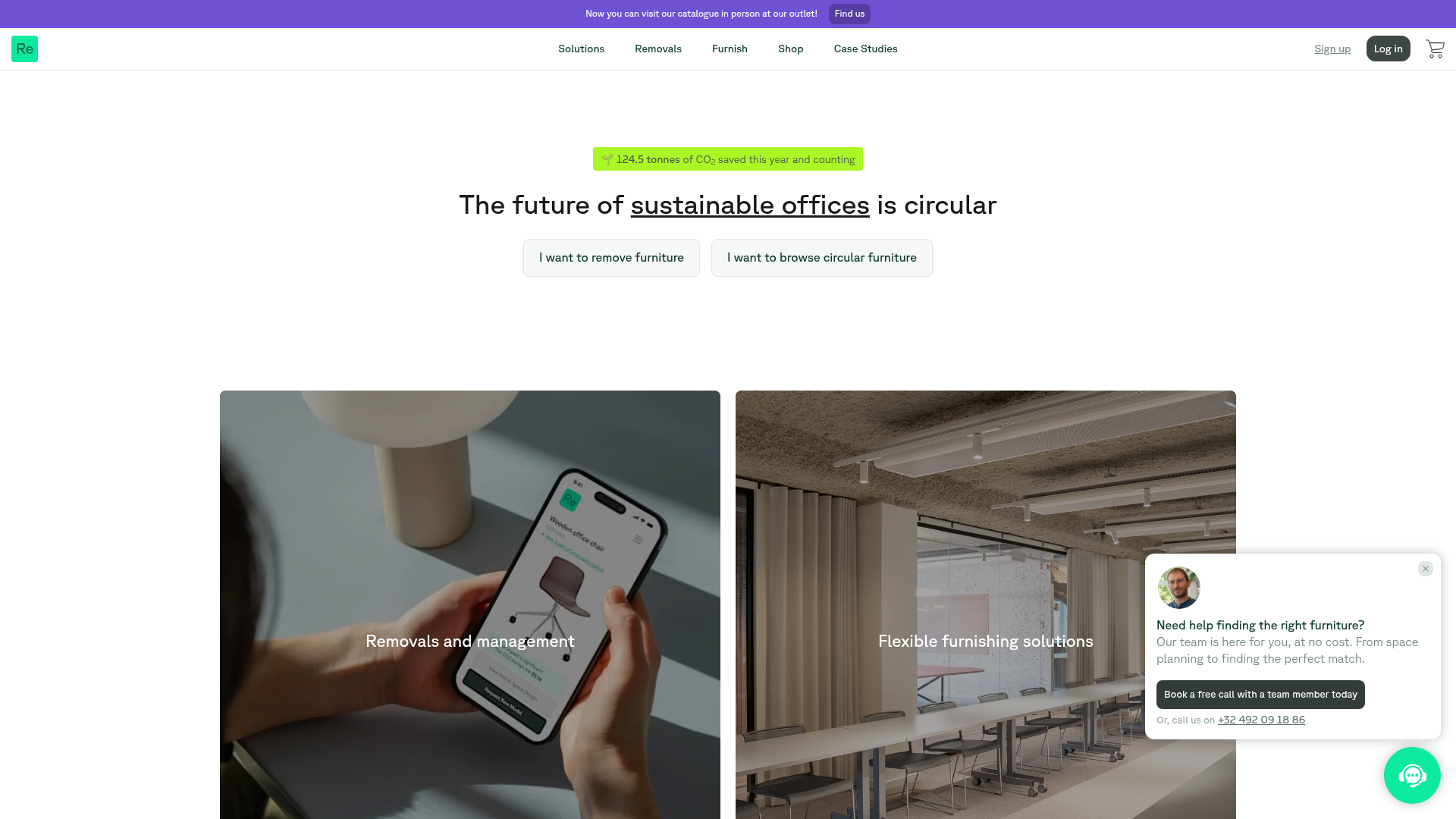
Relieve Furniture Sustainable Marketplace Landing Page
A clean sustainability-focused landing page featuring a hero with environmental impact stats, two-column visual category grid, horizontal logo slider, and a testimonial carousel.
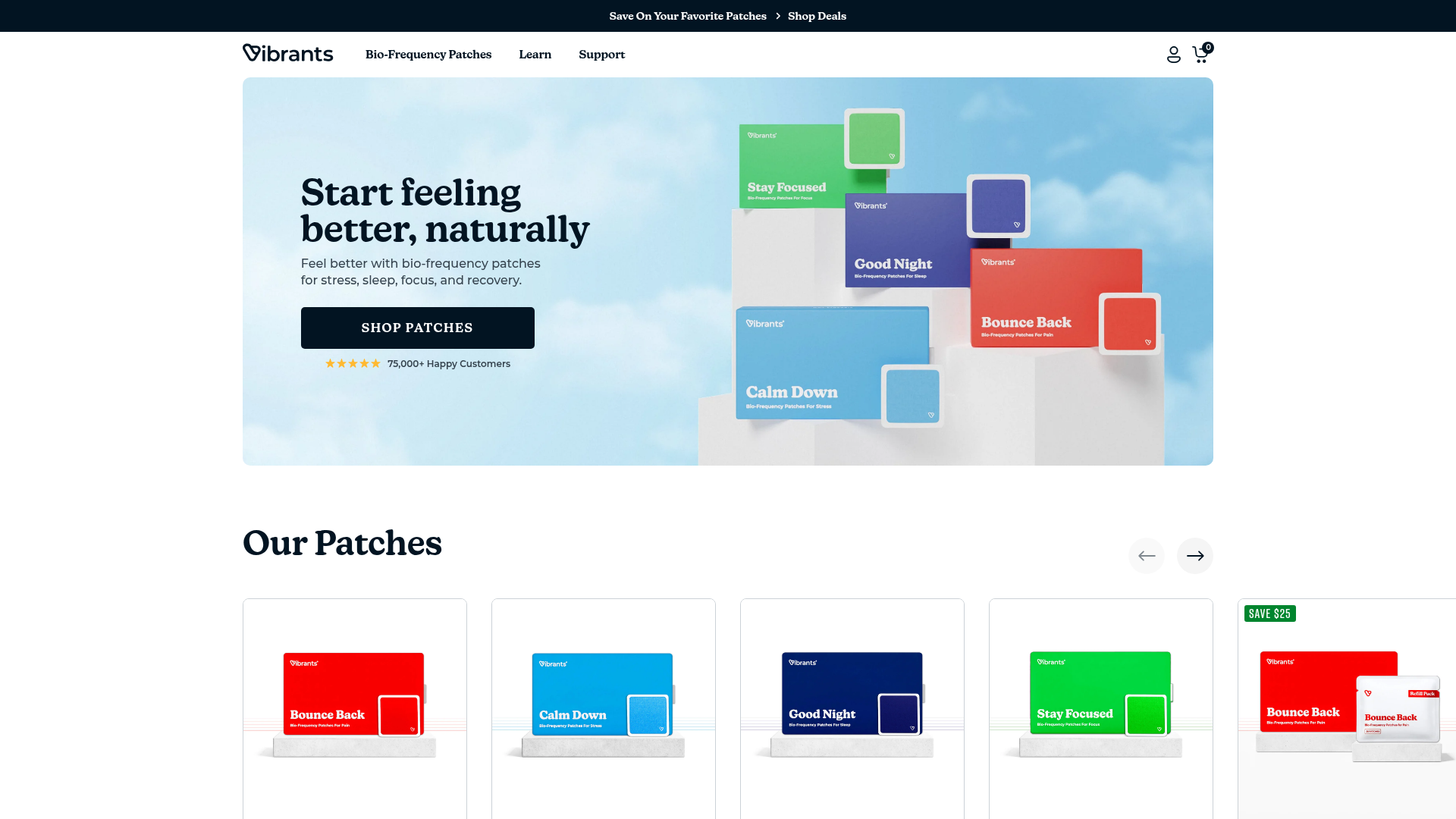
Vibrants Wellbeing E-commerce Landing Page
A clean Shopify-style landing page featuring a full-width hero with overlaid product cards, a horizontal product slider, and interactive cart drawer with utility progress bars.
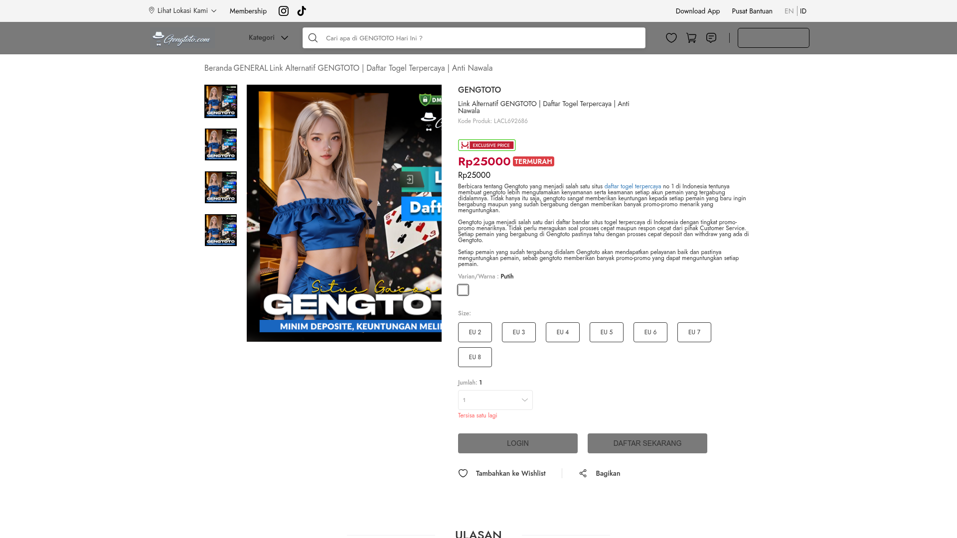
GENGTOTO Product Detail E-commerce Layout
A comprehensive product page featuring a vertical image gallery, detailed item specifications, color/size selection modules, and integrated user review and FAQ components.
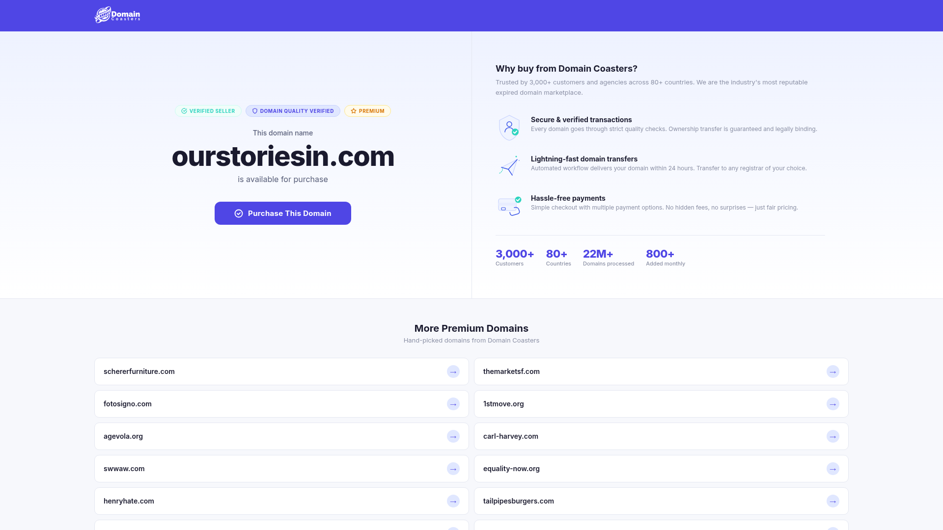
Domain Coasters Landing Page Layout
A clean domain marketplace landing page featuring a split-screen hero with trust badges, statistical counters, and a responsive grid of card-based links for additional inventory.
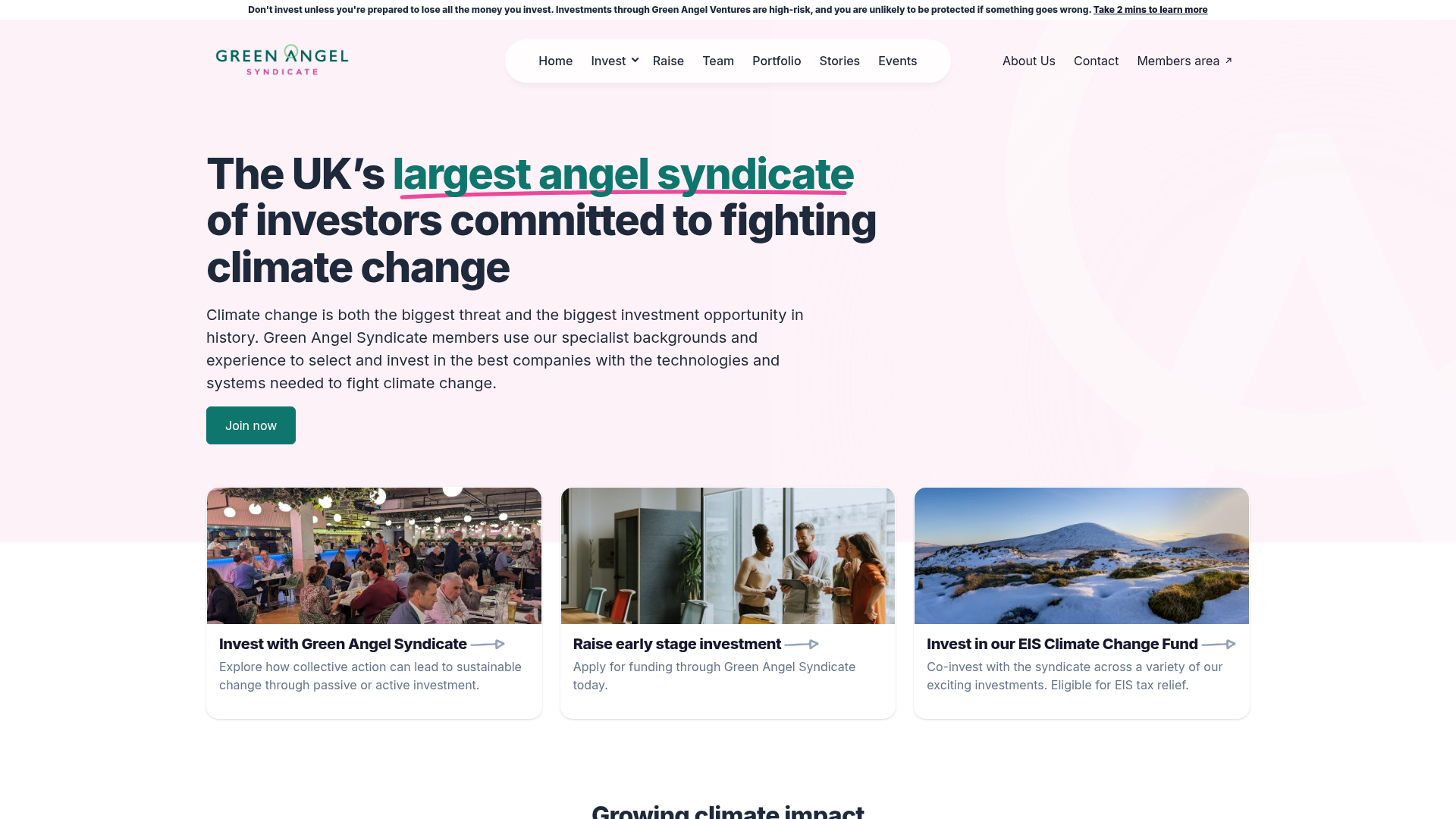
Green Angel Syndicate Investment Landing Page
A clean venture capital landing page featuring a hero section with card-based navigation, a four-column stat grid, and alternating split-layout content sections with image-text pairings.
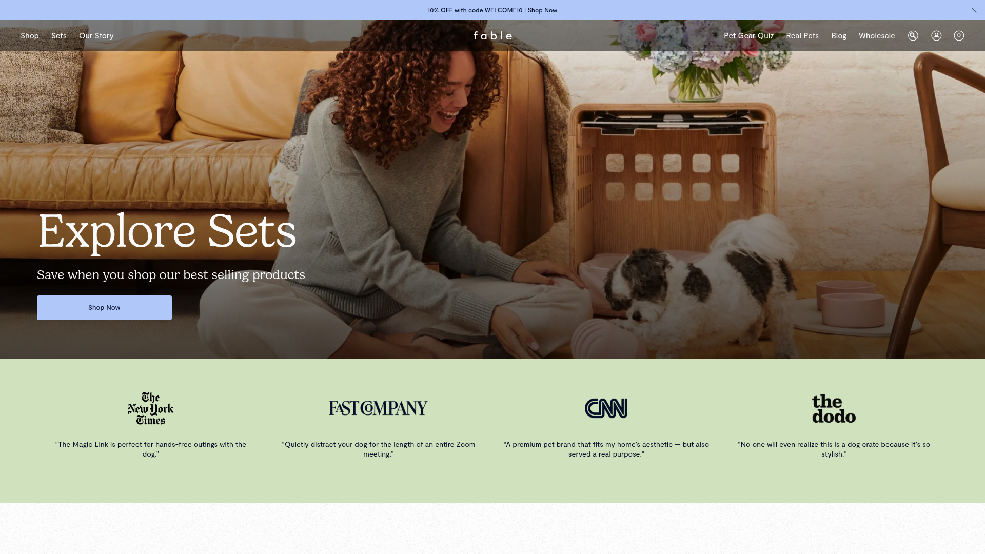
Fable Pets E-commerce Landing Page
A minimalist lifestyle pet brand template featuring a high-impact hero section, a clean logo trust bar, and a centered navigation menu.
