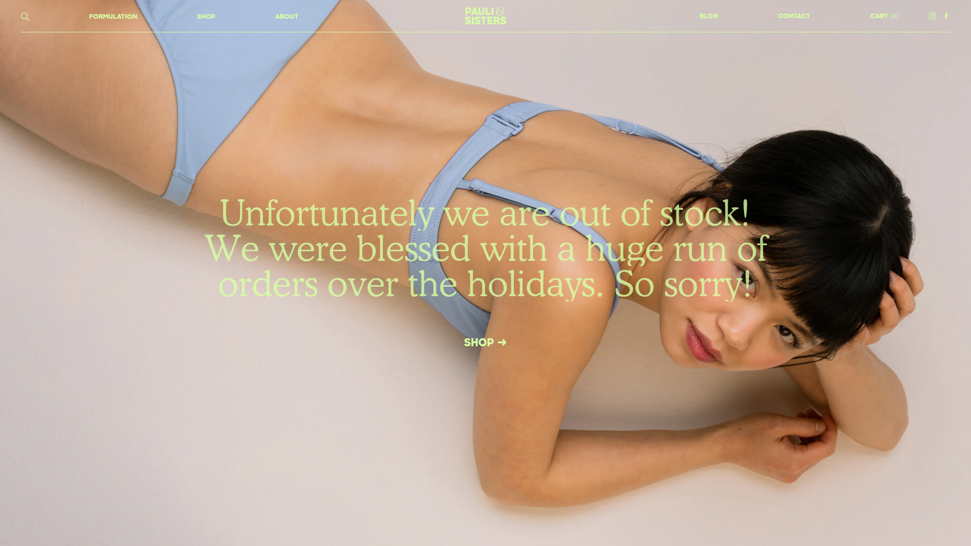
Pauli & Sisters Landing Page
A minimalist e-commerce design featuring a full-width hero image with large overlapping serif text, an interactive ingredient explorer, and a clean split-block layout.
Overview
This landing page for Pauli & Sisters is a masterclass in minimalist, high-end e-commerce design. It uses a high-fashion aesthetic characterized by large serif typography, generous white space, and a unique "split-block" layout that balances product storytelling with institutional content. It is a strong reference for builders looking to create a premium brand presence where visual imagery and editorial-style copy take center stage over dense data grids.
Design System
- Color Palette & Visual Hierarchy: The design uses a sophisticated, muted palette: light sky blue, pale sage green, and soft lemon yellow. These pastels are used as full-bleed backgrounds for specific sections to delineate shifts in content. Bold, full-width high-resolution photography provides the primary visual anchor, while the neon-adjacent sage text creates a modern, slightly rebellious contrast against the skin tones and product shots.
- Typography System: The system relies on a high-contrast serif typeface for headlines (appearing at large scales in the hero) and a clean, wide sans-serif for navigation and functional elements. It effectively uses italics (e.g., "Summer Shirt", "Jojoba", "Vitamin E") to create movement and an organic, handwritten feel within an otherwise rigid layout.
- Page Structure & Flow: The flow transitions from an emotional high-impact Hero into a values-driven text block, followed by alternating image-rich "split blocks" and interactive ingredient explorers. The layout ends with a dual-pane newsletter subscription area and a simple Instagram feed, maintaining a singular column of focus throughout.
- Reusable Components:
- Hero Section: Full-screen background with absolute-positioned text and a simple arrow-lead button.
- Split Block: A 50/50 horizontal split where one side contains text on a solid color and the other contains a full-bleed image.
- Ingredient Explorer: A clever interaction where hovering or clicking ingredient names (displayed in a floating list) triggers corresponding descriptions and iconography on the left panel.
- Product Detail Block: A clean configuration showing product imagery next to a simplified form featuring a customized quantity stepper and an "Add to Cart" button with a distinct arrow icon.
- Interaction & Motion: The HTML reveals the use of
scroll-revealpatterns (matrix3d transforms) that cause text blocks and images to slide upward into view as the user scrolls. Buttons feature a standard→hover state that reinforces the "next step" direction. - Implementation Clues: Built on Shopify, the site uses a modular section-based architecture. The CSS relies on
lazyloadfor performance and utilizesdisplay: flexandbackground-image: url()for the split-pane layouts.
Use Cases
- Who should clone this: Independent skincare, beauty, or lifestyle brands that have high-quality photography and a small SKU count (1-5 products).
- Effective Remixes: Perfect for high-end fashion lookbooks, artisanal food brands, or even a professional portfolio where projects are introduced via editorial storytelling.
- Remix Directions:
- Color Swap: Replace the soft pastels with high-contrast blacks and neon for a streetwear or tech hardware brand.
- Info Architecture: Adapt the "11 Ingredients" section to describe specialized technology features or service steps for a SaaS product.
- Modular Use: Clone the "Split Block" and "Product Block" sections separately to add as featured sections on a standard Shopify homepage.
- Suggested Scope: A full-page clone is ideal for those wanting a cohesive "less is more" brand launch, while a 1-section clone of the Ingredient Explorer provides a unique interactive element for existing sites.
Related Inspirations
Vibrants Wellbeing E-commerce Landing Page
A clean Shopify-style landing page featuring a full-width hero with overlaid product cards, a horizontal product slider, and interactive cart drawer with utility progress bars.
Fable Pets E-commerce Landing Page
A minimalist lifestyle pet brand template featuring a high-impact hero section, a clean logo trust bar, and a centered navigation menu.
Aisle E-commerce Landing Page
A clean Shopify-based layout featuring a high-impact split hero section, a scrolling marquee for trust badges, and interactive product cards with variant swatches and image carousels.
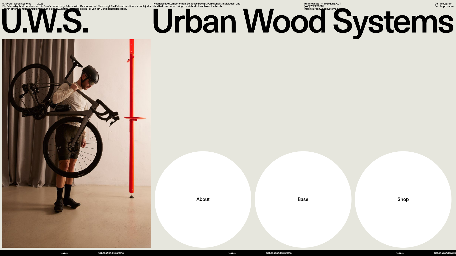
Urban Wood Systems Minimal Landing Page
A minimalist layout featuring a large-scale SVG header, a scrolling text ticker footer, and a clean navigation grid with large circular hover-active buttons.
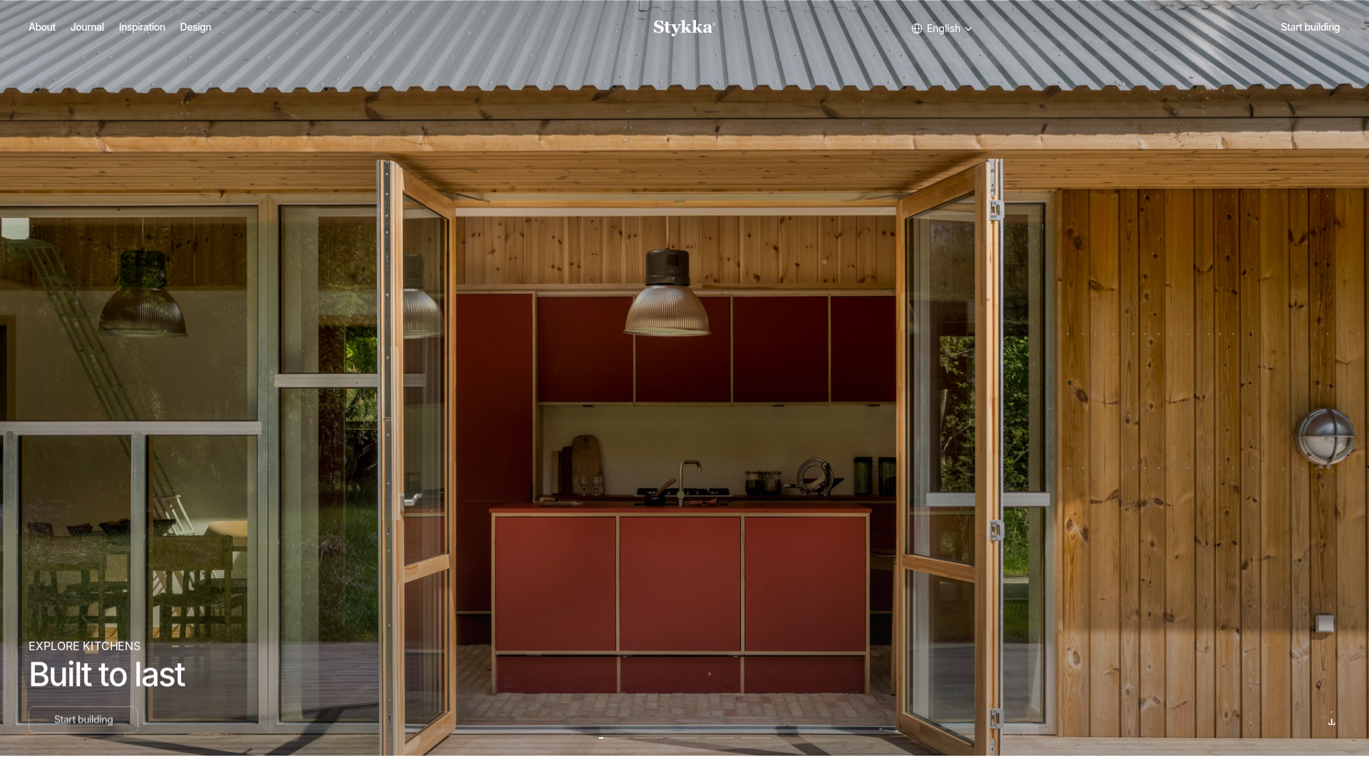
Stykka Modular Furniture Landing Page
A minimalist industrial design featuring a full-screen vertical navigation slider, oversized imagery, and interactive content cards for modular product storytelling.
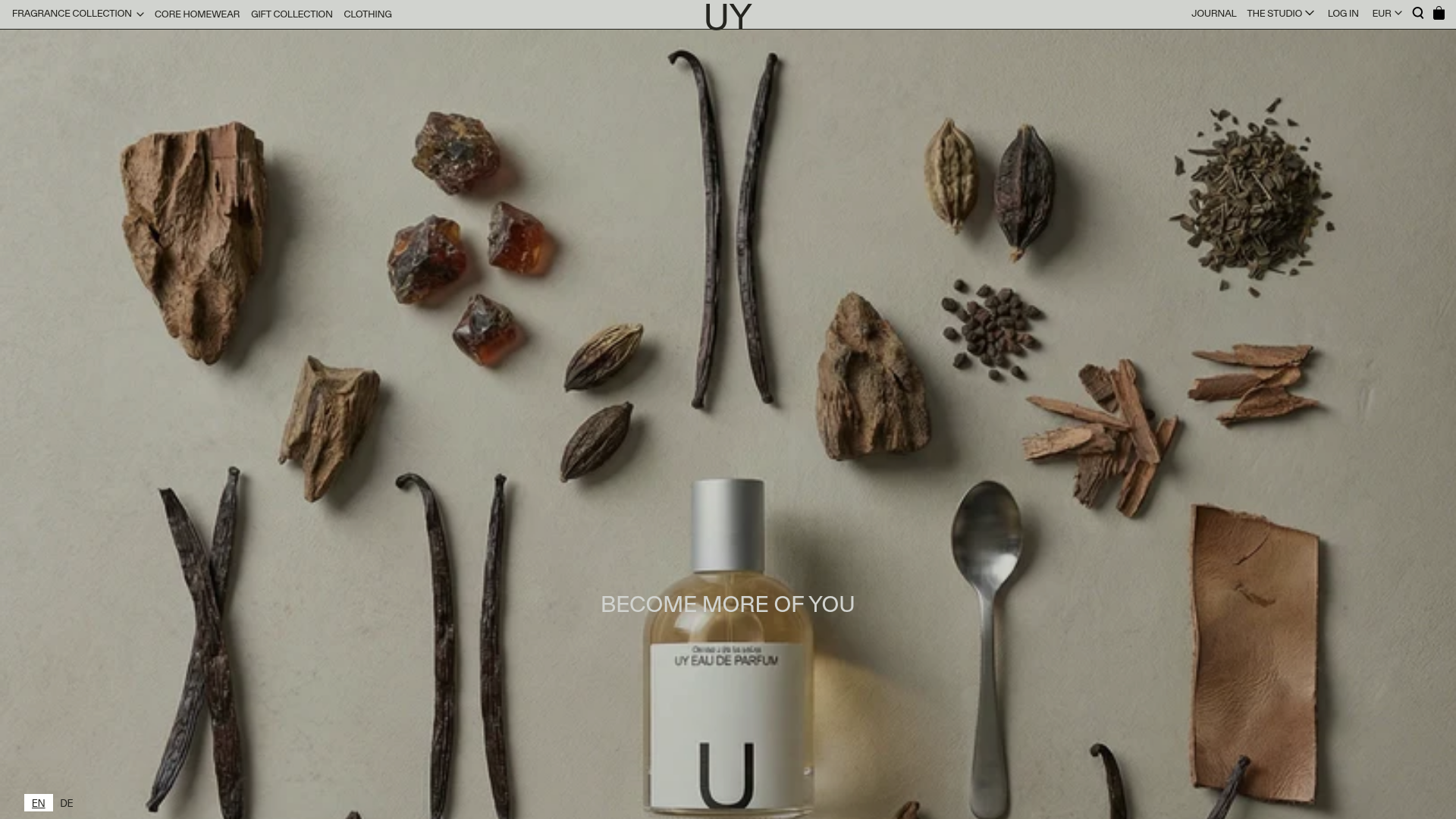
UY Studio Fragrance Landing Page
A minimalist e-commerce layout featuring a high-resolution hero image with ingredient flat-lay aesthetic and a uniform product grid for specialized retail collections.
