Cloudflare Error 1016 Page
A clean, functional error page layout featuring grouped text sections and a simple user feedback survey component.
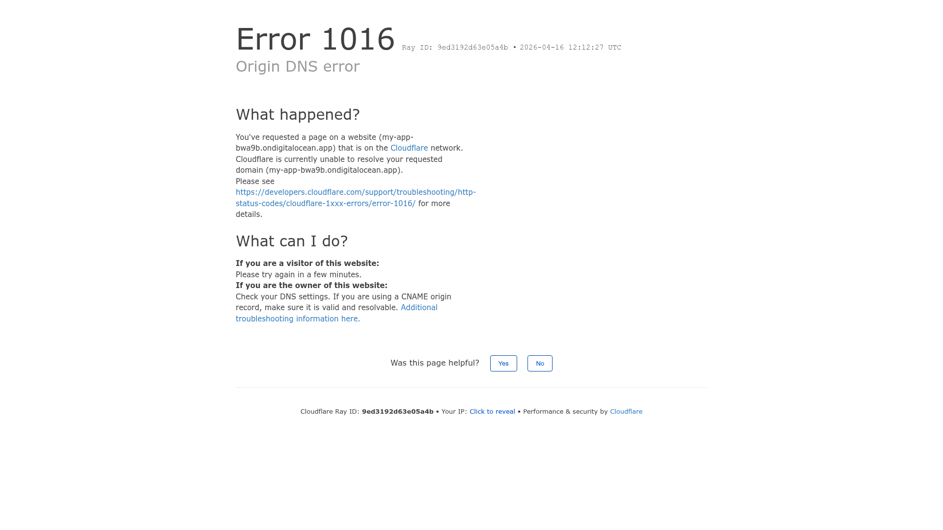
Overview
This project is a clean and functional error page design, specifically the Cloudflare Error 1016 layout. It is a strong clone reference for developers who need to implement high-information-density status pages or system error messages that prioritize readability and actionable troubleshooting steps.
Design System
- Color Palette and Visual Hierarchy: The design follows a strict minimalist aesthetic using a white background with high-contrast black headers (#000000) and gray secondary text. Links are styled in a classic blue for immediate recognition. A light gray border (#D1D5DB) is used as a thematic divider for the footer.
- Typography System: The layout uses a sans-serif stack with a clear hierarchy. Large headers (3xl) use a
font-normalweight for a clean, non-aggressive look. Body text uses a standard 15px size, while metadata and footer text scale down to 13px. Emphasis is achieved through bolding (<strong>) for label-value pairs like "Ray ID". - Page Structure and Section Flow: The flow is strictly vertical and logical: Main error title and ID -> "What happened?" explanation -> "What can I do?" instructions -> User feedback survey -> System metadata footer.
- Reusable Components: Notable components include the simple two-button feedback survey with bordered white buttons and the system metadata footer that neatly groups dynamic strings like IP addresses and unique session IDs.
- Interaction Patterns: The design features a "Click to reveal" toggle for the IP address and simple hover states on buttons. It includes a specific state for success feedback ("Thank you for your feedback!") that replaces the survey upon interaction.
- Responsive Behavior: The HTML reveals a mobile-first utility approach using
w-fullfor smaller screens andw-1/2for desktop content blocks. The footer transitions from a single-line horizontal layout to a stacked vertical list usingsm:blockutilities. - Implementation Clues: The HTML uses Tailwind CSS utility classes (e.g.,
mx-auto,mb-8,px-8,antialiased) and data-translate attributes, indicating it is built for localization and easy horizontal scaling.
Use Cases
- Who should clone this: DevOps engineers or product developers building custom 404, 500, or maintenance pages that need to convey technical information without overwhelming the user.
- Products for Remixing: SaaS dashboards, internal tools, or infrastructure platforms where system status transparency is critical.
- Remix Directions: Swap the monochrome headers for brand colors to better integrate with a host application, or replace the feedback buttons with a direct CTA to a support ticket system.
- Suggested Clone Scope: A quick section clone of the "What can I do?" layout is useful for any information-heavy UI, while a full-page clone is ideal for global error handlers.
Related Inspirations
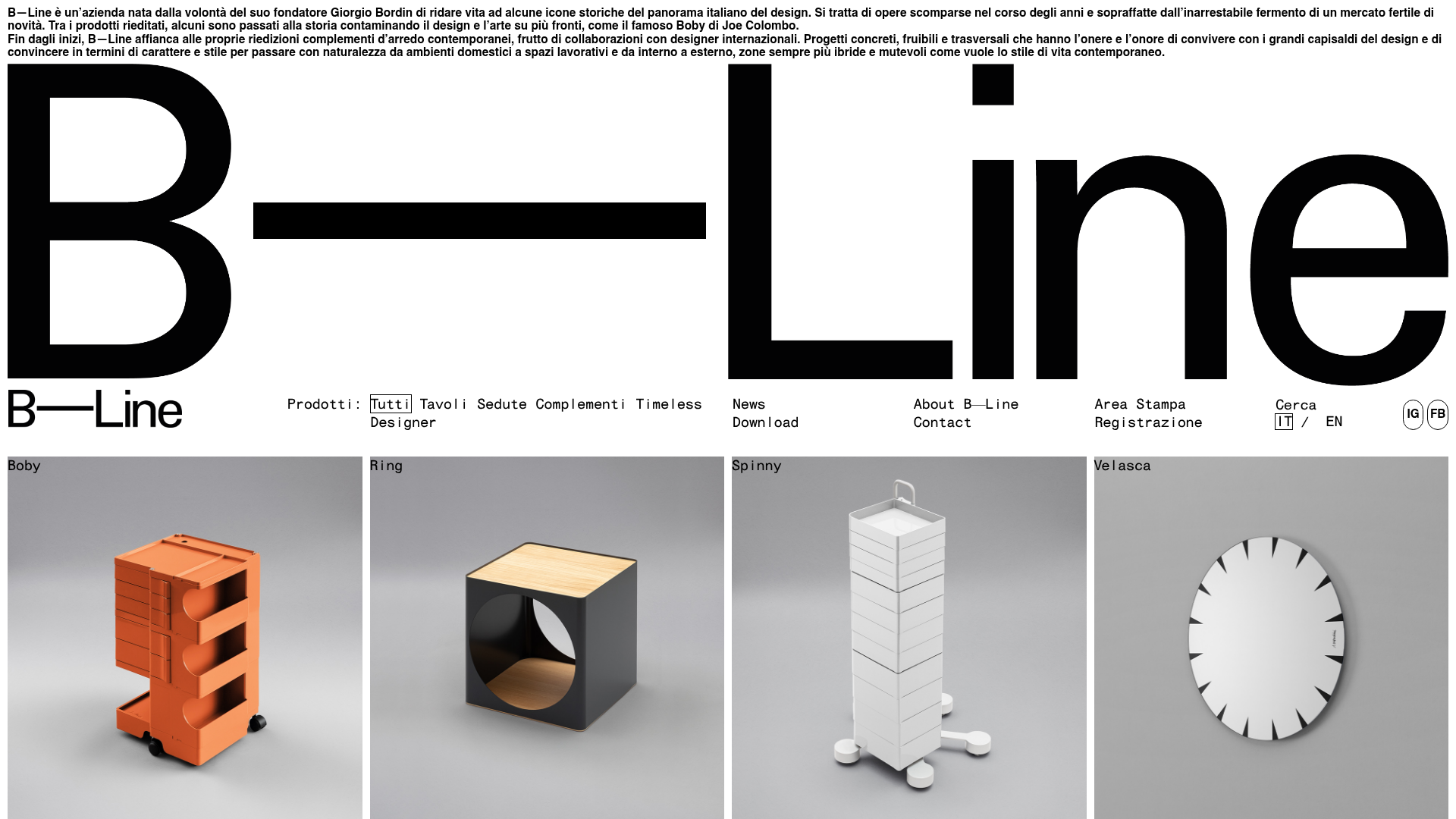
B-Line Minimalist Design Catalog
A high-contrast grid layout featuring an oversized typographic brand header, a text-based navigation menu, and a uniform product gallery using square image tiles.

Cloudflare Invalid SSL Error Page
A minimal, text-based error notification layout featuring a header, bulleted list of technical details, and a horizontal divider for system status messaging.
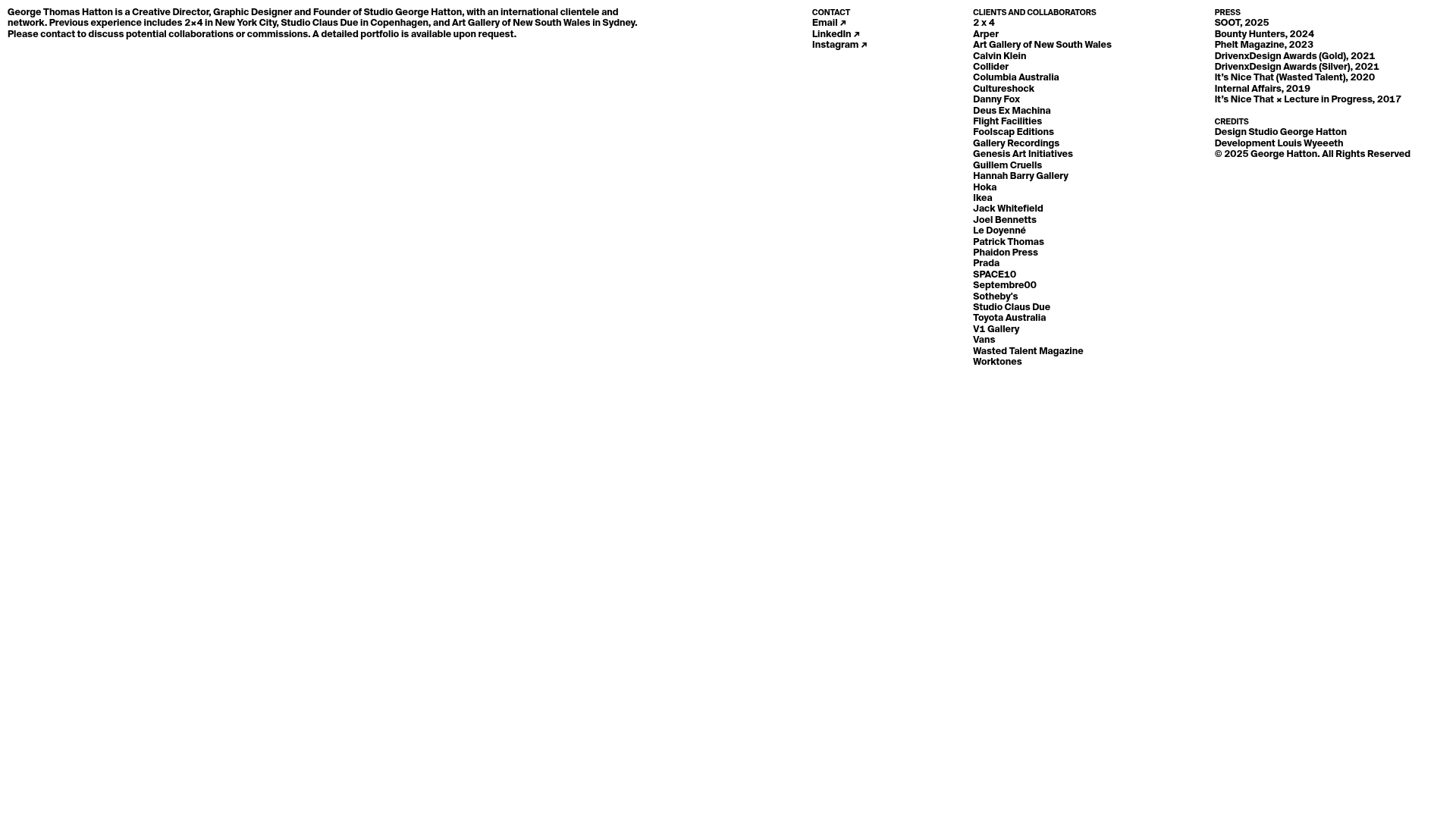
Minimal Text-Based Creative Director Portfolio
A clean, typography-focused landing page featuring a multi-column layout for bio, links, and client lists using simple CSS flex or grid structures.

Munro Partners Financial Growth Landing Page
A professional financial services layout featuring a vertical typographic hero, animated stat counters, a data-driven fund performance table, and a colorful grid for news and investment themes.
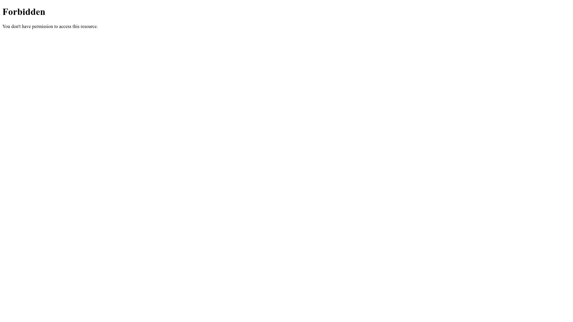
Forbidden Access Error Page
A minimal 403 Forbidden error page layout featuring basic typography and a standard access notification message.
Nginx Default 404 Error Page
A minimal, unstyled 404 error page layout featuring center-aligned text and a horizontal rule separator.
