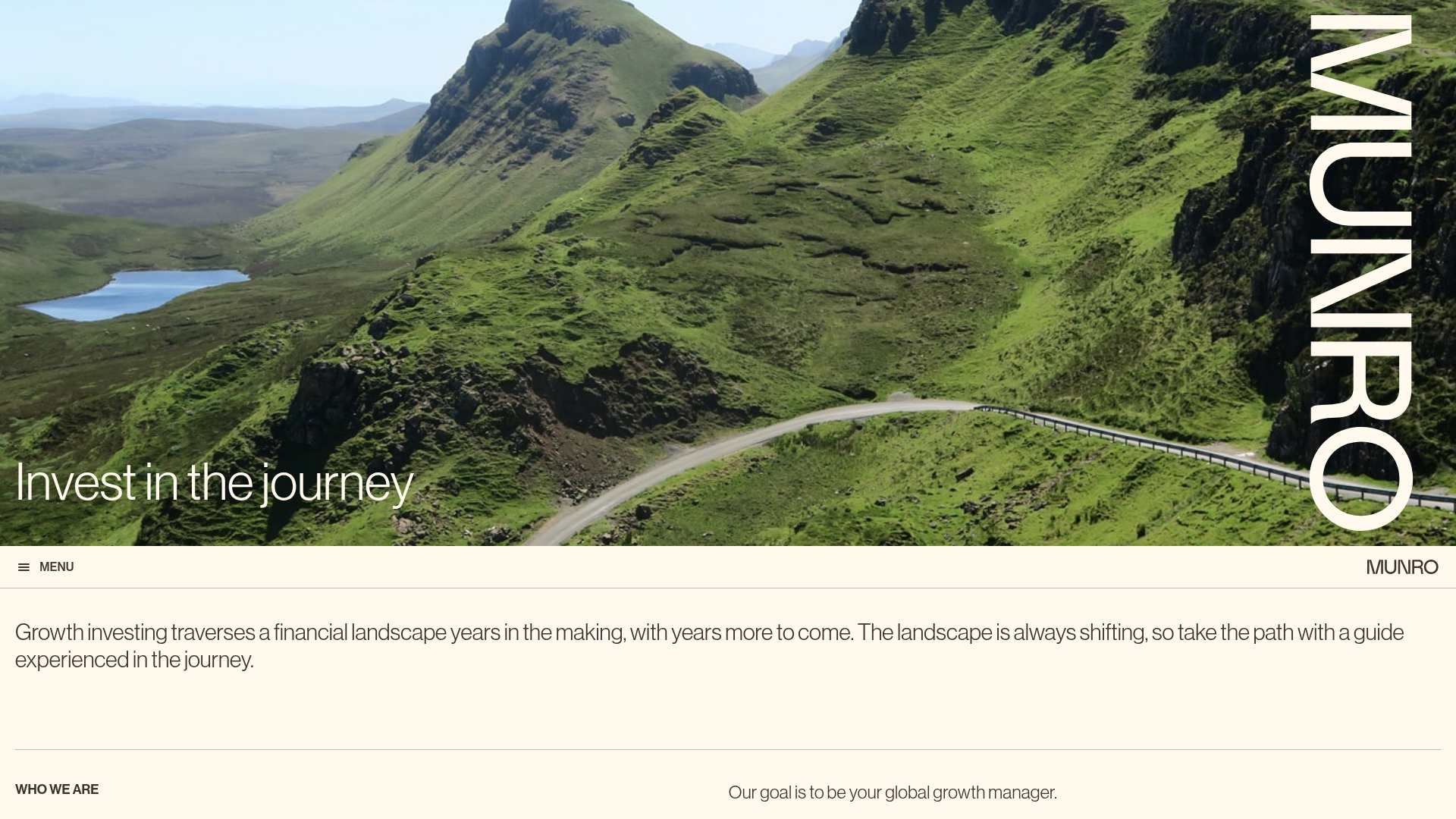
Munro Partners Financial Growth Landing Page
A professional financial services layout featuring a vertical typographic hero, animated stat counters, a data-driven fund performance table, and a colorful grid for news and investment themes.
Overview
Munro Partners' landing page is a masterclass in sophisticated financial service design, blending a high-impact travel-themed hero with a clean, data-driven interface. It effectively balances authority and accessibility by using a vertical typographic layout and an organized grid system to present complex investment metrics clearly. This is a strong reference for builders looking to create a premium brand presence that feels both professional and modern.
Design System
- Color Palette & Visual Hierarchy: The primary background is a warm off-white (
#fff9ee), providing a softer feel than pure white. Accent colors are used functionally for fund categorization: primary blue (#3074f9) for Managed Funds and purple (#a56eff) for ETFs. High-contrast dark greens (#004e4e) and muted golds are used in the news grid for visual variety. - Typography: The system utilizes a clean, sans-serif font (likely Helvetica/Arial or a similar grotesque) with varying scales. The hero section features a unique vertical 'MUNRO' title, while headings for sections like "Who we are" are kept in small uppercase for a refined editorial look.
- Page Structure: The layout follows a logical progression: a large immersive hero image with a philosophical tagline, an 'About' section featuring animated performance stats (FUM, Returns), a detailed performance data table, a category-based browsing grid for "Areas of Interest," and finally a colorful Masonry-style news grid.
- Reusable Components:
- Data Grid: A clean, horizontal performance table (
#homepage-funds-data-table) with subtle hover states for different fund types. - Animated Stat Counters: Simple text blocks that reveal growth numbers upon scroll.
- News Tiles: High-contrast, monochromatic color blocks used as links, creating a vibrant secondary navigation layer.
- Data Grid: A clean, horizontal performance table (
- Interactions & Motion: The page uses
fl-animationandfl-fade-inclasses extensively. These trigger entry transitions for rows and text blocks as the user scrolls, creating a sense of dynamic loading without being distracting. - Mobile Behavior: The HTML reveals a dedicated mobile data table (
fl-visible-mobile). On smaller screens, the horizontal fund rows transform into vertical cards with high-contrast headers to maintain readability without horizontal scrolling. - Implementation Clues: Built using the Beaver Builder framework (indicated by
fl-builder-contentandfl-rowclasses), the site relies on a grid-based utility system to manage spacing and alignment.
Use Cases
- Who should clone this: FinTech startups, asset management firms, and professional consulting services that need to present raw data alongside a narrative-driven brand story.
- Effective Remixes: Venture Capital portfolios can remix the "Areas of Interest" grid to showcase investment sectors, while SaaS platforms can adapt the performance table into a nuanced pricing or feature comparison chart.
- Remix Directions: Replace the landscape hero with industry-specific architectural or abstract imagery; maintain the off-white background and vertical typography to keep the premium feel while swapping the accent blues and purples for brand-specific palette.
- Clone Scope: A full-page clone is ideal for established brands seeking a total refresh, but the performance data table and the colorful news grid are excellent candidates for a singular section clone.
Related Inspirations
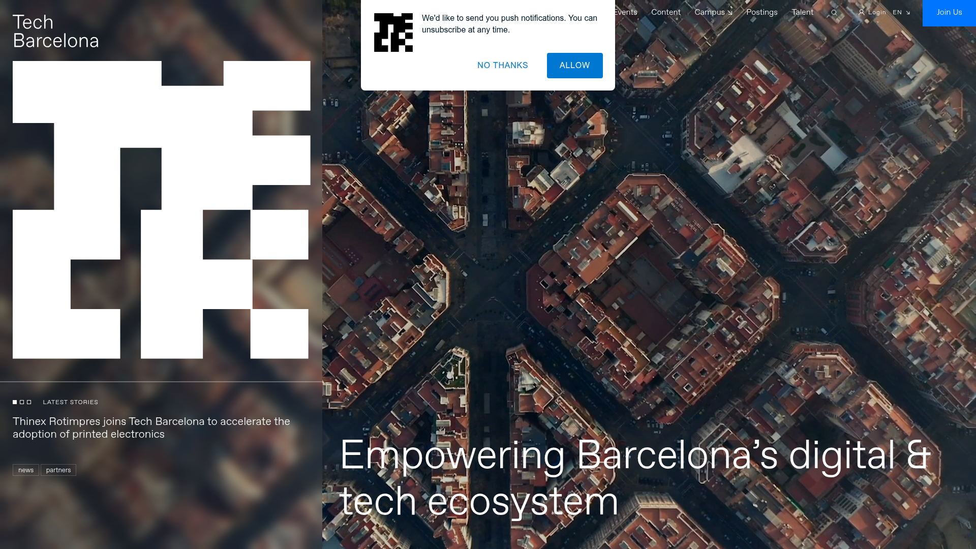
Tech Barcelona Ecosystem Hub Landing Page
A refined landing page layout featuring an immersive video background hero, marquee-style scrolling badges, and card-based sections for events and community projects.

Context Gallery High-End Furniture Landing Page
A minimal editorial layout featuring a multi-column product carousel, designer biographies with image-text pairings, and a magazine-style content grid for curated design stories.

Glein Minimalistic Bento Grid eCommerce
A clean, modular layout using a bento-style responsive grid of text teasers and large-scale product imagery for lookbooks and collection browsing.
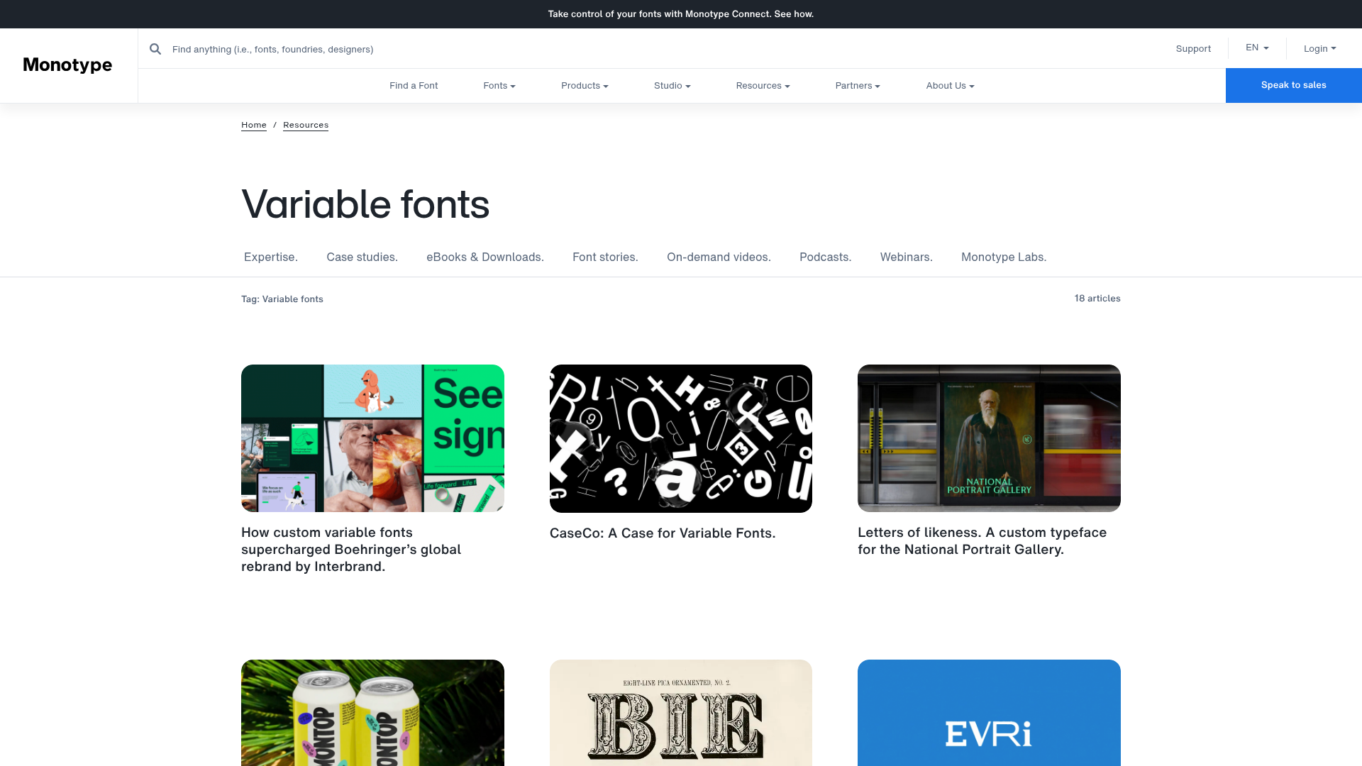
Monotype Variable Fonts Resource Gallery
A clean masonry grid layout featuring content cards with hover-state overlays, category filtering, and responsive image scaling for a media-rich resource center.

Basic.Space E-commerce Gallery Clone
A minimalist product marketplace featuring a clean sticky navigation bar, nested flyout menus, and a horizontally scrollable product carousel with hover-state image switching.

Ashley & Co Lifestyle E-commerce
An elegant Shopify-based storefront featuring a split-screen animated hero, horizontal ticker-tape collection carousel, and dynamic mega-menus with scent-specific color switching and image previews.
