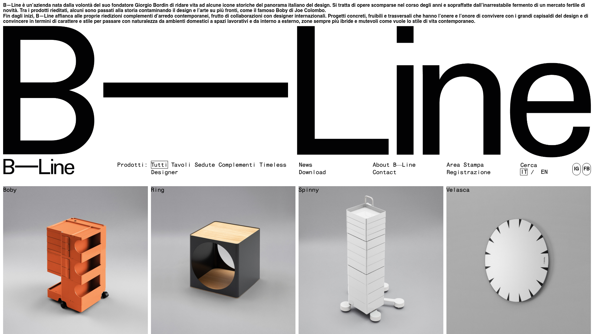
B-Line Minimalist Design Catalog
A high-contrast grid layout featuring an oversized typographic brand header, a text-based navigation menu, and a uniform product gallery using square image tiles.
Overview
B-Line's website is a masterclass in minimalist design, utilizing extreme white space and oversized typography to create a high-end, gallery-like experience. It serves as a strong reference for clones seeking a bold, editorial aesthetic that prioritizes product photography and brand identity over complex interface elements.
Design System
- Color Palette & Visual Hierarchy: A strict monochrome foundation (pure white background, black text) allows the diverse colors of the studio-lit product photography to create the visual interest. The hierarchy is dominated by the massive brand logotype, followed by clean, descriptive text.
- Typography System: The site uses a clean sans-serif (resembling Helvetica or similar architectural grotesks). It features two extremes: massive, display-style headers for branding and small, monospaced or tightly tracked sans-serif for navigation and metadata, creating a stark, modern contrast.
- Page Structure & Section Flow: The layout starts with a dense text introduction, followed immediately by an oversized, responsive logo wrapper. Below the logo is a horizontal text-based navigation bar, which transitions into a clean four-column (desktop) grid of square product tiles.
- Reusable Components:
- Logo Wrapper: A flexible header that breaks the brand name across the width of the viewport.
- Product Tiles: Square
divcontainers withbackground-imageproperties and a simple overlay (.filtro) that displays the product name on hover or in a minimalist overlay. - Text-Only Navigation: A dense, multi-column menu using simple links without buttons or icons.
- Interaction & Motion: The HTML indicates a focus on transitions (
transition: inherit). The product grid uses a simple filter overlay pattern where the product name appears over the image. - Responsive Behavior: The mobile implementation (visible in classes like
.nav-mobileand.logo-wrapper-mobile) stacks the massive branding into a vertical format and collapses the multi-column navigation into a simplified mobile menu. - Implementation Clues: The site is built with a custom WordPress theme using a column-based grid system (
col-md-2,col-sm-50). Styles are managed via classes that separate desktop and mobile intro text (.header-intro.desktopvs.header-intro.mobile).
Use Cases
- Who should clone this: Architectural firms, high-end furniture designers, art galleries, or boutique fashion brands that want their products to feel like curated museum pieces.
- Remixing Product Types: This layout effectively supports any physical goods that benefit from clean, gray-background studio photography, such as industrial equipment, luxury watch collections, or high-end electronics.
- Practical Remix Directions:
- Swap the monochrome palette for a high-contrast brand color while maintaining the oversized type.
- Adapt the information architecture to a single-view catalog where clicking a product opens a minimalist side-panel instead of a new page.
- Reuse the "Logo-to-Nav-to-Grid" flow for a portfolio site.
- Suggested Clone Scope: A full-page clone is ideal for brands with fewer than 50 SKU items; for larger catalogs, cloning the oversized typographic header and the four-column square grid section is highly recommended at a component level.
Related Inspirations

Isla Beauty Skincare E-commerce Store
A clean Shopify-based storefront featuring a split-hero landing page, a step-by-step product system carousel, and a split-screen testimonial section with localized product image sidebars.
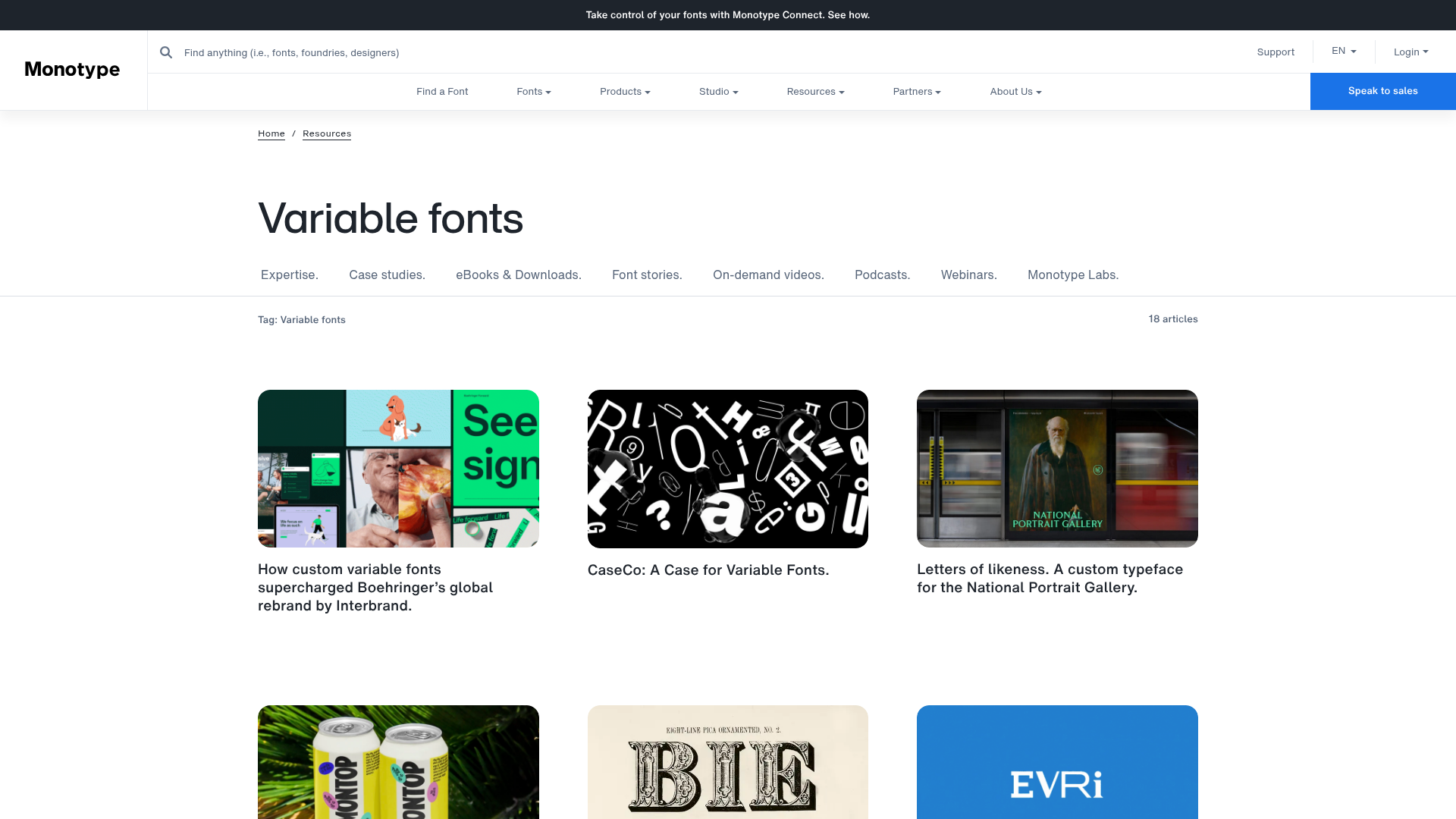
Monotype Variable Fonts Resource Gallery
A clean masonry grid layout featuring content cards with hover-state overlays, category filtering, and responsive image scaling for a media-rich resource center.
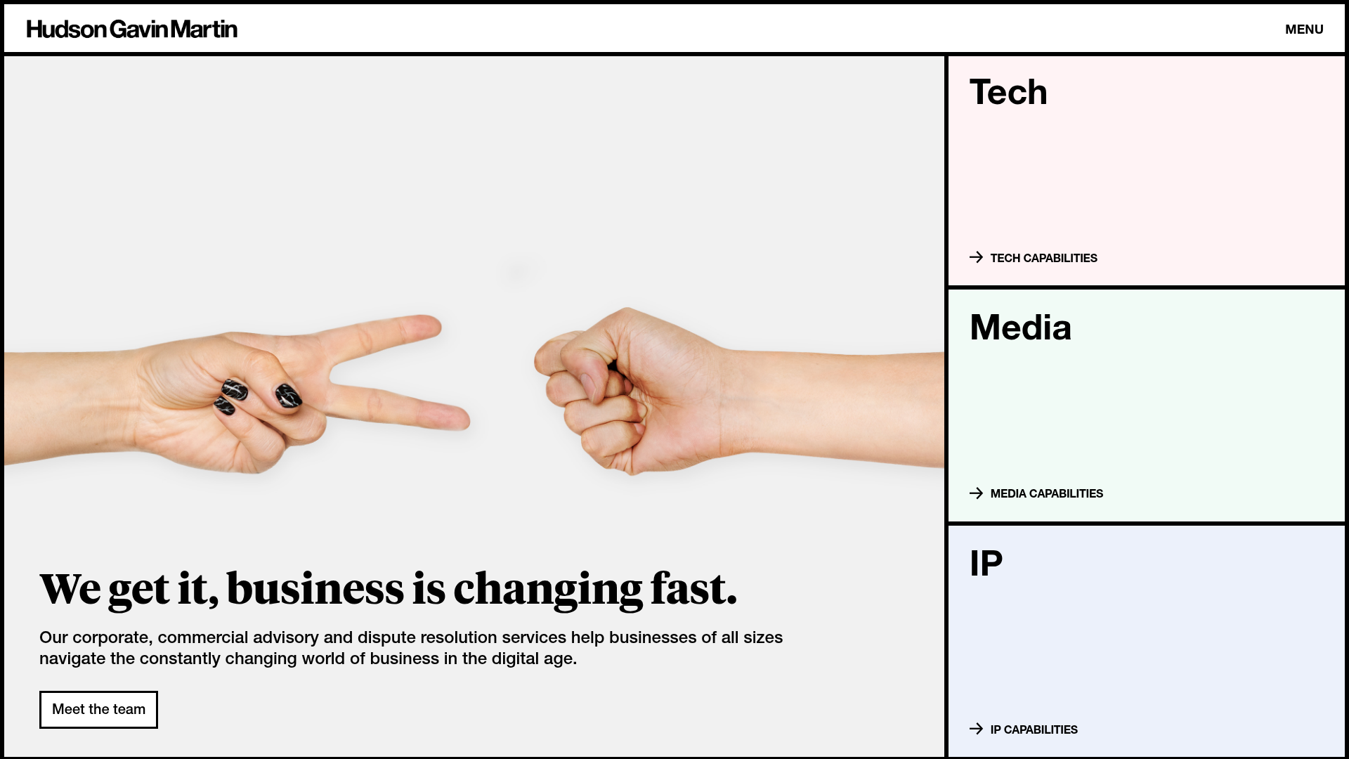
Hudson Gavin Martin Corporate Law Landing
A professional service homepage featuring a minimalist grid-based hero, color-themed navigation blocks, and a bento-style insights feed with subtle hover interactions.
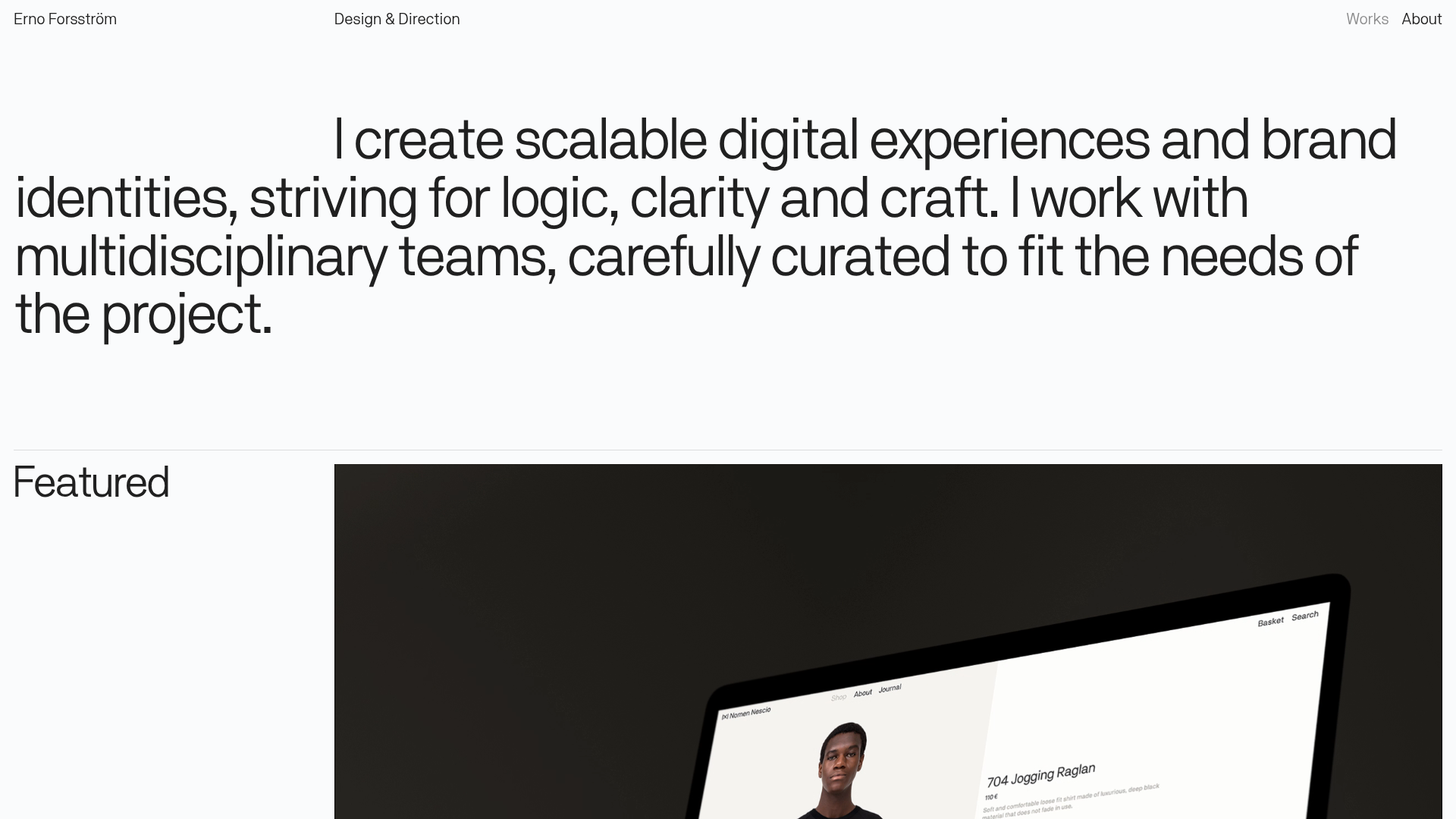
Erno Works Minimalist Design Portfolio
A clean, typography-focused portfolio featuring a sticky grid layout, large editorial headers, and integrated video project thumbnails for dynamic case study previews.
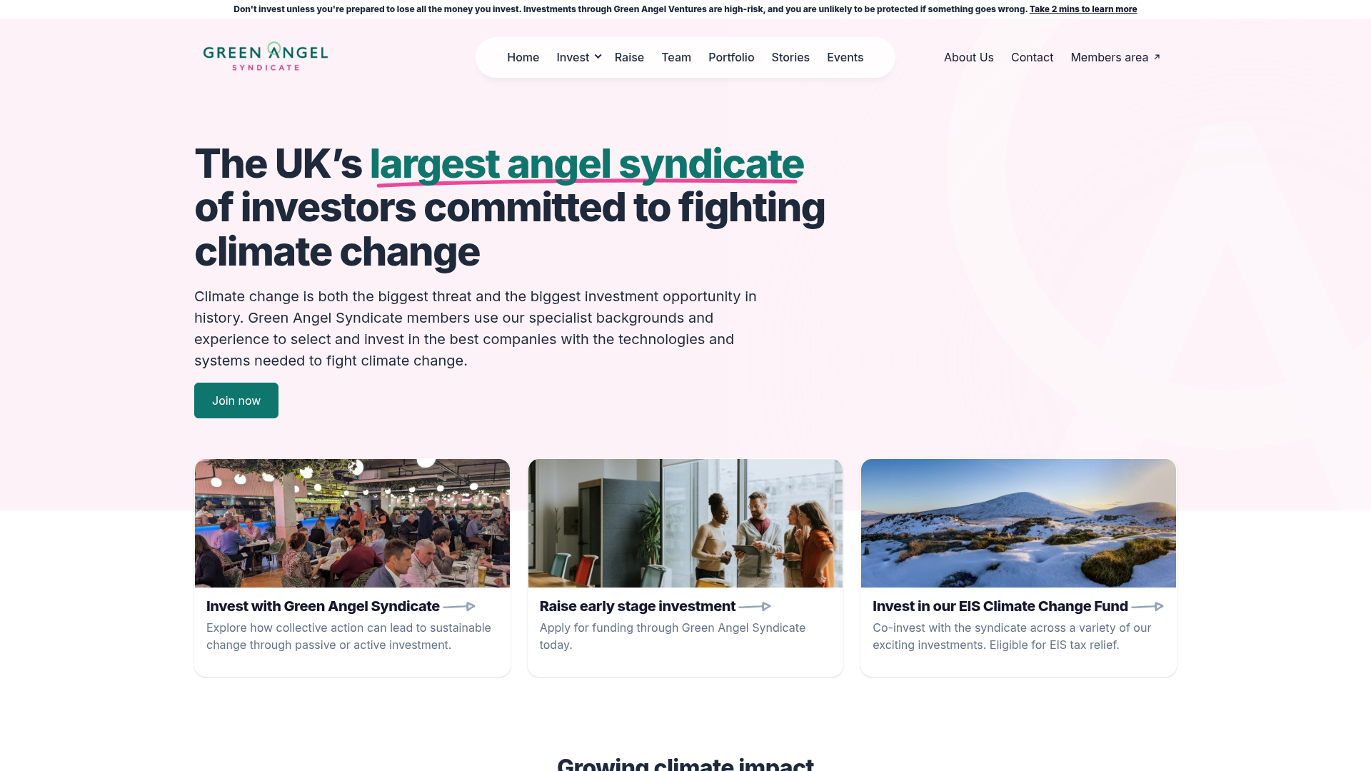
Green Angel Syndicate Investment Landing Page
A clean venture capital landing page featuring a hero section with card-based navigation, a four-column stat grid, and alternating split-layout content sections with image-text pairings.
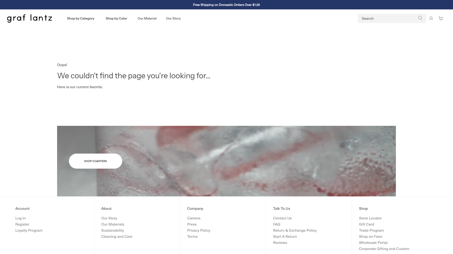
Graf Lantz Minimalist E-commerce 404
A clean Shopify-based error page featuring a full-width video hero with a CTA button, a detailed multi-column footer, and a sophisticated slide-out cart drawer.
