Alt-Border Portfolio With Inline Images
A minimalist art direction portfolio featuring an editorial hero section with inline small-scale images, a horizontal scroll feed, and a variable-density project grid.
Overview
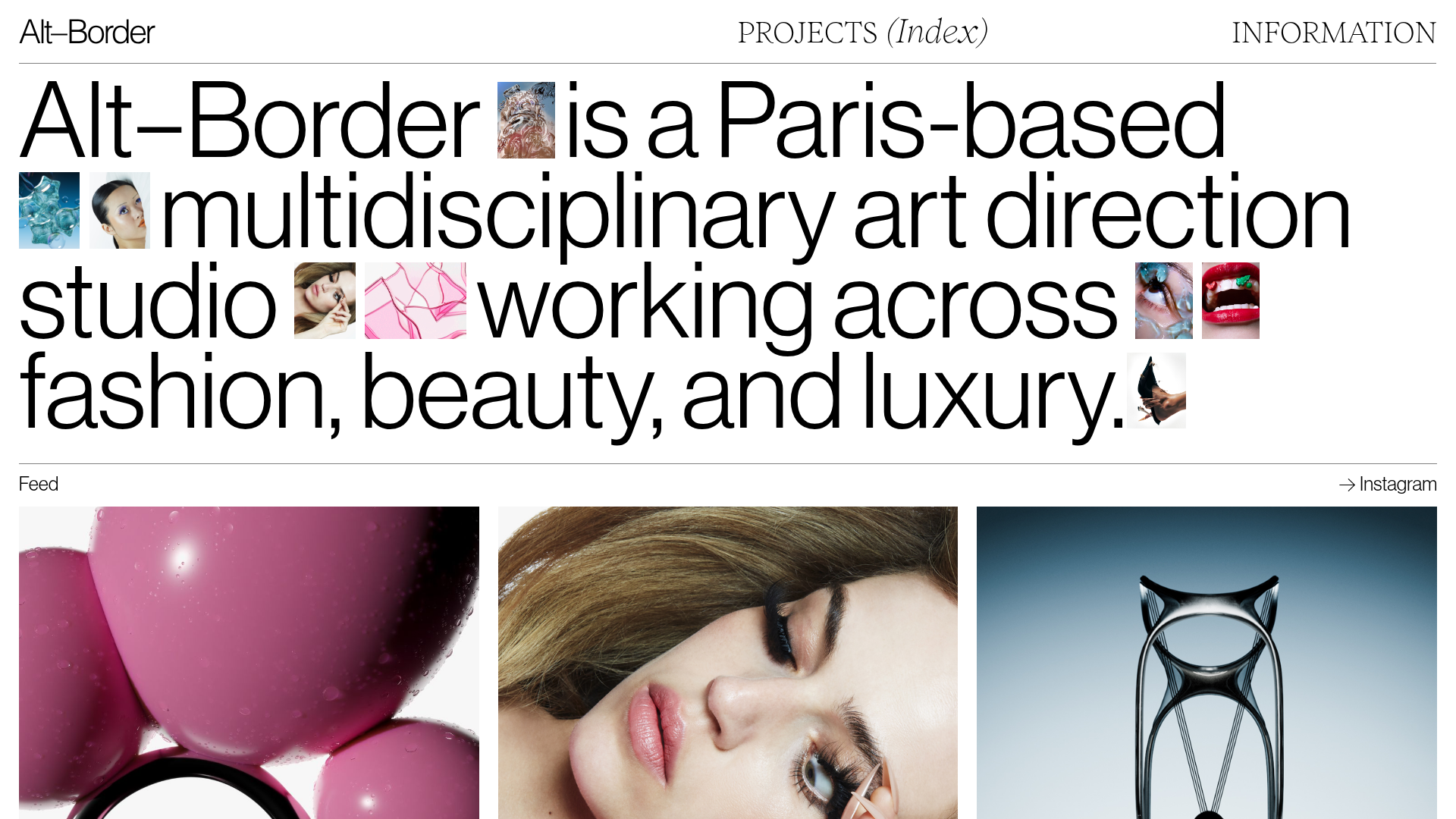
This project for Alt–Border is a sophisticated art direction portfolio that masterfully blends high-fashion editorial typography with dynamic visual elements. It serves as an excellent reference for builders wanting to implement non-traditional hero sections where imagery is woven directly into descriptive text, creating a seamless narrative flow.
Design System
- Color Palette & Visual Hierarchy: The site uses a high-contrast monochromatic base (white background, black text) to ensure that the vibrant, high-saturation fashion photography and CGI renders are the primary focus. Visual weight is managed through extreme scale shifts rather than color.
- Typography System: The system relies on a clean, humanist Neo-Grotesk typeface. The hero text is scaled dramatically to a large display size, while navigational elements and metadata use a small-caps utility for secondary hierarchy. Italics are used sparingly in the navigation for stylistic contrast.
- Page Structure & Section Flow:
- Dynamic Hero: A large textual statement containing small, high-ratio inline images.
- Feed Slider: A horizontal scroll/slider section with left/right navigation arrows.
- Statement Section: A full-width heading on a sticky background summarizing the studio's practice.
- Project Grid: A variable-sized masonry-style grid featuring project thumbnails with text overlays that appear on hover.
- Footer: A massive full-width logo mark followed by essential copyright and navigational links.
- Reusable Components: The "Inline Image Hero" is the standout component—a flex or grid container that treats
<img>tags as words within a sentence. The "Feed" slider and the "Hover Image Grid" (using thediv-texte-imageclass for overlays) are also highly reusable patterns. - Interactions & Motion: The HTML reveals a heavy use of hover states (changing opacity of text over images) and sticky positioning for section headers. Transitions are smooth, likely utilizing Webflow's interaction engine as indicated by
data-w-idattributes. - Implementation Clues: The code uses a grid-heavy layout (
w-layout-grid) and specific classes liketexte-about-big, suggesting a system built for flexibility in image placement within typographic lines.
Use Cases
- Who should clone this: Independent creative directors, high-end production houses, and fashion photographers who want to showcase work within a conceptual, editorial framework rather than a standard gallery.
- Remix Directions:
- E-commerce: Use the inline image pattern to describe product features (e.g., "Our [image of chair] is made from [image of wood]...").
- Agencies: Adapt the "Feed" slider to showcase team members or live studio updates.
- Architecture: Use the variable project grid to highlight different scales of work (details vs. full buildings).
- Suggested Clone Scope: Start by cloning the Hero Section to master the balance between text and inline visuals. The Project Grid is an excellent second step for implementing a sophisticated masonry layout that supports both still images and autoplaying
<video>embeds as evidenced in the source code.
Related Inspirations
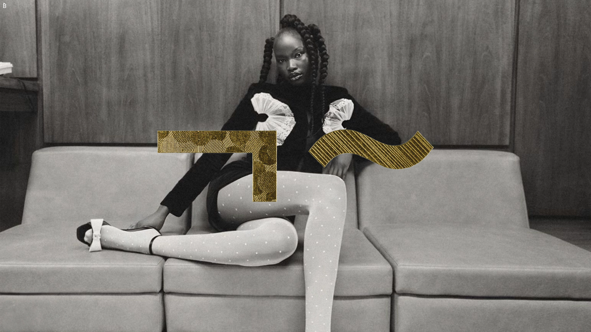
Bibliothèque Design Portfolio Landing Page
Black and white editorial layout featuring an centered hero image with abstract gold geometric overlays and a minimalist sans-serif design aesthetic.
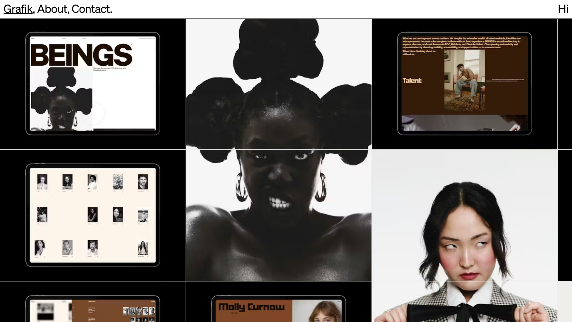
Grafik Portfolio Portfolio Grid Layout
A high-impact portfolio featuring a bold typography header, fixed sidebar navigation, and a large-scale imagery grid suitable for talent directories or creative agencies.

Clase Agency Branding Portfolio
A minimalist design agency portfolio featuring a typographic hero section, full-width image articles, sticky title bars, and integrated scrolling text marquees for a clean editorial layout.
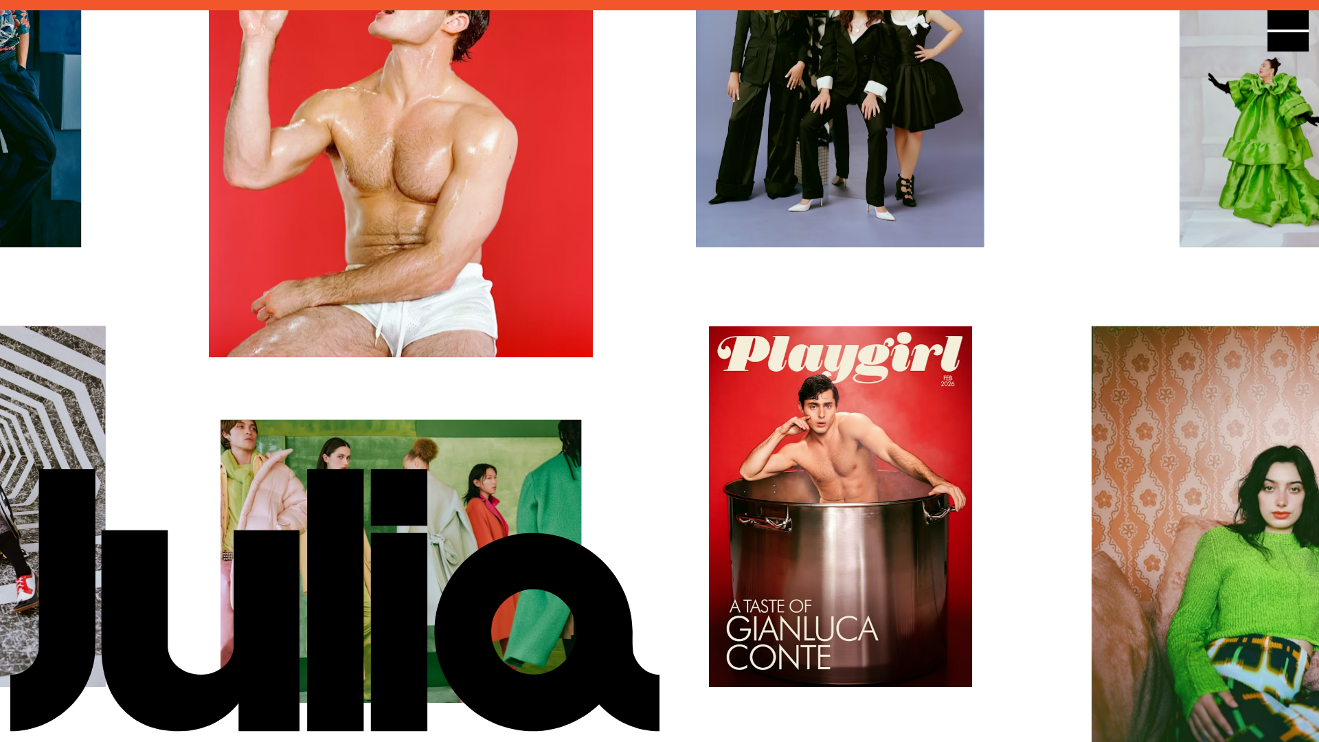
Julia Johnson Photography Portfolio Website
A creative portfolio featuring a masonry-style image grid, overlapping oversized typography, and a minimalist full-screen navigation overlay.

Lundqvist & Dallyn Studio Portfolio
Minimalist design studio portfolio featuring a custom video loader, world clock navigation, and a fluid masonry-style grid for high-quality photography and type design showcases.

AcolorBright Design Agency Portfolio
Minimalist bento-style portfolio layout featuring numerical section headers, horizontally scrolling project teasers, and a clean grayscale client logo grid.
