Grafik Portfolio Portfolio Grid Layout
A high-impact portfolio featuring a bold typography header, fixed sidebar navigation, and a large-scale imagery grid suitable for talent directories or creative agencies.
Overview
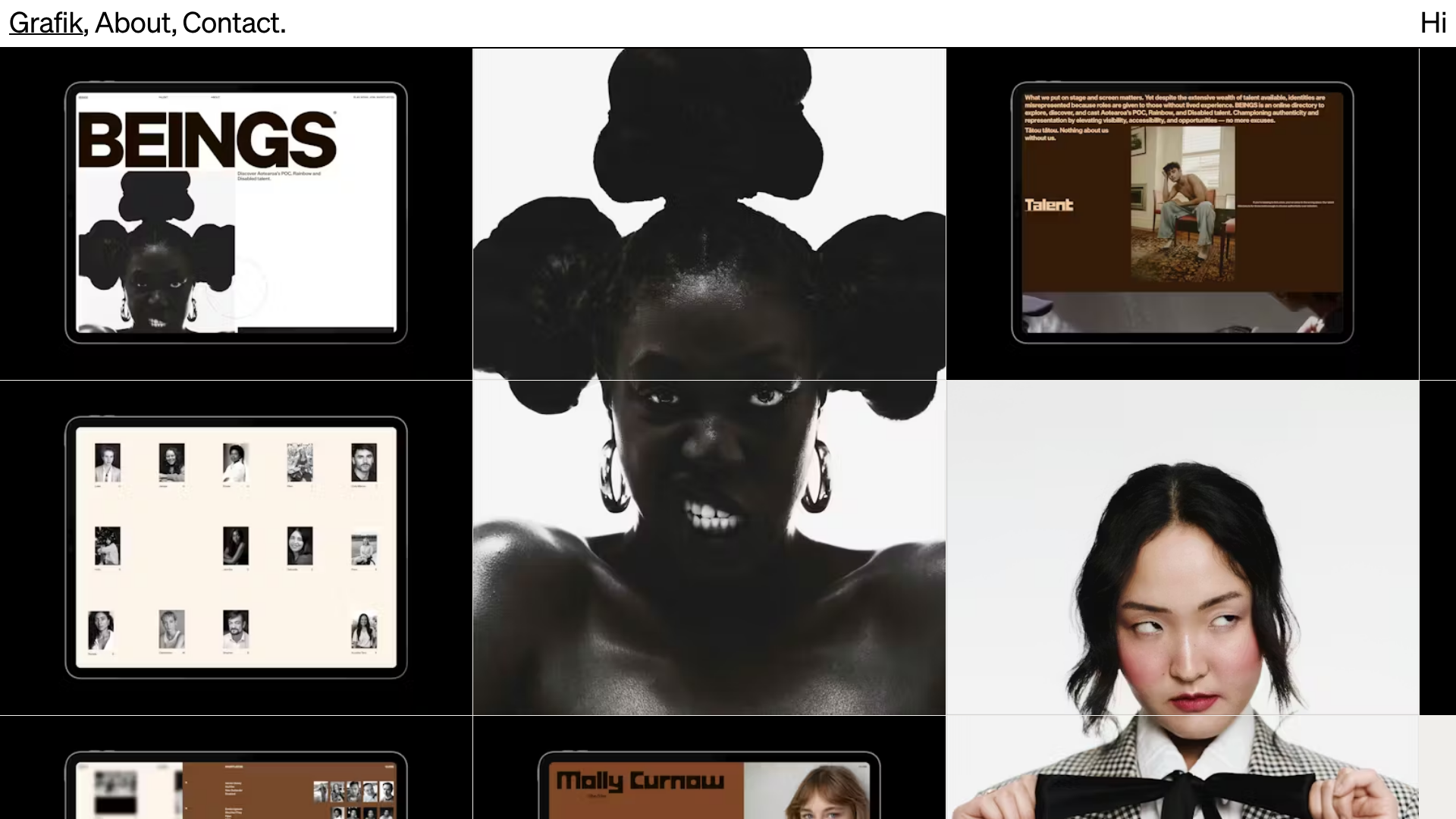
Grafik (specifically the BEINGS project) showcases a high-impact, grid-based portfolio designed for a talent directory. It utilizes a bold architectural layout that prioritizes large-scale portraiture and striking typography to elevate the presence of the individuals featured. This is a strong reference for creators needing a modular yet visually cohesive way to display a large volume of high-quality assets.
Design System
- Color Palette & Visual Hierarchy: The palette is grounded in sophisticated neutrals—stark blacks, off-whites, and earthy browns/tans. The hierarchy is established through extreme scale; large, cropped photography serves as the primary visual anchor, while high-contrast typography provides immediate brand recognition.
- Typography System: Features a heavy, sans-serif display face for primary headings (e.g., "BEINGS") used with tight tracking. Secondary copy uses a clean, utilitarian sans-serif, often in smaller point sizes to maximize negative space and maintain a professional editorial aesthetic.
- Page Structure: The layout follows a strict geometric grid. A top navigation bar remains minimalist, while the content area is divided into large rectangular blocks. One column typically features full-bleed imagery, while the adjacent column contains interactive interface mockups or talent profiles.
- Reusable Components: The project highlights a "Talet Directory" grid component—a multi-column layout of uniform portrait cards with name labels. The navigation bar is a slim, single-line menu with simple text links like 'Grafik', 'About', and 'Contact'.
- Interaction & Motion: Based on the visual evidence, the site uses a scroll-driven flow where large images and tablet mockups act as stationary or parallax-style backgrounds to contextualize the UI design work.
- Responsive Behavior: The design is pre-optimized for multi-device viewing, as seen in the inclusion of tablet-housed mockups that demonstrate how the grid collapses and adapts to different screen aspect ratios.
Use Cases
- Who should clone this: Creative agencies, talent management firms, model directories, and editorial photographers who want a "magazine-style" digital presence.
- Effective Remixes: This pattern can be effectively remixed for an e-commerce lookbook or a luxury architecture firm's project list. The rigid grid provides a stable framework for any high-resolution imagery.
- Practical Directions: Designers can swap the neutral palette for vibrant brand colors to change the mood from "editorial" to "high-energy." The information architecture can be adapted by replacing the tablet mockups with video reels or deeper case study text.
- Suggested Clone Scope: Start with a full-page clone to capture the specific grid ratios and typography scaling, as the impact of this design relies heavily on the relationship between whitespace and large-scale imagery.
Related Inspirations
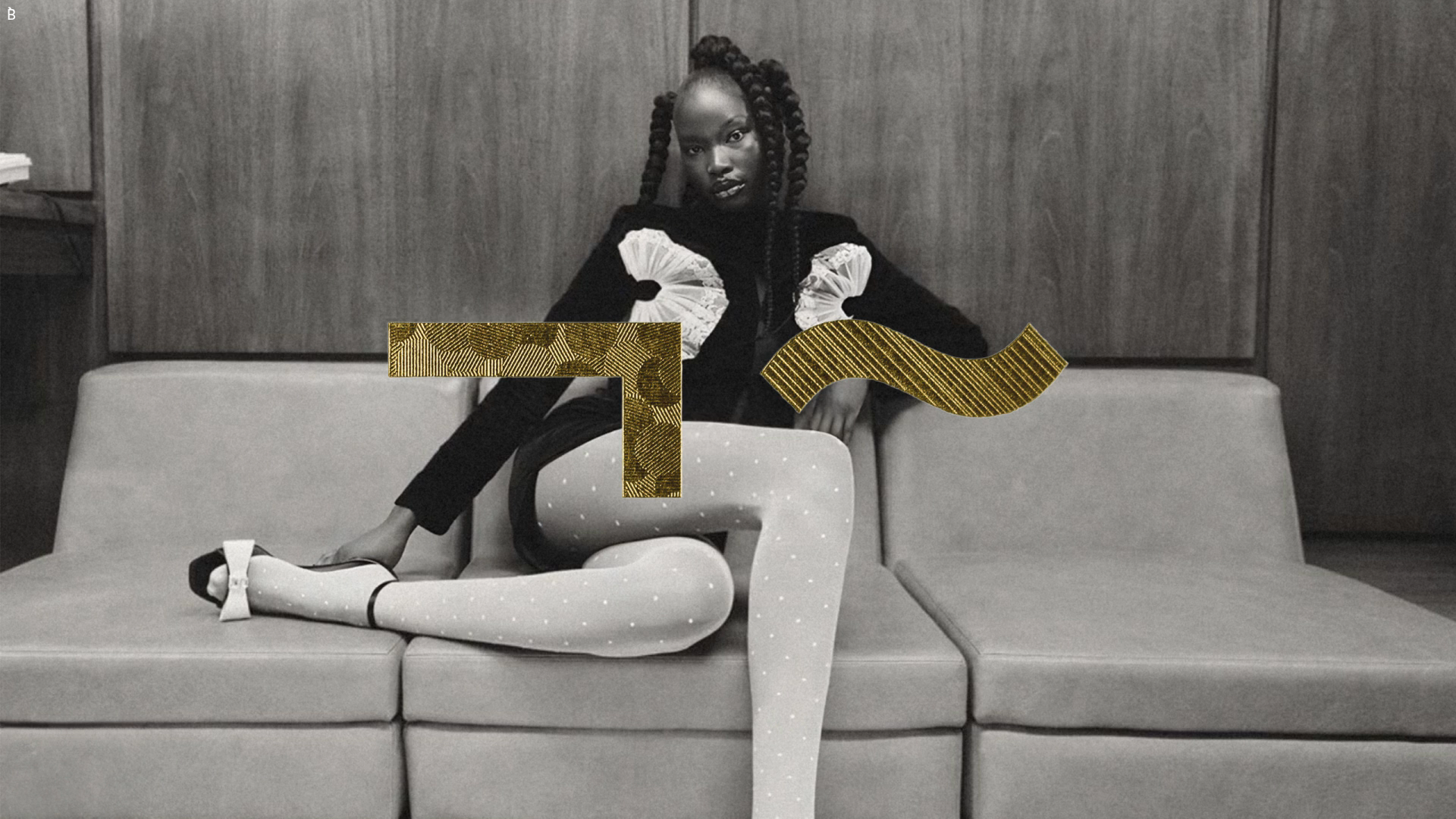
Bibliothèque Design Portfolio Landing Page
Black and white editorial layout featuring an centered hero image with abstract gold geometric overlays and a minimalist sans-serif design aesthetic.
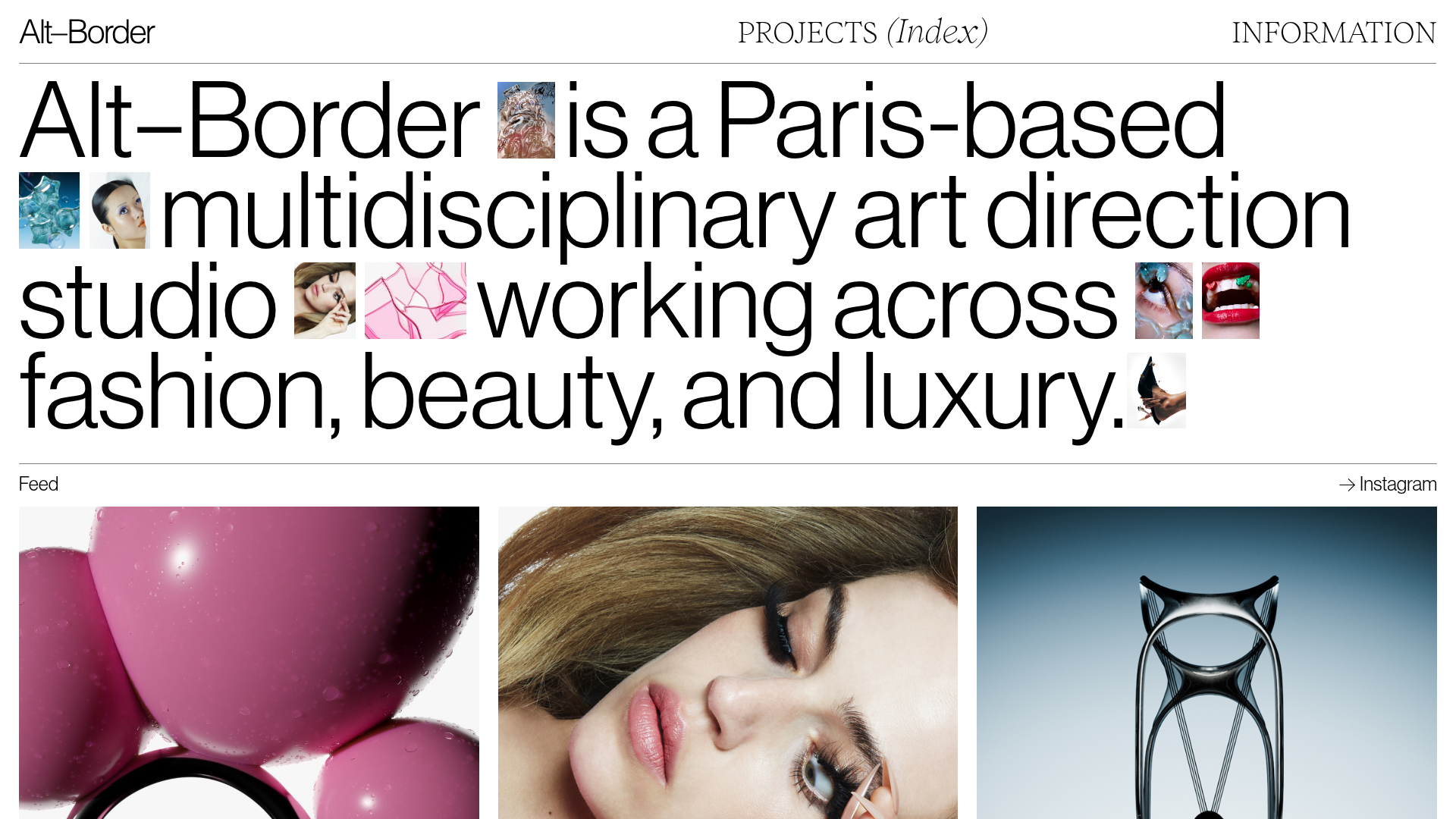
Alt-Border Portfolio With Inline Images
A minimalist art direction portfolio featuring an editorial hero section with inline small-scale images, a horizontal scroll feed, and a variable-density project grid.

Clase Agency Branding Portfolio
A minimalist design agency portfolio featuring a typographic hero section, full-width image articles, sticky title bars, and integrated scrolling text marquees for a clean editorial layout.
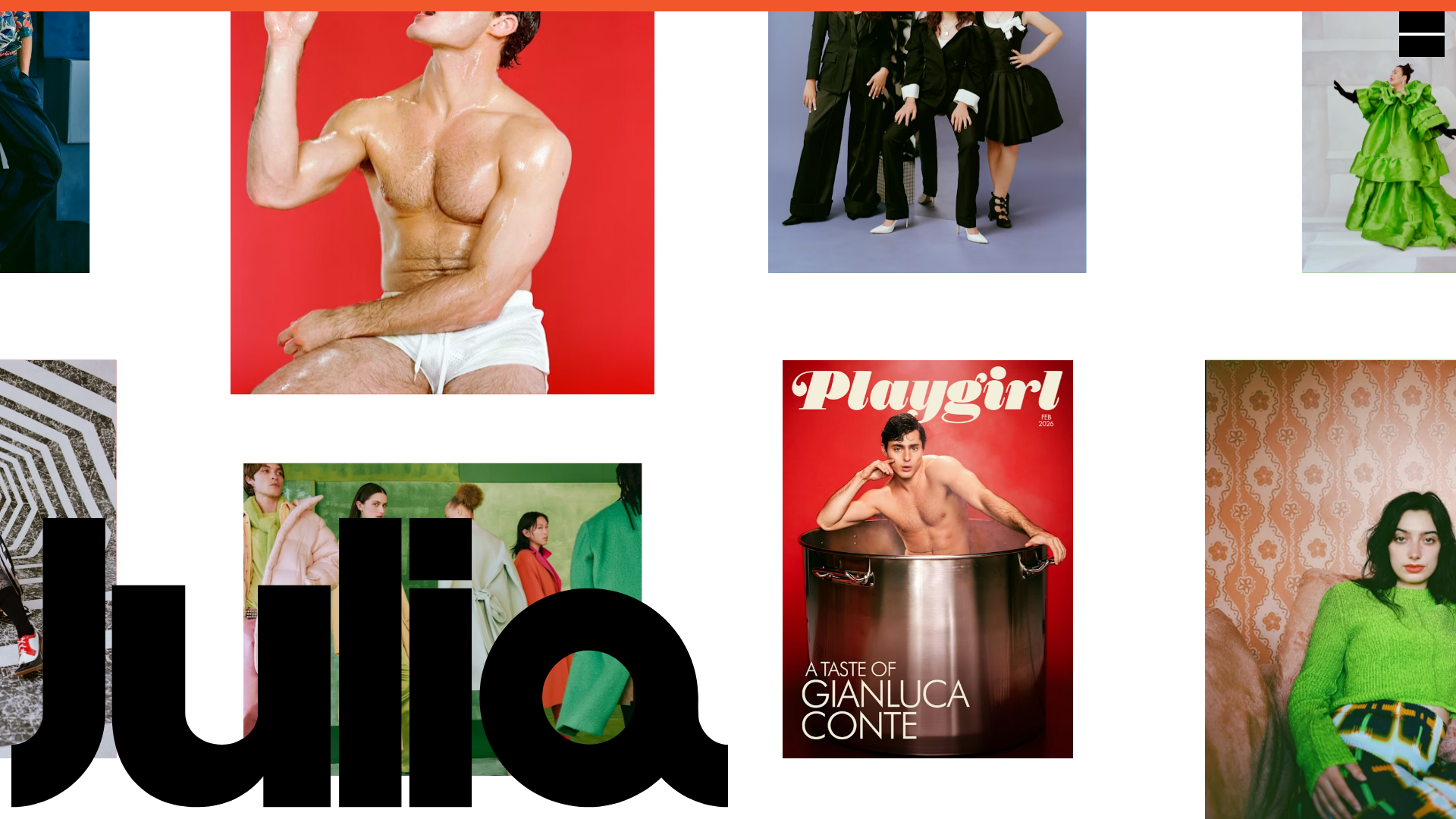
Julia Johnson Photography Portfolio Website
A creative portfolio featuring a masonry-style image grid, overlapping oversized typography, and a minimalist full-screen navigation overlay.

Lundqvist & Dallyn Studio Portfolio
Minimalist design studio portfolio featuring a custom video loader, world clock navigation, and a fluid masonry-style grid for high-quality photography and type design showcases.

AcolorBright Design Agency Portfolio
Minimalist bento-style portfolio layout featuring numerical section headers, horizontally scrolling project teasers, and a clean grayscale client logo grid.
