Industrial Designer Studio Portfolio Page
A minimalist portfolio layout featuring a full-screen canvas hero, integrated image carousel, and a clean grid for showcasing industrial design projects and career highlights.

Overview
This website is a sophisticated, high-end portfolio for Sébastien El Idrissi, an industrial designer. It features a minimalist aesthetic that prioritizes high-quality photography and white space, making it an excellent reference for creatives who want to showcase tangible products or detailed physical works without visual clutter.
Design System
- Color Palette & Visual Hierarchy: The site uses a monochrome base (white background, black text) to ensure that the vibrant colors of the industrial products stand out. Hierarchy is established through bold, oversized headings (H2) and generous vertical spacing between sections.
- Typography System: The design employs a clean, Swiss-style sans-serif typeface. It uses a "big and small" approach: massive headers contrast with smaller, utilitarian-styled body text for project descriptions and tables.
- Page Structure: The layout follows a linear vertical flow starting with a full-screen image carousel, followed by a "Selected Works" thumbnail grid, a dense biographical "About" section with structured lists for clients and press, and ending with a simple contact/newsletter footer.
- Reusable Components:
- Project Grid: A simple, high-impact
ul.projects-gridthat uses square aspect ratios for consistency. - Data Tables: Multi-column lists for press and awards (
div.awards) that use specific year labels for chronological organization. - Newsletter Form: A minimal three-field input system (
name,surname,e-mail) that integrates into the grid layout.
- Project Grid: A simple, high-impact
- Interaction & Motion: The implementation uses a
<canvas>element for the hero section, suggesting smooth, high-performance transitions or WebGL-driven imagery. The HTML structure indicates a state-driven approach (e.g.,class="loading"), typically used for custom page transition animations. - Implementation Clues: The code uses semantic
sectionandarticletags within amain#slideshowcontainer, relying on a custom-built app structure rather than a standard CSS framework for its bespoke spacing and layout logic.
Use Cases
- Who should clone this: Independent designers, architects, furniture makers, and visual artists who have a small number of high-quality project images.
- Effective Remixes: This pattern works perfectly for "Lookbooks" in fashion or product catalogs for boutique hardware brands.
- Practical Remix Directions:
- Swap the monochrome theme for a muted earthy palette to suit an organic brand.
- Adapt the "Selected Press" table into a "Services & Pricing" list while keeping the minimalist list structure.
- Replace the
<canvas>hero with a standard static masonry header if a more lightweight build is required.
- Suggested Clone Scope: A full-page clone is ideal for those wanting a holistic "portfolio-as-a-single-page" experience, but the
projects-gridand the structuredawardslist are the most reusable individual components.
Related Inspirations

Clase Agency Branding Portfolio
A minimalist design agency portfolio featuring a typographic hero section, full-width image articles, sticky title bars, and integrated scrolling text marquees for a clean editorial layout.

Ayaka B. Ito Creative Portfolio
A minimalist design portfolio featuring an immersive full-screen hero image, clean typographic navigation, and a structured layout for showcasing branding and editorial projects.

Lundqvist & Dallyn Studio Portfolio
Minimalist design studio portfolio featuring a custom video loader, world clock navigation, and a fluid masonry-style grid for high-quality photography and type design showcases.
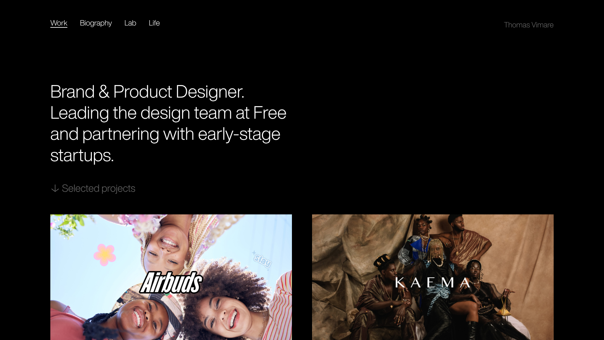
Minimalist Dark Designer Portfolio Grid
A clean, dark-themed portfolio featuring a bold typography hero section and a staggered two-column image grid with subtle entrance animations.

AcolorBright Design Agency Portfolio
Minimalist bento-style portfolio layout featuring numerical section headers, horizontally scrolling project teasers, and a clean grayscale client logo grid.
Waka Waka Furniture Portfolio
A minimalist design showcase featuring a custom cursor, parallax scroll effects, and a vertical image grid layout for high-end product displays.
